Aperitivo Time!

Painting | Oil on Canvas Panel 11” x 14” 

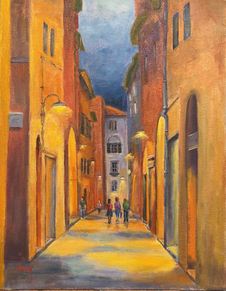
I’ve had the privilege of spending multiple vacations in Italy and am of the opinion that it is simply one of the most fantastic places in the world. The people, food, wine, traditions and, of course apperitivo time! 

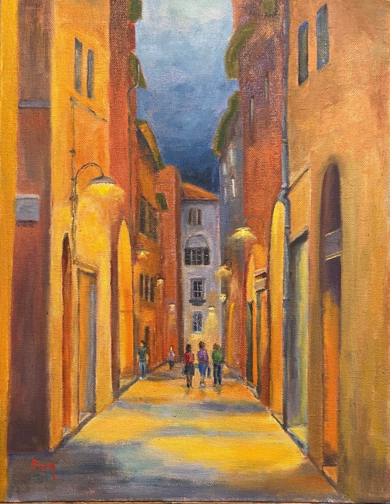
Final painting of Aperitivo Time
Aperitivo Time!

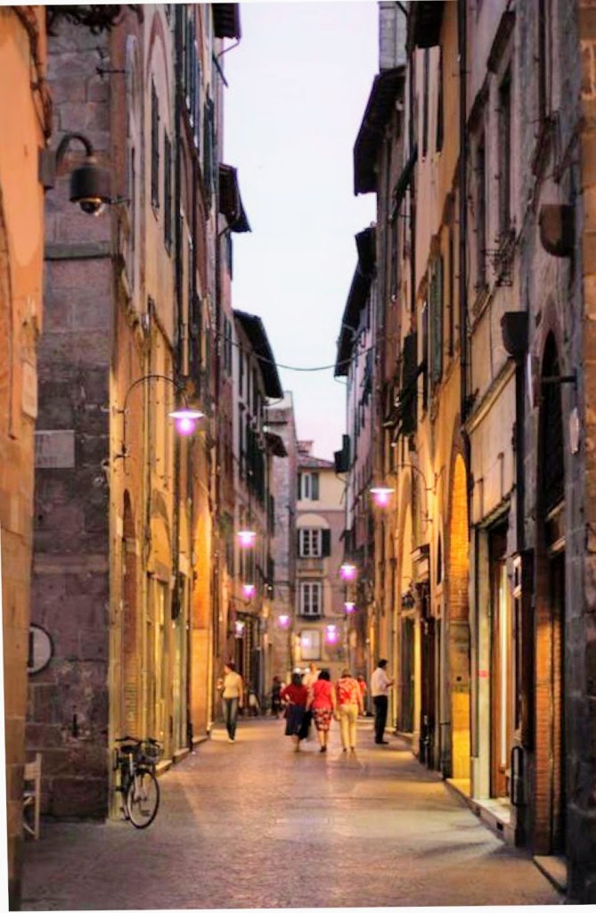
This particular scene is from a street in Lucca, Italy. The reference photo is earlier in the evening, just when the street lights go on, but I pushed the timing back a few hours so the lighting was more prominent. And just like magic, it was apperitivo time – break out the Aperol and snacks! If you don’t know what I’m talking about, rather than stumble through an explanation, just Google it yourself and promise yourself that one day you’ll go experience it first hand. Now back to the art…

This was another session to work on street scenes with people milling about their business (see the previous composition on this topic here, Lilliputian Italian Evening Painting). Ironically, the people were the easiest part of the composition, as the rest of the street and buildings took a lot of rework and adjustments along the way. Not sure why, but sometimes things don’t go smoothly. The other challenge was the surface of this particular canvas board. I had to really load up paint on the brushes in order to make progress, which was due to either the very toothy surface or the fact that it was very absorbent – this canvas board really drank down paint. 

This piece is also meant to be displayed in softer, yellow lighting. It was an experiment that I haven’t purposefully tried to do in the past, but the result is pretty cool. See the side-by-side comparison below, one with “normal” lighting, the other under the yellow/orange soft light. I feel like it adds to the mood and to some degree makes the street glow. 
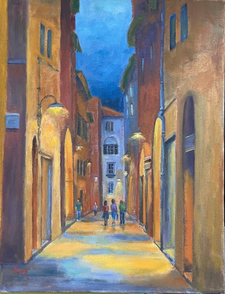
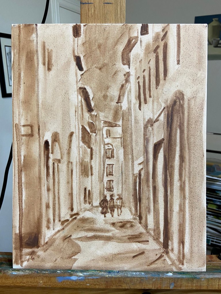
Progression gallery below shows the block-in, early color layout, and final composition.
Lilliputian Italian Evening Painting

Italian Evening | Oil on Canvas Paper | 6 x 8

I’ve been working on a large seaside landscape piece for the past week and ran into a brutal reality… people! The focal point is a group of brightly colored boats sitting on very saturated blue green water, which has been enough of a challenge in and of itself. I had made good progress on that part of the composition and then realized how many people were in the photo along the harbor walkway. Initially, I thought I’d simply wave my artistic license wand and exclude them, but came to the realization that it would be very creepy and vacuous without people enjoying the sunny day.  

Here’s the problem – I can’t paint people!

The large landscape is on temporary hold while I figure this out; I’ve bounced over to this small piece as a way to practice painting Lilliputians. 
This is an evening landscape, I have no idea where, but I’ve declared it to be Italian, which aligns with my current artistic needs. I kept things loose and painterly, but tried to leverage high contrast values to emphasize the lighting on both the building walls as well as the light spilling out of the restaurants. The people were put in last, and I’m pretty happy with the outcome, although I used 5 or 6 different brushes to figure it out.

One thing about painting people into a landscape – it will make you remember to step away from the painting repeatedly to see if they look “right”. To look at them up close is a real horror show – oddly shaped legs, disproportionate torsos, and some of the worst wardrobe decisions ever made. But step back 6 feet and they look fine. 

There are also some areas of the window sills and exterior wall faces that were done with a palette knife, wet into wet paint, which worked well in terms of giving a realistic, aged look. 

Some notes on color mixing:

  • Green awnings = cobalt teal + variations of yellows including cad lemon yellow, cad yellow deep, and cad yellow light. Darker areas are a more traditional mix of ultramarine blue + cad yellow deep + alizarin.
  • Orange red exterior walls = another wide range that used burnt sienna, cad red medium, cad yellow light, and ultramarine blue. 
  • Lights = exterior lights leaned more towards Naples yellow and a touch of cad red light and white. Interior lights utilized the outside lighting mix plus cad yellow light. 

Lastly, I finally remembered to spread the palette around the entire painting to balance the hues. This was especially true across the vertical faces of the building exteriors, giving the scene a better sense of continuity. 

Thanks for reading!

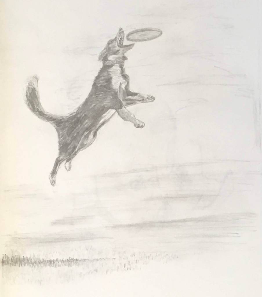
Frisbee Dog!

Frisbee Dog | Graphite on Paper

One of my dogs, Zip, is obsessed with 2 things in life: food and anything thrown. I used to think her love was exclusive to tennis balls, but over the years I’ve learned that not unlike her willingness to eat anything thrown into her food bowl, she will retrieve anything thrown across her yard. The day she trained me to sling a frisbee was a fond day indeed… for both of us. It’s her insatiable drive (dare I say “lust”?) to retrieve that inspired this drawing of Frisbee Dog. 

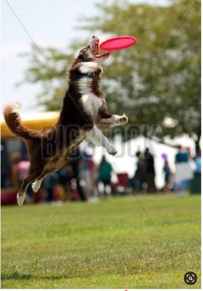
No, this is not Zip, but the reference photo captures all the key elements of a dog in motion doing her thing. The face is particularly tricky, in large part because it’s obscured and squinty, which mutes distinguishing features like eyes and ears. But you gotta love the open mouth and all those frisbee hungry teeth! 

The gallery includes a reference photo and two versions of the drawing. Granted, the drawing is a rough study and not intended to be a refined composition, I thought it was interesting to see how different photo settings can change the look and feel of a piece of art. Using the same source photo of the final drawing, one is set to sharper detail while the other uses a soft setting to remove some of the detail of the pencil strokes. Bear in mind this drawing is done in my sketch book on thin, see-through pages; there’s not a lot of teeth in the paper, thus the relatively rough nature of the drawing. Also, the entire piece was done with only 3 pencils – 2B, HB, and H. 
I think this type of subject would make for a good painting.

I’ll try a few more drawings of frisbee dogs and then make the jump to the canvass. 

Flower Study #5: Pink Rose

Pink Rose (study) | Oil on Panel | 5″ x 7″

Yes, another flower! The Pink Rose started off as a white rose, but some prodding from my wife got me to adjust to something a bit more interesting and thus the improvisation towards pink. 

I’ll confess I’m not thrilled with the outcome of this small piece, but I think it’s simply a matter of style preference. The style is less realistic than I’d like, although as a drawing it works well… but it’s not a drawing, so there’s that.

Pink Rose | Oil on Panel

The reference photo is a beautiful white rose, but in hindsight I can see that it’s flat and lacking variations in value. I didn’t figure this out until I was more or less finished with the piece, but it was a very valuable reminder that grinding through a painting isn’t always the right approach if your gut tells you something is off. I see a lot of paintings on-line that have this stylistic look, so I’m pretty sure it appeals to some folks, but, ironically, it’s not for me.

Squirrel Watch

Pivoting from painting to drawing last week and finally made the time to finish this one. Squirrel Watch is pretty self explanatory – Wolfgang, my 3 year old rescue mutt, sitting in the yard watching the tree tops for the infiltrators! 

One of my artistic goals this year is to improve my dog related art skills. I’m not a big fan of dog portraits, however, I thoroughly enjoy what I like to call “dogs doing stuff”, creating intrigue through motion and activity. Over the coming months I’ll work on various dog related pieces that capture the essence of dogs being dogs as they do their thing. 

Squirrel Watch | graphite on paper

Squirrel Watch was done over the course of a few weeks – I have no idea how long it took, but I wouldn’t be surprised if I spent 6 hours on this relatively small piece. There were a lot of mistakes along the way, but nothing an eraser and some patience couldn’t remedy. 

This isn’t a piece I would frame and hang, but I’m pleased with it from a progress perspective. It’s also riddled with lessons learned, so if you zoom in to see the details you can spot various styles and techniques.

Here’s what I learned and need to remember for future drawings:

  • It’s not necessary to draw hair detail throughout the subject. In this piece, the emphasis should have been on shading and shape foremost, whereas hair detail should be secondary. 
  • Draw hair details with a clear understanding of actual direction of the hair on the dog.
  • Work hair dark to light. 
  • Most of the hair detail can be accomplished using 2B, HB, and H pencils.
  • Show wrinkles in the coat by changing the density of hairs, i.e. closer together or further apart.
  • Dog paws are hard to draw, dammit! 
  • Blades of grass can be done by either individual strokes or by lifting out shading with a thin eraser.