This piece was done earlier this year using a reference photo I took while in Portland, Maine. Most of my works in that area are either “en plein air” or based on my own coastal reference photos. For those of you who have followed my work over the years, you well know I tend to veer to still life from time to time, with a particular affinity for libations. Thus, BEER BOX, technically a beer flight, from Rising Tide Brewery in Portland comes as no surprise.
For the painters out there, remember the use of photo reference is a blessing and a curse. On the one hand, they capture a place or moment for future reference, when perhaps your memory might not be willing to cooperate. On the other hand, they can significantly distort reality and create more problems than they solve. While most of what you read about “painting from photos” (virtually every painting book covers this point) emphasizes the distortions created by photos relative to lighting and hues, IMHO the real terrorist activity of reference photos is their ability to jack with shapes.

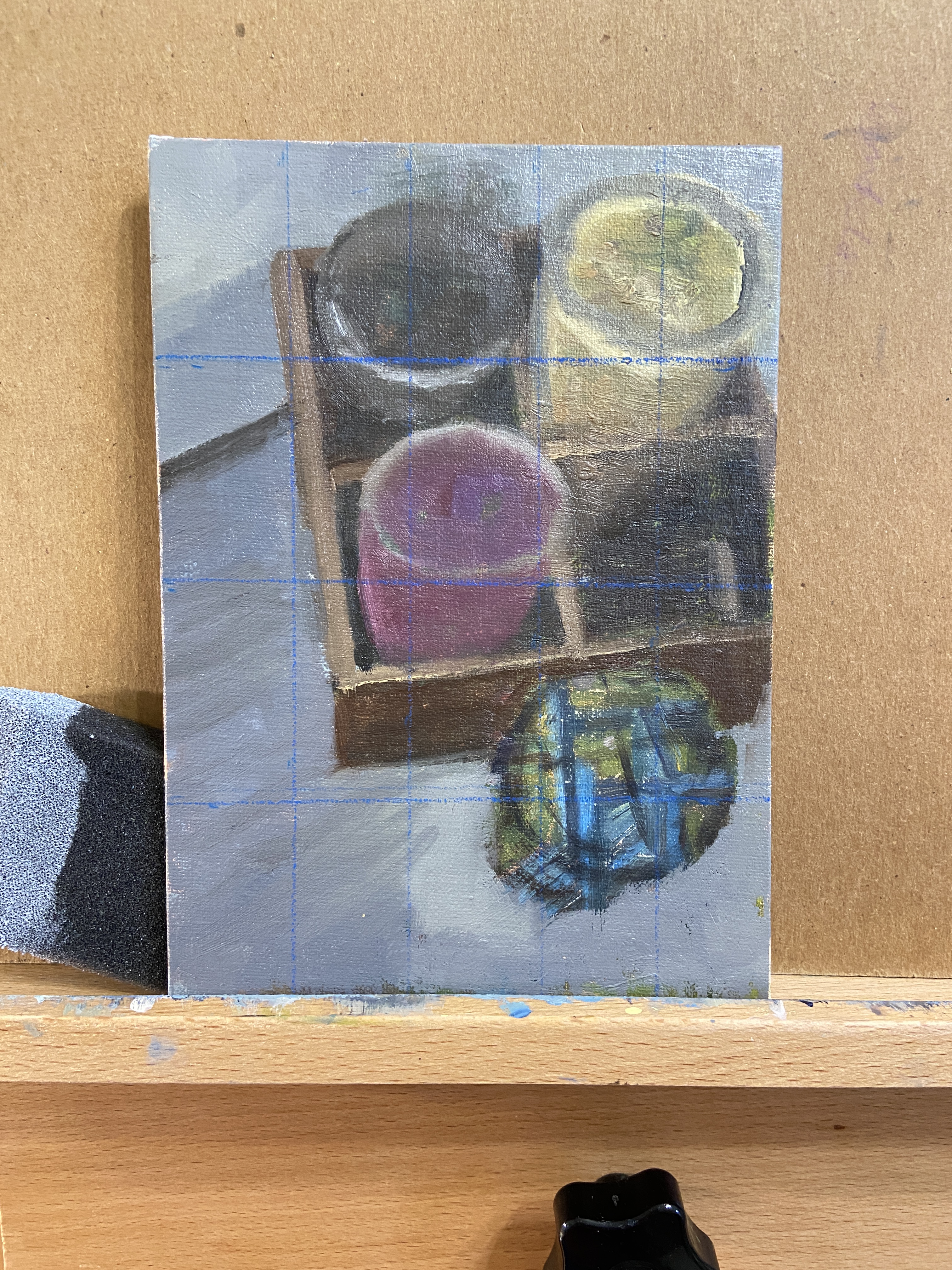
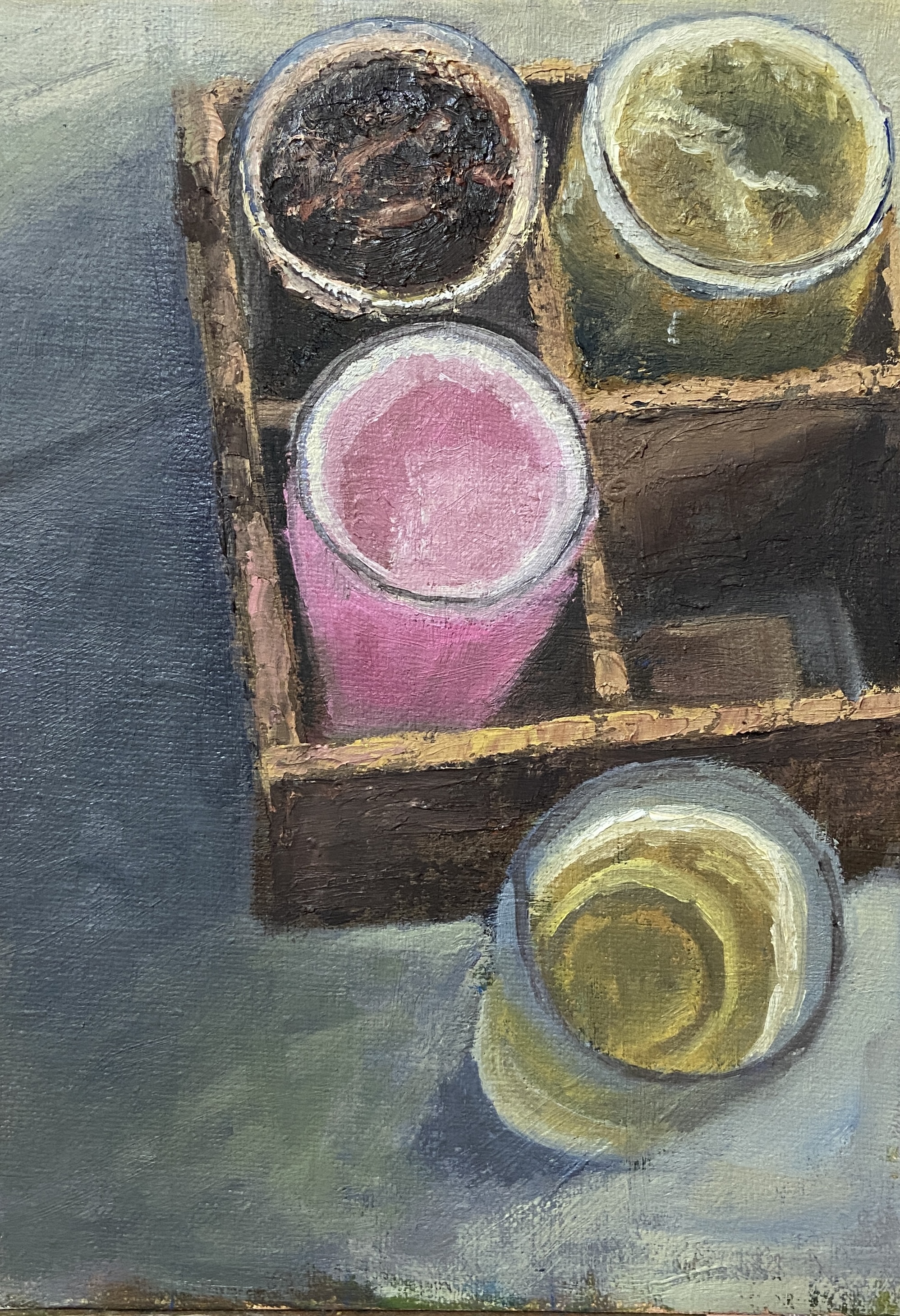
In BEER BOX, I overlooked the shape shifting my iPhone had done to “improve” the photo. I even used a grid to try and get the shapes right, something I rarely employ, and I still didn’t realize the reference photo was just a bit tweaked! It’s hard to notice at first, but the top portion is actually skewed outward, kind of a mini fish-eyed effect. I noticed this after I’d already committed to the compositional structure, so I just rolled with it to see how it would turn out.
In the end, this piece proved to be a perfect mix of frustration and satisfaction. I think it turned out well, despite the odd birds-eye view, and I learned a lot in terms of subtle hue and value changes required to capture the depth of the beer box and how the glassware fades into the deep shadows.
BTW, Rising Tide Brewery makes some great beers and should be a stop on any Portland, Maine brewery crawl. I don’t recall the specific beers in this flight, but the 4 styles were Stout, IPA, Pilsner, and the pink one was a delicious Sour.
Thanks for reading!
#artbern #berntx #crashboomzip #abplanalp #austinartists #atxart #portlandmaine #landscapesmaine #maineart #portlandmaineart #southportland #southportlandmaine #capeelizabeth #risingtidebeer #beerflight #beer #mainebrewers