When I first started painting, the term “study” was something I did to suspicious food at a dive restaurant. Over time, I learned that “study” oftentimes meant “practice”, typically done as a trial effort before tackling the same composition on a larger scale. This interpretation is meant to allow the artist to figure out technique, color palette, and orientation of the work. Fast forward to current day, I’ve come to find that “study” can mean a brutal self-critique of a practice painting that becomes more than a mere invalidation of the compositional structure, but rather a realization that you buggered it up entirely!
Of course sometimes a “study” can magically have no serious flaws, the plaint flowed effortlessly, and all your compositional ideas worked beautifully. Sometimes.
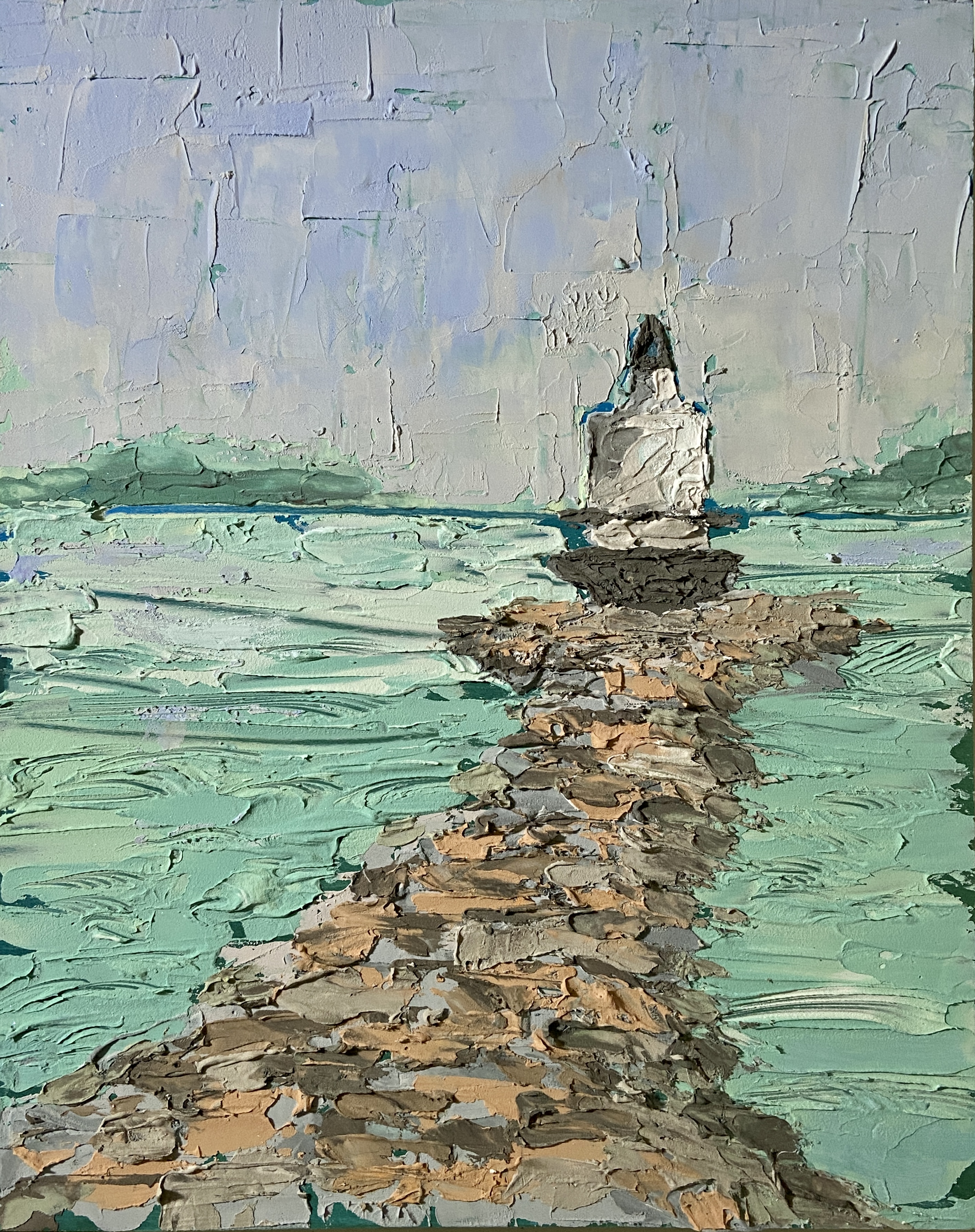
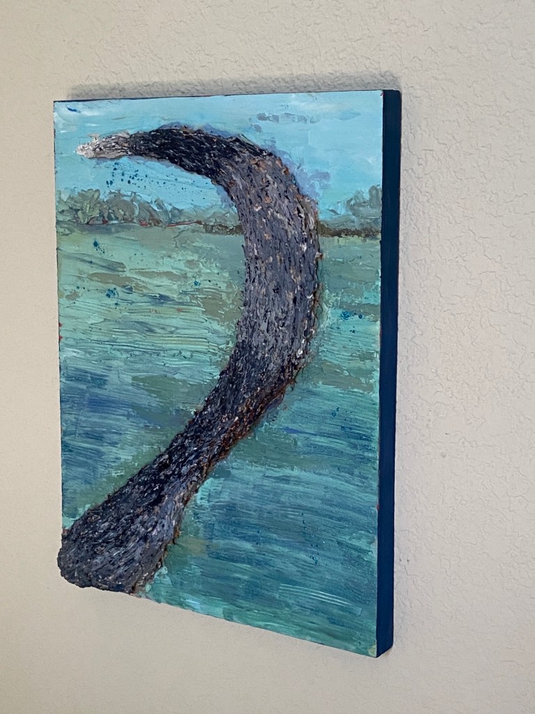
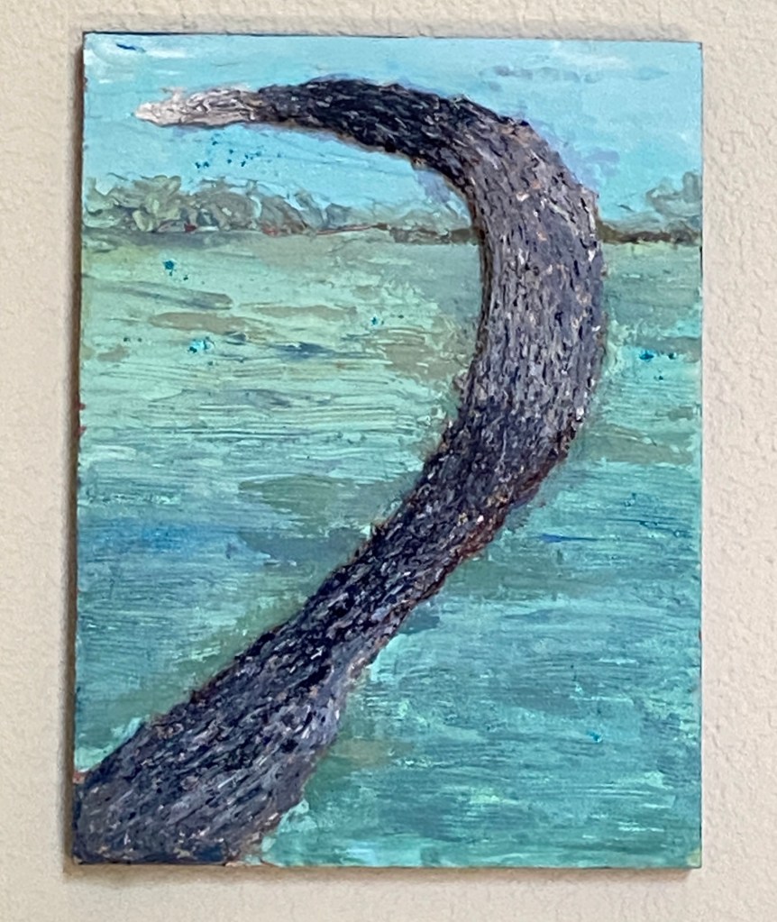
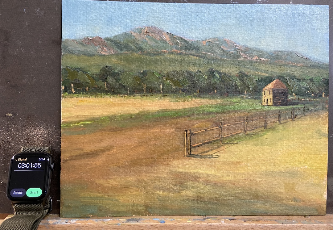
The study FLATIRON HOMESTEAD is proof that this practice has merit! That said, I like this piece because at the end of the day it was a lot of fun, the palette is pretty good, and doing a “real” painting is a likely outcome. There are progress photos per usual, but I’ve also included an annotated version of the completed study to point out the issues of which are detailed below.
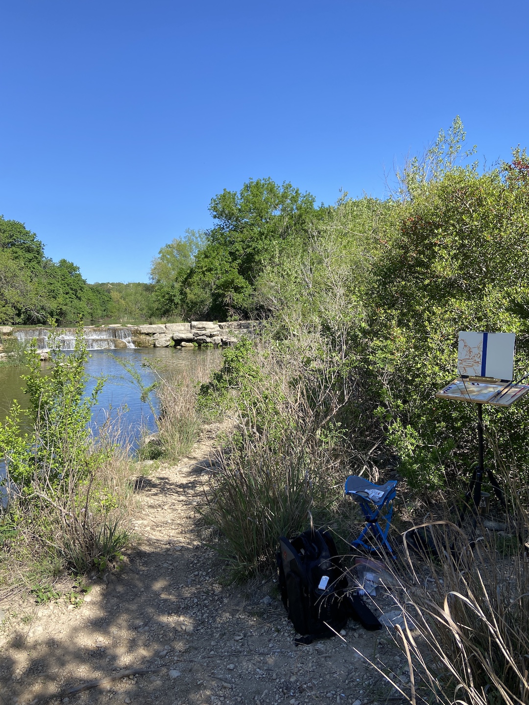
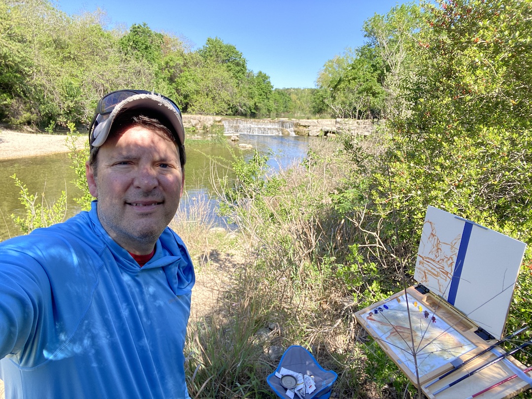
This was painted from a reference photo taken by my mom during a plein air session we did last year near El Dorado Canyon, Colorado. It’s a beautiful location as you can see for miles along the Front Range with the Flatirons as the backdrop. To insert a human-made structure as the focal point of the piece felt wrong and awkward, but in the end it worked out.
I did a couple of sketches to mock-up compositional options, taking more time than I normally would, which I think proved beneficial because the core approach turned out to be much more compelling than the reference photo itself. The other key to this study was setting a time limit, which I chose to be 3 hours. The idea being to not overthink it, but give myself enough time to get the core elements fleshed out properly. This worked well because in the end I had to make major design change decisions (see fence line) quickly, focus on values over hues, and avoid the complication of detailed brush strokes.
Following is the summary of what I learned from this “study”:
1. The tree line is oddly symmetrical in terms of height. Not good! Need to change that next time and always be conscious of varying heights.
2. The fence line is a little too straight, even after the compositional decision to remove part of the fence so it didn’t cut the painting in half.
3. Light source is inconsistent. This would never happen if I painted this en plein air because it would have been impossible to ignore the sun, but drop me in the studio and things can get whacky. The sun is overhead for the flatirons and fields between the trees and the mountains, but the foreground and focal point are clearly lit by a sun that’s more on the horizon, albeit not sunrise.
4. Cast shadows of the fence line are critical and extremely effective. On a larger piece this will really grab the viewer and suck them into the painting.
5. The homestead building angles aren’t right, most likely the front side that’s lit by the sun needs to be a little less wide. This is the only real negative I found by having a time limit because I could have taken the time to repaint this part… then again, why bother if this is a “study”?
6. The highlighted tree trunks, meant to capture the high value contrast of the sunlight coming across the field, are effective and something I want to use in a larger piece, but in this study they are way too big/wide. Should have used a lighter touch with a think brush.
7. The sky color is excellent! I made an adjustment in the 2nd hour to the sky, deciding it was too blue and dark. This has been a problem for me in the past with landscapes, but I think this provides better awareness going forward, namely start lighter than I think it accurate and darken if needed.
8. The flatirons look really good, even though they’re just supporting background to the main elements. I used a palette knife to scrape the granite colors into the greens and that worked well. Need to remember that trick for future efforts.
So, that about sums it up. As you can see, you can learn a lot if you “study”!


#artbern #berntx #crashboomzip #painting #art #abplanalp #austinartists #atxartist #atxart #atxlife #contemporaryart #bouldercolorado #eldoradocanyon #flatirons #cubuffs #cualumni #bernabplanalp #pleinair #study #coloradohistoricalsociety