My recent foray into mixed media, courtesy of plaster and acrylic, has opened up a new perspective for my still life compositions. A good place to start was with my favorite adult beverage, a tasty Porter.
This is a very small composition, 4×4”, but in large part thanks to the 3D-ish impact of the thick plaster, it has a lot textual appeal. I did this without a reference photo, or beer model for that matter, going from memory of similarly themed past paintings. This one is most notably related to Last Sip, but oddly enough it was infinitely easier to create for a couple of reasons. First, the smaller size makes things go much faster. But more notably, the use of colored plaster and the simplicity of the subject make for a quick creation.
I might have just gotten lucky, too, and nailed it on the first try.
I might return to this specific piece and do some direct painting using acrylics on the plaster, which would add more vibrancy and get rid of the slight chalky effect.
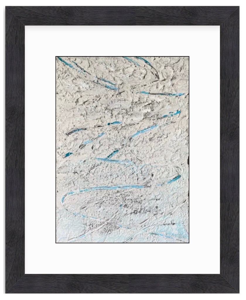
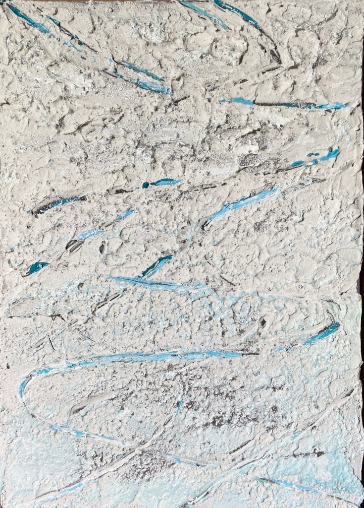
This is project #2 from the aforementioned Textured Painting workshop at The Contemporary at Laguna Gloria. This was a real Bob Ross experience, as my original plan was to simply experiment with texture and some pottery tools to see how they manipulated the joint compound, as well as experiment on canvas board with my newfound medium. Lo and behold, I discovered ski tracks in the snow – an abstract painting exploration turned “real” composition.
The coloring of the snow is actually tinged with yellow and muted with purple, which is very hard to see in the photos. The first step was to paint the canvas panel all black, let it dry, then cover it with the off-white spackle. The pottery tool was some kind of metal prong with a very small, circular tip. Dragging this tool through the soft spackle exposed the black board underneath, sometimes closing back up over itself in the thicker sections, much like skiing through fresh snow.
On day 2, after the initial spackle had dried, using a water spritzer, I applied some kind of sparkly dust provided in the instructor’s box of goodies, which created a very cool reflective effect, like sun on snow. The last step was to apply a sky-blue acrylic mix to some of the wider tracks, which added color and the effect of the sky reflected in the snow.
Overall, I’m very happy with this abstract turned ski tracks realism piece. I think it would be a very marketable piece, too, at a larger size in a black frame for someone who loves skiing. Thank you, Bob Ross!
Virtual FrameFresh Tracks ZoomTextureTexture, Sparkles, and Blues
SPRING POINT LEDGE LIGHTHOUSE 2 | Mixed Media on Wood | 8×10″
I recently attended a 2-day workshop at The Contemporary at Laguna Gloria. The focus was textured painting, which ultimately boiled down to playing with joint compound (gypsum spackle) and acrylic paint. I was amazed at how easy and fun it was to adapt to this medium.The technique is very straightforward, whereby one mixes acrylic paints into the joint compound, which is an off-white, and do whatever you want provided it’s put on a hard surface, for which I used wooden boards.
Most of the class did abstract pieces, which make sense as you get to play with pottery tools to get cool shapes and textures. It’s very forgiving, too, because you can simply wipe it off and start over again provided you don’t wait more than a day, at which point it hardens. I chose to do still life and landscape pieces, taking advantage of the impasto nature of the spackle. The instructor said she hadn’t considered doing landscape compositions with this technique, but to me it seemed intuitively suited for the textural nature of the real world.
I intend to add some vibrancy to this composition with acrylic paint… I think. This is definitely the start of a new and exciting medium! Stay tuned for a number of new pieces in spackle and acrylics.
I have the good fortune of 7 of my paintings being included at Austin Fine Art Gallery’s annual holiday group show of small arwtorks called “small WONDERS”! All works are framed and ready to go on your walls, or, given their relatively small size, they’re easy to ship to friends and family who might appreciate authentic art from an Austin artist.
BLACK LAB | Graphite on Paper | 11×13″
BULL CREEK, AUSTIN | Oil on Board | 6×8″
DOG TIRED | Oil on Board | 16×12″
JUST THE RIPE SIZE | Oil on Panel | 5×7″
SPRING POINT LEDGE LIGHTHOUSE | Oil on Board | 8×6″
POPCORN | Oil on Canvas | 14×11″
SOMETHING BLUE | Oil on Board | 12×9″
Small WONDERS will consist of over 300 mini works by over 35 greater Austin artists, ranging from 5×7’s to 16×20’s. Everything will be PRICED to GIFT with prices ranging from $100 to $600. Don’t miss this wonderful show to start or add to an art collection for you and your loved ones!There will be an opening reception on Saturday, December 9th from 4-7pm. There will be holiday treats, drinks and live music during the opening reception. The show runs through early January.
For more information about the gallery and this show specifically, go to www.artframingservices.com, navigate to the “small WONDERS” show announcement, and consider dropping by for some holiday cheer and say hi during the opening reception.
Artists showing include:
BERN ABPLANALP UMBREEN AHMAD TOM BENTLEY VICKI BREVELL TAMMY BROWN HOLLY CRAIG ALAN EHRLICH PAT FLATHOUSE ANN FLEMINGS JULIA FLETCHER SALLY FRASER OLGA GORALEWICZ LACY HUSMANN JESSICA GREENWOOD PING IRVIN CRAIG IRVIN CHRISTINE JAMES CAROLYN KILDAY MELISSA KOTZEV SCOTT LEOPOLD MARCH MATTINGLY LINDA MONTIGNANI M MURDOCK EDD OGDEN NANCY PATON RICARDO ROBLES JOYCELYN SCHEDLER ANASTASIA SHIMANSKAYA CELESTE SMITH CONNIE TAYLOR MINDEN TEN EYCK LILIANA VASQUEZ LINDA WELLS JOHN WEST ELIZABETH WILSON WALKER WINN RENEE WOMACK
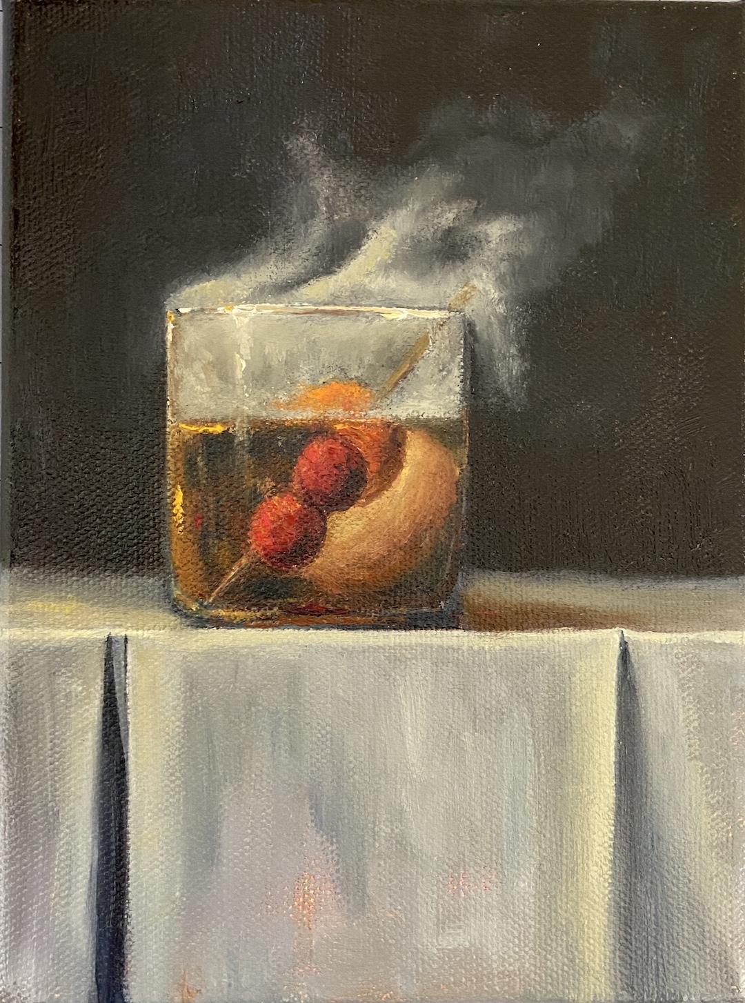
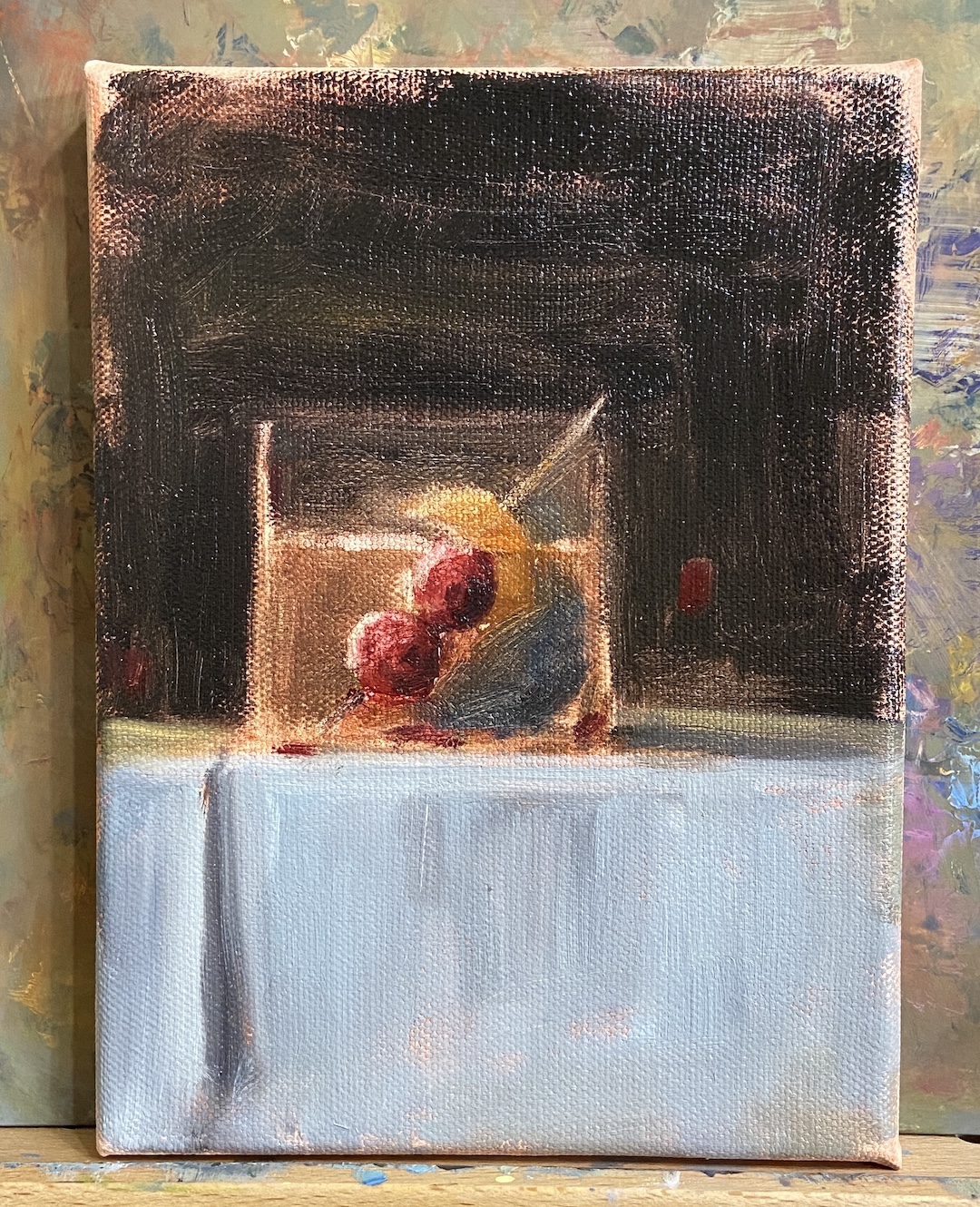
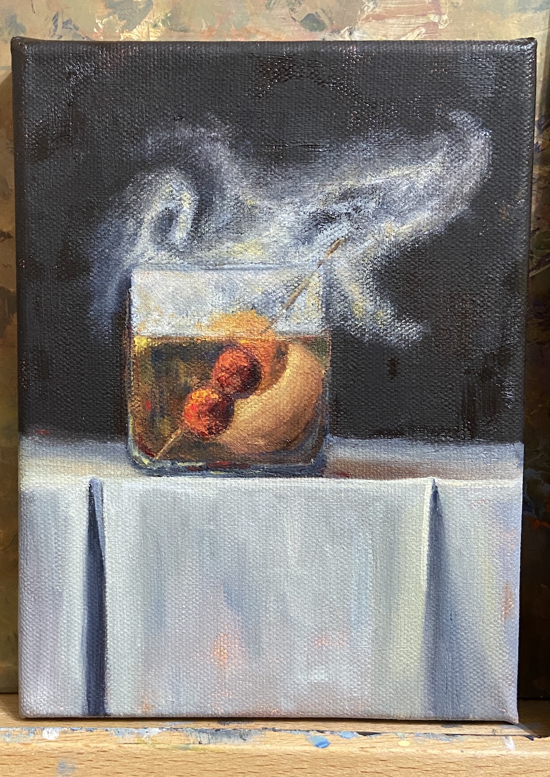
SMOKY OLD FASHIONED is a recent commission piece, something I love doing, especially when it’s for a gift or something sentimental. In this instance, the painting is for a gift for someone who apparently has everything. Painting to the rescue!
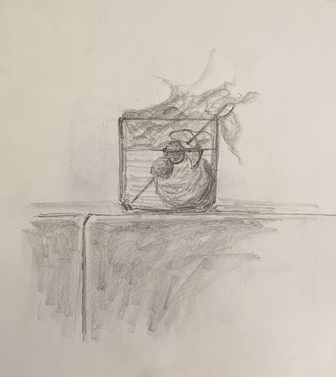
My process for custom work involves a number of preliminary discussions followed by sketches that give compositional options. Just like blocking in the value structure of the actual painting is key to a good outcome, with a custom piece, coming to an agreement on the core elements and structure of the composition is vital.
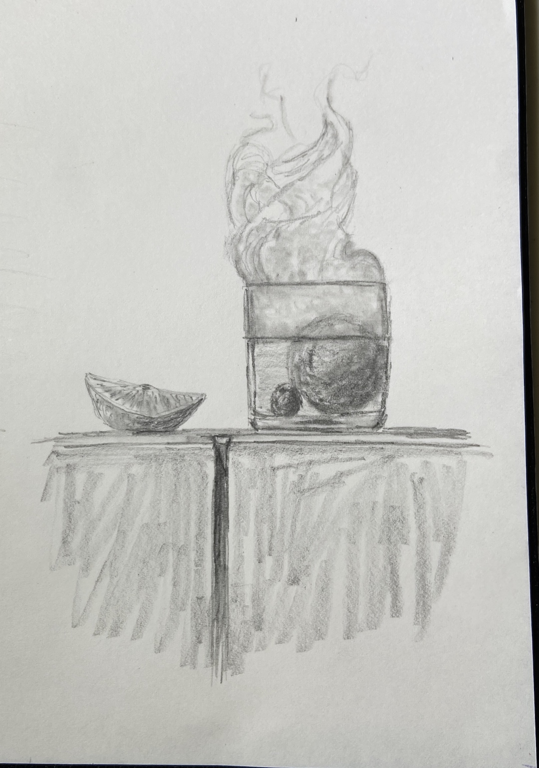
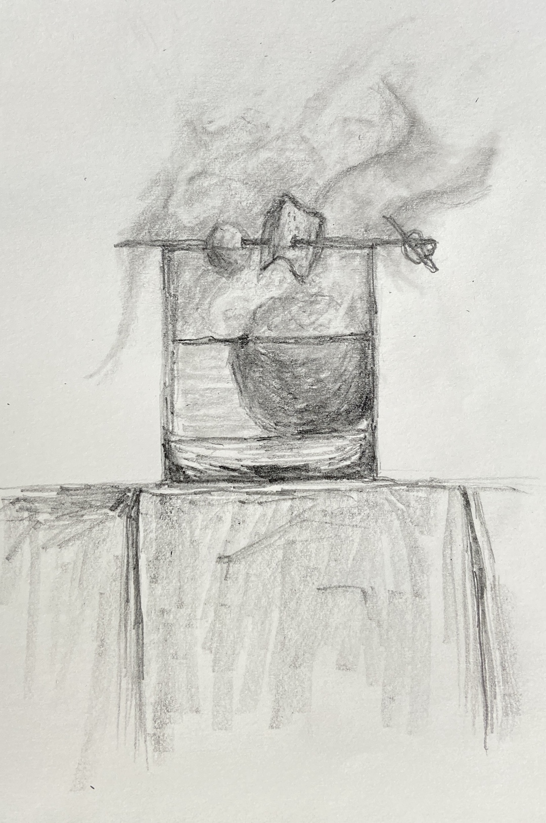
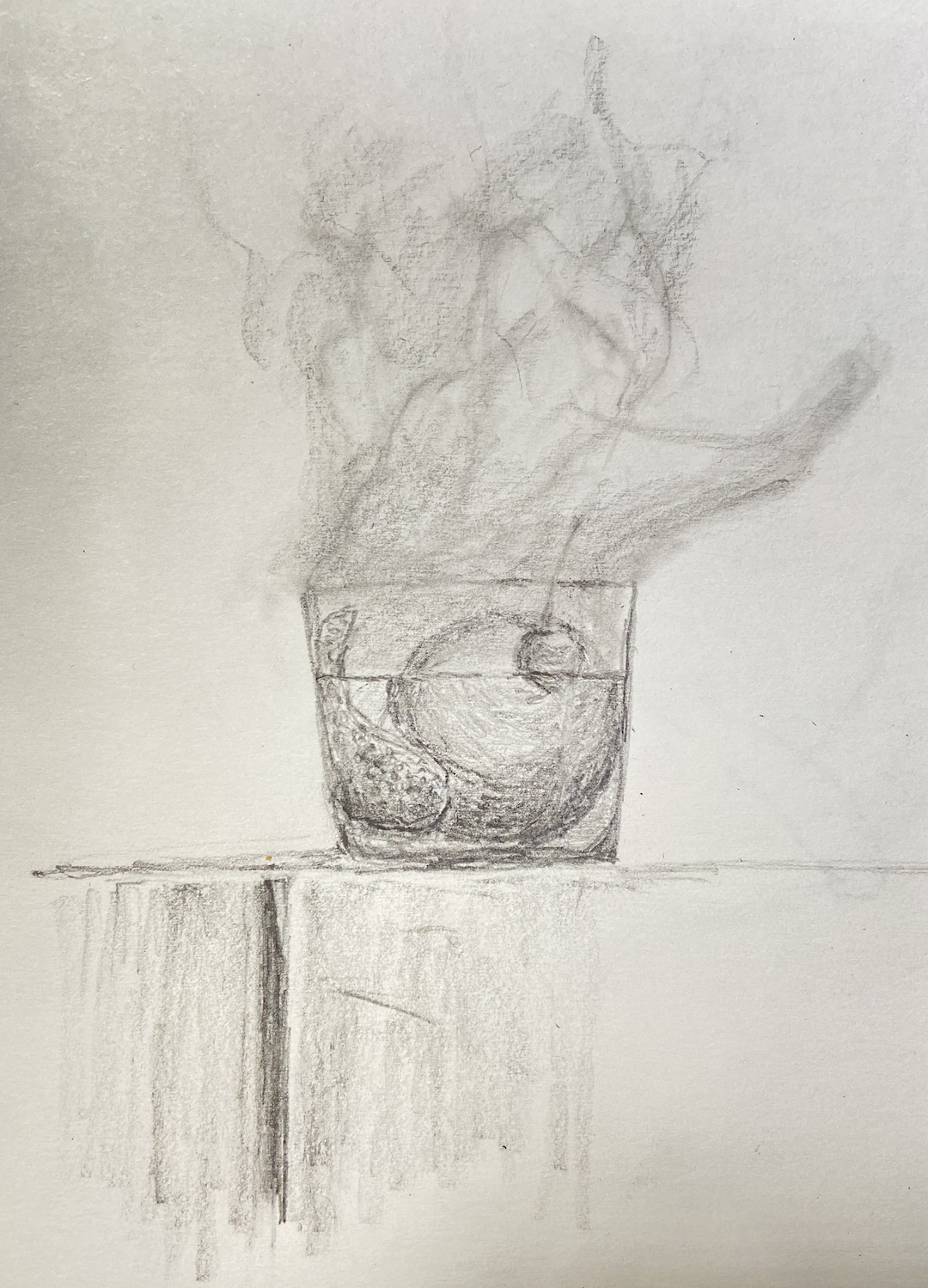
I’ve painted a number of libation-based still life compositions, but nothing with smoke. It required me to investigate if painting smoke was similar to creating fog, mist, or larger fire-based plumes.
The answer, it turns out, was an emphatic NO! It seems that once you pump smoke into a cocktail glass, weird shit happens and it becomes lifelike and animated. Looking at reference photos further complicates matters, introducing possibilities of upward windy smoky tendrils, or smoky bits that spill over the edge toward the table. Come to discover both of these considerations are smoked red herrings! Smoky tendrils are “fresh” burning anomalies, and the only smoke that sinks seems to be dry ice based smoke, which you can imagine is in a lot of cocktail glamour shots.
The trick with this piece was clearly… smoke! But before getting to that challenge, there was the issue of compositional tension. Technically, an Old Fashioned isn’t so much a cocktail as an origins story of composition. The Meehan’s Bartending Guide, my personal true North for all things cocktail, notes “the cocktail was first defined on May 6, 1806, in The Balance and Columbian Repository as ‘a stimulating liquor, composed of spirits of any kind, sugar, water and bitters’. By the time it showed up in a professional bar manual for the first time in Theodore Proulx’s 1888 The Bartender’s Manual, it was already “old-fashioned”.” My personal preference is rye whiskey, simple syrup, bitters, 1 cherry and an orange twist. Now back to the painting…
The request for this piece was to incorporate Luxardo cherries, orange peel, and a large round ice cube. Figuring out how best to structure this as a piece of art was trickier than I thought, even without the smoke. Once you put all that stuff into a lowball glass, it’s impossible to not notice the tension of so many things jammed into a small space. To tackle this problem we simply talked through various sketches that presented different solutions, and we ultimately landed on cherries on a toothpick, angled into the glass, orange peel also on the toothpick but above the whiskey line, and lastly a demotion of the round ice to the background. As a pleasant surprise, once the smoke was added, it significantly improved the compositional structure because it broadened the view and seems to have further reduced the tension, essentially granting the viewer a larger viewing room.
Lastly, the smoke technique. I still need to refine the approach, so stay tuned for more smoky cocktails, but the core approach seems sound. The smoke is not white, that’s the first thing. Turns out it’s about 20 variations of gray, leaning warm (cad yellow deep) above the glass, and a little cool (lemon yellow) below the rim. The brushwork boils down to a lot of push and pull between the light grays and the black background, using a lot of scumbling with an oversized round brush. As the smoke expands above the glass, it was important to make sure there was a very thin layer on the outside edges of the core smoke to lend it a sense of movement. The person who commissioned this piece has a cocktail smoker top, which sits on the top of the glass and is then pulled off in a flourish when the smoking is done, which pulls some of the smoke up and out of the glass. It’s all very entertaining, until you try to paint it!
SPRING POINT BOATS | 10 x 8” | Oil on Canvas Board
This is a follow-up to a previous post while in Maine. SPRING POINT BOATS was started en plein air, the session just long enough to allow me to lay in a solid structure and composition that was interesting. There was some artistic license taken in terms of boat placement and colors, but the remainder of the setting is, believe it or not, an accurate depiction.
While the paint didn’t effortlessly jump off the brush, something did click regarding boat shapes and structure. I’m not happy with how some of the areas look a bit chalky, but that should be easy to improve in future efforts. I believe I relied too much on Titanium White to lighten values throughout the piece, as opposed to reserving it primarily for the boats. However, the sense of a strong mid-afternoon sun on a calm day came through pretty well.
The last self-critique, and it’s a big one, is the compositional structure. I didn’t notice until the work was done, but now I can’t “unsee” it, that the lighthouse jetty looks artificial because it comes into the painting in a parallel that’s very distracting. It needs to be more angular, or at the very least, I need the sight line to be above the jetty so you can see the side and top, not just the side. I have to laugh, though, because I was so proud of my artistic licensure of the boats, yet I ignored the massive rock jetty in the background. Oh well, there’s always next time.
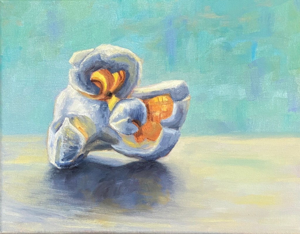
In the spirit of fun and interesting still life subjects, please welcome this tasty kernel… POPPED PERFECTION! This is my second popcorn themed composition, but unlike the original, which featured 3 pieces of the corny goodness, the focus is a single, beautiful popped kernel.
Popcorn is a tricky subject to paint, in large part because there’s nothing standard about any of it’s shapes or surfaces. Had I tried to paint this as a novice I would have found a new hobby and never painted again. That said, when you get it right, it’s a thrill!
There are a number of ways to add artistic interest to this type of still life. I wanted to emphasize the transparent elements of a nice big juicy piece of popped corn, thus the focal points with orange and yellow where light can penetrate. To really make the piece pop (sorry, couldn’t help myself) I used a blue background, which is the complementary hue to orange and therefore provides a strong contrast without having to worry too much about the similar values. Furthermore, the piece is very simplistic in terms of having nothing else on the canvas, which is meant to help it jump off the canvas from across the room.
SPRING POINT BOATS is a work in progress from a gorgeous day on a pier overlooking a marina adjacent to Spring Point Ledge Lighthouse. This initial session was about 2.5 hours, half of which was spent establishing the composition structure and a practice sketch to verify the arrangement of the boats. Note that boats move, even when they’re tightly anchored in the marina, so photos of each boat in the desired position are essential to finishing a seascape like this in the studio.
The temperature was perfection in the shade, my wife was with me enjoying the outdoors and providing very helpful compositional tips, and there was a family of Ospreys on the other side of the marina (right behind us) that are the talk of the town… amongst bird people at least. I’ll admit they are interesting to watch, as the parent (not sure which one, I’m not up to speed on Osprey gender identification) was busy dropping off fresh caught fish for the two babies. At some point, one of the bird watchers rounded the corner of the pier where I was painting, said “hi”, and I was convinced she was about to ask to see what I was working on, only to then question “why aren’t you painting the Ospreys?” Of course I told her I hate birds, was dismayed at the tankards of shit they spray all over town, and that their screeching was something of nightmares.
Of course that was with my inside voice. My public self, using my actual voice, told her instead that the Ospreys were entertaining but difficult to paint, an answer she seemed to deem acceptable – perhaps she hadn’t considered the complexity of painting moving birds in a nest of twigs atop a 75’ pole in the middle of the bay. She giggled and shuffled away, apparently never having noticed I was painting. Perhaps some grumpy plein air painters – you know who you are – scared her off in the past and she’s afraid to ask. I digress…
As to this painting, I had already decided this was going to be a 50/50 job, namely half outside, half in studio. The goal was to lay down a solid structure and really balance the massive blue expanse of the sky and sea with the focal points of the boats. The lighthouse should give perspective and some added interest to the piece, but the intent to so give the sense of place sitting on the water watching the day go by. For me, this is still very difficult because virtually all sailboats are dominated by white, either the sails or the top deck, so the brush strokes have to be very intentional and the values need to shift much stronger than what I see “live”, at least that’s how I think it should be done.
Stay tuned for the completed work, which I’ll keep very loose and painterly in an attempt to put the viewer outside with the boats.
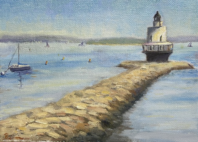
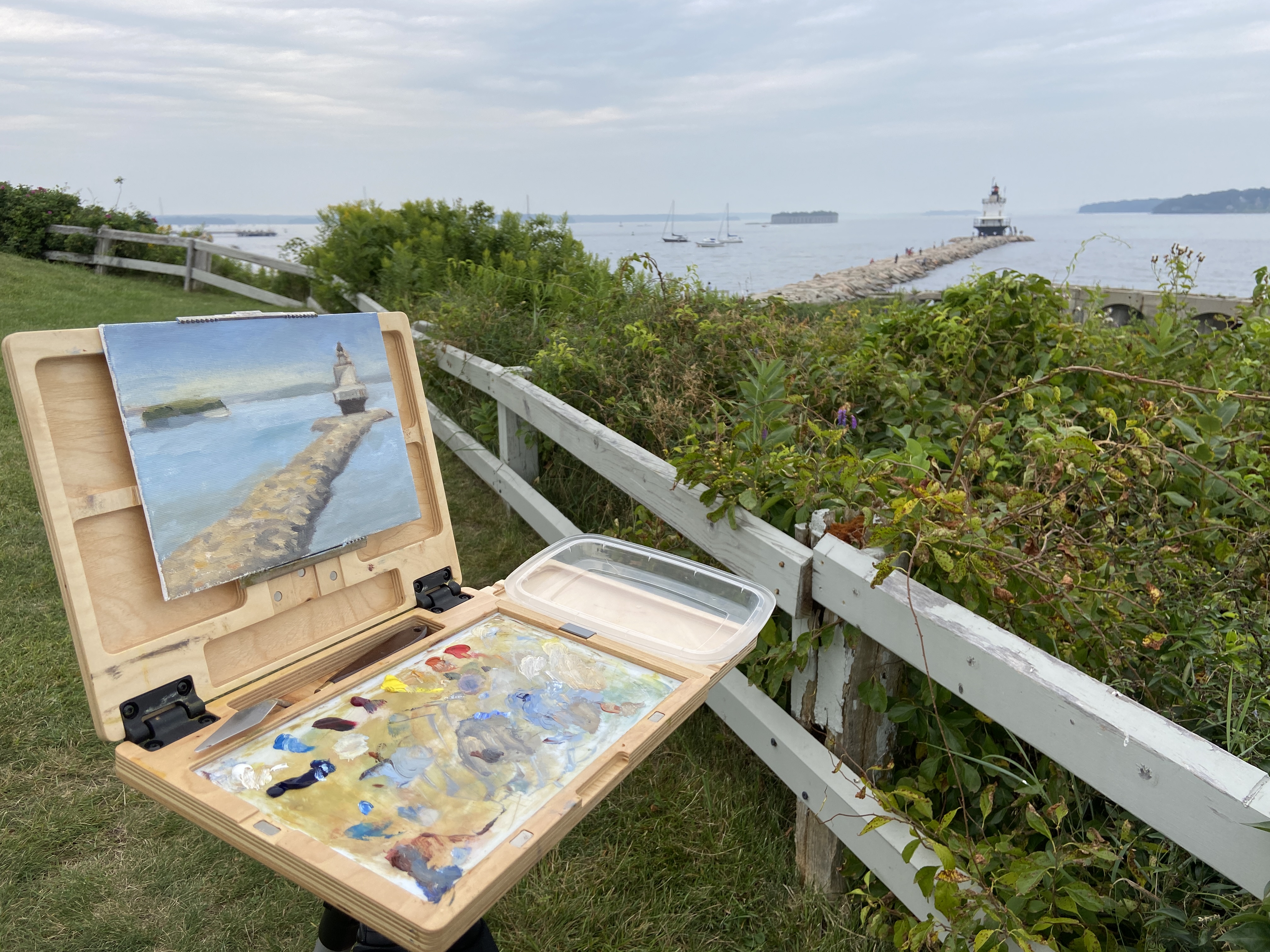
SPRING POINT LEDGE LIGHTHOUSE | 6×8”| Oil on Canvas Board
Finished! I’ve posted a couple of progress related updates regarding this composition and I’m happy to say the 3rd time is a charm… this one’s done! If you look at the previous progress post, you’ll notice the removal of the tiny island fortress of Fort Gorges, an extreme application of artistic license. It was giving me fits compositionally, in part because the intent to use it as a balance with the lighthouse on the right was more of a distraction than something complimentary. I was going to simply mute the greens of the trees and push it back in the scene, ensuring the lighthouse was the focus, but what I discovered was that it’s such an unusual structure that it took over the composition as the viewer is sucked into wondering “what the hell is that?” I mean seriously, how often do you see an old fort on an island with a miniature forest growing in the center? I tried to convince myself that I painted it so realistically and thus it was a distraction, but in reality it’s simply weird to see out of the full context of Casco Bay, so I wiped it out… in the interest of artistic integrity.
The fort was easy enough to wipe out, but the issue it was meant to address, namely a well balanced composition, was still a problem. Not a pro at just dropping shit into a painting out of thin air, this seemed like a good scenario for practice. I’m pretty happy with the result, but it took a conscious effort to ignore details and simply work in some loose brush strokes. I also incorporated some of the ubiquitous lobster buoys found in and around Casco Bay, and lastly some distant sailboats to give the sense of an active afternoon on the water.
As to the focal point, the final result of the lighthouse and the complex stones of the jetty came out pretty well given my relatively minimal subject matter experience. As any of you artists know, tackling new subjects can be a reminder of the impossibility of knowing how to paint anything and everything equally well. The process was very enjoyable and satisfying, so there will be more lighthouses in the near future. I might expand my new found rock painting knowledge to some coastal scenes, too.
SPRING POINT LIGHTHOUSE | 8×10”| Oil on Canvas Board
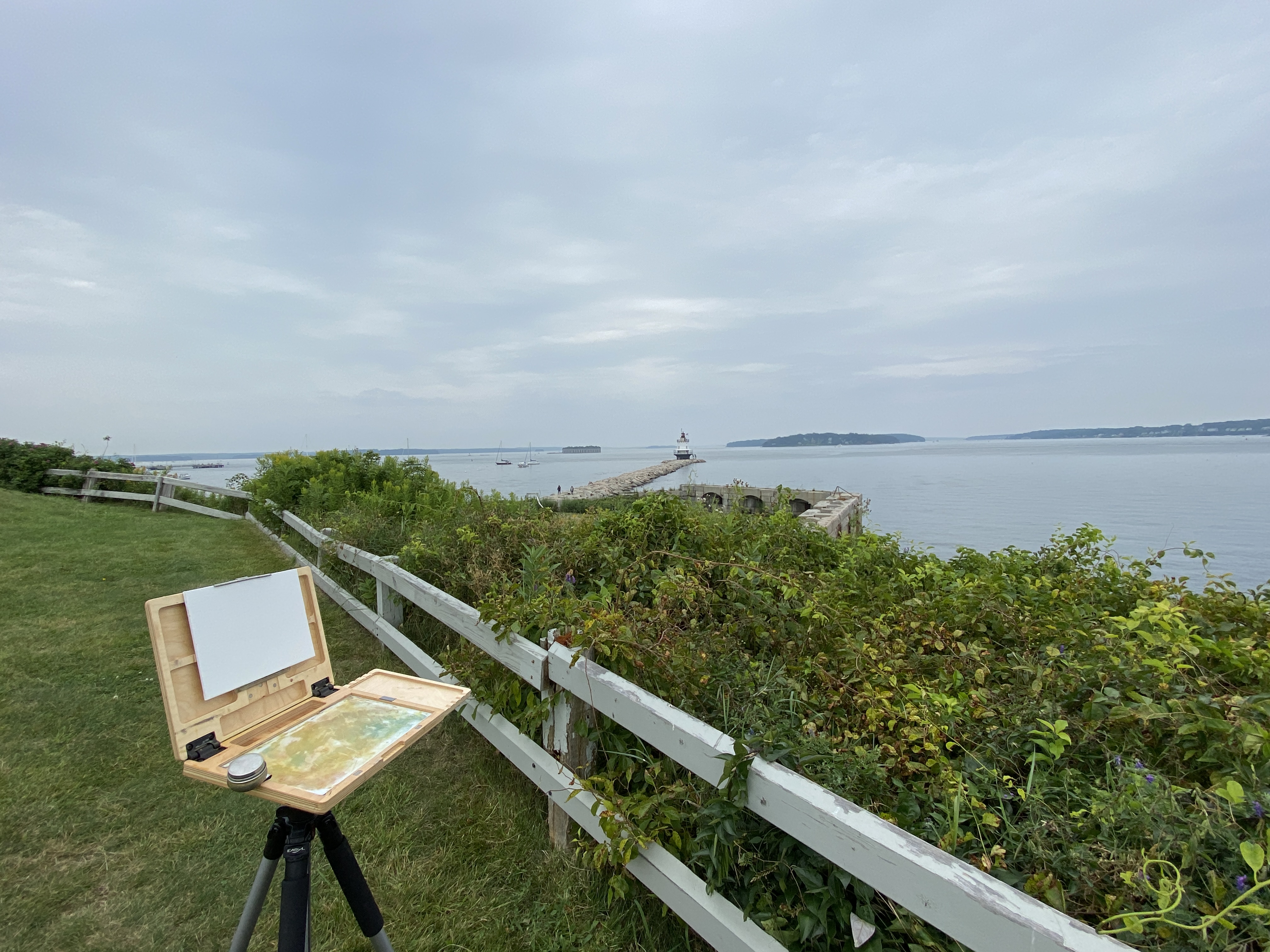
Presented with a sketchy weather forecast for the coming few days, my need to get out and tackle this lighthouse painting got the best of me and I made a rare late afternoon plein air session happen. Nothing about the timing or the weather made sense for an outdoor session, but when the temperature is in the lower 70s that’s all the motivation I really need.
The drawing session from last week proved very helpful with this composition. I knew exactly how I wanted to orient everything, which in this case was the jetty, NOT the lighthouse. I need to remember this for future works, namely to find the piece of the composition that’s going to serve as the anchor for all perspective and measurements and start there, noting that this isn’t always going to be the focal point. The vertical orientation of everything on the horizon and the width/centering of the lighthouse relative to the jetty was also key. This made things move very fast so I could get to the business of putting oil on canvas.
Starting with the sky and working forward was my approach this session. I’m ultimately ignoring the very gray, muted light because I know what this looks like on a sunny day and the plan is to polish things up in the studio or return to this location to finish it off with better contrasts. However, I’m very happy with what I finished today in just over an hour. A part of me says I should leave it as is and simply shore up the lighthouse details. Maybe I’ll put myself on an hour limit and refine whatever I can within that time constraint? Something to think about.
Side note, a family with a young girl come by to ask if they could check out the painting. Apparently she likes to paint and seeing someone doing it outside on a day like today was either very cool, or just weird. Either way they seemed to be entertained and were very appreciative of our brief chat. I’ve never understood plein air painters who get so bent out of shape when people ask to check out what they’re working on. Doesn’t bother me, especially if what I’m painting doesn’t look like garbage.