A few months ago I finished this triptych, now called “GOING GOING GONE”, but it sat around in the studio waiting for framing inspiration. Well, that inspiration finally showed up in the form of cork foam board, an orphaned 12×26″ frame, and a whole lot of JB Weld epoxy glue.
If you’re interested in the details of this artwork, follow the link to the post in the above paragraph. Otherwise, read on to learn about the challenging world of custom framing, at home, with nary a YouTube DIY video to be had.
Challenge #1: How does one attach wood blocks to a frame without backing? I was headed down the path of cutting a custom wood back, but then I stumbled across a 1/4” thick foam board while looking for balsa wood as a lighter alternative to plywood. I also happen to have a matt cutter, which is much more finger friendly than my rotary saw, which is buried somewhere in the garage.
Challenge #2: How to attach foam board to frame? Also known as “glue or screw?” I was leaning screws, but as I was digging through my massive drawer of miscellaneous art crap, I came across a tube of JB Weld, an epoxy glue that’s stickier than a wet booger. Despite having been used once in the past, probably more than 3 years ago, it still worked!
Challenge #3: What was the best way to affix the wood blocks to the newly added foam core backing? See aforementioned sticky booger solution. But, the trickiest part was ensuring the 3 blocks, all of which are different sizes, were lined up properly. I’m positive there’s a better way to do this, but I opted to use a center string and blue tape at right angles to ensure the blocks were glued in the right spot.
Surprisingly, it worked out! I used the cork side of the foam board so I didn’t have to paint the white side, and I kinda liked the light brown coloring, which looked like a porter or amber beer. The best part, which my wife pointed out, was that by using the cork side for the backing, it was similar to a coaster bottom… like for a cold pint of beer… get it?
This piece will likely be added to my solo show, “Something for Everyone”, at Kerbey Lane Cafe in San Marcos, Texas, available for the reasonable price of 10 cases of Guinness or (512) Pecan Porter.
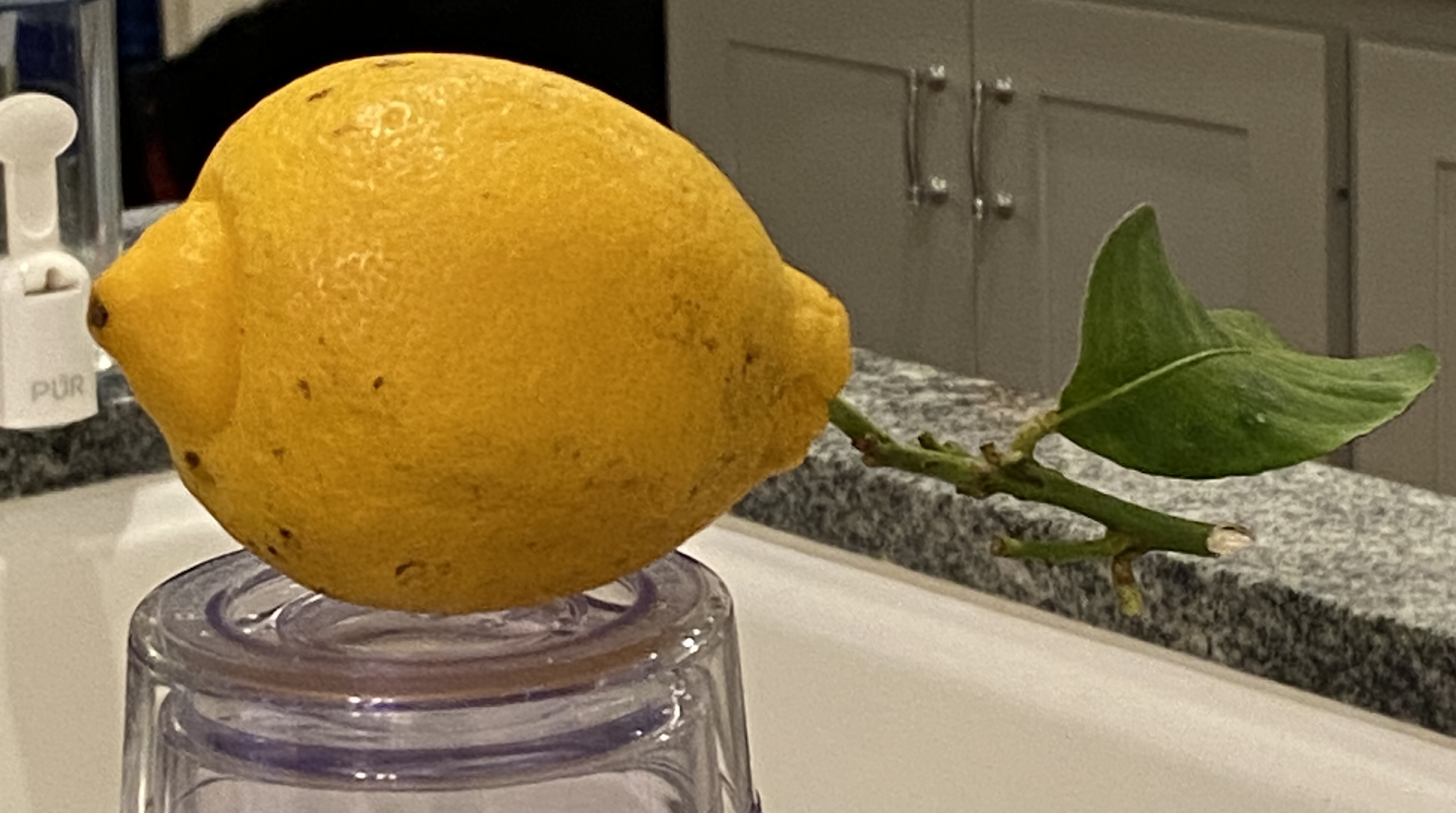
The lemon used in this drawing was given to me and my wife by our long-time neighbor, who brought it from her kid’s home in California! She toted it home on the plane, along with some oranges, not as a “thank you” for watching her house while she was out of town… she was just being neighborly!
Before I cut into this fine fruit, I wanted to do a proper drawing, as I was struck by it’s slightly odd shape and the long stem with a single leaf still attached. If I didn’t know better I would have guessed this lemon was stolen, quickly yanked from the tree under the cover of darkness!
I used four different pencils to get the proper shading – H, B, 2B, and 4B. For those of you who don’t draw, these are how darkness levels are rated on pencils. For this example, H is the lightest, 4B the darkest. You’ll notice the reference photo has the lemon perched on a glass, making you ask “what is that about?”. This was intentional, a matter of pragmatism so I didn’t have to hunch over for a proper viewing angle.
Lastly, I’ll point out that the focal point is… the leaf! It’s not only unusual to see the stem/leaf on a lemon still life, but it’s also a unique shape, probably a result of being slightly emaciated, causing it to curlycue rather abruptly. Hopefully you can tell it’s a leaf and the fact that it’s a bit oddball doesn’t detract from the overall composition.
Here’s another installment from my January “draw-a-day” self-imposed challenge. While I didn’t draw every single day, I came pretty close. Most of what I did was practice for new paintings, which, as I’ve mentioned previously, can be immensely helpful in determining not only how to approach a new composition, but even if you want to do it in the first place!
FRENCH CAFÉ is a sketch intended to inform a painting I just started. After having done an initial block-in on the canvas I realized this was going to need further consideration before moving forward. This sketch is that “further consideration”, allowing me to do a handful of things before returning to the canvas.
For the curious, following is how this sketch will help the painting:
People: arrangement, sizing/scale, and simplification. The last point, simplification, is a by-product of drawing whereby one has to convey the essence of the figures purely through shapes, whereas the painted version will also leverage colors.
Focal point: The sketch taught me that I’m lacking a focal point, so the painting will need to do a better job of focusing on a particular grouping of people at the tables. In this sketch, it’s not clear where the viewer should concentrate.
Details: Between the umbrellas, windows, people, and trees, there’s a lot going on. It will be important to exclude some elements in the painting to make it effective, and more enjoyable to paint. The vines growing up the walls will get 86-ed, as will some of the ground floor windows and doors.
Values: There will need to be very high contrast of values between the shaded people and those areas that are in direct sunlight. You can tell that this sketch, while effective in many ways, really looks flat with the exception of the overhanging trees at the top. This is where I made a point to do high contrast in light and darks, adding a 6B pencil to the mix.
Stay tuned for the actual painting, which will be a challenge, albeit a well informed one thanks to this sketching exercise.
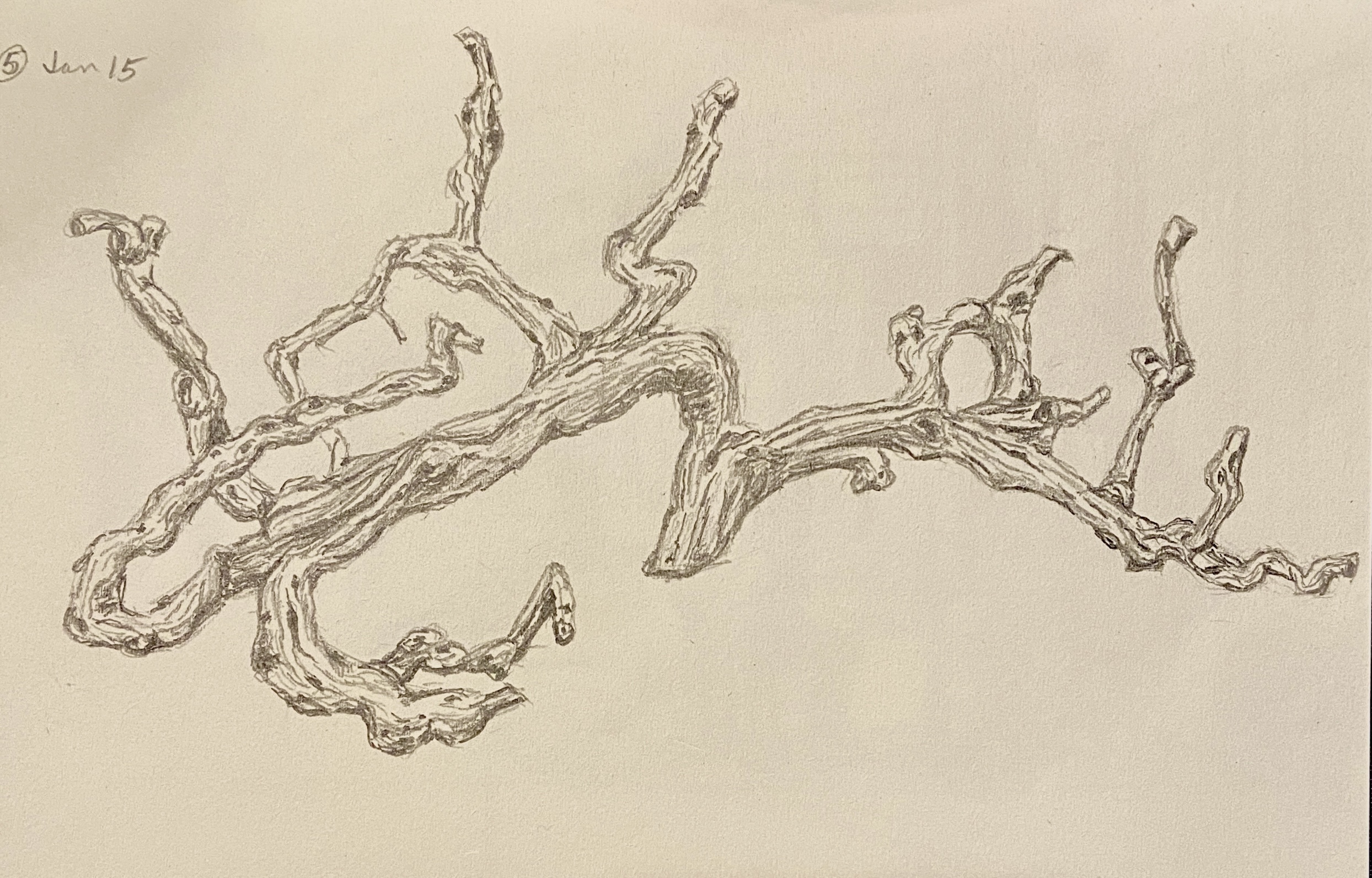
Today is for the wine lovers out there! This is one of the various drawings from this month’s draw-a-day self-imposed idiocy. I think even oenophiles would have trouble recognizing this drawing at first glance, but it hopefully becomes apparent that this is a grape vine. An old, grape-less, dead vine, but a grape vine nonetheless.
The reference photo is from my visit to The Piccolo Hotel (great place, btw) in Paso Robles, California. I didn’t realize what it was at first – I just thought it was a cool wood carving over the fireplace in the lobby. But when you get to looking at it in more detail, and taking into account the location (wine country!), the reality sets in that this is the epitome of upcycling! This grapevine, while alive, provided tasty wine… and in death is transformed into art! What’s not to love about that!
The Library at The Piccolo, Paso Robles
As an art subject, it was very tricky initially. I thought it was going to be a disaster, in large part due to the details involved, but perseverance won out and all the wavy lines and dark circles coalesced into a pretty decent drawing. More importantly, it was a lot of fun to draw and something I’ve added to the short-list of formal compositions. Drawing or painting, I’m not sure which… maybe both.
One final comment: Paso Robles wine is excellent! Makes sense, right? I mean, c’mon, the vines are beautiful, alive or dead!
This is the first of numerous drawings I’ll be doing over the course of the coming 30 days. There are a number of goals involved with this exercise. Initially, I was going to set a lofty goal of a drawing-a-day, but reality has set in and the target has been tempered to draw-a-day.
This drawing, ROSE, is from day 3 of the challenge. I’ve done a painting called YELLOW ROSE in the past, based on the same reference photo, so it was interesting to return to this after a few years. I was surprised how quickly this drawing came together; some sort of long-term artistic muscle memory.
The other benefit of a self-imposed 30-day draw challenge is that it drives me to practice potential new compositions. Doing a quick sketch of a painting subject is helpful in the field for plein air, and for studio work, but sketches are typically done to refine the compositional strategy. However, doing a more complete drawing answers the question, “do I want to paint this?” Sometimes, you get into the details of a painting and realize that it’s not any fun because it’s either beyond your skill set, too tedious, or simply not very exciting.
In the coming weeks, stay tuned for more drawings auditioning to become paintings!
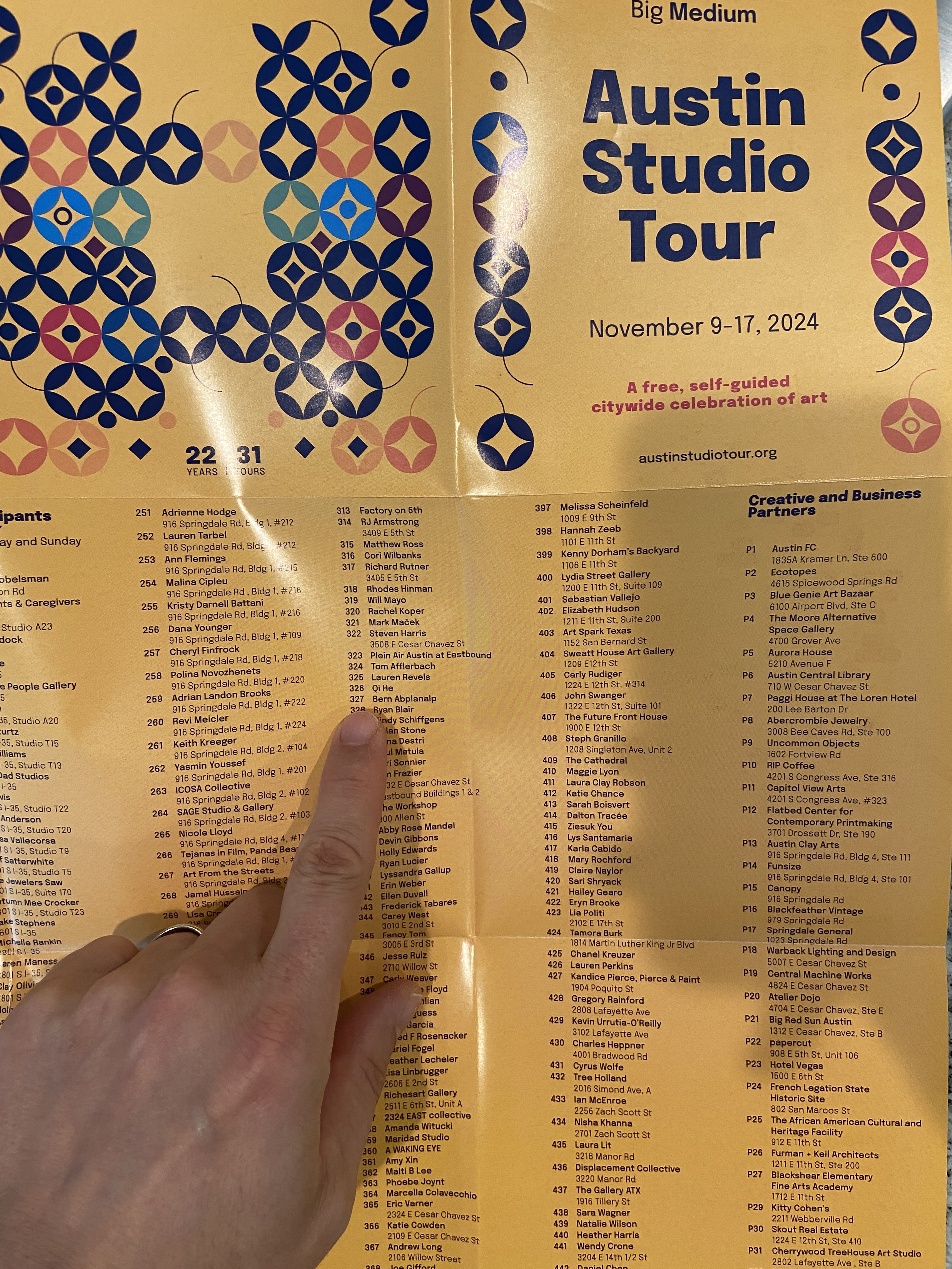
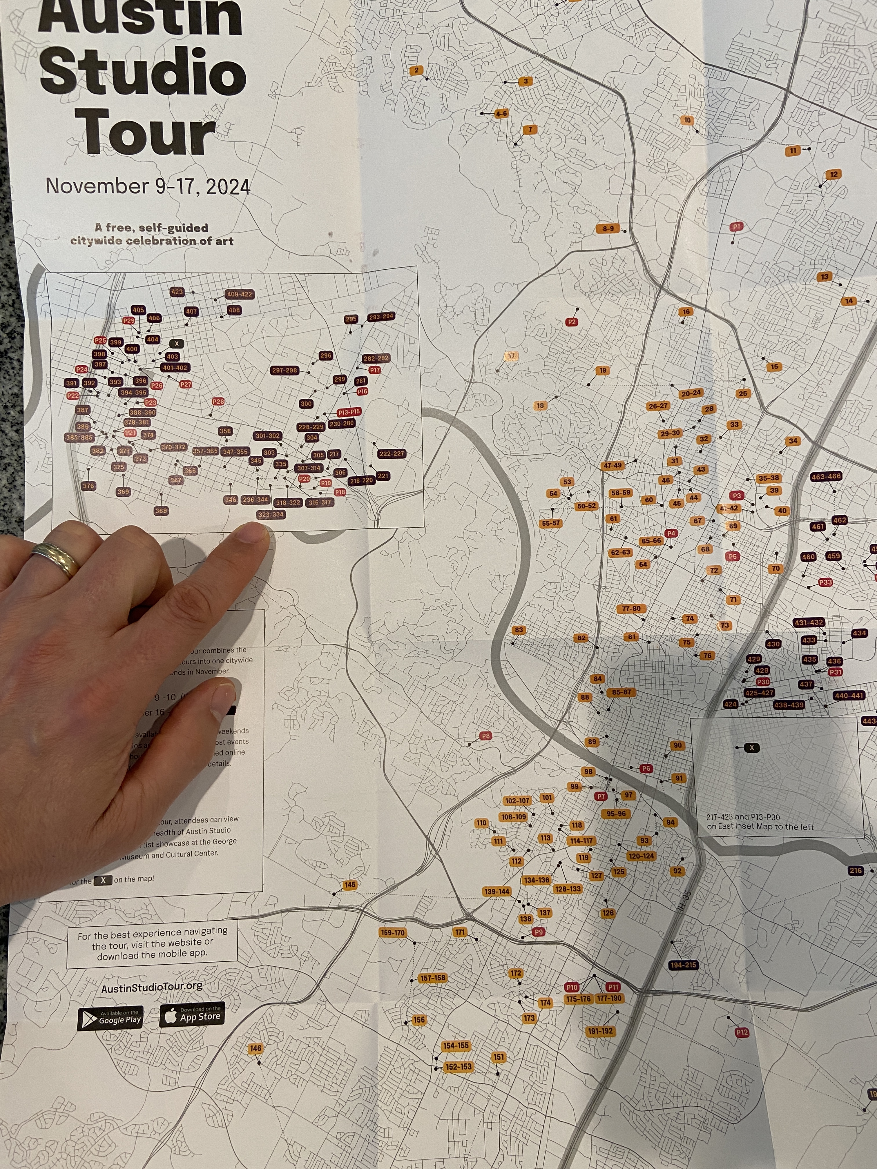
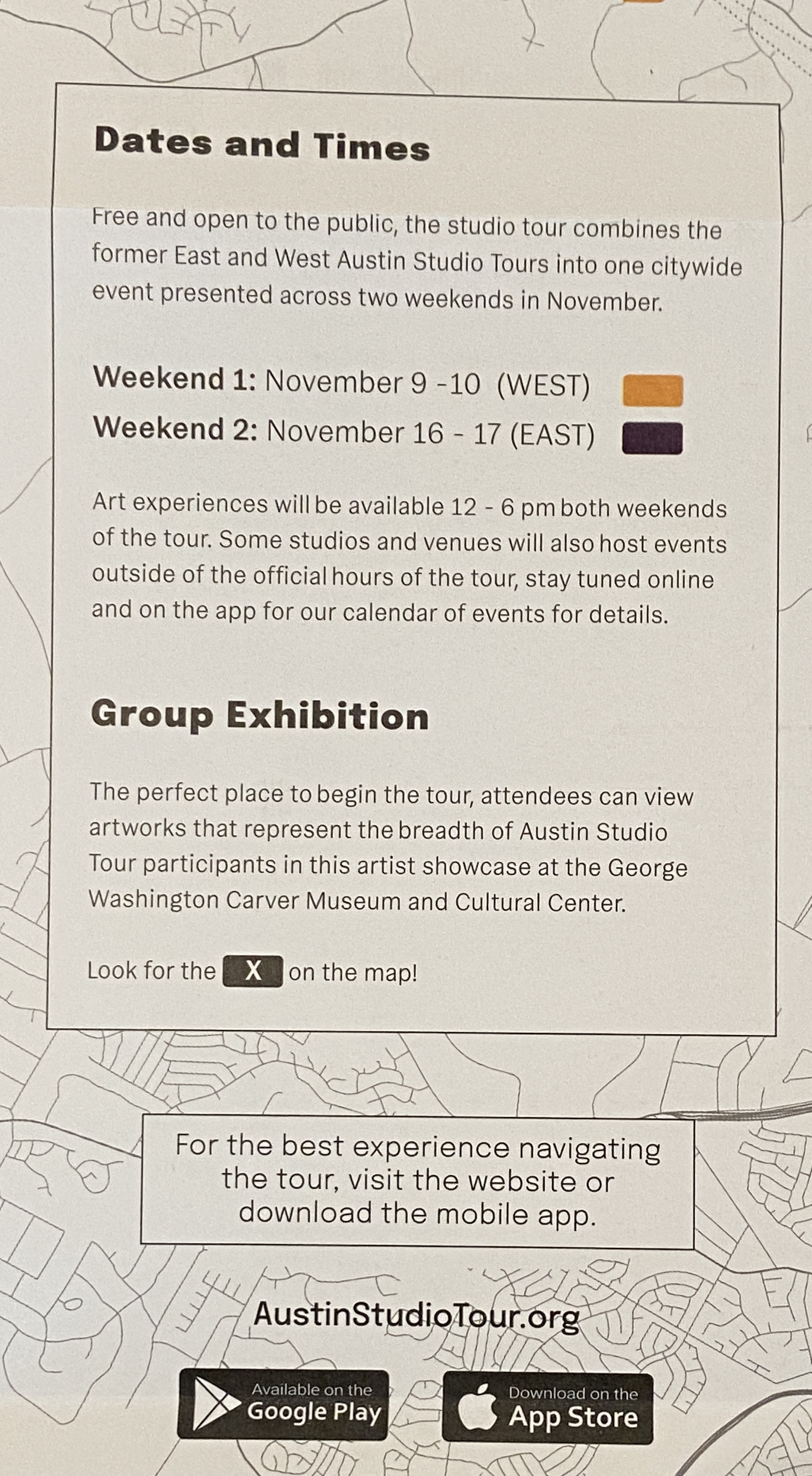
Exciting news on the art event front… I’ll be participating in the 31st edition of the Austin Studio Tour the weekend of November 16 & 17th! For those of you in the Austin area, if you haven’t checked out the studio tour in the past, I highly recommend it, even if I weren’t involved. It’s a very rare Austin event that’s chock full of talented artists, free of charge, and it doesn’t take over Zilker Park or Auditorium Shores for the month!
The Austin Studio Tour, in a nutshell: over the course of two weekends, more than 400 artists open up their studios or display in public spaces/galleries… for FREE! The city is basically split into East and West sides (I35 being the demarcation), whereby weekend 1 is “WEST” studio tour, and weekend 2 is what I like to call the OG “EAST” studio tour.
Weekend 1 is today and tomorrow, Nov 9 & 10th, weekend 2 is Nov 16 & 17th. Official opening times are noon – 6pm each day, but there are some that open beyond those times, including Friday evening.
I’m stop #327 at a building called EASTBOUND located at 3232 E Cesar Chavez St. I’ll be joined by a dozen of my painting friends from Plein Air Austin, well, more like I’ll be joining them, so visitors get a chance to see a TON of art at a single location.
I’ll have at least 20 pieces of original artwork for sale, including a bunch of new pieces that will make their debut at this show. It’s a mix of plein air originals, studio work, and per some interest from friends and family I’ll be adding some drawings to the mix.
Stay tuned for more updates, including a list of other artists showcasing their talents at our location, live plein air demo details, and “Beers with Bern” after party locations.
Get out and explore the talent of Austin artists! Hope to see y’all next weekend!
The bats are coming! This is a skrawing, or is it a dretch… I dunno, whatever you call the in between gray area of an informal sketch and a structured drawing. Regardless, the plan is to do a larger piece, at least by my standards, of the iconic Austin bats departing their home under the Congress Street bridge.
The focal point will be the silhouettes of the people on the bridge, secondarily the bats. The anchor, not something that’s officially a painting term as far as I know, will be the brilliant sun in the lower right corner, which is very tricky in a drawing, so you’ll have to use your imagination. The value contrasts will be extreme, so balance is going to be key. Why I’m attempting this is beyond me…
3 BOATS ON CASCO (study) | 5×8” | graphite on paper
Figuring out why a composition is failing can be a real challenge at times. If the painting fundamentally sucks, I know it’s a lack of talent or experience on my part. Sometimes, however, it just doesn’t look right. It’s on this latter front that I often find myself with boats.
Granted, I don’t have extensive experience painting seascapes that highlight boats. They’re tricky and I believe lots of practice is the key to get the blizzard of weird angles, maddening levels of detail, and the reality that they move constantly, even when anchored, working in concert as a composition.
Last week I did a short plein air session of boats – it was a total failure, although the outing itself was great time spent on the coast. I decided to try drawing the same scene in the studio to see if I could figure out the issues. As it turns out, this small study solved a lot of problems, of which there were 2 big ones.
First, the viewing angle was too steep, meaning it works better with a more horizontal perspective. The painting I had done was simply too aerial, probably in part because I was standing on a pier and secondly it was low(ish) tide, so everything was below my line of sight.
Secondly, the composition included something very unusual, namely Fort Gorges, which is literally a Civil War era fort seemingly floating around in Casco Bay. It’s an iconic part of the Bay for those who know Portland, Maine, but for those “from away”, it’s basically a big ‘ol WTF part of the horizon. It’s made all the more confusing to the uninitiated because it has a tree filled square in it’s center, which makes Fort What-the-Fuck even more awkward with what looks like a Jolly Green Giant broccoli patch springing skyward. How does one work that convincingly into a composition. NOBODY!
Upon realization that Fort WTF needed to be ignored, aka artistic license, the final version of the drawing was complete. Note that in the pictures there is a before and after version to show the impact of using a drastic design decision to make the composition work. Whaddya think?
UMBRELLA IN SHADE (study) | 5×8” | graphite on paper
This is a plein air sketch from my rental backyard in Maine, which has a big, red umbrella as well as a massive oak tree for shade. At certain times of day the umbrella gets shaded by the oak tree, which creates a neat value contrast underneath. While I didn’t get the pass through lighting just right, its always satisfying to get an object like an umbrella properly drawn.
On a compositional note, I definitely will look to do a future painting of an umbrella from this underneath perspective. I really like the mystery it creates whereby the viewer has no idea what’s happening on the table, or even in the background below 3 or 4 feet. Oddly enough, the lack of a “bottom” seems to continually redirect me back into the composition. Does it work that way for you, too?
This study doesn’t make the cut for a “real” painting, but it was fun to draw, so perhaps I might try another angle one day soon. In the meantime I’ll keep an eye out around town for a bright, colorful patio umbrella for a proper painting effort.
When I first started painting, the term “study” was something I did to suspicious food at a dive restaurant. Over time, I learned that “study” oftentimes meant “practice”, typically done as a trial effort before tackling the same composition on a larger scale. This interpretation is meant to allow the artist to figure out technique, color palette, and orientation of the work. Fast forward to current day, I’ve come to find that “study” can mean a brutal self-critique of a practice painting that becomes more than a mere invalidation of the compositional structure, but rather a realization that you buggered it up entirely!
Of course sometimes a “study” can magically have no serious flaws, the plaint flowed effortlessly, and all your compositional ideas worked beautifully. Sometimes.
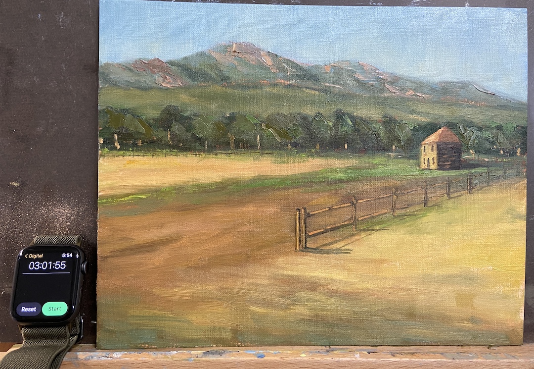
The study FLATIRON HOMESTEAD is proof that this practice has merit! That said, I like this piece because at the end of the day it was a lot of fun, the palette is pretty good, and doing a “real” painting is a likely outcome. There are progress photos per usual, but I’ve also included an annotated version of the completed study to point out the issues of which are detailed below.
This was painted from a reference photo taken by my mom during a plein air session we did last year near El Dorado Canyon, Colorado. It’s a beautiful location as you can see for miles along the Front Range with the Flatirons as the backdrop. To insert a human-made structure as the focal point of the piece felt wrong and awkward, but in the end it worked out.
I did a couple of sketches to mock-up compositional options, taking more time than I normally would, which I think proved beneficial because the core approach turned out to be much more compelling than the reference photo itself. The other key to this study was setting a time limit, which I chose to be 3 hours. The idea being to not overthink it, but give myself enough time to get the core elements fleshed out properly. This worked well because in the end I had to make major design change decisions (see fence line) quickly, focus on values over hues, and avoid the complication of detailed brush strokes.
Following is the summary of what I learned from this “study”:
1. The tree line is oddly symmetrical in terms of height. Not good! Need to change that next time and always be conscious of varying heights.
2. The fence line is a little too straight, even after the compositional decision to remove part of the fence so it didn’t cut the painting in half.
3. Light source is inconsistent. This would never happen if I painted this en plein air because it would have been impossible to ignore the sun, but drop me in the studio and things can get whacky. The sun is overhead for the flatirons and fields between the trees and the mountains, but the foreground and focal point are clearly lit by a sun that’s more on the horizon, albeit not sunrise.
4. Cast shadows of the fence line are critical and extremely effective. On a larger piece this will really grab the viewer and suck them into the painting.
5. The homestead building angles aren’t right, most likely the front side that’s lit by the sun needs to be a little less wide. This is the only real negative I found by having a time limit because I could have taken the time to repaint this part… then again, why bother if this is a “study”?
6. The highlighted tree trunks, meant to capture the high value contrast of the sunlight coming across the field, are effective and something I want to use in a larger piece, but in this study they are way too big/wide. Should have used a lighter touch with a think brush.
7. The sky color is excellent! I made an adjustment in the 2nd hour to the sky, deciding it was too blue and dark. This has been a problem for me in the past with landscapes, but I think this provides better awareness going forward, namely start lighter than I think it accurate and darken if needed.
8. The flatirons look really good, even though they’re just supporting background to the main elements. I used a palette knife to scrape the granite colors into the greens and that worked well. Need to remember that trick for future efforts.
So, that about sums it up. As you can see, you can learn a lot if you “study”!
Flatiron Homestead ReferenceBlock In – Values!Uhm… lotta greenPalaette and Values WorkingFence Line Needs Help3 Hours Limit!Final FLATIRON HOMESTEAD