UMBRELLA IN SHADE (study) | 5×8” | graphite on paper
This is a plein air sketch from my rental backyard in Maine, which has a big, red umbrella as well as a massive oak tree for shade. At certain times of day the umbrella gets shaded by the oak tree, which creates a neat value contrast underneath. While I didn’t get the pass through lighting just right, its always satisfying to get an object like an umbrella properly drawn.
On a compositional note, I definitely will look to do a future painting of an umbrella from this underneath perspective. I really like the mystery it creates whereby the viewer has no idea what’s happening on the table, or even in the background below 3 or 4 feet. Oddly enough, the lack of a “bottom” seems to continually redirect me back into the composition. Does it work that way for you, too?
This study doesn’t make the cut for a “real” painting, but it was fun to draw, so perhaps I might try another angle one day soon. In the meantime I’ll keep an eye out around town for a bright, colorful patio umbrella for a proper painting effort.
When I first started painting, the term “study” was something I did to suspicious food at a dive restaurant. Over time, I learned that “study” oftentimes meant “practice”, typically done as a trial effort before tackling the same composition on a larger scale. This interpretation is meant to allow the artist to figure out technique, color palette, and orientation of the work. Fast forward to current day, I’ve come to find that “study” can mean a brutal self-critique of a practice painting that becomes more than a mere invalidation of the compositional structure, but rather a realization that you buggered it up entirely!
Of course sometimes a “study” can magically have no serious flaws, the plaint flowed effortlessly, and all your compositional ideas worked beautifully. Sometimes.
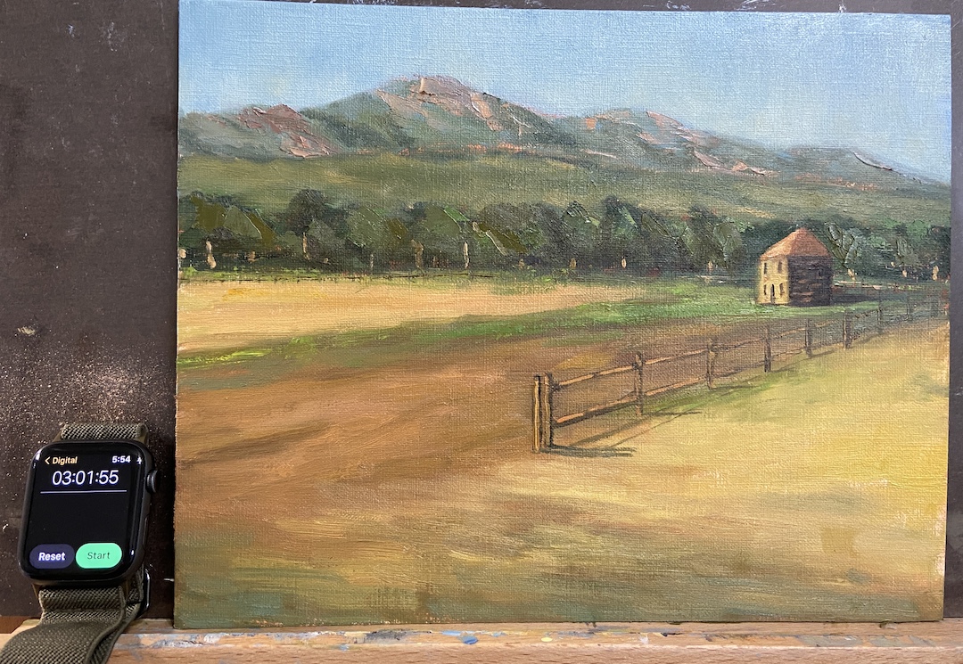
The study FLATIRON HOMESTEAD is proof that this practice has merit! That said, I like this piece because at the end of the day it was a lot of fun, the palette is pretty good, and doing a “real” painting is a likely outcome. There are progress photos per usual, but I’ve also included an annotated version of the completed study to point out the issues of which are detailed below.
This was painted from a reference photo taken by my mom during a plein air session we did last year near El Dorado Canyon, Colorado. It’s a beautiful location as you can see for miles along the Front Range with the Flatirons as the backdrop. To insert a human-made structure as the focal point of the piece felt wrong and awkward, but in the end it worked out.
I did a couple of sketches to mock-up compositional options, taking more time than I normally would, which I think proved beneficial because the core approach turned out to be much more compelling than the reference photo itself. The other key to this study was setting a time limit, which I chose to be 3 hours. The idea being to not overthink it, but give myself enough time to get the core elements fleshed out properly. This worked well because in the end I had to make major design change decisions (see fence line) quickly, focus on values over hues, and avoid the complication of detailed brush strokes.
Following is the summary of what I learned from this “study”:
1. The tree line is oddly symmetrical in terms of height. Not good! Need to change that next time and always be conscious of varying heights.
2. The fence line is a little too straight, even after the compositional decision to remove part of the fence so it didn’t cut the painting in half.
3. Light source is inconsistent. This would never happen if I painted this en plein air because it would have been impossible to ignore the sun, but drop me in the studio and things can get whacky. The sun is overhead for the flatirons and fields between the trees and the mountains, but the foreground and focal point are clearly lit by a sun that’s more on the horizon, albeit not sunrise.
4. Cast shadows of the fence line are critical and extremely effective. On a larger piece this will really grab the viewer and suck them into the painting.
5. The homestead building angles aren’t right, most likely the front side that’s lit by the sun needs to be a little less wide. This is the only real negative I found by having a time limit because I could have taken the time to repaint this part… then again, why bother if this is a “study”?
6. The highlighted tree trunks, meant to capture the high value contrast of the sunlight coming across the field, are effective and something I want to use in a larger piece, but in this study they are way too big/wide. Should have used a lighter touch with a think brush.
7. The sky color is excellent! I made an adjustment in the 2nd hour to the sky, deciding it was too blue and dark. This has been a problem for me in the past with landscapes, but I think this provides better awareness going forward, namely start lighter than I think it accurate and darken if needed.
8. The flatirons look really good, even though they’re just supporting background to the main elements. I used a palette knife to scrape the granite colors into the greens and that worked well. Need to remember that trick for future efforts.
So, that about sums it up. As you can see, you can learn a lot if you “study”!
Flatiron Homestead ReferenceBlock In – Values!Uhm… lotta greenPalaette and Values WorkingFence Line Needs Help3 Hours Limit!Final FLATIRON HOMESTEAD
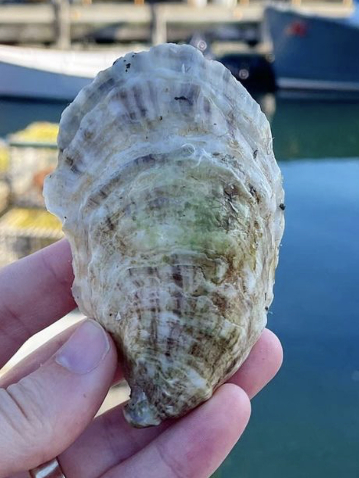
HALF SHELL STUDY | Graphite on Paper | 4×6”SOPO Seafood Oyster, South Portland, ME
East coast oysters, specifically Maine oysters, are the best in the world according to my palette. My favorite place to eat oysters is at SoPo Seafood in South Portland, Maine. In a word – AMAZEBALLS! – the food surpassed only by the charm, expertise, and knowledge of the staff.
A painting of a massive oyster shell is forthcoming, thus this study drawing. What I learned is that oyster shells have a LOT of friggin’ lines! Not something you really think about when eating oysters, but the shells are beautiful, albeit a bit on the gray side.
I have the good fortune of 7 of my paintings being included at Austin Fine Art Gallery’s annual holiday group show of small arwtorks called “small WONDERS”! All works are framed and ready to go on your walls, or, given their relatively small size, they’re easy to ship to friends and family who might appreciate authentic art from an Austin artist.
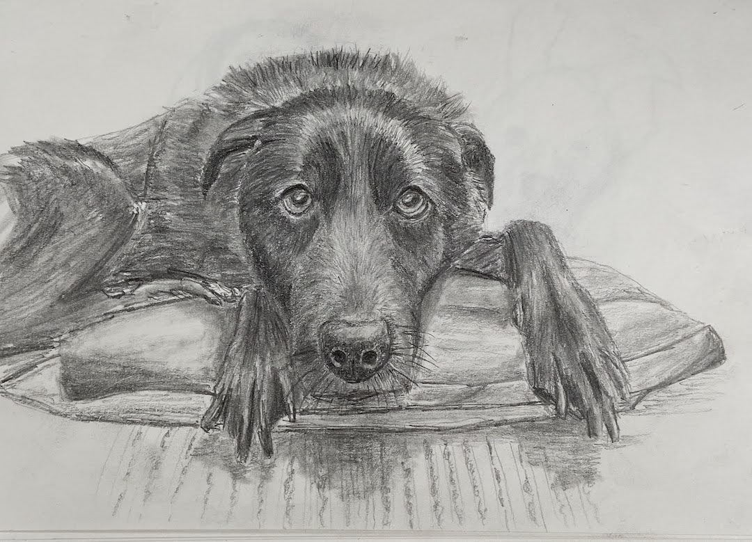
BLACK LAB | Graphite on Paper | 11×13″
BULL CREEK, AUSTIN | Oil on Board | 6×8″
DOG TIRED | Oil on Board | 16×12″
JUST THE RIPE SIZE | Oil on Panel | 5×7″
SPRING POINT LEDGE LIGHTHOUSE | Oil on Board | 8×6″
POPCORN | Oil on Canvas | 14×11″
SOMETHING BLUE | Oil on Board | 12×9″
Small WONDERS will consist of over 300 mini works by over 35 greater Austin artists, ranging from 5×7’s to 16×20’s. Everything will be PRICED to GIFT with prices ranging from $100 to $600. Don’t miss this wonderful show to start or add to an art collection for you and your loved ones!There will be an opening reception on Saturday, December 9th from 4-7pm. There will be holiday treats, drinks and live music during the opening reception. The show runs through early January.
For more information about the gallery and this show specifically, go to www.artframingservices.com, navigate to the “small WONDERS” show announcement, and consider dropping by for some holiday cheer and say hi during the opening reception.
Artists showing include:
BERN ABPLANALP UMBREEN AHMAD TOM BENTLEY VICKI BREVELL TAMMY BROWN HOLLY CRAIG ALAN EHRLICH PAT FLATHOUSE ANN FLEMINGS JULIA FLETCHER SALLY FRASER OLGA GORALEWICZ LACY HUSMANN JESSICA GREENWOOD PING IRVIN CRAIG IRVIN CHRISTINE JAMES CAROLYN KILDAY MELISSA KOTZEV SCOTT LEOPOLD MARCH MATTINGLY LINDA MONTIGNANI M MURDOCK EDD OGDEN NANCY PATON RICARDO ROBLES JOYCELYN SCHEDLER ANASTASIA SHIMANSKAYA CELESTE SMITH CONNIE TAYLOR MINDEN TEN EYCK LILIANA VASQUEZ LINDA WELLS JOHN WEST ELIZABETH WILSON WALKER WINN RENEE WOMACK
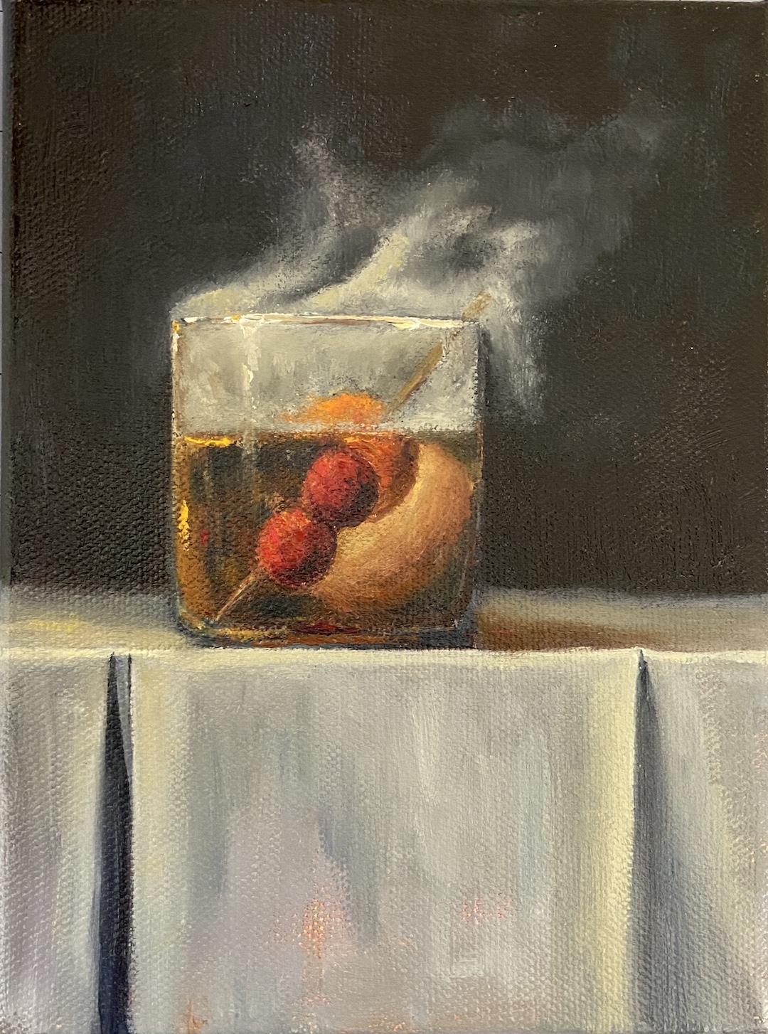
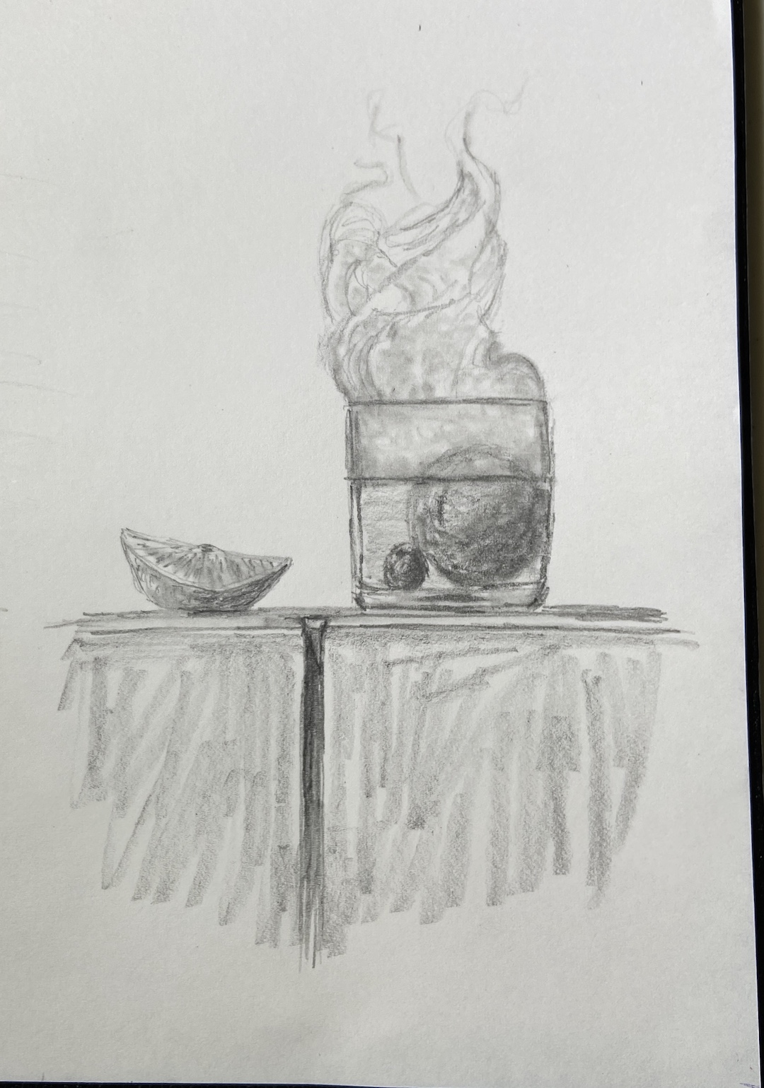
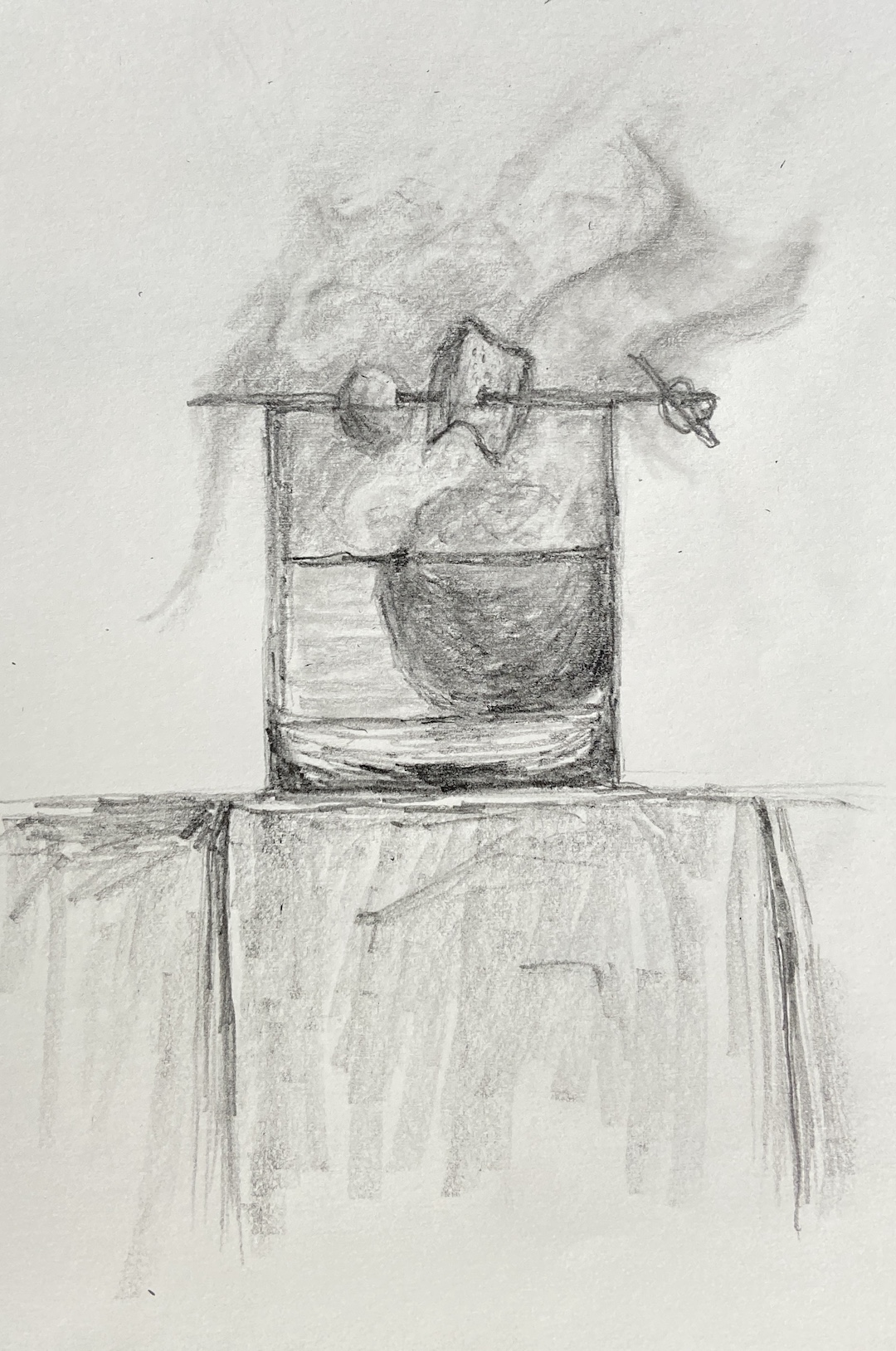
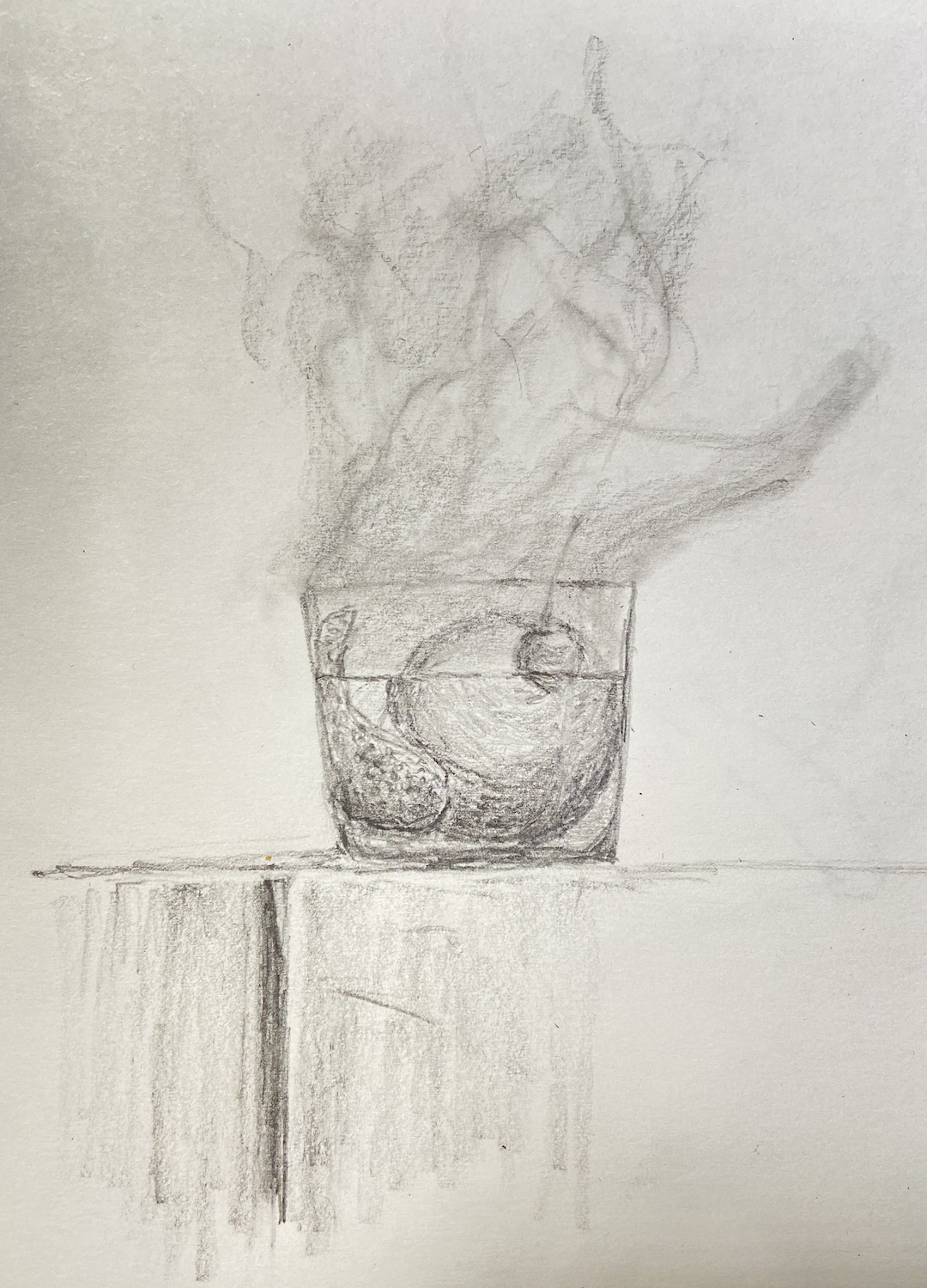
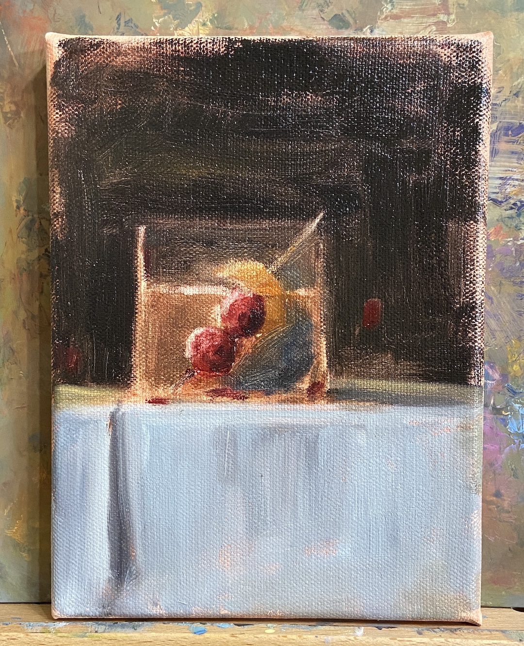
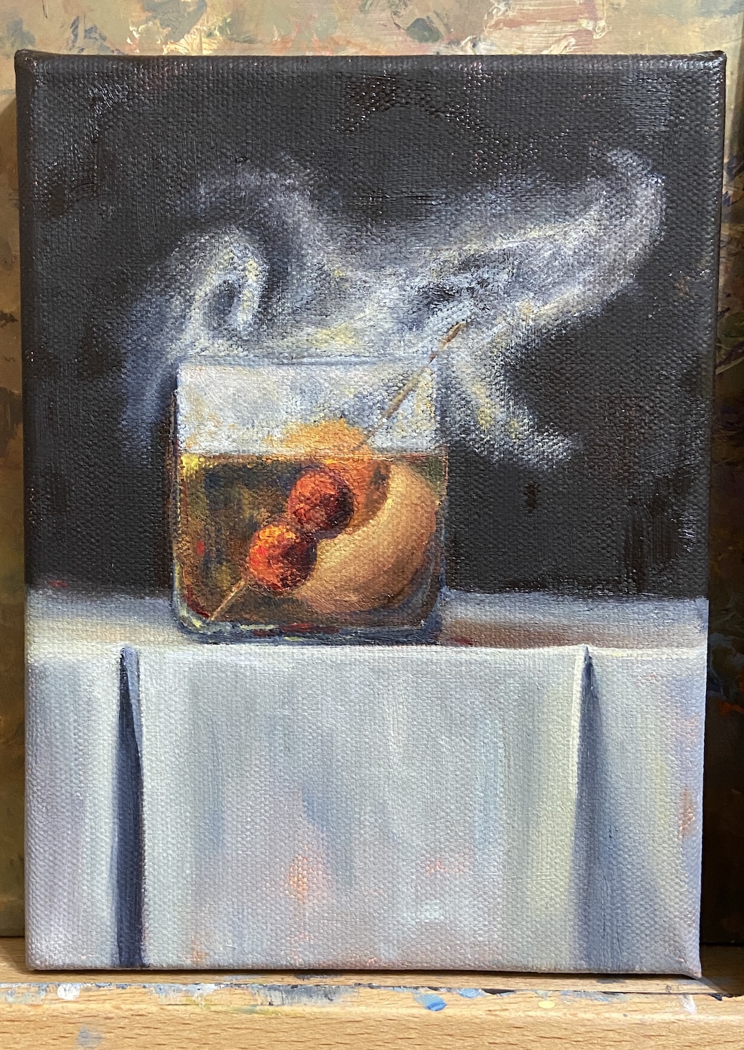
SMOKY OLD FASHIONED is a recent commission piece, something I love doing, especially when it’s for a gift or something sentimental. In this instance, the painting is for a gift for someone who apparently has everything. Painting to the rescue!
My process for custom work involves a number of preliminary discussions followed by sketches that give compositional options. Just like blocking in the value structure of the actual painting is key to a good outcome, with a custom piece, coming to an agreement on the core elements and structure of the composition is vital.
I’ve painted a number of libation-based still life compositions, but nothing with smoke. It required me to investigate if painting smoke was similar to creating fog, mist, or larger fire-based plumes.
The answer, it turns out, was an emphatic NO! It seems that once you pump smoke into a cocktail glass, weird shit happens and it becomes lifelike and animated. Looking at reference photos further complicates matters, introducing possibilities of upward windy smoky tendrils, or smoky bits that spill over the edge toward the table. Come to discover both of these considerations are smoked red herrings! Smoky tendrils are “fresh” burning anomalies, and the only smoke that sinks seems to be dry ice based smoke, which you can imagine is in a lot of cocktail glamour shots.
The trick with this piece was clearly… smoke! But before getting to that challenge, there was the issue of compositional tension. Technically, an Old Fashioned isn’t so much a cocktail as an origins story of composition. The Meehan’s Bartending Guide, my personal true North for all things cocktail, notes “the cocktail was first defined on May 6, 1806, in The Balance and Columbian Repository as ‘a stimulating liquor, composed of spirits of any kind, sugar, water and bitters’. By the time it showed up in a professional bar manual for the first time in Theodore Proulx’s 1888 The Bartender’s Manual, it was already “old-fashioned”.” My personal preference is rye whiskey, simple syrup, bitters, 1 cherry and an orange twist. Now back to the painting…
The request for this piece was to incorporate Luxardo cherries, orange peel, and a large round ice cube. Figuring out how best to structure this as a piece of art was trickier than I thought, even without the smoke. Once you put all that stuff into a lowball glass, it’s impossible to not notice the tension of so many things jammed into a small space. To tackle this problem we simply talked through various sketches that presented different solutions, and we ultimately landed on cherries on a toothpick, angled into the glass, orange peel also on the toothpick but above the whiskey line, and lastly a demotion of the round ice to the background. As a pleasant surprise, once the smoke was added, it significantly improved the compositional structure because it broadened the view and seems to have further reduced the tension, essentially granting the viewer a larger viewing room.
Lastly, the smoke technique. I still need to refine the approach, so stay tuned for more smoky cocktails, but the core approach seems sound. The smoke is not white, that’s the first thing. Turns out it’s about 20 variations of gray, leaning warm (cad yellow deep) above the glass, and a little cool (lemon yellow) below the rim. The brushwork boils down to a lot of push and pull between the light grays and the black background, using a lot of scumbling with an oversized round brush. As the smoke expands above the glass, it was important to make sure there was a very thin layer on the outside edges of the core smoke to lend it a sense of movement. The person who commissioned this piece has a cocktail smoker top, which sits on the top of the glass and is then pulled off in a flourish when the smoking is done, which pulls some of the smoke up and out of the glass. It’s all very entertaining, until you try to paint it!
SPRING POINT LIGHTHOUSE | 8 x 6” | Graphite on Paper
This is a preliminary drawing for a plein air session I plan to do later this week. This particular lighthouse is accessible via a jetty made of granite, which I can say from personal experience is deceptively long. As is the case with many lighthouses, the setting is often more impressive than the structure, which makes sense given they’re designed to protect navigators from the very dangerous geographies upon which they sit. Ironically, in a world where technology has made many lighthouses functionally irrelevant, they’re wildly popular destinations for visitors to explore… on land.
The other attraction to lighthouses, as an artist, is they’re much like snowflakes whereby no two are alike, so there’s something new to tackle with every composition. Combined with their intriguing landscapes, lighthouses are a must do as an artist.
I like to do detailed drawings instead of quick sketches when the subject is complicated or something new. The jetty is very intimidating for me, so it was important to get a handle on how to simplify while not losing the feel of all those massive granite blocks. I’m not sure if the drawing approach will translate to the painting, but a few things become clear from this exercise. First, the layout of the blocks needs to have defined directional lines in the fore and mid ground planes to capture the overall shape of the jetty. Secondly, there are numerous tiny shadows and value variations that give the blocks their distinct shapes, which will require some trial and error once the paint hits the canvas.
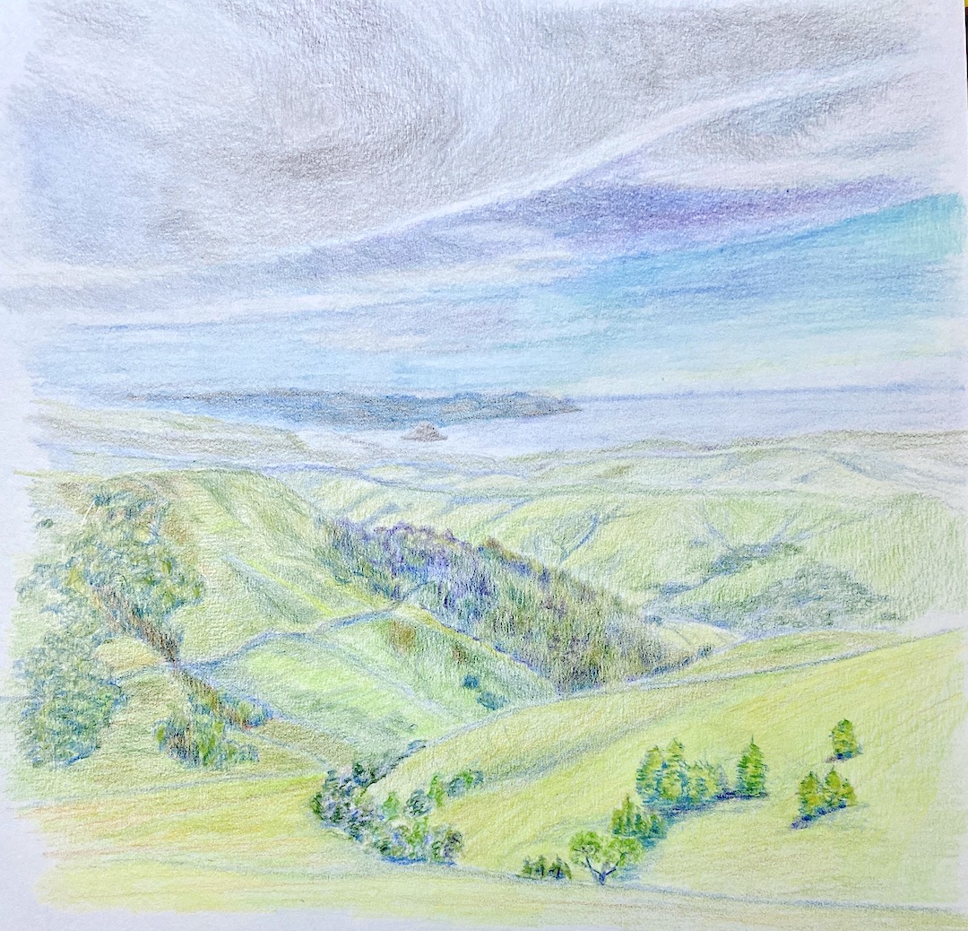
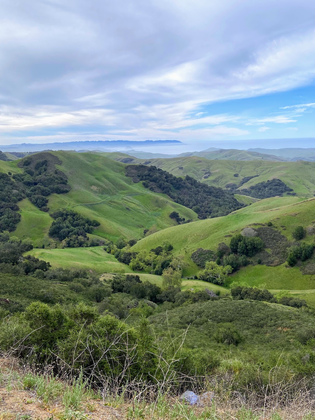
Central Coast – Morro Bay | 9 x 12” | Colored Pencil on Paper
A few months ago we took a trip to indulge in wines of Paso Robles, California. This is a beautiful area, a little hard to get to, and the wine is fantastic. Don’t get me wrong, I’m no wine snob… my palette is worth a $40 bottle of wine at best. However, over the years we’ve done a lot of travel around the world and there is no better way to find wines you like than to be in the actual region and explore. Again, we tend not to go to places for the purpose of doing wine tastings, but what else are you going to have with dinner?
We took a beautiful drive from Paso Robles, CA to Morro Bay. Along the way we came across this stunning view, giving a first glance of the ocean as we wound through the hills. As you can see from the reference photo, it’s beautiful, but as an artist you see a whole lotta green!
I chose to do this piece in colored pencil instead of oil paint for two reasons. First, I’ve recently started experimenting with colored pencils and the investment in a new pencil set needed some return. Secondly, it gets brutally hot in my upstairs studio during the summer, so having the pencils setup downstairs is an easy way to get my creative fix for the day if I don’t feel like running the AC for 3 hours in the middle of the afternoon. Pragmatism, go figure.
I’ve done a few practice sessions with colored pencils after taking a workshop from Jenny Granberry, who is a great artist and instructor, a rare combination. This piece was a challenge and intended as a massive practice exercise with the goal of something “completed” in the end. This composition was a challenge for reasons beyond my lack of colored pencil experience. First, I can’t remember the last time I’d done a drawing-based landscape, and secondly, the greens!
What I find the most interesting part of this piece is the fact that I worked from the top down (far to near), and I don’t know about you, but I can definitely see that the bottom part of the drawing is notably better than the top. I can hear Jenny now… keep your pencils sharp and go slow. I hear you Jenny, I hear you, it just took half a page to get there.
As to the greens, I focused on blending variations of blues in the more distant hills, segueing to stronger yellow in the foreground. I wasn’t excited about the final look initially, as it lacked warmth from the sun, so I drank some wine to work up some liquid courage to grab an orange/red pencil to add an overlay to the foreground hills. Unlike oil painting, you can’t just wipe off pencil – true, it can be erased, but then you’re compromising the “tooth” of the paper, and at some point I hope to be good enough that something like that matters.
In the end, Central Coast – Morro Bay was a great learning experience and provided a wealth of knowledge through trial and error. I also think I’ll return to this subject matter in landscape perspective for a larger oil painting.
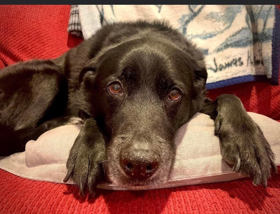
This is a friend’s dog, Vedder, who I’ve never met… the dog, not the friend. I only know about this adorable black lab (I’m guessing… looks like a black lab, hoping he’s a rescue dog, too) because I occasionally check Facebook and he manages to take a lot of really good photos of his dog. As a doggy dad myself, I know how hard it is to get a good pic of your dog, especially a black one.
I’ve been spending a lot more time this year working on dog portraits and other dog related compositions. Many of them have fallen short of anything resembling artwork, thus the lack of posts on this topic. However, some things have started to click lately and I believe it’s because I’ve returned to the core exercise of drawing instead of painting dogs. I’ll bounce back to painting them very soon, but sometimes my brain needs a reset in terms of how it translates between my eyes and the canvas.
Vedder was all about getting the face, especially those soulful eyes, just right. I’m pretty happy with the outcome, especially since the initial drawing block-in required very little adjustment. In other words, the proportions of the face and related features was accurate from the outset, something I hadn’t been getting right with the brush and canvas.
Drawing dogs is very tedious, but it’s offset by very rewarding outcomes. The process of drawing hair via thousands of “strokes” is a test of patience, which artists really need, but oftentimes it can be elusive as you’re excited to get a composition done. Vedder is an older pup, how old I’m not sure, so he has features such as white hairs and a well-used dog nose. These are very tricky to get onto the paper with graphite only. As you can tell from this composition I missed the mark on that front, but the rest of the details I hope capture the personality of Vedder. I’ll have to cross post this on Facebook to see if my friend has an opinion.
On the technical front, I used 3 pencils – HB, 2B, and 4B. The paper is very basic, no idea what it actually is because it’s a sketchbook that I usually tote around on trips when I want to get some sketching done to capture the place for posterity. Very convenient, but the paper has no teeth which makes it hard to layer hair strokes with value shading.
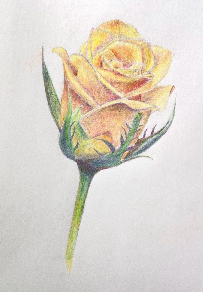
Yellow Rose Botanical | 8” x 10” | Colored Pencil on Paper
I finished my botanical drawing (virtual) classes last week and this Yellow Rose is my final project. The sessions were 2 hours weekly for 8 weeks, the instructor (Jenny Granberry – @jennygeeberry) was hilarious, and I learned a lot about both botanical artistry and how to use colored pencils properly.
Yellow Rose Botanical Drawing
The biggest challenge was figuring out how to incorporate a range of colors beyond basic yellows to add interest, value variations, and realism. I was using a limited palette (12 pencils), but through some trial and error I managed to land on a few color combinations that added a lot of depth to the overall piece.
I’m hoping to do a few botanical series over the course of this year. I like the idea of colored pencil drawing because it incorporates drawing and a lot of oil painting concepts, although the techniques are very different.
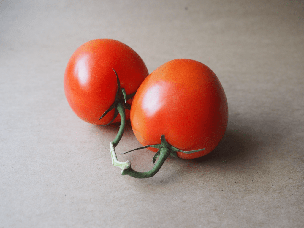
As we settle into a new year, hopefully a better one than 2020, I thought it was time to learn something new on the art front. To that end, I’ve been attending a weekly Botanical Drawing class. The theme of “new” is splattered all over this class – it’s done virtually (a first for me), focused on botanical drawing (another first), and in colored pencil medium (yet another first… kinda).
This week’s subject was a pair of tomatoes on the vine. The first two classes were graphite only, no colored pencils, so this was the first session that introduced color. I’m using a small set of 12 SoHo colored pencils, which are very vibrant and so far seem to do the trick. It’s going to be a challenge pivoting from oil painting, where colors are seemingly endless through mixing of a core set of hues. The colored pencils are a different challenge because there’s only so much layering of colors that the paper will tolerate. In oil painting, if you overdo it with oil paint colors it goes brown or a dirty grey, but you can wipe it off the canvas. The colored pencils, however, can only support a limited amount of mixing on paper, and it’s largely un-erasable. It’s a wee bit stressful at times!
I really like the challenge of capturing the reality of botanicals, which is at the heart of botanical drawing. It will be interesting to see how the various compositions evolve on the color and value front over the remaining 5 weeks of class.
This week’s composition vine tomatoes is done on standard paper and measures about 7 x 5”.