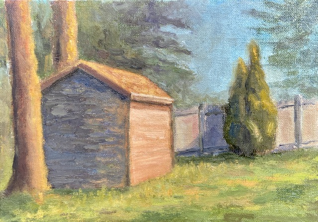
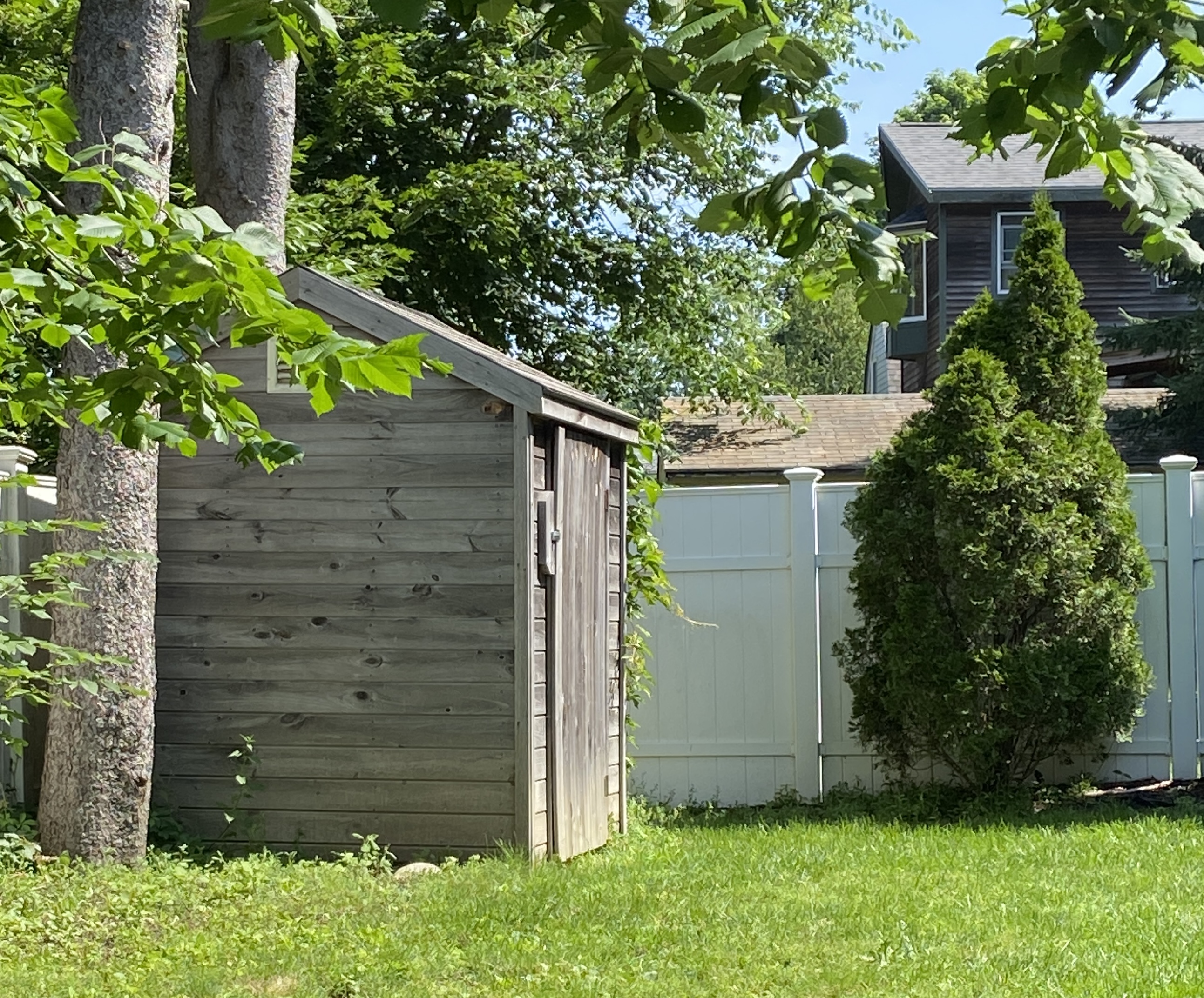
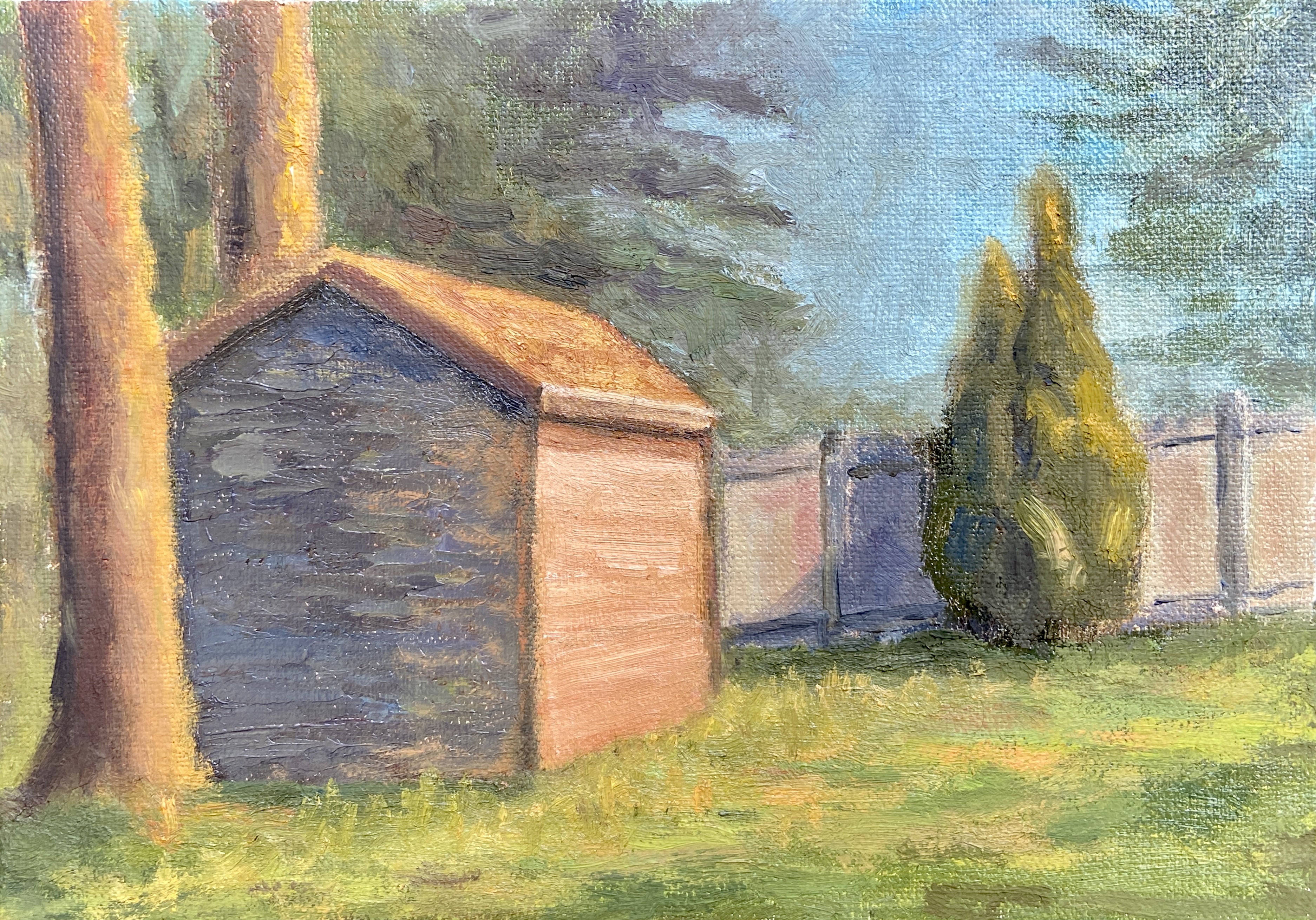
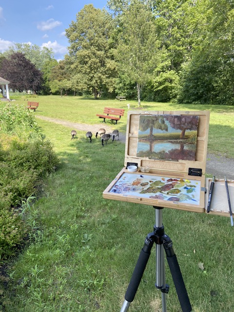
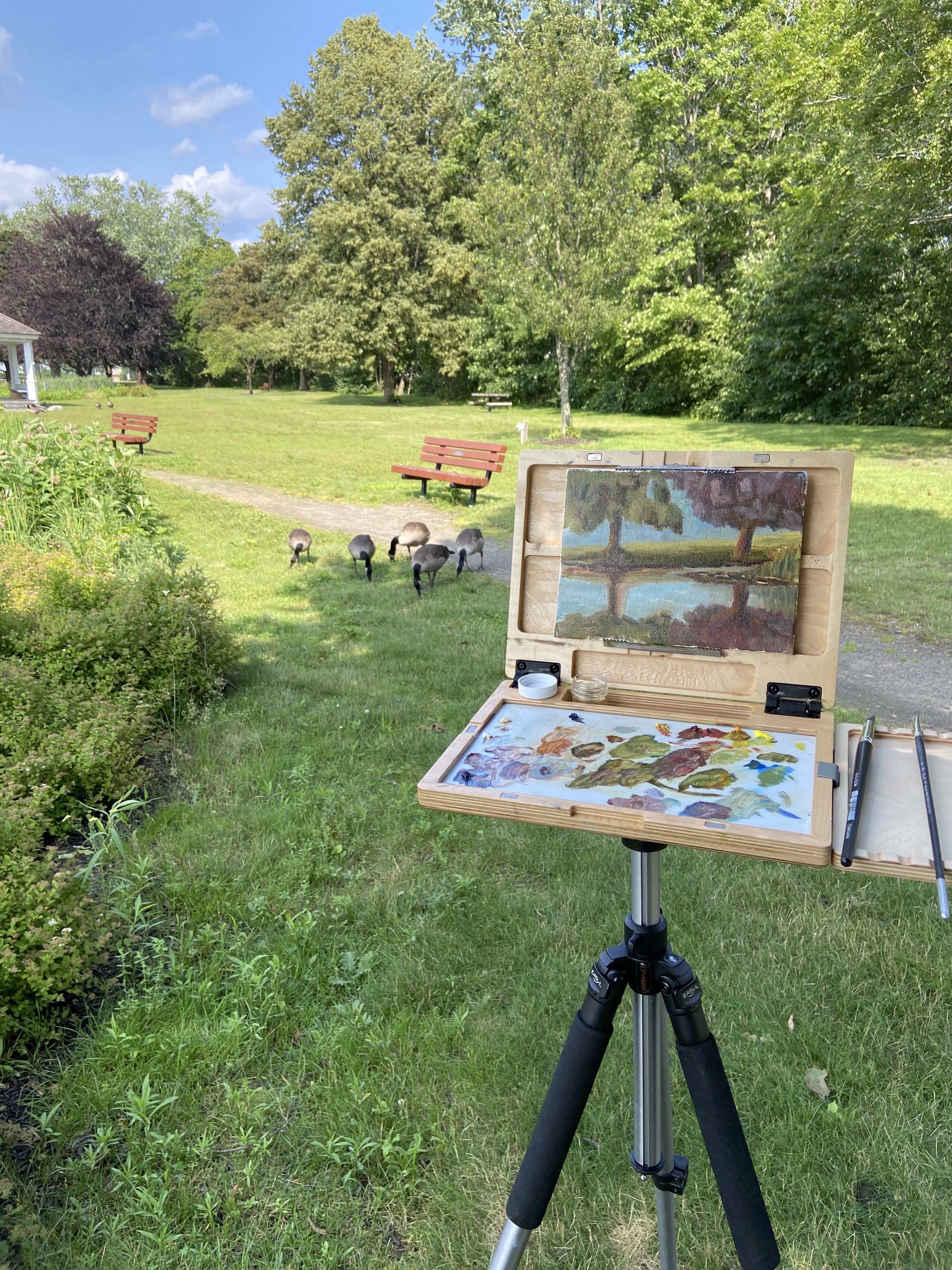
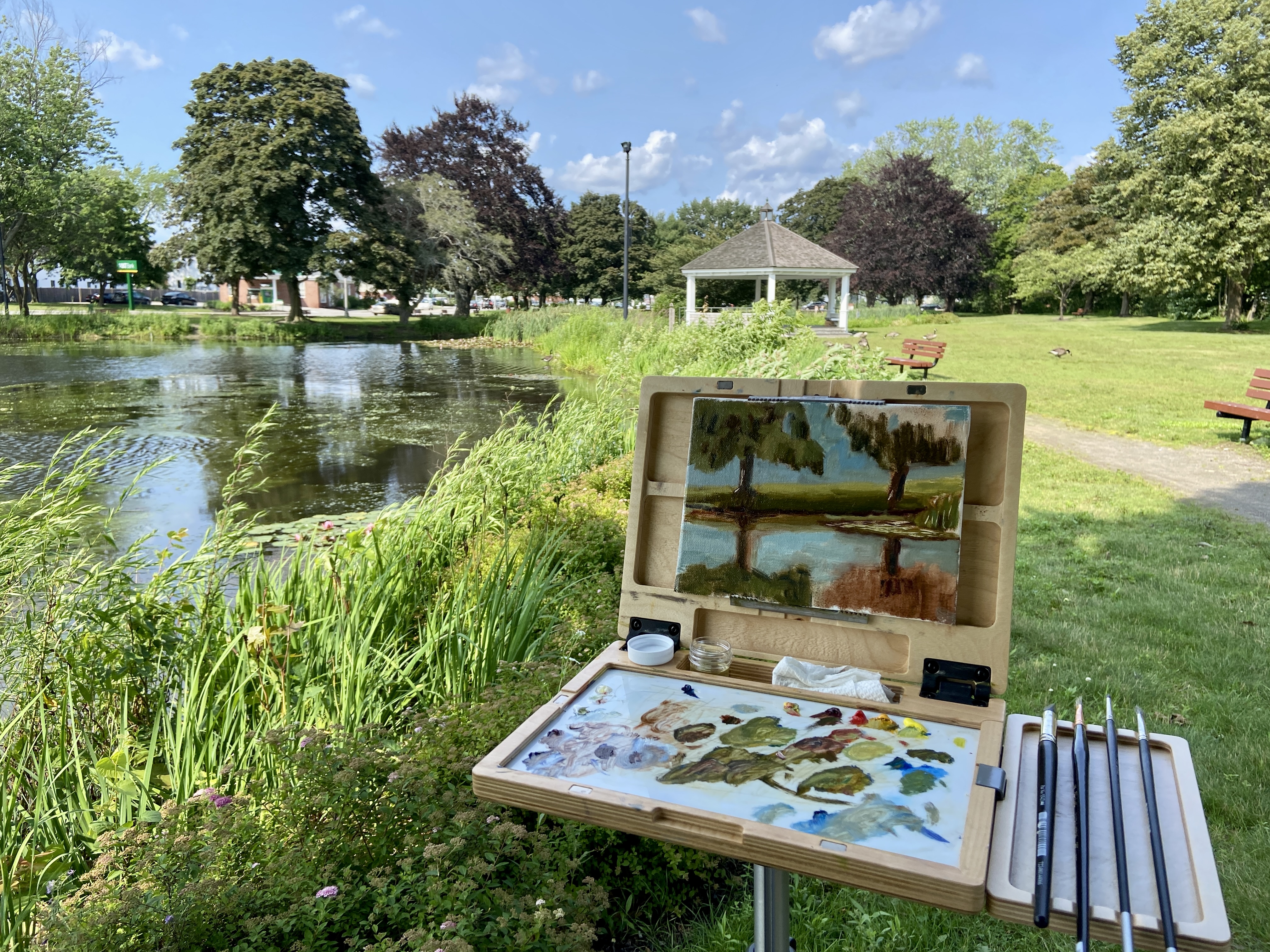
I recently attended a 2-day workshop at The Contemporary at Laguna Gloria. The focus was textured painting, which ultimately boiled down to playing with joint compound (gypsum spackle) and acrylic paint. I was amazed at how easy and fun it was to adapt to this medium.The technique is very straightforward, whereby one mixes acrylic paints into the joint compound, which is an off-white, and do whatever you want provided it’s put on a hard surface, for which I used wooden boards.
Most of the class did abstract pieces, which make sense as you get to play with pottery tools to get cool shapes and textures. It’s very forgiving, too, because you can simply wipe it off and start over again provided you don’t wait more than a day, at which point it hardens. I chose to do still life and landscape pieces, taking advantage of the impasto nature of the spackle. The instructor said she hadn’t considered doing landscape compositions with this technique, but to me it seemed intuitively suited for the textural nature of the real world.
I intend to add some vibrancy to this composition with acrylic paint… I think. This is definitely the start of a new and exciting medium! Stay tuned for a number of new pieces in spackle and acrylics.
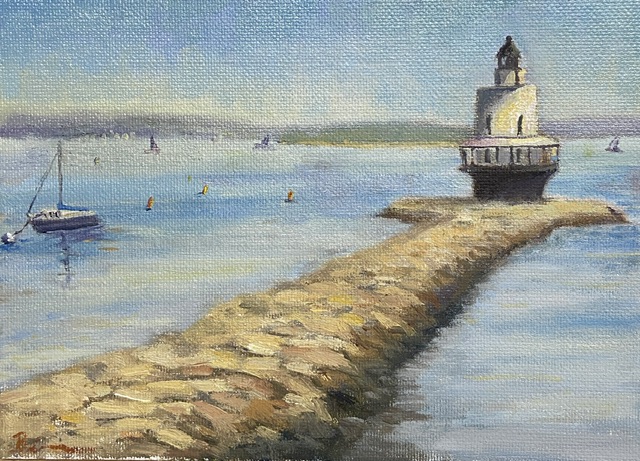
#artbern #berntx #crashboomzip #painting #art #abplanalp #austinartists #atxartist #contemporaryart #southportlandmaine #abplanalp #bernabplanalp #springpointledgelighthouse #lighthouse #maine #portlandmaine #getoutside #fortgorges #contemporaryatx #texturedpainting