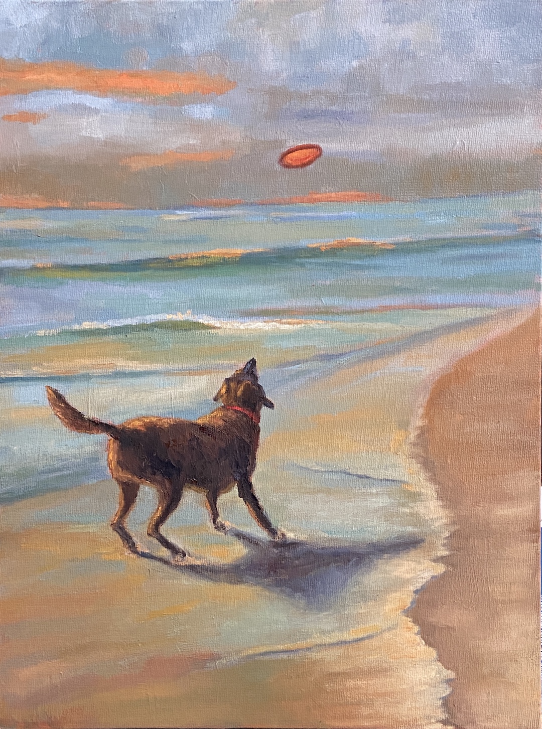
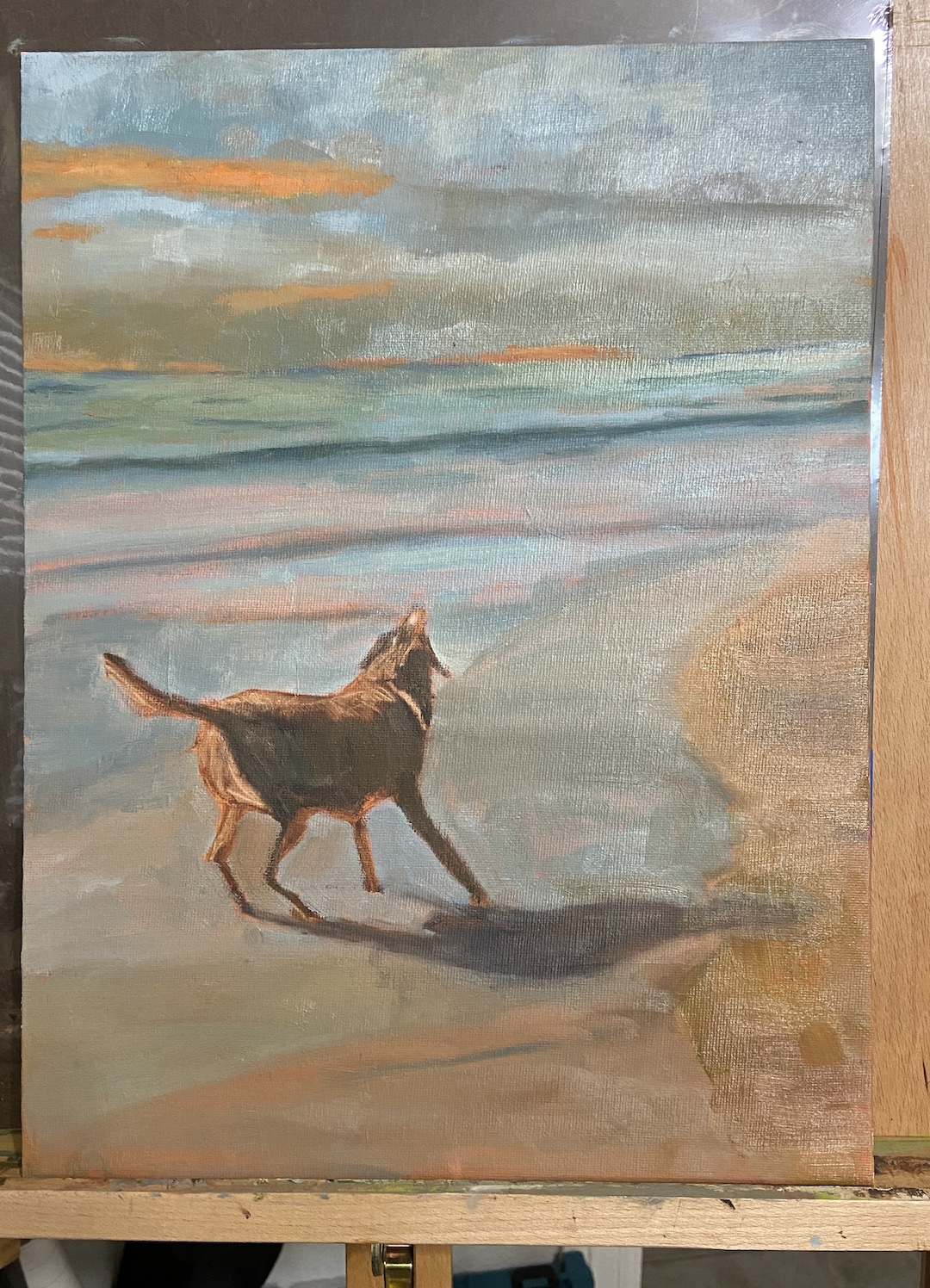
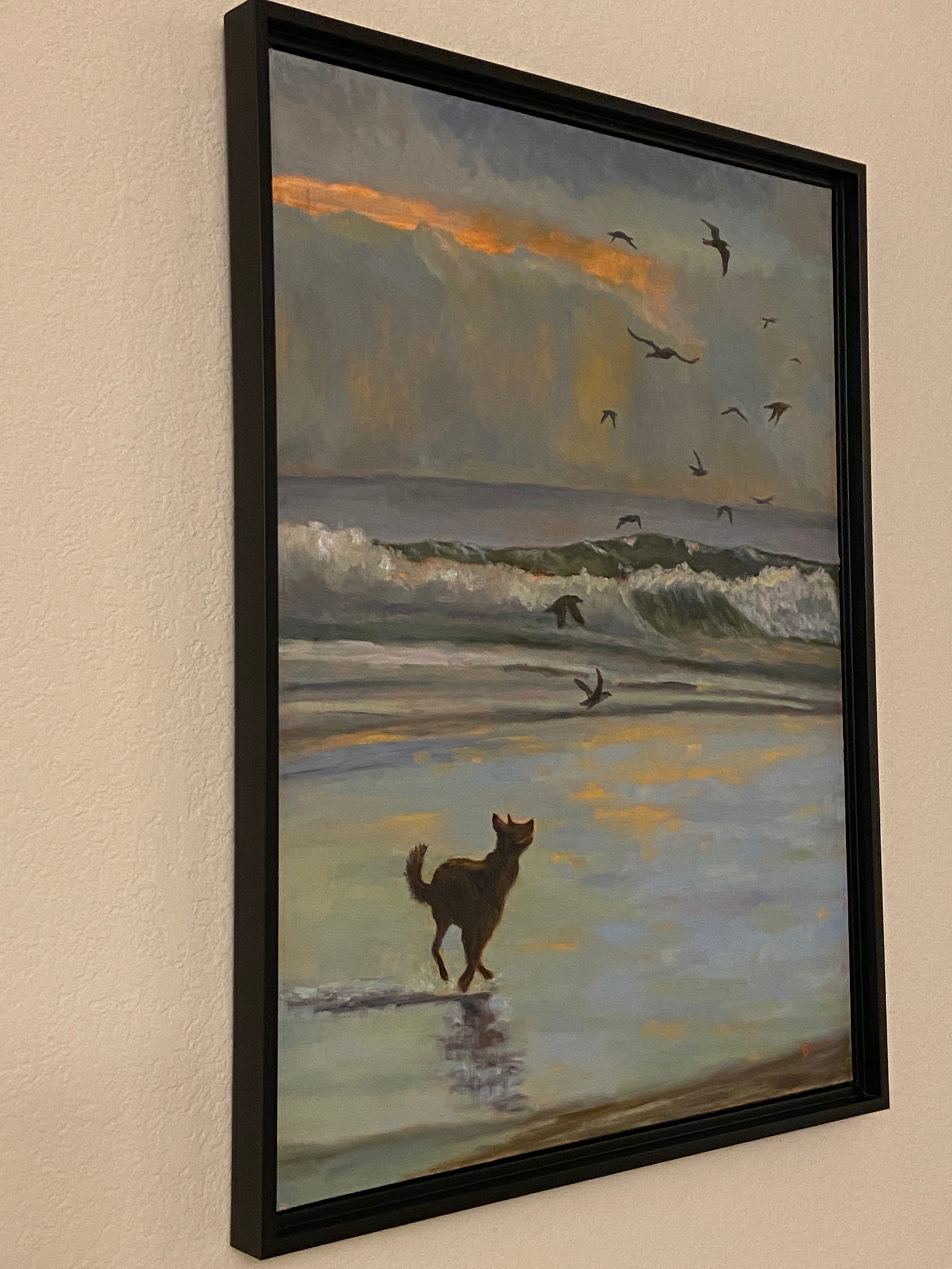
This is a follow-up from the Gaggle of Geese post a few weeks ago. The finishing “touches” for the studio ended up being a little more like finish “construction”, but I finally got to a point that seemed good enough.
Let me admit, I don’t like this composition, but I really like parts. Others might see something more appealing, as art tends to work that way, but it seems artists trying to sell works tend to force themselves into liking everything they paint. To the uninitiated, know that they’re lying. There’s not an artist out there who likes even most of their final pieces. At the end of the day, our compositions tend to have really cool elements that we love, and various faults that distract us to no end.
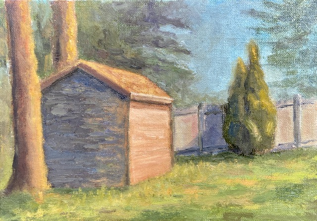
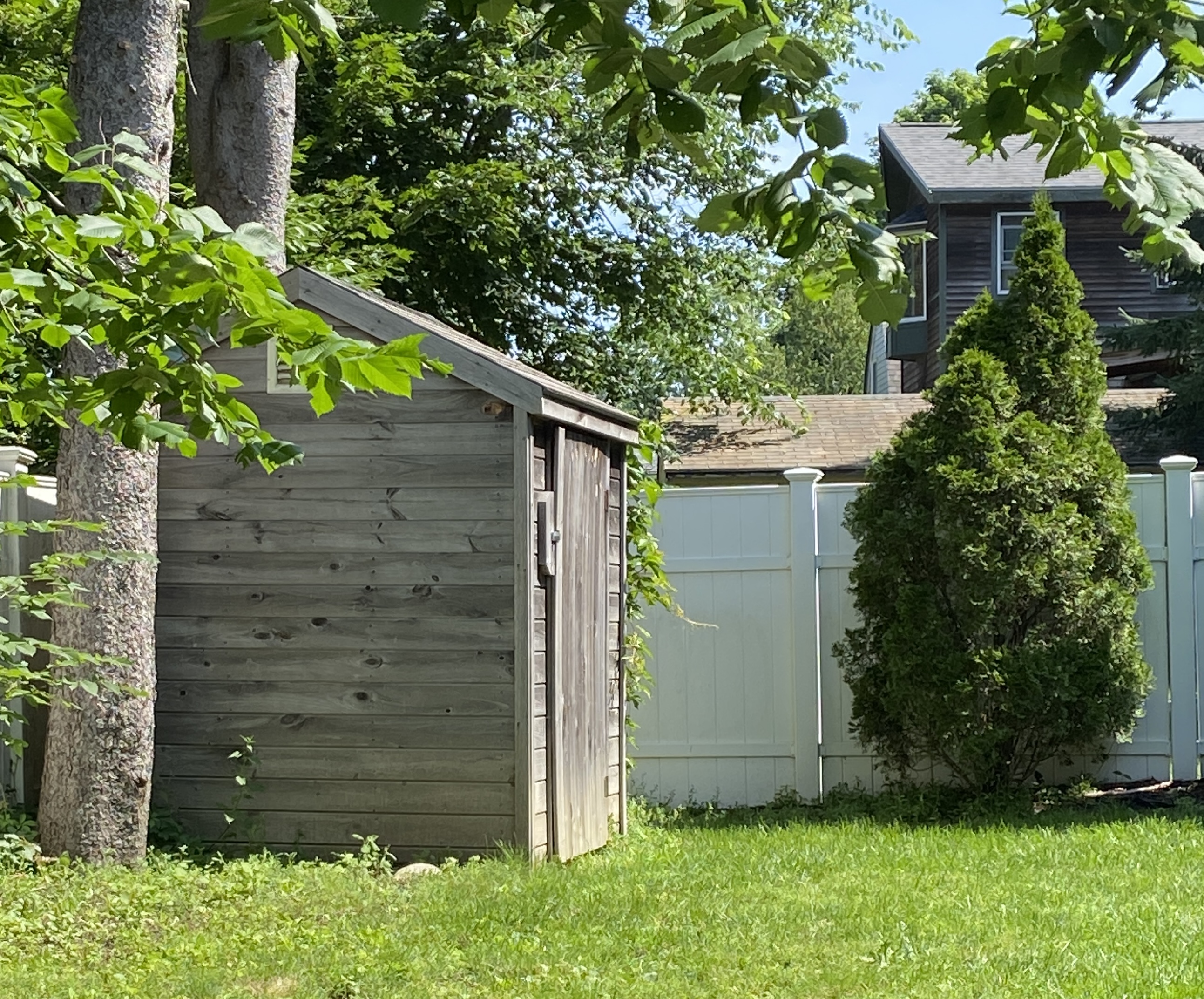
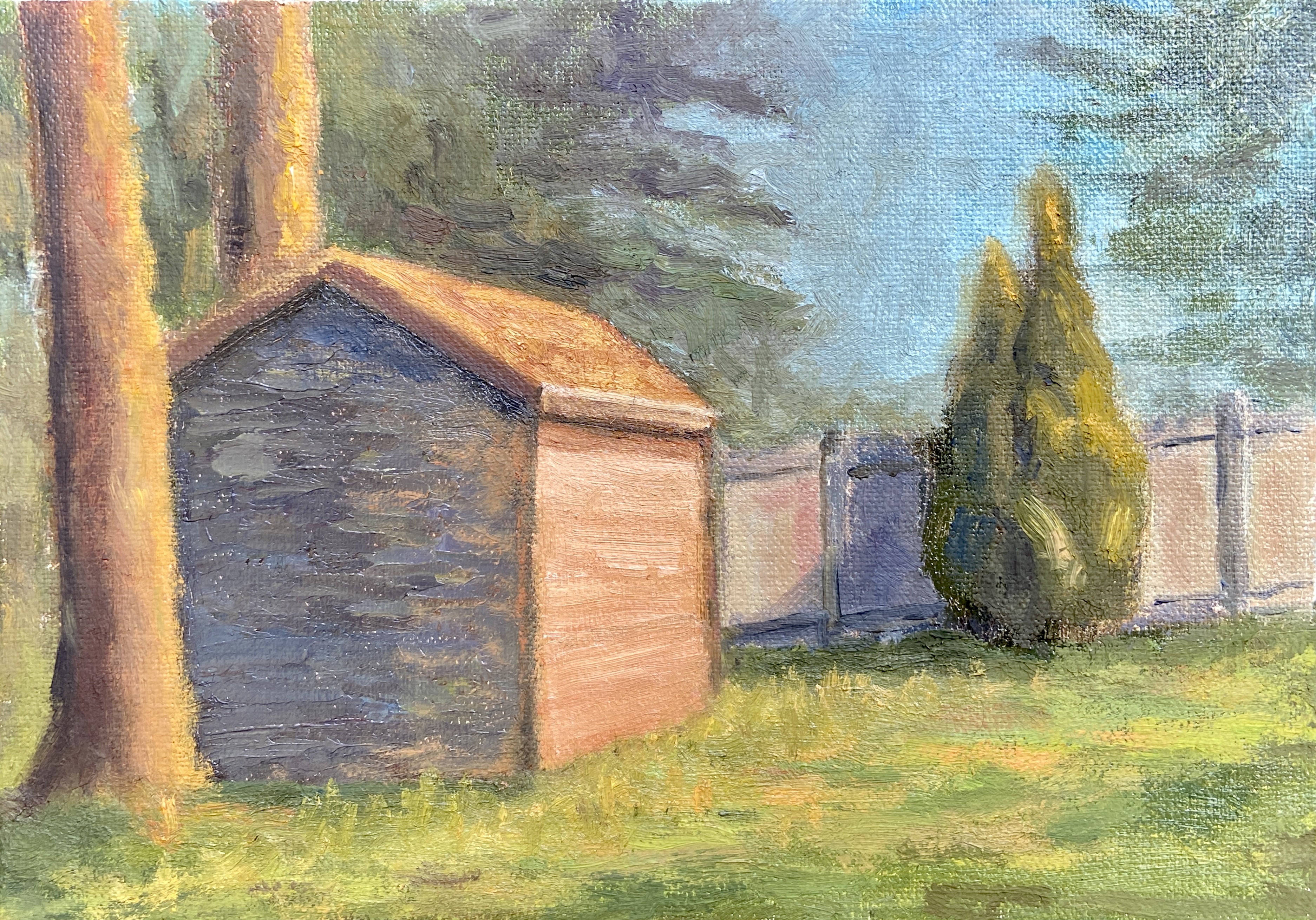
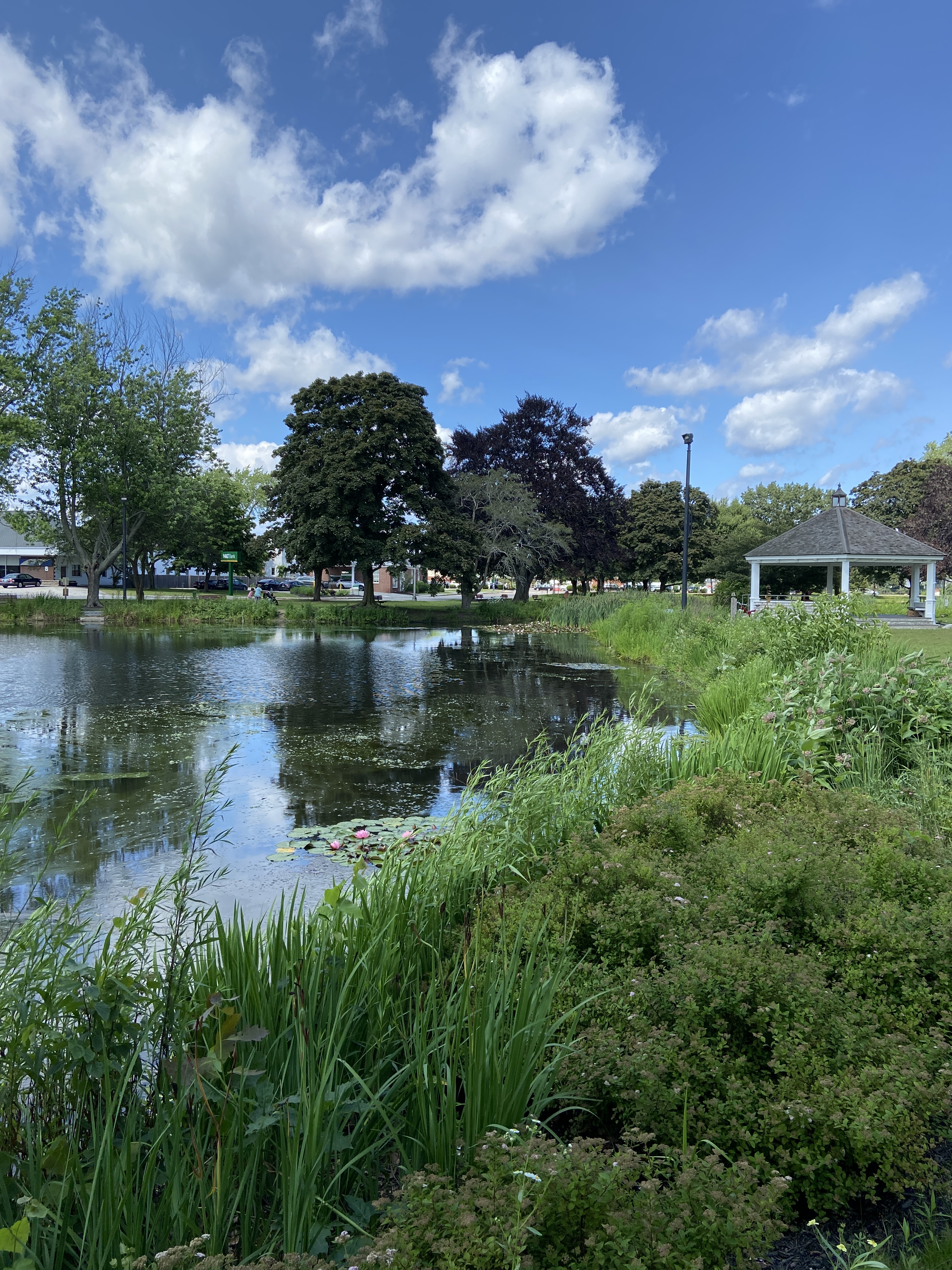
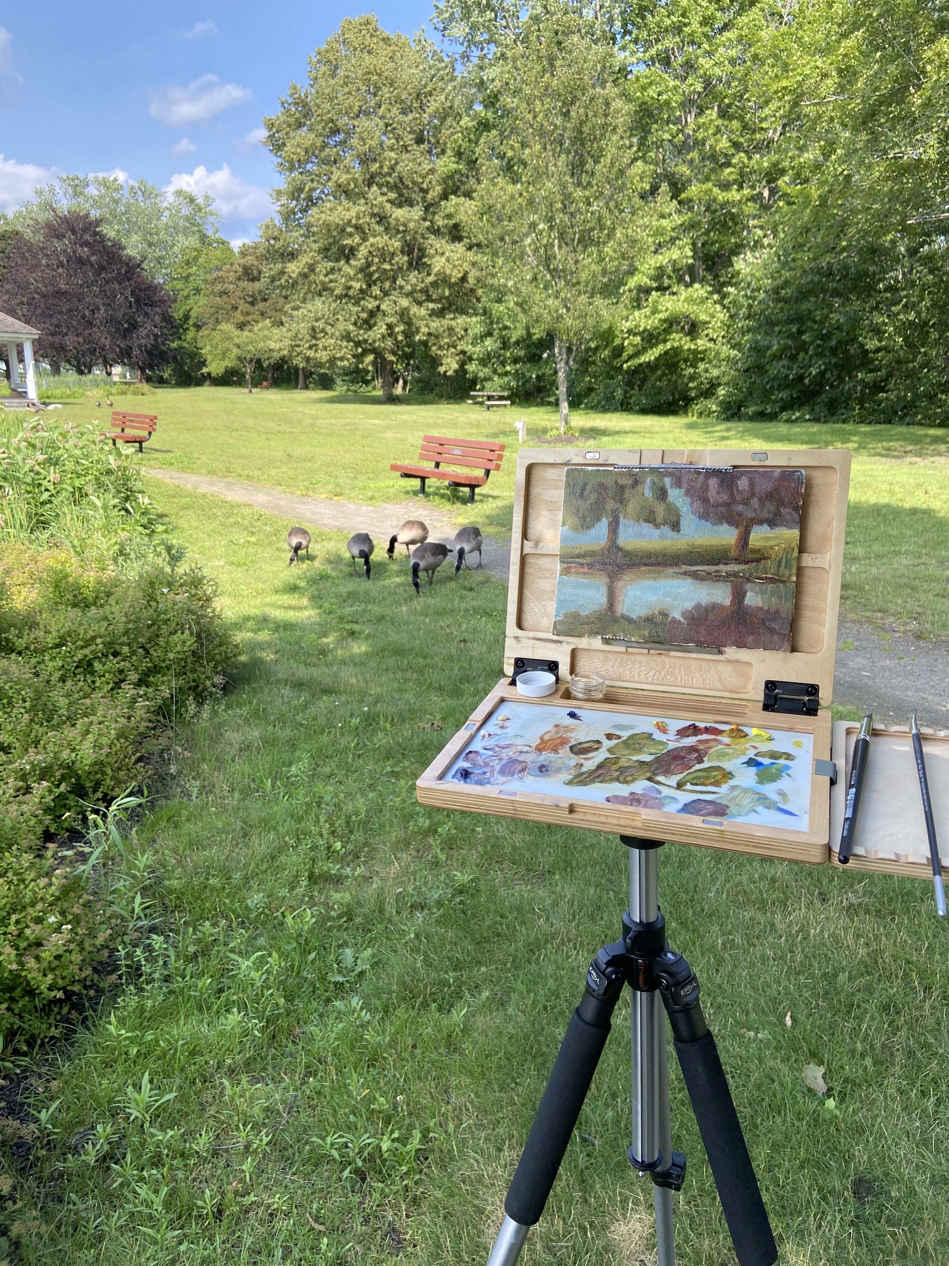
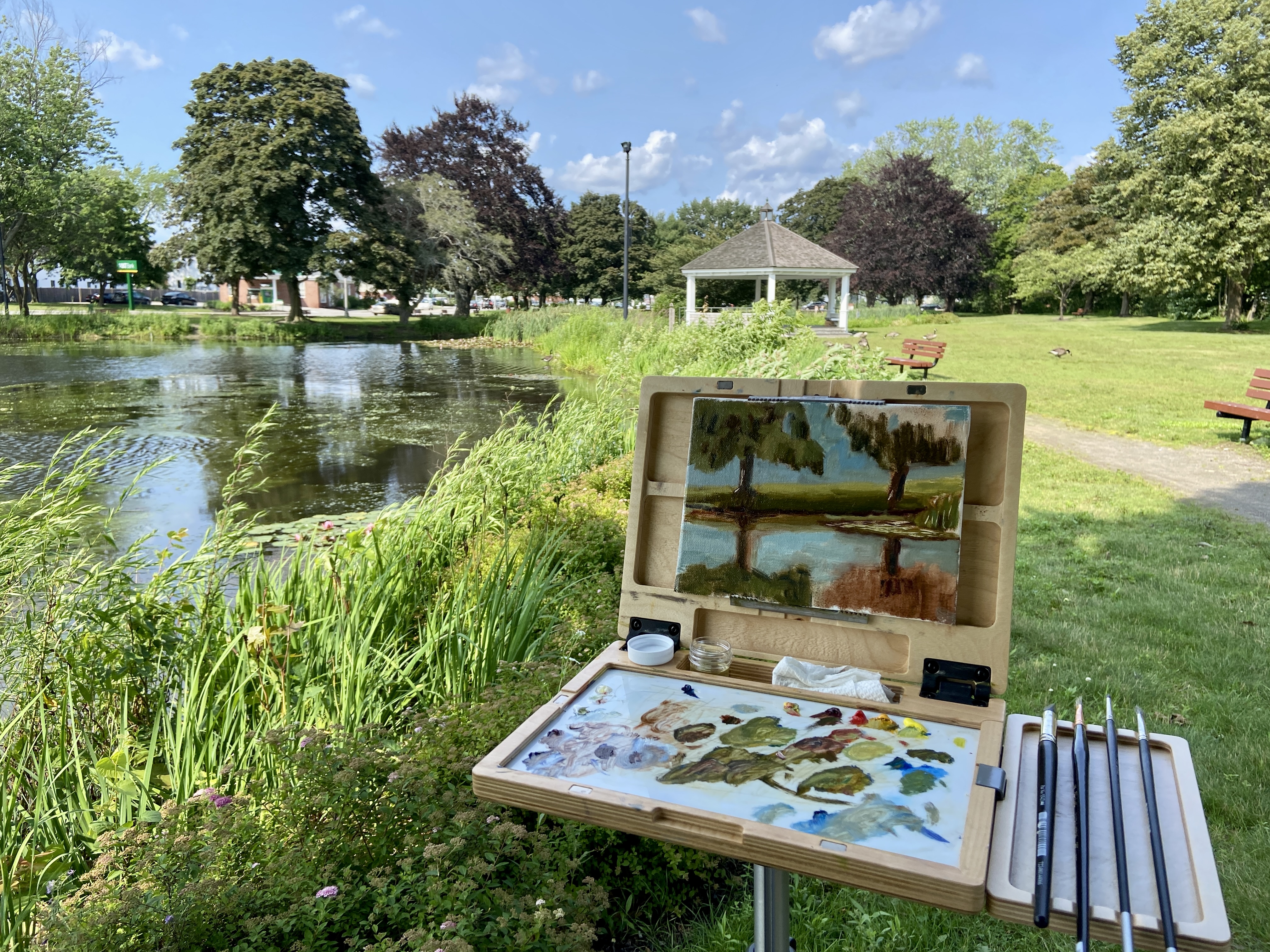
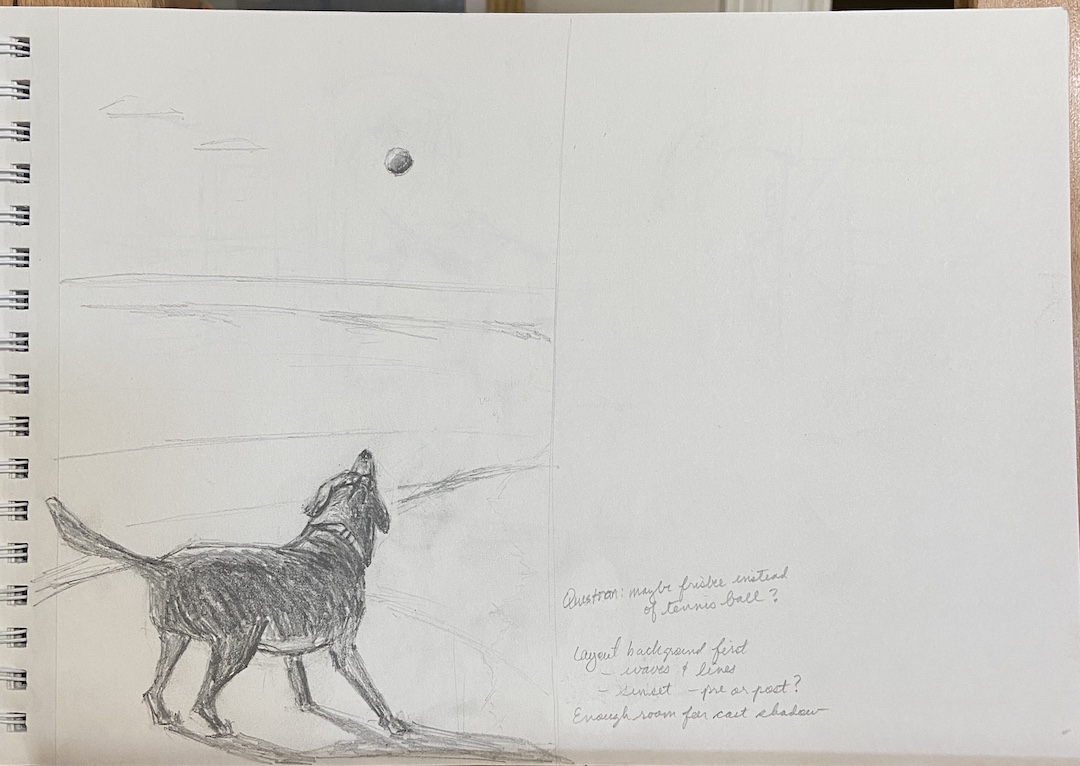
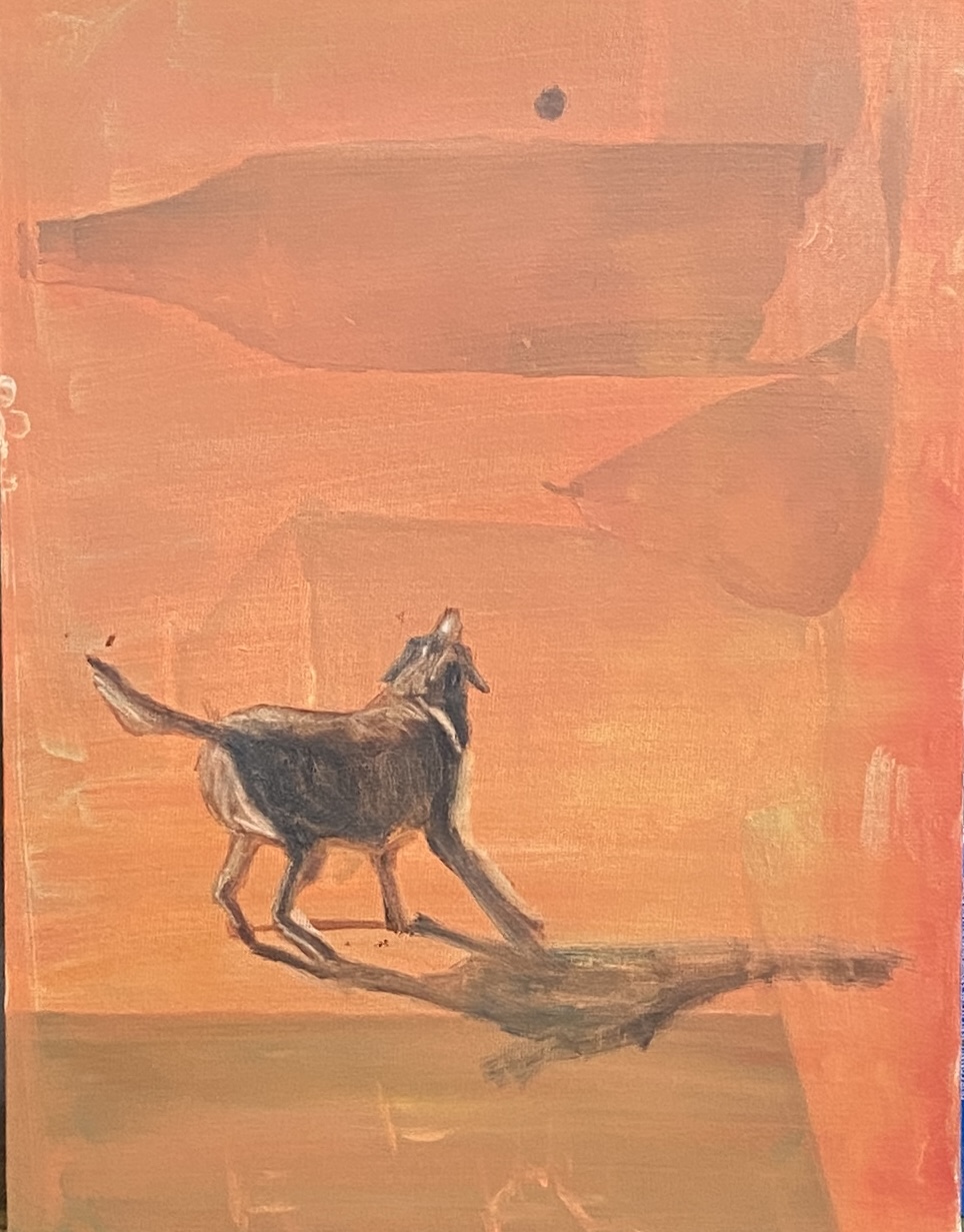
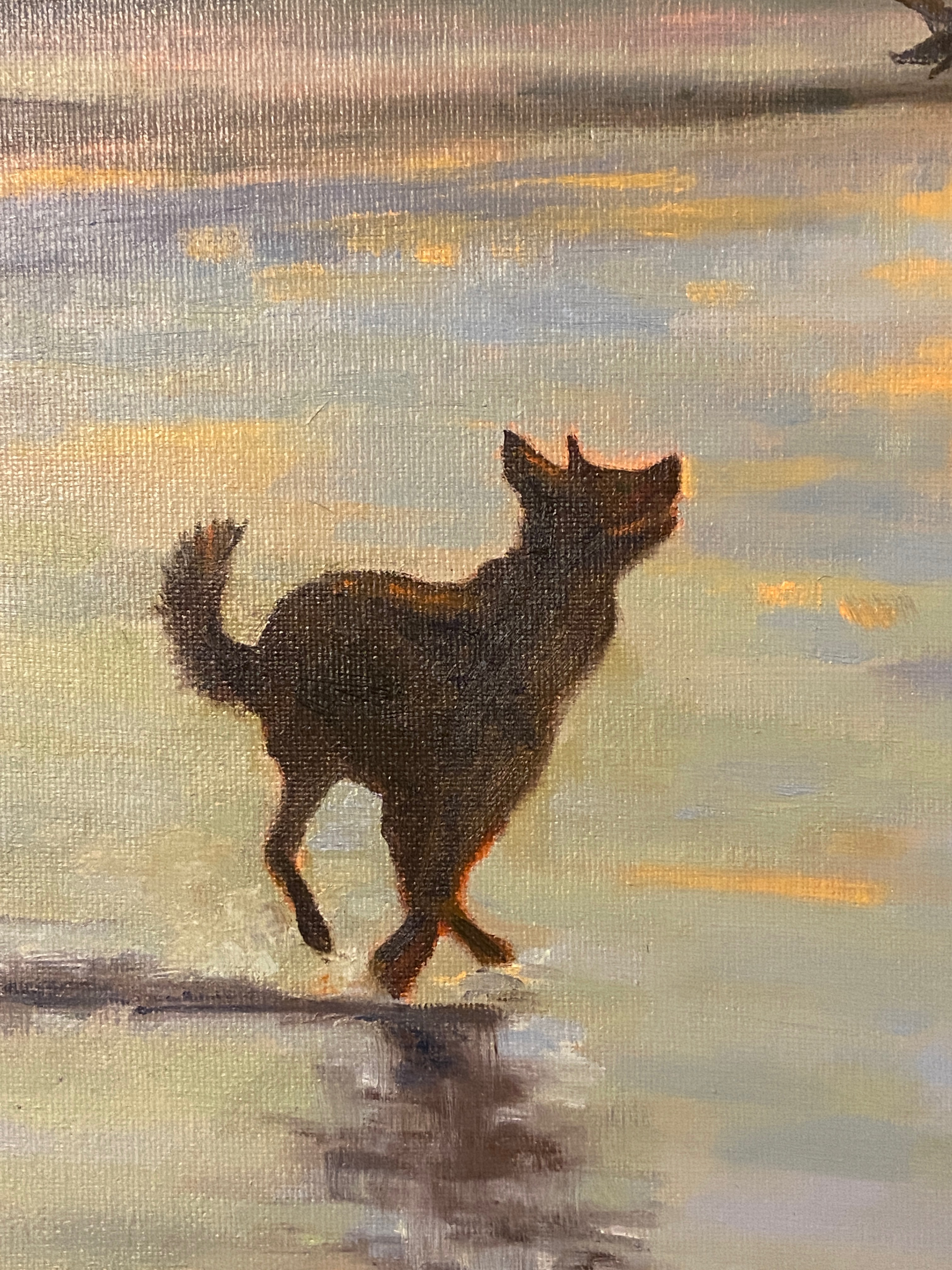
MILL CREEK POND was a joy to paint. If you’ve read the previous post and seen the video of the geese, you understand why. In terms of the studio work, I was really focused on simplifying the trees. Apparently I ignored a few basic compositional tenets along the way and ended up with two trees perfectly aligned left and right, meeting in the middle of the canvas. So annoying, but that’s what happens if you don’t step back frequently at the beginning and take the time to ensure the layout works.
Regardless of the “amateur hour” compositional oversights, I had a lot of fun learning how to simplify the masses of the trees, especially the purple oak. Living in Texas, there are no purple oaks, and everything that’s green has a coating of yellow cedar pollen, so things skew very warm. Painting a very dark purple oak tree with huge leaves that gather in numerous masses is, well, an awkward endeavor and hard to create on the first go. Ultimately I gave up, said it’s good enough, and pivoted to the warmth of the setting sun on the trunks, grass, and lily pads.
Hope you enjoy the final product regardless of my self-critique. It worked out in the end… kinda.
Thanks for reading!
#artbern #berntx #crashboomzip #painting #art #abplanalp #austinartists #atxartist #atxart #atxlife #contemporaryart #southportlandmaine #abplanalp #bernabplanalp #pleinair #pleinairaustin #geese #millcreekpond