This was one of the studies for the Brushes With Cancer composition. While it didn’t end up being the primary piece for the BWC cause, I like the colors and composition enough that I’m pretty sure I’ll return to this in the near future and do a more complete painting on canvas or panel.
Graphite on Paper | 8″ x 10″
Lotus Flowers on Pond
I did a detailed drawing prior to the painting, which turned out really well. In fact, I think I like it more than the painting.
Yes, another flower! The Pink Rose started off as a white rose, but some prodding from my wife got me to adjust to something a bit more interesting and thus the improvisation towards pink.
I’ll confess I’m not thrilled with the outcome of this small piece, but I think it’s simply a matter of style preference. The style is less realistic than I’d like, although as a drawing it works well… but it’s not a drawing, so there’s that.
Pink Rose | Oil on Panel
The reference photo is a beautiful white rose, but in hindsight I can see that it’s flat and lacking variations in value. I didn’t figure this out until I was more or less finished with the piece, but it was a very valuable reminder that grinding through a painting isn’t always the right approach if your gut tells you something is off. I see a lot of paintings on-line that have this stylistic look, so I’m pretty sure it appeals to some folks, but, ironically, it’s not for me.
The 4th of a 5 part study series, Yellow Rose, came together very quickly. The gallery above shows the progression as well as the varied contrast in painting compositional styles. If you have a favorite thus far please make a comment and let me know.
Before diving into the details of the composition on the next page, I thought the history of the “Yellow Rose of Texas” and the song lyrics were really interesting to read in tandem. I typically haven’t looked into the history of my painting subjects, but having done it with something as innocuous as this yellow rose, I found it to be a curiously motivating way to start a project. I think I’ll add it to my painting process and see if it unlocks some additional artistic mojo in future compositions. And yes, I’ll try not to bore y’all along the way.
The Flower Study painting series continues moving forward. Now that we have 3 studies completed (click for previous posts on this series: Study #1 Poppies, Study #2 Hydrangeas), it makes sense to line them up at the start of each related post to see how things are moving along. I want to continue exploring different compositional ideas so I can make an informed decision, both with respect to my actual skills as well as artistic considerations (what looks good), before taking on a large, formal piece for the house.
Today I wanted to share some simple varnishing techniques that can quickly and easily protect a painting. Nothing earth shattering here, but if you haven’t done a lot of varnishing of finished artwork before, or simply curious about other techniques, hopefully there are some tidbits for you in this post.
Supplies:
Varnish – I use Gamblin Gamvar Picture
Cosmetic Wedges
Rubber gloves
Paper towels
There are various types of varnish that can be used to get a good protective coat on a finished painting, but I like this particular varnish because it’s virtually odorless and very easy to use because it doesn’t become tacky too quickly. Instead of a wide soft brush to spread the varnish around the painting, I like to use cosmetic wedges instead because a) they don’t shed hairs like a brush does, b) they’re cheap, and c) it’s easier to spread varnish.
I’m varnishing 2 pieces, one large canvas and one small panel. I’ll focus on the larger canvas piece, but I wanted to provide the smaller panel periodically to illustrate another surface.
Varnishing Setup
This painting, Zip’s Flowers, was finished a couple months ago and has been stored on a drying rack, largely away from dusty conditions. Even in a nicely controlled drying condition such as this, I still take the time to wipe down the painting surface to get rid of the dust. What I find works best is first sweeping the surface with a wide clean brush, preferably one that hasn’t been used before, followed by a few wipes with a Swiffer dust cloth. The idea is to ensure that there isn’t a fine coating of dust anywhere on the painting, otherwise it’ll clump up when you apply the varnish.
To apply the varnish, lay the painting flat on a covered surface with some bright light overhead. Pour some varnish directly onto the painting. I like to pour a small puddle, about the size of quarter, in the middle of the painting, then slowly spread it around using one of the cosmetic wedges. Don’t overthink this part – just pour and spread. This allows me to see how the varnish will spread and the kind of coverage I can get with a small amount to start. It’s much easier to add more varnish than it is to try and gracefully remove excess; trust me, it’s not pretty. For every one of the DIY YouTube videos demonstrating varnishing techniques out there, I assure you there are 10 deleted videos of instructors slopped in varnish and/or furious at brush hairs drowning in tacky varnish.
Add more varnish as needed to get the entire painting surface covered, but remember it’s not about thickness, just coverage. The reason I suggested having a bright light overhead is to allow you to see the reflection of the surface and thereby quickly find spots that you missed.
First Coat Complete
Another advantage of using the cosmetic wedges over a brush is the complete mindlessness involved in spreading the varnish over the surface. Again, go back to any of the DIY YouTube videos and you’ll see how obsessed they are with brushing carefully so you a) don’t end up with too many brush hairs in the varnish, and b) getting a smooth surface. By contrast, the wedges are very soft and don’t even snag on impasto areas of the painting, so you can easily manipulate the varnish around the painting. Note that you might end up with some very tiny bubbles if you’re spreading quickly or pressing down too firmly, but they will go away in a few minutes and in my experience are never an issue.
After the varnish has been applied, I return the painting to its dust-friendly rack and let it dry. The varnish I’m using dries pretty fast, but I wait another week before applying a second coat. You can see in the gallery at the end of this post the results, but to set expectations remember this is not a high gloss finish, although you can use varnishes that give a more intense finish. Ultimately I’m looking for what I like to call fresh protection for the painting, meaning the varnish recharges the hues and vibrancy of the painting which also providing a protective layer that will allow your masterpiece to last a few hundred years.
Unvarnished
First Coat (wet)
Second Coat (Wet)
Varnished and Dry
Small Panel Varnished and Dry
Varnishing Progression (NOTE: a before & after comparison is hard to capture with photos)
The whole process takes about 15 minutes for the initial session and it’s very simple so there’s not a lot of trial and error involved.
This week’s composition is going to be auctioned off for charity to support the Central Texas Food Bank, which needs donations to support the growing demand generated by the Coronavirus pandemic. Despite the lighthearted nature of this painting, which is intended to inject some humor (at nobody’s expense) into a bleak situation, the Coronavirus is a serious challenge for the world that needs leadership and creativity to overcome. Details regarding the auction and how to participate are at the end of this post.
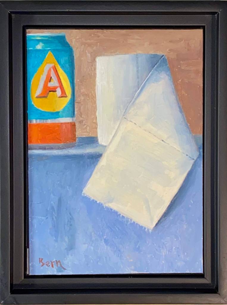
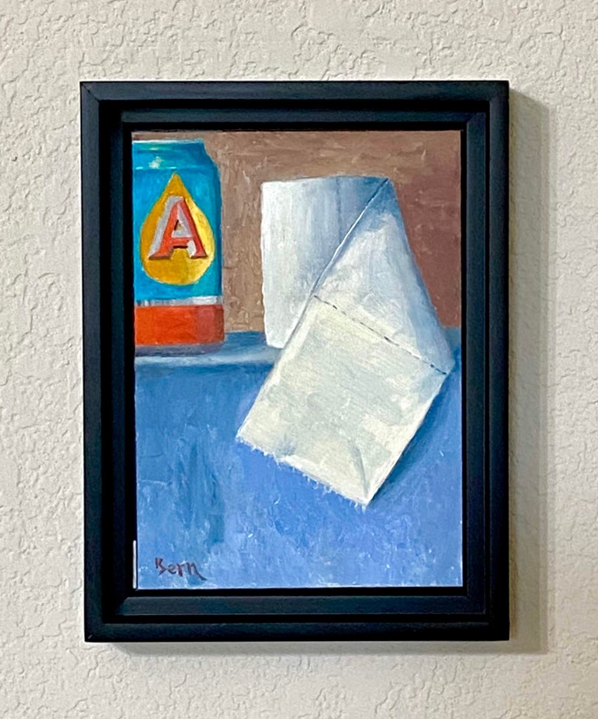
I’ve enjoyed working on more still life this year and I’m starting to get a better feel for various objects. The use of toilet paper and a beer can struck me as an interesting challenge because they are so contrasting in their own composition. In fact, if you really think about it, beer and tp have quite a strong relationship despite their contrasting structure, but that discussion is for another day. When I started this piece we had recently returned from a couple of trips to various grocery stores to stock up on supplies and at the very least, secure a couple weeks worth of toilet paper, beer, and wine. Priorities, right? Local news coverage continued to highlight hoarding and runs on tp (sorry, just can’t help myself), at which point my nervous laughter and need to find something positive in all the bad news led to the idea (hard to call any of this “inspiration”) for this composition. At the very least it gave me an outlet through art and a chuckle at the madness the world sometimes throws our way. I hope you get a guilty giggle from this piece too, but if the work is offensive in any way, please accept my heartfelt apologies as my goal was well intended. And ultimately, the related auction of this piece will provide a donation that will feed many people in need during this serious time.
Final Close Up
Final Framed
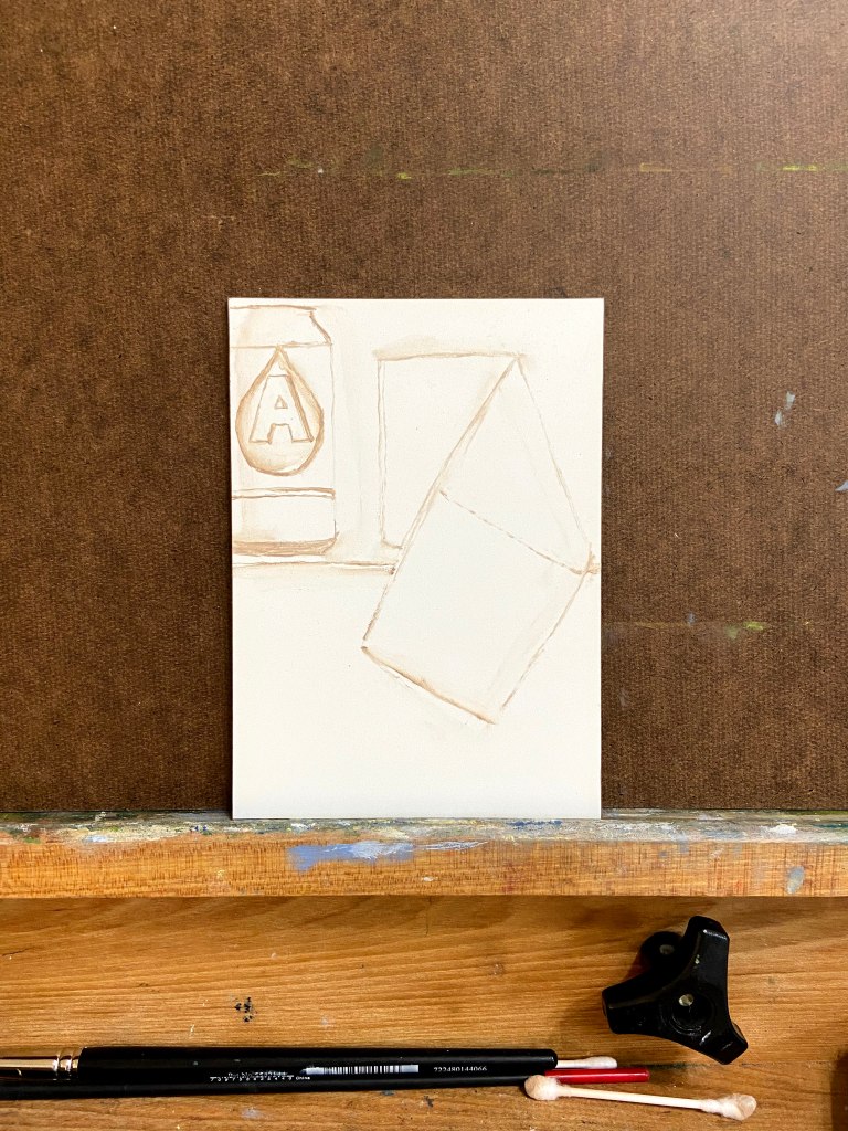
Progression
Rough In Sketch
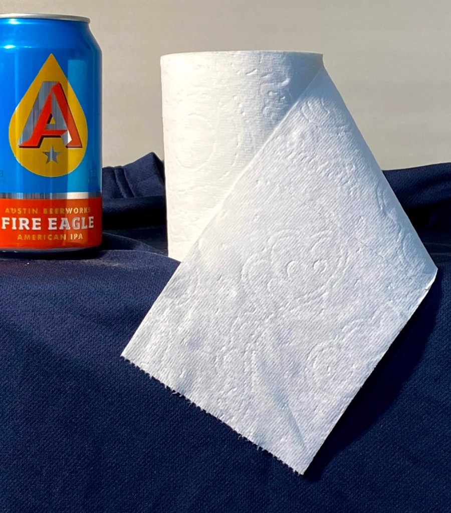
Reference Photo – TP and Austin Beerworks Fire Eagle IPA
Special Art Auction Details
This week’s composition is going to be auctioned off for charity to support the Central Texas Food Bank, which needs donations to support the growing demand generated by the pandemic.
Auction Overview
Artwork is called Pandemic. My Austin friends will recognize the beer can, but for the uninitiated, it’s Austin Beerworks’ Fire Eagle IPA. The source of the toilet paper, however, is uncertain.
This is original artwork, completed March 18th, 2020. The painting is done in oil on a 5″ x 7″ wood panel. The artwork is being sold framed.
The auction is being done as an Event on my Facebook art page, “Impasto”. Direct link to the Event is here.
100% of the winning bid will go directly to the aforementioned charity, Central Texas Food Bank. The winning bidder will receive a copy of the receipt from me showing the donation was made in full.
No shipping fees if sent to a United States address. International shipping rates will apply.
Letter of authenticity will be included (proves provenance and confirmation of original artwork).
Winning bid must pay via PayPal, Venmo or check. Artwork will be shipped upon processed payment.
If you want to participate in the auction, follow these simple steps:
Go to my Impasto Facebook page here, and navigate to the Events section, or navigate directly to the Eventhere; look for the event called “Special Art Auction Benefitting Central Texas Food Bank”. The About section of the Event will reiterate these auction guidelines and information about the artwork. Go the Discussion sectionto place bids via the Comments section.
BIDS MUST BE MADE IN THE COMMENTS SECTION OF THE EVENT.
The opening bid must be at least $50. Bidding must be done in no less than $5 increments, which means your bid must be at least $5 more than the previous high bid listed. Of course you can feel free to make incremental bids much higher than only $5!
The comments should sort old to new, so scroll to the bottom of the comments to see the latest high bid. WARNING – sometimes Facebook gets a mind of it’s own and the comment sorting logic gets whacky, so just make sure you pay attention.
Bidding opens at 12Pm CDST, Saturday, March 21, 2020. Bidding will close at 5pm CDST, Friday, March 27, 2020.
Winning bidder will be notified Friday, March 27th, 2020.
Last week I decided to create a large flower inspired abstract painting for the house. It’s going to take a lot of practice, though, so I’ve committed to a dozen small studies of various flowers until I find what will work both aesthetically and still be within my sphere of skills.
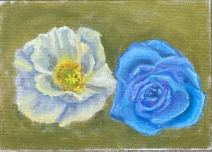
The first study was essentially a wrestling match with poppies. The white poppy was first, followed by a pause of a couple days before tackling the blue flower. The goal wasn’t to create a beautiful piece of artwork, but rather test drive a few approaches, various brushes types and sizes, and play around with values to create convincing petals.
Flower Study – White Poppy & Blue Hybrid
I used a small 5×7 canvas panel, which is fine for the initial studies, but I’ll need to switch to a gesso board or more refined canvass surface. A toothy surface like this canvas panel is great for many subjects, but it’s not going to work for flowers. Also worth noting is the blue flower isn’t a poppy at all and had nothing to do with the reference photo. I wanted to try something with more complexity in terms of petals, and thus created some kind of cross breed never before seen by humankind.
This is a good start and got me excited to pursue more flowers. Next up will be hydrangeas with a more earnest attempt at realism.
Say hello to PB&K the latest addition to the Dog Toys series, although it might be more appropriate to start a new sub-category called “Cheeky Still Life”.
The Kong was done with a painting knife to give it the subtle texture of a well worn, go-to Fido favorite. As any dog lover would attest, especially the big chewers, a peanut butter stuffed Kong is a great source of entertainment… and protein. Even the most hearty chewers have trouble putting a dent in one of these rubber wonders, but they do lose their sheen and get a roughed up look over time. By contrast, the (creamy) peanut butter and the remainder of the composition is all impasto-free brushwork.
Ultimately, the intent of the composition is to make every dog parent look, nod, and laugh at the reality of what we’re all willing to do for our lovable canine companions.
Oil on canvas paper, 8″x10″
Palette knife and an array of brushes (rounds and flats)
Key colors
Peanut Butter – Yellow Ochre, Naples Yellow
Kong – Ivory Black + Ultramarine Blue, Burnt Sienna + Ultramarine Blue
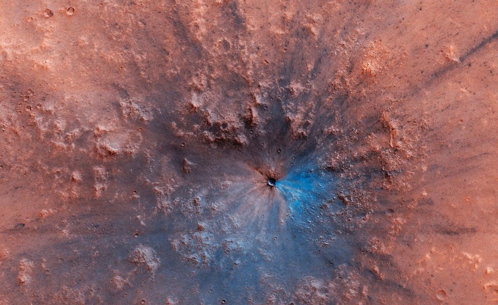
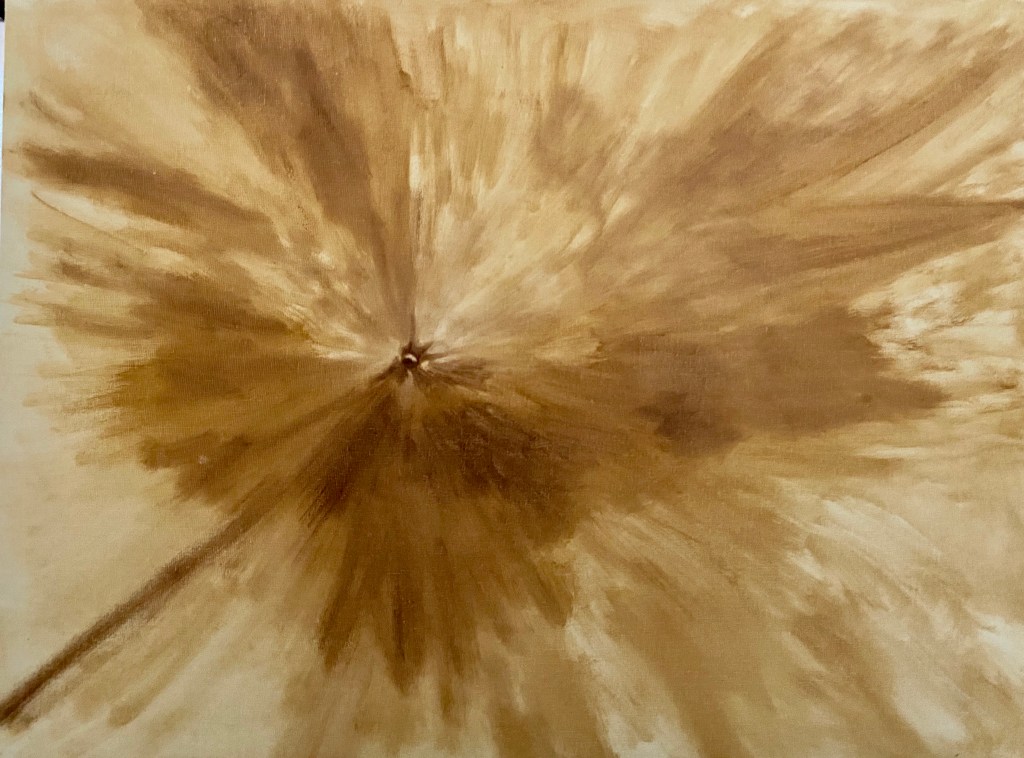
The mission to Mars is complete! This larger piece was a lot of fun on many fronts and allowed for some variations in technique and colors. This is largely an abstract project, although I worked to replicate the essence of the Martian surface, albeit with some wild colors.
Reference Photo
Block In
First Layer
Final Composition
Focal Crater Zoom In
Meteor Spray Progression
After the block-in, which was described in the Meteors and Squirrels post last month, I focused on the colors. It was at times infuriating trying to create other worldly space dust hues, but I kept at it until I found something that resonated with me. Along the way, I will admit, there was a lot of wasted paint. The solution was glazing, whereby I was able to push and pull the hue and intensity as needed through thin layers atop an initial color scheme. There were 3 glaze layers in total, but the first one was the most impactful, essentially making the whole piece pop and really come alive! It was an exciting moment and something I absolutely love as an artist, namely when you make a creative decision to change the approach and it actually works! Hell yeah!
After 2 glazing layers, I made another compositional decision to invest more time and effort in multiple craters. The piece needed to convey the powerful impact of the main focal crater, but the addition of other craters enhances the overall painting and incorporates some needed texture. The craters also unwittingly added a strong sense of value contrast and lighting direction that I didn’t realize was lacking until I started dropping them into the Martian surface.
The final glaze layer was more opaque than previous layers and it was selectively done across the composition to soften and blur many of the larger craters so one gets the sense of a dusty surface – otherwise they simply looked too crisp and clean, an effect I wanted on the focal point but not the other craters.
Overall, this piece was fun to do, but I’m not excited about the outcome. I absolutely love the impact crater – still now sure how that came together so nicely – and the projection of colored Mars dust (meteor spray) worked well, but I realized the composition isn’t something that appeals to me visually. The final colors aren’t what I’d envisioned and I simply couldn’t get away from the red orange… and I don’t really like that hue, so in the end it was a stupid decision on my part. That said, I’ll be interested to see who likes this piece, either because of the pronounced coloring, or perhaps the Martian space theme, which isn’t a typical painting subject.
Technical details for my fellow art dorks:
Oil on canvas board, 30″x24″
Glazing done in final layers, but not atop the focal crater
Brush sizes were primarily 2 or 6, mostly Flats and Rounds,
It’s happy hour time again! Before moving forward, it’s time to reveal the name of the cocktail from the Happy Hour – Roosevelt post from a few weeks ago… the Sazerac! It’s a great drink and the next time you’re in New Orleans I highly recommend a visit to The Roosevelt for the original recipe.
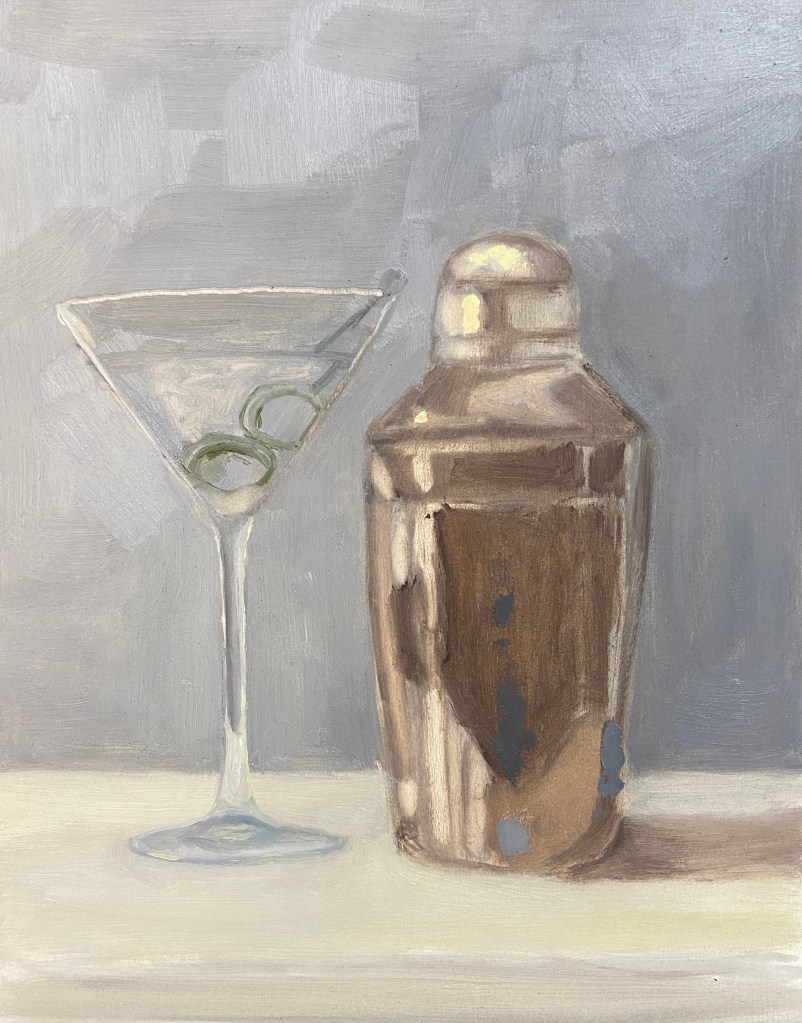
This latest addition to the series should be much easier for you to figure out, although it wasn’t necessarily easier to paint. Happy Hour – Shaken is an iconic cocktail indeed and something that James Bond fans will recognize instantly, although 007 preferred a stirred version.
This cocktail is a top choice in my household – even the dogs like it! Well, they probably would love it, but they just get to have the ice cubes after the drink has been strained. Yes, it’s hilarious – they hear the shaker, come running to the bar, and proceed to sit (without a command mind you) until I’m done, at which point they each get a piece of ice. They are, without a doubt, very lovable booze hounds.
Back to the painting…
I’m very happy with the outcome and feel like the repeated efforts on this Happy Hour series is starting to show demonstrable improvements in the artwork. This was a challenge on 2 fronts. First, the ongoing challenge of glassware in a still life has been tricky to refine, but I finally figured out the right value scheme to make it work – the solution for me was simply being more aggressive with the darker values. Secondly, I lacked experience painting truly reflective metal in still life compositions. Again, a more concerted approach with the darker values made a difference, but more importantly was simply waving the wand of artistic patience and working through the various reflected elements.
A few additional observations and details about the composition:
Reference Photo: As you can tell the shaker is not exactly the same as what’s in the photo. I used a reference photo blending technique, using the real shaker as my primary source, but simplifying the object by looking at other photos and paintings on-line that were, quite frankly, better cocktail shakers.
Brush and Knife: The vast majority of the piece is done with a Flat #4 and Round #2 brush, but the olives are all knife work. They are the focal point of the composition, and as such I wanted them to have some more texture and a reflective quality of their own.
Size: This is more than twice the size of previous Happy Hour series pieces, 8″x10″ vs 5″x7″ boards. Usually when I go bigger, the work is harder technically, but this time it seemed easier. Like I said, progress.
I haven’t figured out what the next cocktail in the series will be, but I’m leaning towards something with a shaker. Cheers!