Sticky Booger Framing

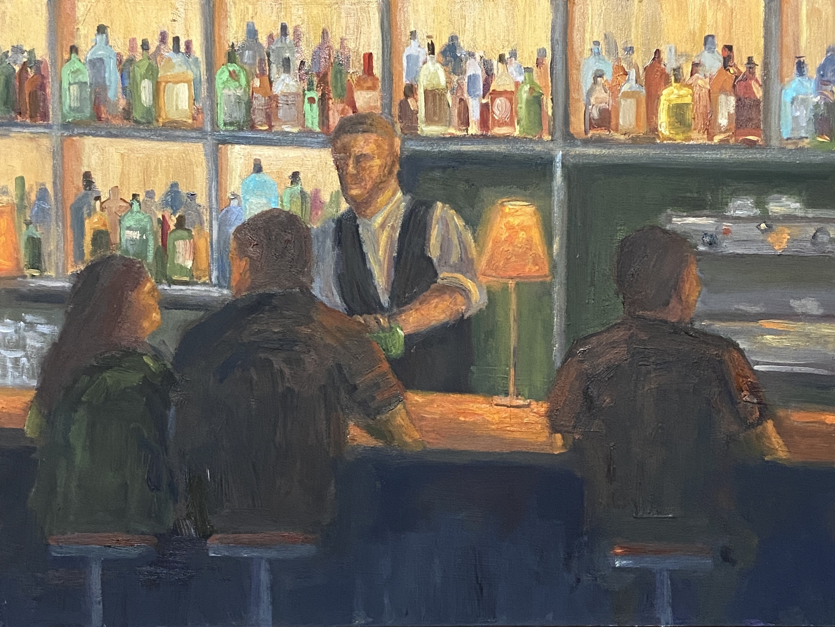
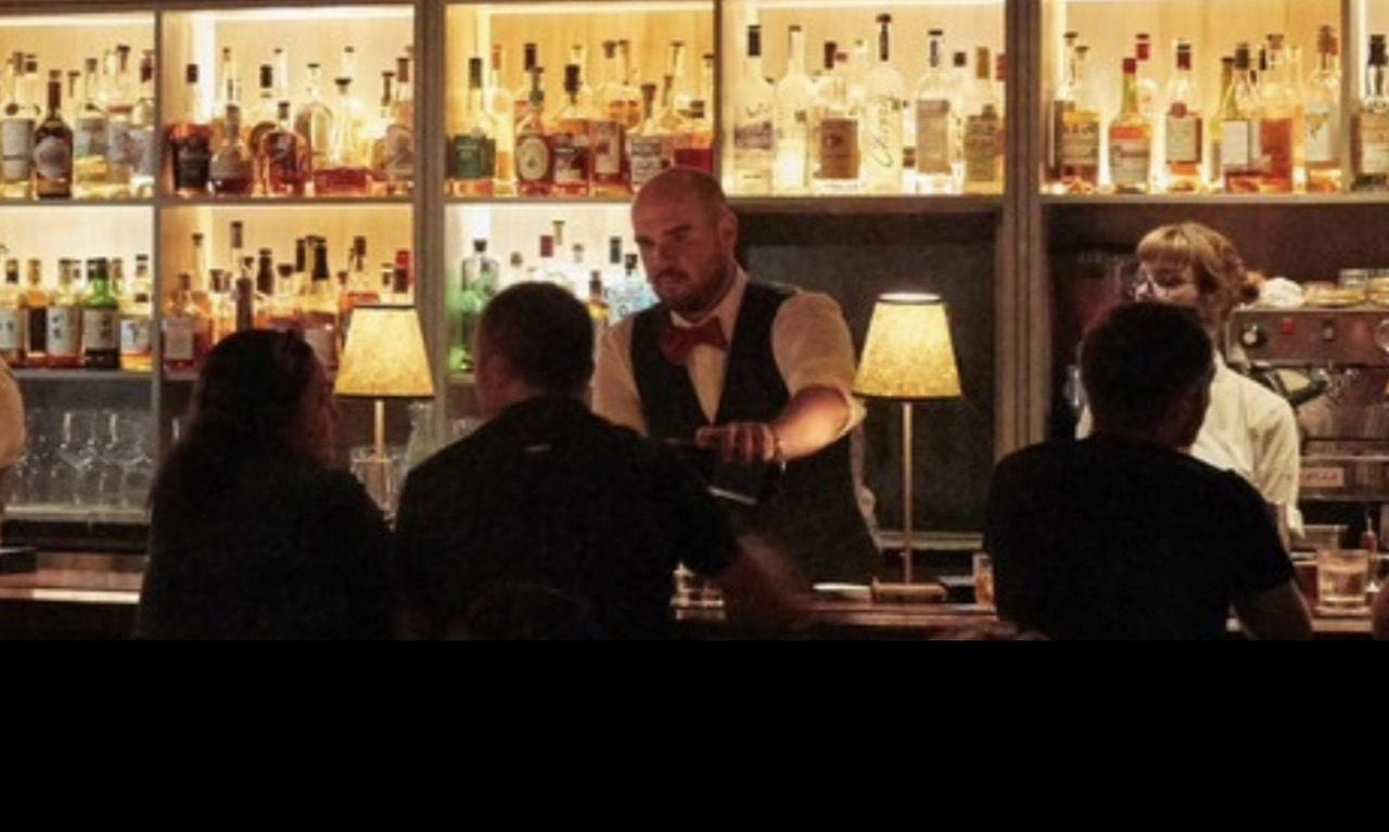
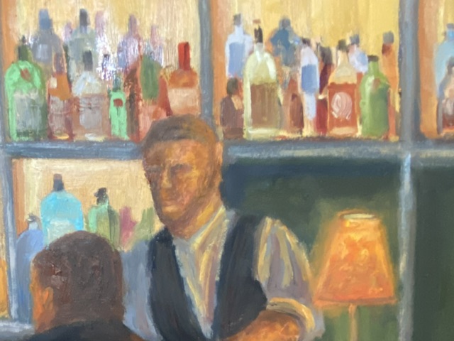
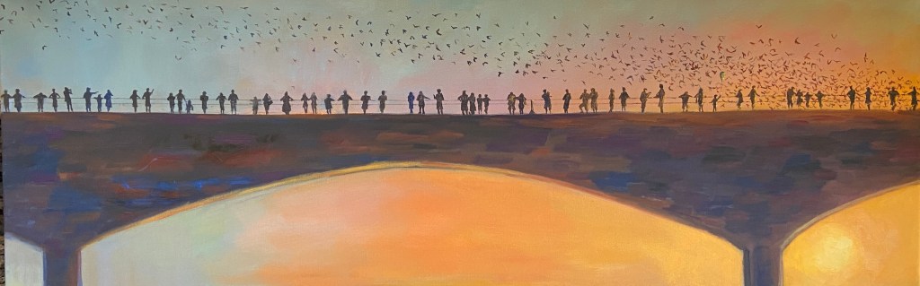
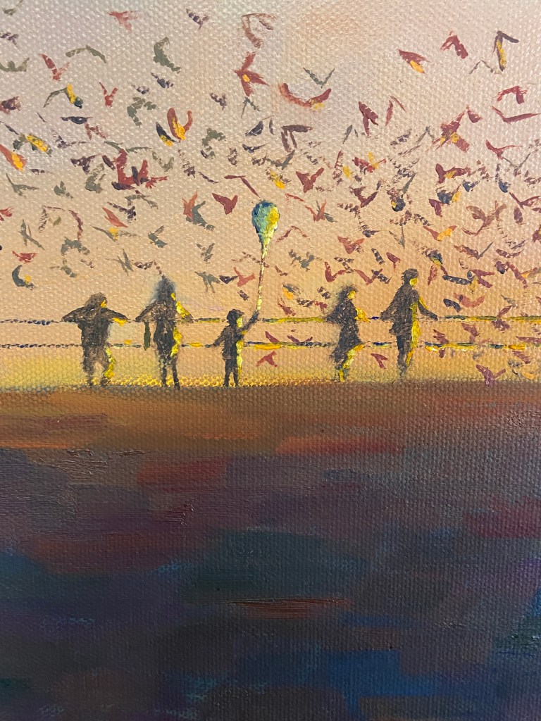
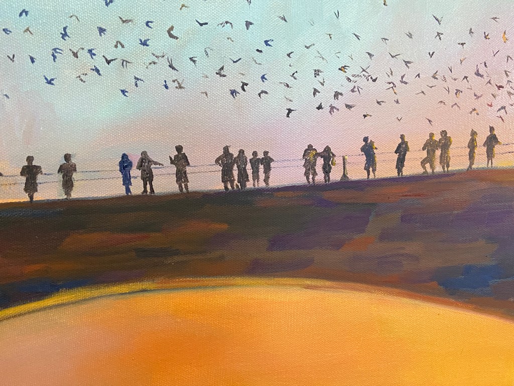
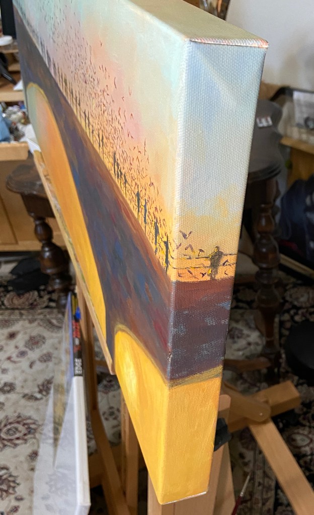
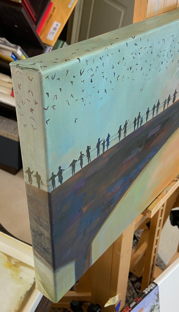
A few months ago I finished this triptych, now called “GOING GOING GONE”, but it sat around in the studio waiting for framing inspiration. Well, that inspiration finally showed up in the form of cork foam board, an orphaned 12×26″ frame, and a whole lot of JB Weld epoxy glue.

If you’re interested in the details of this artwork, follow the link to the post in the above paragraph. Otherwise, read on to learn about the challenging world of custom framing, at home, with nary a YouTube DIY video to be had.

Challenge #1: How does one attach wood blocks to a frame without backing? I was headed down the path of cutting a custom wood back, but then I stumbled across a 1/4” thick foam board while looking for balsa wood as a lighter alternative to plywood. I also happen to have a matt cutter, which is much more finger friendly than my rotary saw, which is buried somewhere in the garage.

Challenge #2: How to attach foam board to frame? Also known as “glue or screw?” I was leaning screws, but as I was digging through my massive drawer of miscellaneous art crap, I came across a tube of JB Weld, an epoxy glue that’s stickier than a wet booger. Despite having been used once in the past, probably more than 3 years ago, it still worked!

Challenge #3: What was the best way to affix the wood blocks to the newly added foam core backing? See aforementioned sticky booger solution. But, the trickiest part was ensuring the 3 blocks, all of which are different sizes, were lined up properly. I’m positive there’s a better way to do this, but I opted to use a center string and blue tape at right angles to ensure the blocks were glued in the right spot.

Surprisingly, it worked out! I used the cork side of the foam board so I didn’t have to paint the white side, and I kinda liked the light brown coloring, which looked like a porter or amber beer. The best part, which my wife pointed out, was that by using the cork side for the backing, it was similar to a coaster bottom… like for a cold pint of beer… get it?

This piece will likely be added to my solo show, “Something for Everyone”, at Kerbey Lane Cafe in San Marcos, Texas, available for the reasonable price of 10 cases of Guinness or (512) Pecan Porter.

Thanks for reading!

Glowing Happy Hour

LAMP GLOW | 10×14” | Oil on Panel
Reference Photo, Photographer Unknown

Oftentimes I use my own photos as inspiration for my paintings, but I also use pics from people I don’t know. This is something I believe most painters do, typically for a couple of possible reasons. First, I paint, I’m no photographer, so my photos are, well, not very good. Some things even an iPhone can’t fix. So I might use my own photo as the main reference, but find other options online of the same area to enhance the view. The other main reason for using a reference shot from someone else, be it an individual, magazine, etc., is because it’s something or some place I’ve never seen or been to personally. It’s this latter reason that applies to this new piece, LAMP GLOW. 

I spent a lot of time on the canvas with this one, which was expected given my lack of experience painting people in detail. In fact, I must have wiped the face of the bartender no less than 6 times, and reshaped the bar patrons many times as well. Ultimately, I’m happy with the result and I learned a lot in terms of technique and what NOT to do. 

Lamp Glow Detail

The focal point of LAMP GLOW is the glow from the lamp on the bar, not the lamp itself. Because the glow is a soft light with a mid-range value, it was a little tricky to make it work. Usually, the focal point of a composition is highlighted by things such as high contrast values or sharp edges. Lacking these options I pushed the saturation and ensured the soft, orange light bathed the primary elements in the painting, which (hopefully) makes the glowing lamp a clear focal point given it emanates throughout the scene. 

In terms of design decisions, I’m not sure I took the right approach regarding the liquor bottles in the background. While they turned out nicely, I think they’re ultimately a distraction and might be more effective if they were softer and less saturated. Oh, and painting 67 individual bottles is a wee bit tedious.

Stay tuned for more bar scenes! 

#austinart #artbern #berntx #crashboomzip #abplanalp #austinartists #bartender #bars #nightlife #happyhour #atxlife #steakhouse #lampglow #cocktails

French Café Sketch

FRENCH CAFÉ | Graphite on Paper

Here’s another installment from my January “draw-a-day” self-imposed challenge. While I didn’t draw every single day, I came pretty close. Most of what I did was practice for new paintings, which, as I’ve mentioned previously, can be immensely helpful in determining not only how to approach a new composition, but even if you want to do it in the first place! 

FRENCH CAFÉ is a sketch intended to inform a painting I just started. After having done an initial block-in on the canvas I realized this was going to need further consideration before moving forward. This sketch is that “further consideration”, allowing me to do a handful of things before returning to the canvas. 

For the curious, following is how this sketch will help the painting:

  • People: arrangement, sizing/scale, and simplification. The last point, simplification, is a by-product of drawing whereby one has to convey the essence of the figures purely through shapes, whereas the painted version will also leverage colors. 
  • Focal point: The sketch taught me that I’m lacking a focal point, so the painting will need to do a better job of focusing on a particular grouping of people at the tables. In this sketch, it’s not clear where the viewer should concentrate.
  • Details: Between the umbrellas, windows, people, and trees, there’s a lot going on. It will be important to exclude some elements in the painting to make it effective, and more enjoyable to paint. The vines growing up the walls will get 86-ed, as will some of the ground floor windows and doors. 
  • Values: There will need to be very high contrast of values between the shaded people and those areas that are in direct sunlight. You can tell that this sketch, while effective in many ways, really looks flat with the exception of the overhanging trees at the top. This is where I made a point to do high contrast in light and darks, adding a 6B pencil to the mix.

Stay tuned for the actual painting, which will be a challenge, albeit a well informed one thanks to this sketching exercise. 

#austinart #artbern #berntx #crashboomzip #abplanalp #austinartists #stilllife #drawing #graphite #frenchcafe #sketch #umbrellas 

Painting Auditions


ROSE | Graphite on Paper | 3 x 3”

This is the first of numerous drawings I’ll be doing over the course of the coming 30 days. There are a number of goals involved with this exercise. Initially, I was going to set a lofty goal of a drawing-a-day, but reality has set in and the target has been tempered to draw-a-day. 

This drawing, ROSE, is from day 3 of the challenge. I’ve done a painting called YELLOW ROSE in the past, based on the same reference photo, so it was interesting to return to this after a few years. I was surprised how quickly this drawing came together; some sort of long-term artistic muscle memory. 

The other benefit of a self-imposed 30-day draw challenge is that it drives me to practice potential new compositions. Doing a quick sketch of a painting subject is helpful in the field for plein air, and for studio work, but sketches are typically done to refine the compositional strategy. However, doing a more complete drawing answers the question, “do I want to paint this?” Sometimes, you get into the details of a painting and realize that it’s not any fun because it’s either beyond your skill set, too tedious, or simply not very exciting. 

In the coming weeks, stay tuned for more drawings auditioning to become paintings!

#austinart #artbern #berntx #crashboomzip #abplanalp #austinartists #stilllife #drawing #graphite #flower #rose #botanical #sketch 

Hill of Life: The Gnarly Side of Barton Creek

HILL OF LIFE | Oil on Canvas | 24 x 20” 

Say hello to the inaugural composition for 2025, HILL OF LIFE. If you’re a mountain biker living in Austin, then you know. For the rest of you, this is the northern endpoint of the Barton Creek Greenbelt, 7 miles upstream from one of Austin’s most iconic sights, Barton Springs. 

It’s fitting that the two ends of the greenbelt are polar opposites. The southern end is accessible via a short walk from a parking lot, and is suited for swimming, cooling off, and relaxing in the shade of live oaks. Conversely, the northern entry is a sketchy ride down a steep, rocky, 300 foot drop-in and is suited for mountain bikers with a death wish or adrenaline junkies. 

The HOL is actually an old maintenance road that was used (I believe) by the city to access the trail in emergencies, be it fire fighting or EMS services for some poor bastard who’s riding skills couldn’t cash the check their ego was writing. Over the years, the road was decommissioned and all that remains are the cement joints that connected the main sections. Over the years, erosion has created  big “steps” off the lip of these joints… and therein lies the focal point of HILL OF LIFE. Oh, and great sunsets, too!

This piece started with plein air sketches, which was easy to do given this location is a 5 minute hike from my house. I had intended to do a plein air study from this location, too, but after the sketches and my own personal experience with this trail over 20+ years, I felt like a study wasn’t necessary. So I teed this up in the studio and started throwing paint at the canvas! 

The obvious focal point is the huge setting sun, but I also consider the darkest section, namely the last ledge down the trail, as a main hook for the viewer. The odd looking concrete bar at the base of the painting is one of the aforementioned joints in the original road, which makes a little more sense when you look at the painting and reference photo side-by-side. I spent considerable time ensuring this was more realistic than impressionistic to garner interest in the piece, hopefully without causing confusion for those who haven’t been to the Hill of Life. 

Lastly, the sun is done primarily with thicker paint application using a palette knife, which gives it more texture and a stronger presence on this larger canvas. It also allows for more blending, which I find helpful when trying to nail the value and warmth of something as intimidating as the sun. 

For those of you in the Austin area, this piece is part of my solo show, “Something for Everyone”, on display (and for sale) through end of June at Kerbey Lane in San Marcos. 

Thanks for reading!

#austinart #artbern #berntx #crashboomzip #abplanalp #austinartists #pleinair #pleinairaustin #paa #hilloflife #bartonsprings #hikeaustin #alltrails #bartoncreek #violetcrowntrail #kerbeylanecafe #sanmarcos #HOL #mountainbiking #hiking

327 Austin Studio Tour

Exciting news on the art event front… I’ll be participating in the 31st edition of the Austin Studio Tour the weekend of November 16 & 17th! For those of you in the Austin area, if you haven’t checked out the studio tour in the past, I highly recommend it, even if I weren’t involved. It’s a very rare Austin event that’s chock full of talented artists, free of charge, and it doesn’t take over Zilker Park or Auditorium Shores for the month! 

The Austin Studio Tour, in a nutshell:  over the course of two weekends, more than 400 artists open up their studios or display in public spaces/galleries… for FREE! The city is basically split into East and West sides (I35 being the demarcation), whereby weekend 1 is “WEST” studio tour, and weekend 2 is what I like to call the OG “EAST” studio tour. 

Weekend 1 is today and tomorrow, Nov 9 & 10th, weekend 2 is Nov 16 & 17th. Official opening times are noon – 6pm each day, but there are some that open beyond those times, including Friday evening.  

I’m stop #327 at a building called EASTBOUND located at 3232 E Cesar Chavez St. I’ll be joined by a dozen of my painting friends from Plein Air Austin, well, more like I’ll be joining them, so visitors get a chance to see a TON of art at a single location. 

I’ll have at least 20 pieces of original artwork for sale, including a bunch of new pieces that will make their debut at this show. It’s a mix of plein air originals, studio work, and per some interest from friends and family I’ll be adding some drawings to the mix.

Stay tuned for more updates, including a list of other artists showcasing their talents at our location, live plein air demo details, and “Beers with Bern” after party locations.

Get out and explore the talent of Austin artists! Hope to see y’all next weekend! 

#austinart #artbern #berntx #crashboomzip #abplanalp #austinartists #atxart #atxartist #atxlife #pleinair #pleinairaustin #paa #austinstudiotour

Boston Study

New work-in-progress, ACORN STREET, oil on canvas board. This piece is also serving the purpose of a study for a larger composition, provided it turns out well. It’s off to a good start, though, but it will take a few more hours on the easel to get there. The perspective and values are solid and should provide the foundation for an eye-grabbing painting. 

This was also my first session as a student in an open studio class taught by Robin Cheers. Her artwork is beautiful, very painterly, and really captures a sense of place and activity. As an instructor, she made a very strong first impression and provided some great insights that will go a long way to improve my technique. 

Stay tuned for the finished work!

#acornstreet #boston #robincheers #austinart #artbern #berntx #crashboomzip #abplanalp #austinartists #atxart #atxartist #atxlife 

Congress Bridge Bats

BRIDGE 56 | Oil on Canvas | 12 x 36”

This piece is inspired by the bat colony under the Congress bridge in Austin, Texas, but note they are not the focal point. The 56 silhouettes along the bridge are the intended focal point, which as a group, show the evening observations of the bats on a summer evening. However, as you look at each individual person, you can see how their experience is unique. Hopefully you, as the observer, have some emotional response to some of these folks. 

The sun plays a big part in this composition, cascading it’s golden light across the landscape, creating some strong value contrasts not only on the horizon, but also on the silhouettes, especially those on the right side of the bridge. It also creates a balance between warm and cool hues, with subtle purples in the middle creating a temperature transition. Lastly, the sun has been finished with a palette knife for an impasto effect, which helped amp up the brilliance. 

Another element of the composition is the use of the 1.5” edge of the canvas, allowing the bats and silhouettes to flow around the frame. The figures on each side are looking into the painting, which should help direct observers into the composition. 

Stay tuned for additional bridge silhouette paintings! 

EVOLVING – Group Show at Art for the People Gallery (NEW LOCATION)!

I’m privileged to be included in another group show at Art for the People Gallery in Austin! I’ll have two pieces in the show, FISHERMANS POINT and SMOKY ON ICE. I’m especially stoked at this opportunity because these pieces showcase two very distinct painting styles, namely landscape and still life. 

The show runs June 7th – August 17th, 2024, opening reception NEXT SATURDAY, June 8th, 12-4pm CDT at the new location of Art for the People Gallery in Austin, Texas.

Note that the Art for the People Gallery has moved locations and is no longer on South 1st street. They are part of Good Dad Studios located at 2801 S. I-35 Frontage Rd. Good Dad Studios is Texas’ largest artist complex, which means they have a lot of artist studio space, and within the facility are galleries and other businesses, one of the most notable being Art for the People Gallery. 

Reach out if you have any questions, or better yet go to the gallery and check out all the art.

SMOKY ON ICE | 8 x 10″ | Oil on Board
FISHERMANS POINT | 9 x 12″ | Oil on Board

Thanks for reading!

#artbern #berntx #crashboomzip #abplanalp #austinartists #atxart #artforthepeoplegallery #aftpg #rescuedogs #dogsofinstagram #pleinairaustin #stillife #gooddadartists #oldfashioned #cocktail #smokyoldfashioned #bourbon #theglenallachie_ #whiskey #cascobay #portlandmaine #landscapesmaine #maineart  #portlandmaineart  #southportland #southportlandmaine #capeelizabeth #fishermanspoint #fishingshacks #willardbeach

The Disappearing Pint

GOING, GOING, GONE! | Triptych | 10×16” | Mixed Media on Wood

Sometimes things don’t go to plan. Bob Ross had a phrase for this in the art world, “happy accidents”. What dear ol’ Bob didn’t clarify was that sometimes the plan goes to shit before the painting begins! 

GOING, GOING, GONE was supposed to be 3 square panels of equal size, the only progression being the artwork itself. However, before planning the composition I hadn’t verified the existence of 3 identical panels in my studio… AFTER having painted the middle panel, i.e. “GOING”. So rather than being the patient, pragmatic person who pauses the artistic process and acquires 2 additional identical panels before proceeding, I searched my studio for the next best option! It’s hard to tamp down unbridled excitement for starting a piece of art, so I’ll give myself a little break in that I was ready to get this thing moving without delay! 

Turns out I was having a Bob Ross moment. The triptych, while unconventional, proved to be very effective in terms of turning your expectations upside down. Specifically, the pint of beer is drunk down over 3 stages, whilst the side of the panels increases. I’m sure the experience isn’t universal, but my senses get upended a little as I digest the 3 panels and have to do a double take because the detail, values, and saturation decrease as the panels dramatically increase in size. I hope it has the same effect for you, otherwise it might be a little boring. 

As to the mixed media approach, I simply wanted to build on my recent foray into this technique. I suppose this could be done quite effectively with standard oil painting, but there’s something fundamentally different with the texture and chalky finish of spackle and acrylic paint that makes these artworks stand out from a crowd. That said, I think these pieces are like saltillo tile – you either love it or hate it – but either way you can appreciate its unique nature. 

Lastly, I’m excited to frame this triptych, although I have no idea how I’m going to do it. However, I do like the vertical layout as done in the photo, which is a little different spin on the typical triptych layout, but it also forms the shape of a pint glass… so there’s that.

Stay tuned for the final decision. Perhaps it’s a painting you’d like on your wall? 

#artbern #berntx #crashboomzip #painting #art #abplanalp #austinartists #atxartist #atxart #atxlife #contemporaryart #beer #pint #mixedmedia #impasto #stilllife