Trying out an eBay auction this week for a piece posted recently called Something Blue. If you’re interested in bidding check it out here. The auction runs through Sunday 5pm CT.

Trying out an eBay auction this week for a piece posted recently called Something Blue. If you’re interested in bidding check it out here. The auction runs through Sunday 5pm CT.
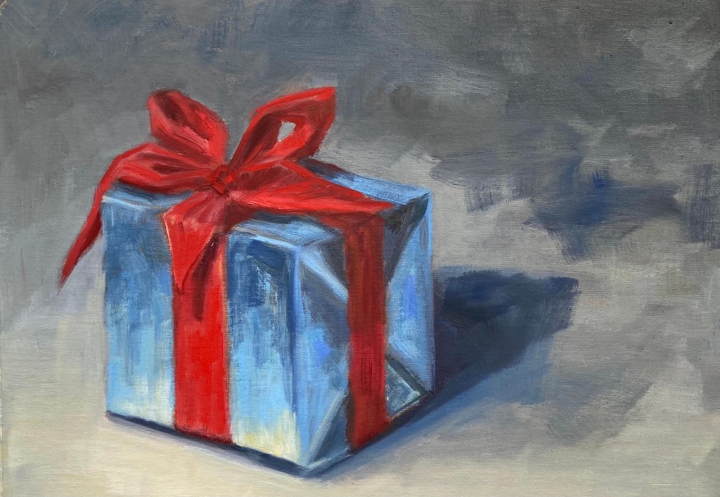
Blue Gift Red Bow | Oil on Canvas Paper | 12 x 9 | $30
Blue present with a bright red bow is a foray into holiday themed still life. Stay tuned for ornaments, candles, and more gifts.

Greetings art fans! If you’re interested in watching me create a holiday themed painting LIVE, tune in on my Austin Studio Tour live stream event this Sunday, November 22nd from 2-4pm Central.
The details and links to the Zoom stream are posted on the home page of the Impasto website, https://crashboomzip.wordpress.com. This is a come-and-go event, so drop in if you’re interested anytime.
#AustinStudioTour2020
Oil on Paper | 6” x 8”
If you’ve been reading my blog for the past year, you’ll recall the familiar look of this battered tennis ball in the Ball! Ball! Ball! composition. This was done on paper, while the original was on canvass board. I definitely prefer the teeth of the canvass board because it allows for a more textured look, lending to more realism in terms of teasing out the hairs of a well used tennis ball.

The palette was simple, but I never got the clay court orange just right. I’ll have to experiment before doing it again on a larger scale. The green of the ball itself is a base of Permanent Green Light, straight out of the tube, with variations of Cadmium Yellow Light and a touch of red. The shadow side of the ball is more traditional green from Ultramarine Blue and Cadmium Yellow Deep.
Lastly, a comment on fine details. This ball doesn’t look like a tennis ball until the final white seam is added. It’s amazing how a very simple object such as this ball doesn’t come into focus until the one identifying element has been added. Without the seam, they’re all just yellow green fuzzy balls.


Oil on Paper | 6″ x 8″

This was one of the studies for the Brushes With Cancer composition. While it didn’t end up being the primary piece for the BWC cause, I like the colors and composition enough that I’m pretty sure I’ll return to this in the near future and do a more complete painting on canvas or panel.
Graphite on Paper | 8″ x 10″

I did a detailed drawing prior to the painting, which turned out really well. In fact, I think I like it more than the painting.
Oil on Canvas | 40” x 30”


I’ve been working on a very exciting piece in a program called Brushes With Cancer, which “provides psycho-social support to those touched by cancer to improve the quality of life for cancer patients, their family and loved ones, through a unique art experience.”
Emergent is a collaboration with JoAnn Sackett, another participant in the BWC program, who is a cancer survivor and the inspiration for the piece. You can learn more about our pairing and the creation of this piece at our page on the Brushes With Cancer Austin event site.
It’s an honor to be involved with Brushes With Cancer and their Austin 2020 program. I hope you enjoy learning about their mission and enjoy the artwork in the links provided in this post.


Oil on Paper | 8” x 10”
This is a study of one of New Orleans’ iconic street cars, specifically the Saint Charles line, which are a national treasure and are on the register of National Historic Landmarks.
The intent of this study was to capture the fantastic late afternoon light as it enveloped the street car scene. There’s a lot of green, but the metallic nature of the street car is reflective and a distinct texture against the backdrop of the old New Orleans oak trees.
This study gets me excited to do a larger composition, which will have similar lighting but some additional details that I didn’t want to tackle with this test drive. I’m happy I took careful notes regarding the color mixtures, too. Always take color notes!


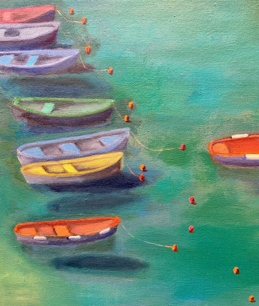
Vernazza | Oil on Canvas | 18” x 24”
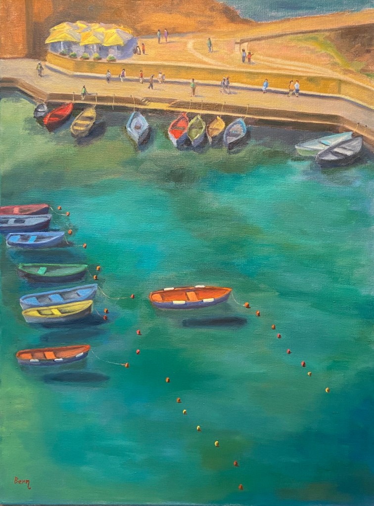
It’s hard to declare any of the hundreds of bucolic coastal towns of Italy “the” iconic Italian coast, but Vernazza makes a lot of those lists for good reason. Granted, the crowds make it down right awful, but the windows of time outside of the hordes, or better yet beyond the tourist season entirely, show how perfection can be achieved. When it comes to painting, however, it gets a bit intimidating.
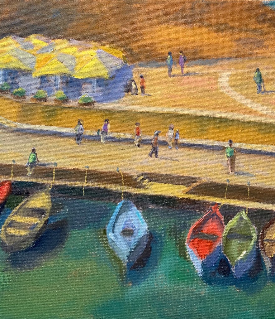
The reference photo is from a lookout along the from Monterosso al Mare to Vernazza, a beautiful stretch of the Cinque Terre that affords stunning views of the coastline, vineyards, and even some live music along the way. As we neared Vernazza on a cloudless day, the late morning sun lit up the colorful boats of the small harbor. It just had to be painted!
The challenges with this composition were varied and steep. I actually started it in early April, then had to set it aside for a month because it wasn’t progressing as I wanted and a breather can help recharge the artistic part of my brain in ways that sheer obstinance cannot.
To be clear, it’s very unlikely I will ever paint another landscape from this angle, i.e. from hillside looking down at a steep perspective. Aside from all the unusual shapes it creates and skewing of details that you simply don’t see from a more familiar horizontal angle, it’s really hard to create a painting with depth when THERE IS NONE! I rarely yell in these posts, as I tend to be pretty even tempered and patient, so yelling isn’t part of my communication style, but in this instance I had to yell at myself after I came to the realization after having spent numerous sessions and countless hours on this painting that the reason I was having trouble creating depth was because there was virtually none. When you look down on a landscape at this angle, you absolutely kill the depth because there’s no reference in the distance. Hell, there isn’t even a horizon line, which means many of our painterly tricks to create depth as the scene recedes are non existent.
Despite the compositional challenge, I’m pleased with the outcome and I love the wide range of colors. And to some degree there is “depth” to the composition, namely in the dark shadows of the boats on the shallow harbor sea floor as well as the buoys floating on the water, helping guide the viewer around the painting. They look like they’re floating on a sea of blue-green, and, well… believe me, they are. Go see for yourself one day.
Painting | Oil on Canvas Panel 11” x 14”
I’ve had the privilege of spending multiple vacations in Italy and am of the opinion that it is simply one of the most fantastic places in the world. The people, food, wine, traditions and, of course apperitivo time!

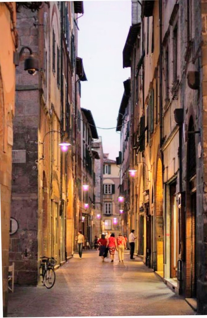
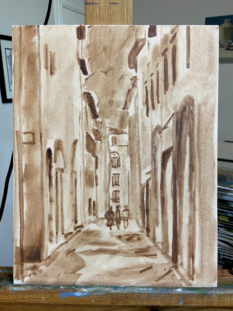
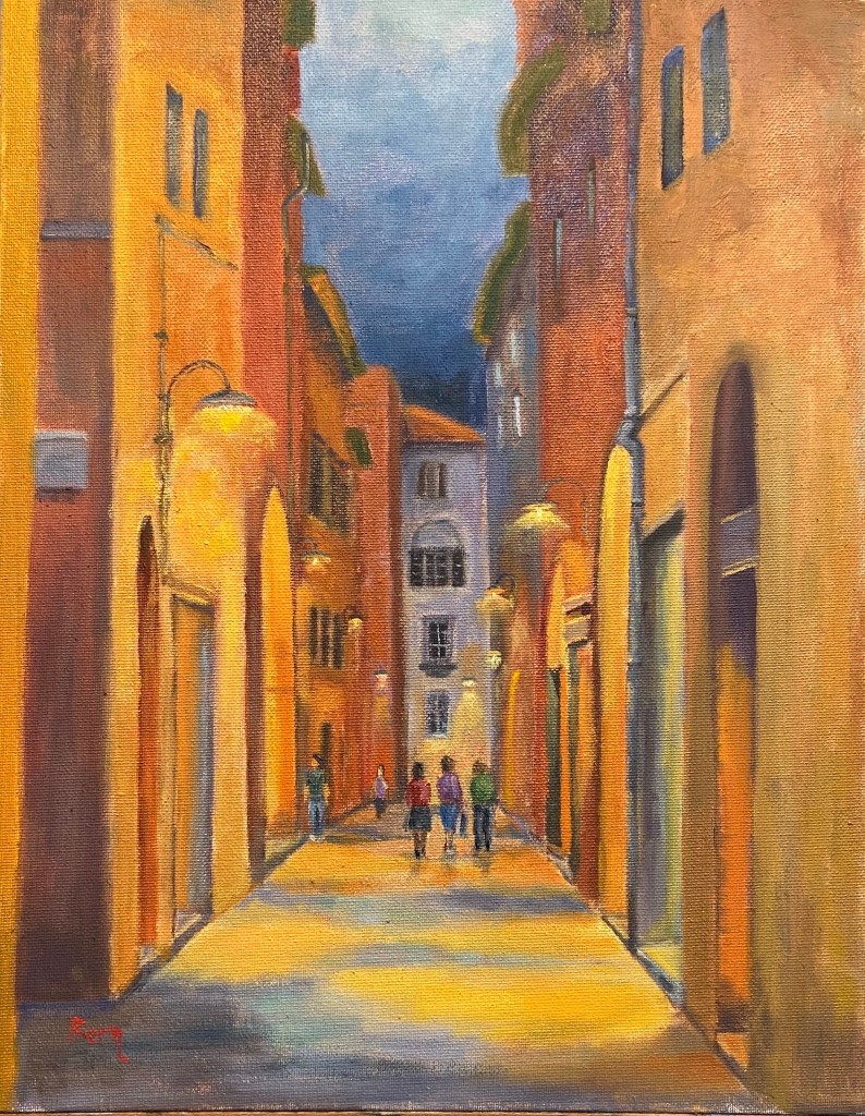
This particular scene is from a street in Lucca, Italy. The reference photo is earlier in the evening, just when the street lights go on, but I pushed the timing back a few hours so the lighting was more prominent. And just like magic, it was apperitivo time – break out the Aperol and snacks! If you don’t know what I’m talking about, rather than stumble through an explanation, just Google it yourself and promise yourself that one day you’ll go experience it first hand. Now back to the art…
This was another session to work on street scenes with people milling about their business (see the previous composition on this topic here, Lilliputian Italian Evening Painting). Ironically, the people were the easiest part of the composition, as the rest of the street and buildings took a lot of rework and adjustments along the way. Not sure why, but sometimes things don’t go smoothly. The other challenge was the surface of this particular canvas board. I had to really load up paint on the brushes in order to make progress, which was due to either the very toothy surface or the fact that it was very absorbent – this canvas board really drank down paint.
This piece is also meant to be displayed in softer, yellow lighting. It was an experiment that I haven’t purposefully tried to do in the past, but the result is pretty cool. See the side-by-side comparison below, one with “normal” lighting, the other under the yellow/orange soft light. I feel like it adds to the mood and to some degree makes the street glow.
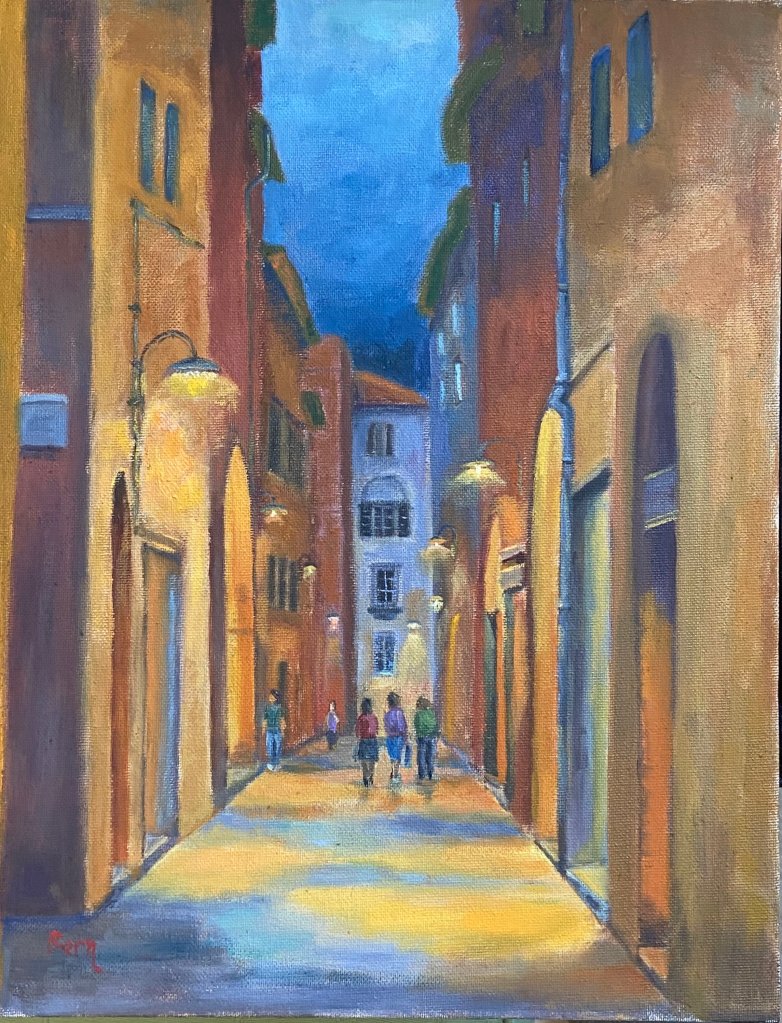

Progression gallery below shows the block-in, early color layout, and final composition.

Italian Evening | Oil on Canvas Paper | 6 x 8
I’ve been working on a large seaside landscape piece for the past week and ran into a brutal reality… people! The focal point is a group of brightly colored boats sitting on very saturated blue green water, which has been enough of a challenge in and of itself. I had made good progress on that part of the composition and then realized how many people were in the photo along the harbor walkway. Initially, I thought I’d simply wave my artistic license wand and exclude them, but came to the realization that it would be very creepy and vacuous without people enjoying the sunny day.
Here’s the problem – I can’t paint people!
The large landscape is on temporary hold while I figure this out; I’ve bounced over to this small piece as a way to practice painting Lilliputians.
This is an evening landscape, I have no idea where, but I’ve declared it to be Italian, which aligns with my current artistic needs. I kept things loose and painterly, but tried to leverage high contrast values to emphasize the lighting on both the building walls as well as the light spilling out of the restaurants. The people were put in last, and I’m pretty happy with the outcome, although I used 5 or 6 different brushes to figure it out.


One thing about painting people into a landscape – it will make you remember to step away from the painting repeatedly to see if they look “right”. To look at them up close is a real horror show – oddly shaped legs, disproportionate torsos, and some of the worst wardrobe decisions ever made. But step back 6 feet and they look fine.
There are also some areas of the window sills and exterior wall faces that were done with a palette knife, wet into wet paint, which worked well in terms of giving a realistic, aged look.
Some notes on color mixing:
Lastly, I finally remembered to spread the palette around the entire painting to balance the hues. This was especially true across the vertical faces of the building exteriors, giving the scene a better sense of continuity.
Thanks for reading!
