Vernazza

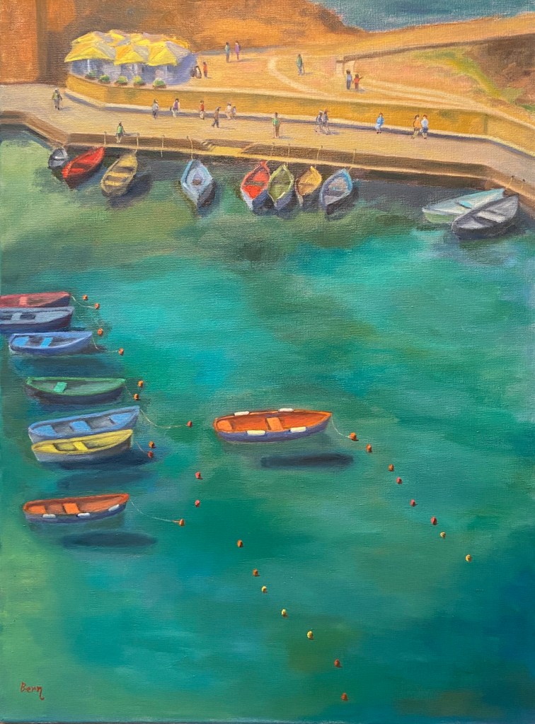
Vernazza | Oil on Canvas | 18” x 24” 

Vernazza-Italy-Cinque-Terre-painting-art-Bern-Abplanalp
Vernazza Harbor

It’s hard to declare any of the hundreds of bucolic coastal towns of Italy “the” iconic Italian coast, but Vernazza makes a lot of those lists for good reason. Granted, the crowds make it down right awful, but the windows of time outside of the hordes, or better yet beyond the tourist season entirely, show how perfection can be achieved. When it comes to painting, however, it gets a bit intimidating.

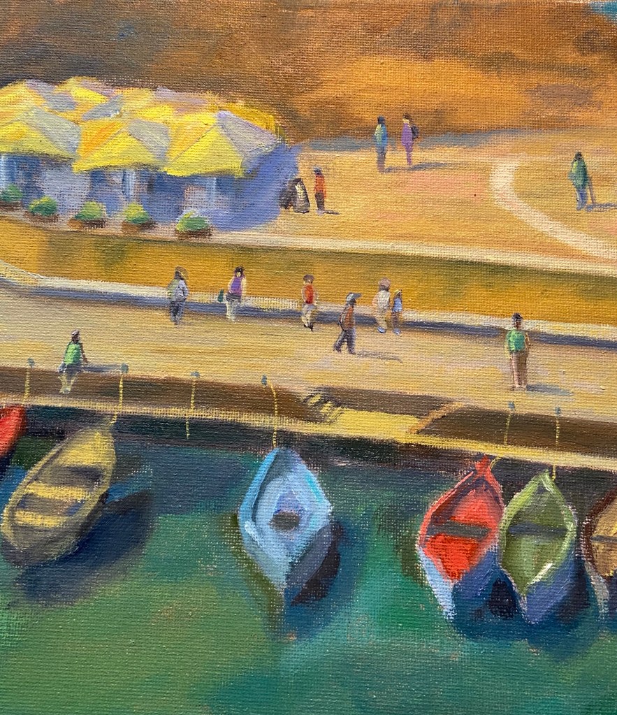
The reference photo is from a lookout along the from Monterosso al Mare to Vernazza, a beautiful stretch of the Cinque Terre that affords stunning views of the coastline, vineyards, and even some live music along the way. As we neared Vernazza on a cloudless day, the late morning sun lit up the colorful boats of the small harbor. It just had to be painted! 
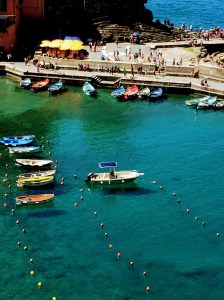
Vernazza-Italy-Cinque-Terre
Vernazza, Italy
(Cinque Terre)

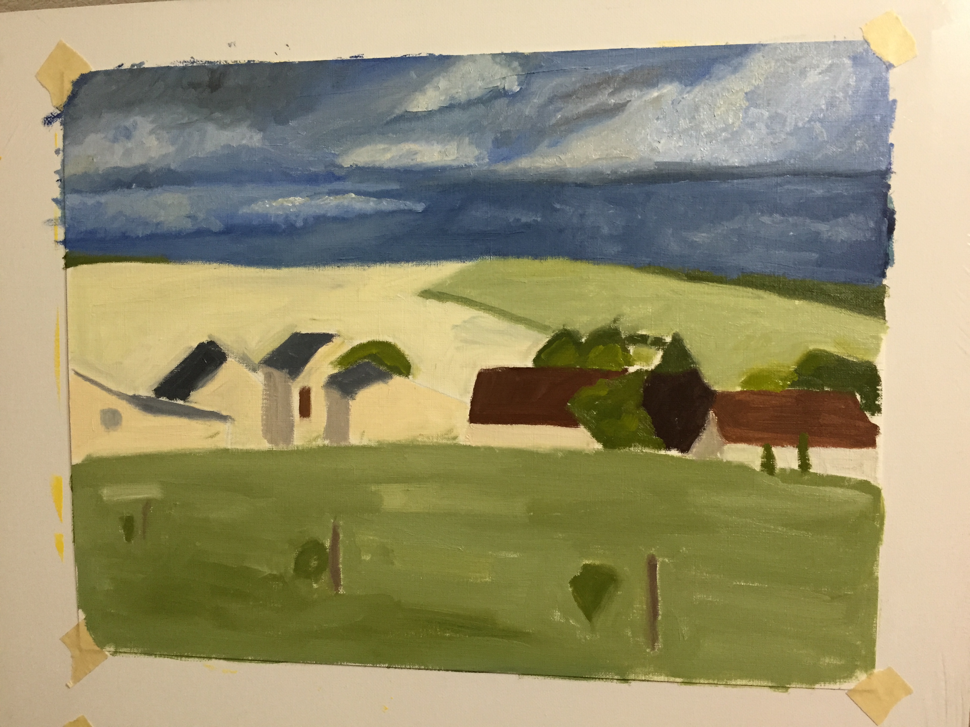
The challenges with this composition were varied and steep. I actually started it in early April, then had to set it aside for a month because it wasn’t progressing as I wanted and a breather can help recharge the artistic part of my brain in ways that sheer obstinance cannot. 

To be clear, it’s very unlikely I will ever paint another landscape from this angle, i.e. from hillside looking down at a steep perspective. Aside from all the unusual shapes it creates and skewing of details that you simply don’t see from a more familiar horizontal angle, it’s really hard to create a painting with depth when THERE IS NONE! I rarely yell in these posts, as I tend to be pretty even tempered and patient, so yelling isn’t part of my communication style, but in this instance I had to yell at myself after I came to the realization after having spent numerous sessions and countless hours on this painting that the reason I was having trouble creating depth was because there was virtually none. When you look down on a landscape at this angle, you absolutely kill the depth because there’s no reference in the distance. Hell, there isn’t even a horizon line, which means many of our painterly tricks to create depth as the scene recedes are non existent. 

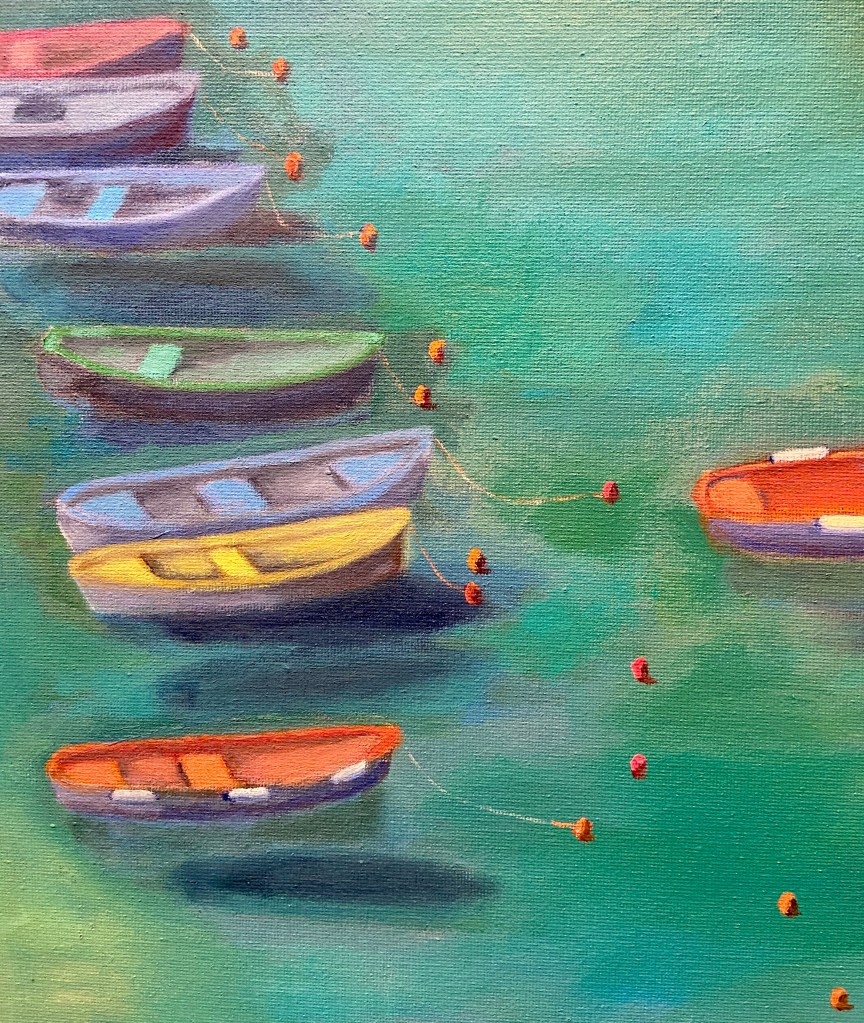
Despite the compositional challenge, I’m pleased with the outcome and I love the wide range of colors. And to some degree there is “depth” to the composition, namely in the dark shadows of the boats on the shallow harbor sea floor as well as the buoys floating on the water, helping guide the viewer around the painting. They look like they’re floating on a sea of blue-green, and, well… believe me, they are. Go see for yourself one day.

Zip’s Flowers

Zip’s Flowers: 20″x16″, oil on canvass

Sometimes art is very cathartic, but at times it can be maddening. However, I’ve learned over the years to rethink the frustration and consider those pull-my-hair-out-of-my-head moments as learning experiences, and more often than not it works. When I just can’t get a piece to work, either compositionally or from a technical skills perspective, if I focus on what I need to learn to fix it rather than become irritated at my shortcomings, I tend to get back that Zen painting zone.

Zip’s Flowers has been a long learning experience! Wars have taken less time to finish. That said, it’s chock full of newly acquired knowledge, of which I’m very excited about. There’s also some personal interest in terms of the background of this photo. This flower shop is a few blocks down the street from where I lived one summer in San Francisco. We lived in a great neighborhood along the border of the Mission and Castro districts, on 18th between Hartford and Noe. This flower shop, now called Urban Flowers, was along the way to the dog park. My wife would take the dogs at least once a day to the dog park. One day, the 1 year old puppy, Zip, decided smelling the flowers was no longer satisfying, so she opted to taste them. As the story goes, she reached out and grabbed a dangling flower from one of the pots and proceeded to knock the whole thing over! I wasn’t there, but my wife said the people at the shop were very friendly and weren’t concerned about Zip’s flower chomping. Of course I had to see this for myself, and a few days later I was walking Zip past this flower shop and sure enough, she tried to gobble down a basket of roses as we walked by.

The composition itself was probably the hardest hurdle to overcome, which I took license to adjust reality to make things work. The reference photo shows a wide variation of building colors and construction materials, so some adjustments had to be made on various fronts to make it look less contrived – ironically, the reality in the photo was too hard to believe in a painting. The values also had to be exaggerated to give depth and a sense of place, whereas the photo was very flat. Finally, the amount of tissue papered flowers was overwhelming and a bit distracting, so that was scaled back significantly.

My favorite part of this painting is the right foreground. First, the flowers in white paper came out much better than I had anticipated and they really frame that side of the painting. I also like the realism they add to the scene. Secondly, I’m very happy with the tall yellow sunflowers going up the stairs. These two elements combine to draw the viewer into the painting (hopefully) and consider wandering through the rest of the composition.

The sheer multitude of color is initially distracting for me, but once I stepped away from it for a day and returned to the completed piece, the colors were more welcoming and a source of excitement.

Do you like this piece? I’m guessing people either love it or hate it, given the colors and somewhat busy nature of the scene. Suggestions and observations are welcome.

Danube – larger scale

Took another shot at the Danube river village. Originally did a small piece on canvass last year, which was challenging but fun. Took another go at it, but this time on a larger scale, going up to 24” x 12”, which for me is a considerable size leap. It worked out well, albeit slow going. The finished piece is ok, but I clearly leaned too heavily on the warm, red end of things, instead of capturing the fading cool light at the end of the day, which was the setting on this piece. That said, it came out pretty well and I learned a lot about details and the need to consider atmospheric perspective.


4652473C-68F2-460D-9FF0-A270A462CA6C

French Countryside Loire Valley – Practice sessions continue on 2 fronts

More progress this weekend on the practice sessions for the Loire Valley countryside piece. Added the first pass at details to the sky on the oil on paper. I’ve done clouds in graphite before, but never detailed painting. Learned a lot about what not to do, most notably trying to be too precise and layered paint to thickly. Need to go with looser brush strokes and thinner paint, I think. Advice is welcome, so comment if you have some helpful guidance please.

The second pic below is a practice session on my iPad. Still getting the hang of the Paper 53 app tools, but it’s been very helpful in drafting possible compositional elements that I wouldn’t otherwise have taken the time to do with paint. It’s very limited when compared to real painting and drawing, but it’s an invaluable drafting tool for layout and testing ideas.

IMG_3617 IMG_0002