Red Vase in Cellophane: DONE

IMG_3083

Did a pivot back to the “canvas” today, so Daily Sketch continues tomorrow.

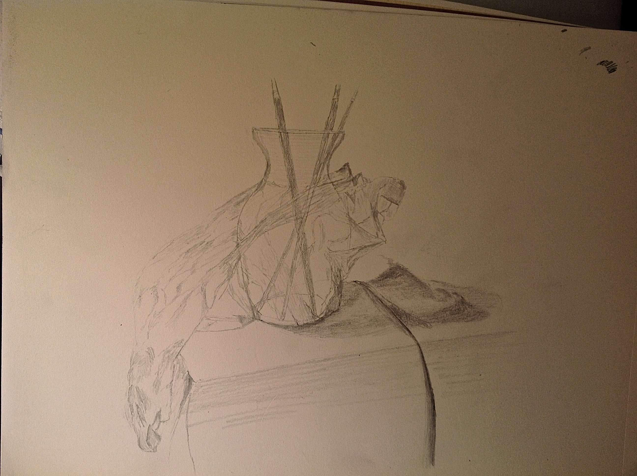
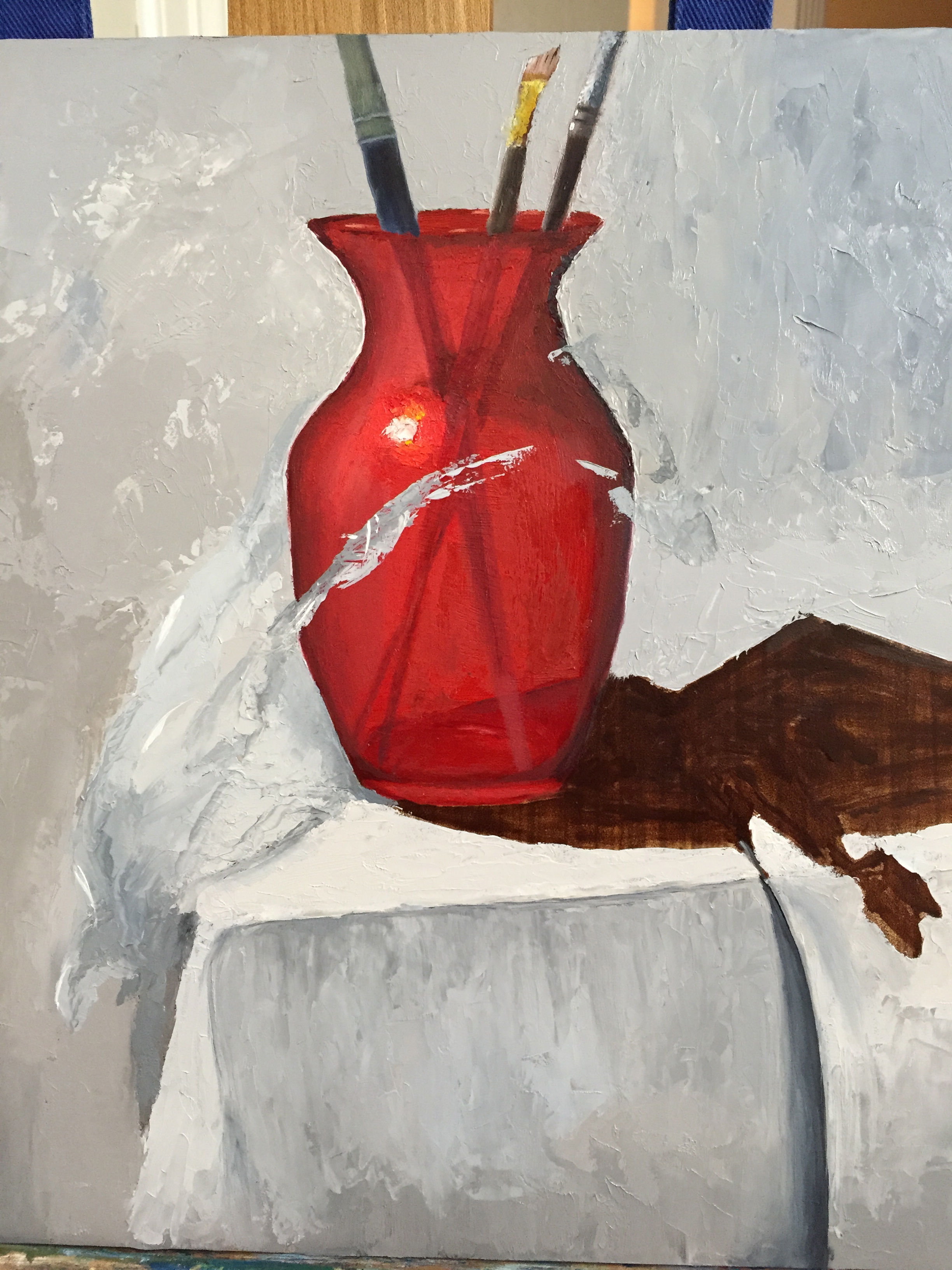
I returned to the challenge of the cellophane wrapped vase, having run into numerous problems that I just couldn’t figure out. But after some time to think through why the cellophane just didn’t look right, I came up with 3 primary issues to fix:

  1. Too many highlights. The painting looked like it had run into a bird poop tornado! Luckily I had learned how to remove these with a painting knife from the Cheifetz workshop last month; added some pics of the removal of one of the offending highlights.
  2. The highlights were to rounded. The cellophane highlights should be at hard angles which helps give the sense of stiff shapes, as opposed to softer material like fabrics.
  3. The values were wrong. Needed warmer grays on the light source side (left) and a wider range of lights.

In the end, I’m pleased with the results given it was a first effort with this somewhat complicated medium. Next time I will make sure the wrapping of the still life object is done with more purpose and in tighter bunches. This composition was poorly designed on my part. The cellophane was a loose gathering on the left side and lacked enough tight fitting accents, which would have made it easier to interpret.

Light pressure on knife…
IMG_3081
… and the highlight slides right off!

Sketch… a day? : #1 – Vase wrapped in saran wrap.

Toying with the idea of trying to do a sketch a day for 30 days. Some might be really remedial, namely what can I sketch in 10 minutes while fighting off sleep. While others might be a full hour of practicing a new composition that will ultimately turn into a painting later. Either way, I’ll give it a try and see if I can do it. Actually, one exception to the “per day” rule – painting sessions count towards the sketch-a-day commit.

Here’s sketch #1 – the vase wrapped in cellophane, which is the very same subject I’ve been painting. Thought a sketch working through the values in the cellophane with graphite might help tackle the actual painting, which I hope to work on this weekend. This sketch was done in about 45 minutes. The photo sucks, but the lighting effect is kinda cool, with the light source over stated from the left side. For the drawing artists out there, this was done with a 2B mostly, but I used an HB for some of the lighter cellophane areas. I used a gummy eraser to pull off some of the cast shadow shading to get a transparent effect of the vase. Working the value ranges of the cellophane was insanity. It will probably be easier to manipulate with oil paint.

vase sketch_2015_03_12

Red Vase and Cellophane – Update

With a few deep breaths, and some tasty wine for liquid courage, I dove into the cellophane stage of this composition. I carved out a little more than an hour tonight to get the ball rolling. I was pleasantly surprised with the progress, but I will admit that my inner artist was struggling with laying gray tones on top of the pretty red vase in the name of cellophane.

It was rough going initially b/c there weren’t enough value contrasts between the white table cloth and the wide range of cellophane grays and cast shadows. Then I remembered the advice from David Cheifetz during his workshop a couple weeks ago – “Value is king! A painting with the right values but wrong colors will still look pretty good.” I’m not about to put that on a tshirt or a bumper sticker, but its great guidance. I stepped away from what seemed like the right dark and light grays and made both ends of the spectrum more extreme, darker grays and lighter grays. It seems to have worked so far.

The real power of the cellophane image won’t really come together until the grays are laid in properly and then the bright, white highlights are added on top. That’s what gives the cellophane it’s shape and texture. I’m still not entirely convinced this will look like the real thing when I’m done, but stepping back from this first stab at it, I was able to see the shape of the cellophane starting to come together. The key is going to be establishing that clingy sensation with the highlights. Fingers crossed…

[The grays of the cellophane are primarily 2 setups: Ultramarine blue + burnt umber + white OR white + ivory black. I’ll probably add a 3rd option for the cooler side of the cellophane (right side, away from the light source) of UB+raw umber+white. ]

IMG_3064

Progress Report – Red vase in cellophane

Not to the cellophane yet, but good progress overall. More meaty update later this week.

IMG_1790