Channelling Artistic Hate

Mirror Pond, Austin TX | 6 x 8” | Oil on Linen Board

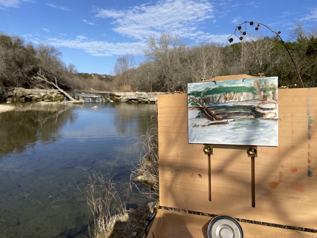
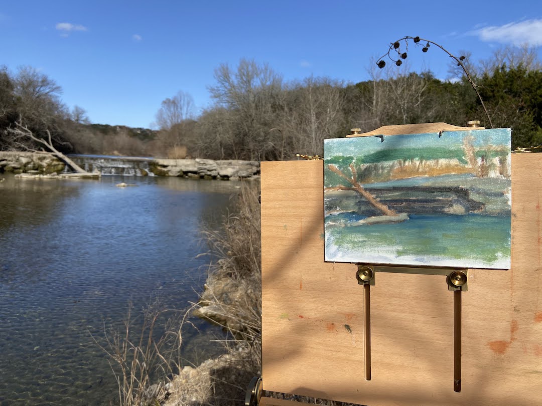
Taking in more of the great Spring weather, I headed out to do some more plein air. This session was at a place called Mirror Pond in Austin, very close to Lady Bird Lake and part of the Zilker Nature Preserve, which was the first nature preserve created in Austin back in 1935 (learn more at AustinTexas.gov). No dogs allowed, so my canine assistant, Zip, could not join me today to keep the pesky squirrels away. 

Mirror Pond is gorgeous and tranquil when it has water, but I was pretty sure today it would be dry, which it was. What I wasn’t expecting was such a pretty site despite the lack of water. I probably wouldn’t have noticed half of the cool geological formations had there been a pond to ogle over. 

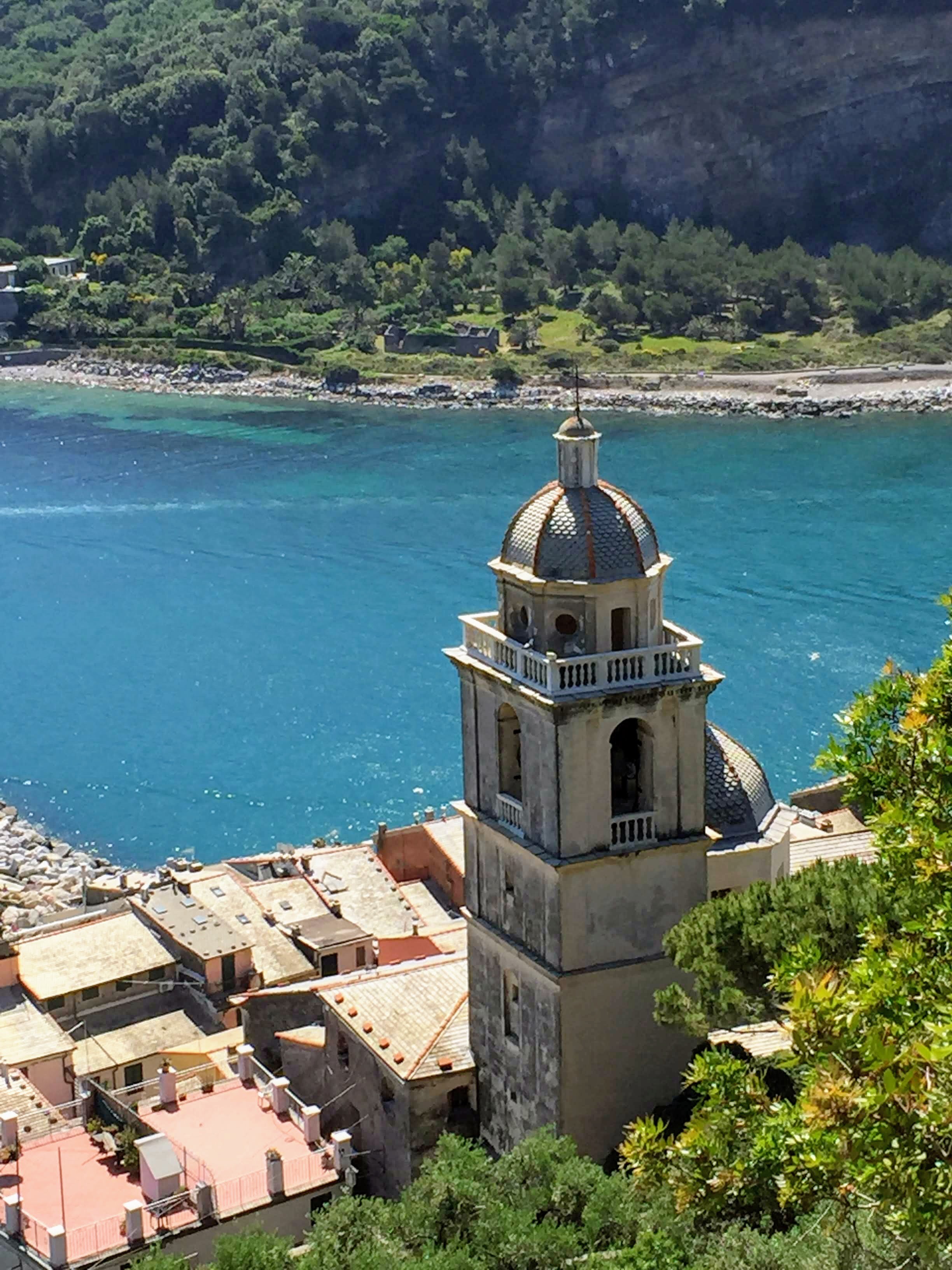
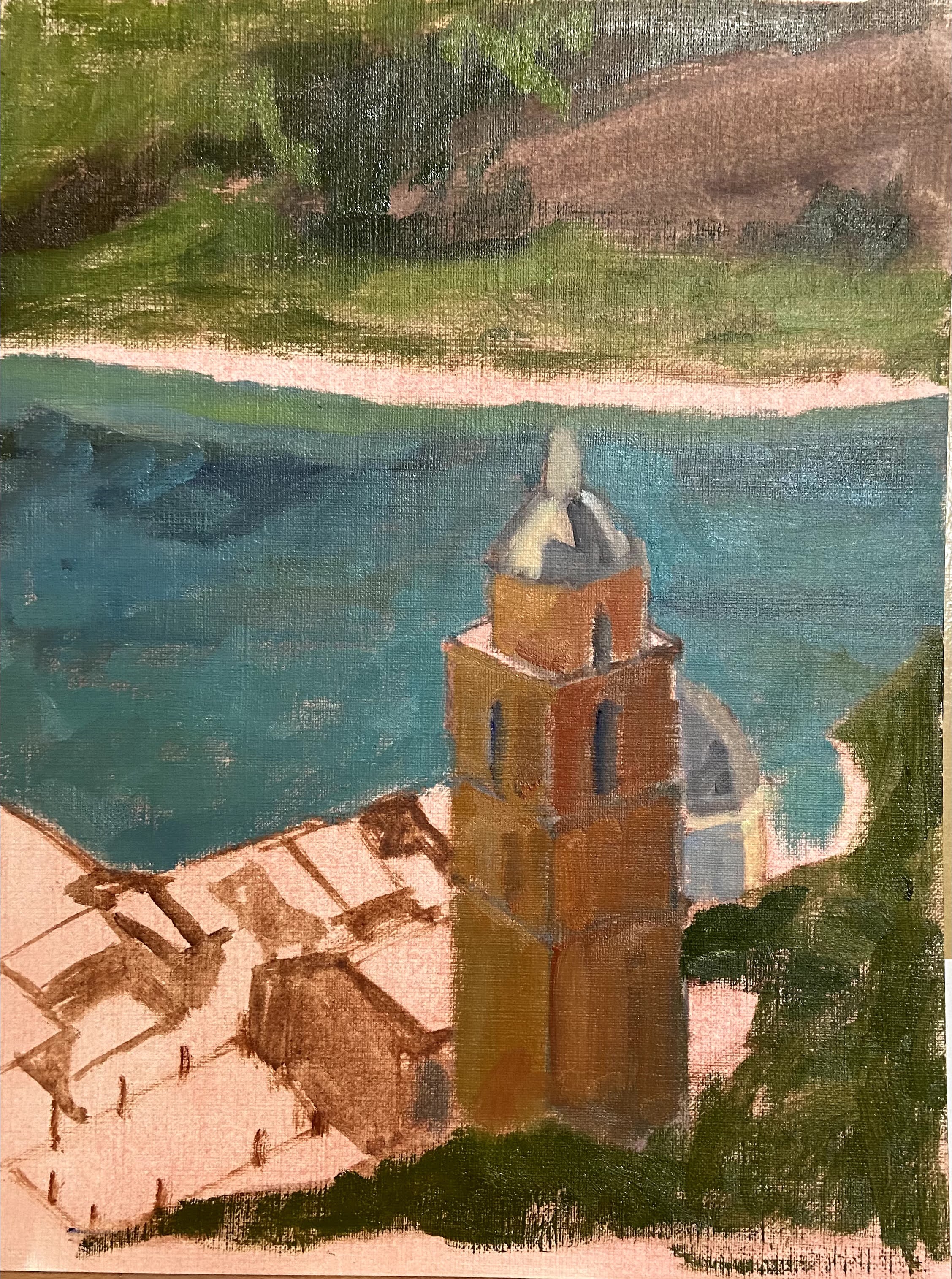
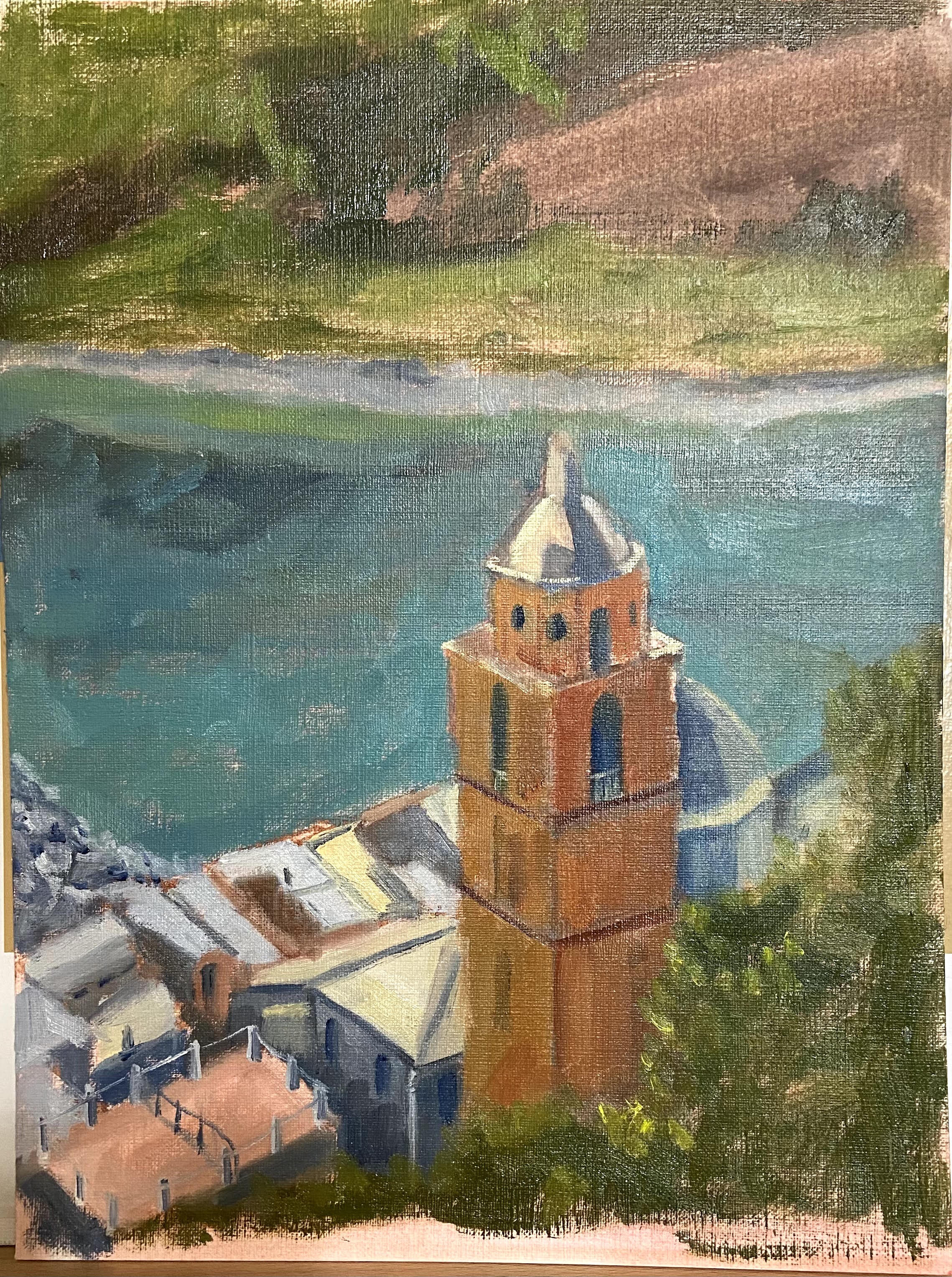
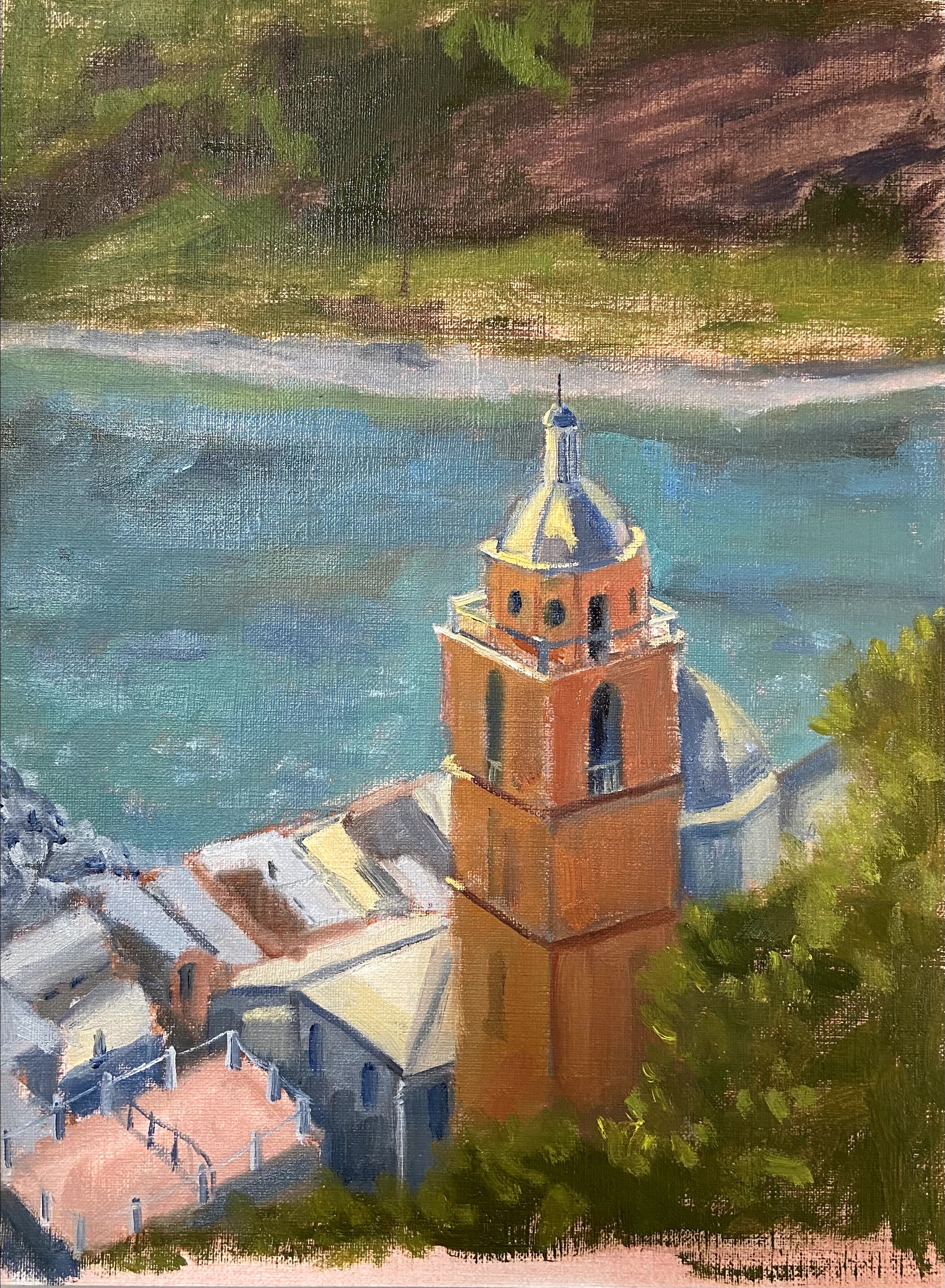
For those of you not familiar with plein air painting, one of the challenges is finding subjects that you can paint quickly and not get scuttled by the fast moving sun and shadows. I’ve included a gallery of photos below that show this effect and why it’s important to a) move fast, and b) take lots of photos early so you have something to work from in the studio to finish the work.


This composition started out as nothing more than a “get out there and paint” goal, but once I got the piece back in the studio and began fiddling around with some compositional ideas, it sucked me in for hours! 

I was asking myself “why the hell am I painting a cedar tree again?” As noted in previous posts, I hate cedar trees for many reasons, but it seems that I can channel that fury-based energy into artistic currency. In this particular case, I pivoted my initial focal point from the sideway limestone arch to the interestingly shaped cedar tree above it.

The first thing that caught my attention was the cool shape of the cedar tree; it’s actually the inverted shape of the limestone arch upon which it sits. See it? It’s not perfect, but close enough to draw my interest. Secondly, I used some artistic license to accent the red (representing my burning hatred of these trees) of the cedar limbs to make the entirety of the greens pop. It also had the unintended side effect of increasing the value contrast against all the other greens in this composition. 

Painting Mirror Pond has also reminded me that the craft of plein air is often about making a mediocre landscape come to life. Not sure if I managed to pull it off this time, but I learned a lot along the way.

#artbern #berntx #crashboomzip #painting #art #abplanalp #austinartists #pleinairaustin #cedarallergies #austinparksfoundation #zilkernaturepreserve #atxartist #atxart #atxlife

Attack of the Cedars!

Cedar Season | 5 x 7” | Oil on Canvas Board

#artbern #berntx #crashboomzip #painting #art #abplanalp #austinartists #pleinairaustin #cedarallergies #HOL #bartonsprings

Cedar Season is my second plein air session of the year… I’m falling behind and need to get outside more often as Spring is upon us. However, to my credit, it’s not easy going into the field in Austin in January and February because cedar allergies are at peak. But last month I doubled up on the Claritin and headed into the woods along the Hill of Life and Barton Springs Greenbelt.

I brought my trusty painting sidekick, Zip, to help keep an eye out for any suspicious squirrel activity. Actually, I should say she’s my aspiring painting sidekick, of which this session was an initial interview. The real question was to see if she could manage 2-3 hours of watching me paint, or otherwise occupy herself without wandering around wreaking havoc with her 12 ft leash. 

Let’s be clear – I hate Texas cedar trees. They account for all of my sinus headaches in January and February, and anywhere they grow, they take over the landscape. Supposedly they’re not an invasive species, but last time I checked “invasive” was defined as “(especially of plants or a disease) tending to spread prolifically and undesirably or harmfully.” So, like I said, they’re invasive. 

Why did I opt for a painting of cedars? Well, it turns out they create a very pretty landscape when you’re buried in a forest trail of the damned things. I also wanted to tackle the challenge of all the greens, trunks, and cast shadows.

A few compositional decisions that seemed to work well. First, the cedar trunks are a brownish red color, so I used a heavy dose of Alizarin Crimson to accent the focal areas of the larger trees; I believe that mix also has some Indian Red, too. The second decision was to make the cast shadows very dark, which works well (at least I think so… what about you?) in creating more contrasts and a sense of tree coverage. 

In terms of the sidekick interview, Zip got the job! She was very relaxed and entertained by my strange activity, but occasionally treats fell from the sky… so she was content. 

Thanks for reading! 

Breath of Plein Air!

HOL Dam Falls | 7” x 5” | Oil on Canvas Board

One of my 2022 art-related resolutions is to do more plein air work. I’ve managed to log a couple of days in the field near my house to start the year; this is the first of those sessions. 


There is a trailhead in my neighborhood to the Barton Creek Greenbelt called the Hill of Life (HOL). At the bottom of the HOL (about 1/2 mile long and 300′ elevation drop) is Barton Creek, which is the source of these falls, unofficially called the HOL Falls. Over the past few years, however, due to the massive growth in Austin’s population (I’m lookin’ at you California and Florida), endless festival cycle, and general obsession the world seems to have with Austin, this area has been overrun and trashed with douchebags and idiots who are obsessed with Instagram selfies at the swimming holes along the creek. But I digress…


On weekday mornings, however, there is a respite from the obnoxious, disrespectful throngs and I can enjoy the greenbelt as it was intended. On this day I set up along the creek bank about 100 yards downstream from the falls. I made the aesthetic decision to represent a more springtime landscape, namely all the green trees in the background, but the remainder of the scene is accurate. 


It was a gorgeous morning with a very light wind. The sun was a little obscured by high clouds, but there were enough moments when it peeked through that I got a good read on shadows and value contrasts. Plein air session are always entertaining because something unplanned invariably happens – wind blew my trash bag up and onto my paints, tall reeds also brushed against my painting in the breeze a few times (nature’s paintbrush I suppose), and of course I forgot a wet canvas holder so I had to MacGyver a packing solution for the hike home. 


Overall I’m happy with the outcome, but the greens and atmospheric perspective are off. I’d like to get to the point where my plein air has a sense of place like Laurel Daniel, but that’s going to take a lot more practice… which I don’t mind given how fun it is to paint outdoors! 


Thanks for reading!


#artbern #berntx #crashboomzip #painting #art #abplanalp #austinartists #pleinairaustin #hilloflife #HOL #bartonsprings #closetheHOLtrailhead #sosalliance

Sedona Plein Air Workshop – Part 1

Sunrise Trail View, Sedona, AZ | 12” x 9” | Oil on Board

In November, I attended a plein air workshop in Sedona, Arizona, led by Bill Cramer. Bill is a very talented artist based in Prescott, Arizona, so he knows these landscapes very well. His artwork is captivating and a mastery of light and colors – I encourage you to take a look at his work when you get some time.

Our class size was a little large – 10 people – but it was a good mix of friendly artists, the vast majority of who were established professionals with a wide range of styles. Despite having so many students (I consider anything over 6 alot), what you miss out on 1on1 time with the instructor is in many ways made up by observing and chatting with the other artists in the class. This is especially true in plein air workshops because it seems plein air is not a beginner level pursuit of artists, so the attendees tend to be professionals, experienced hobbyists, or overzealous fans of the instructor. Ha! If you’re an artist, you know exactly what I’m talking about. 🙂

The best thing about this workshop was getting to experience this adventure with my mom. She has been painting as a back-up creative outlet to her true love, the piano, but over the years she’s come to appreciate plein air painting, something I’d been talking about for years (despite my lack of actual experience in getting outside to paint on a regular basis). We don’t live in the same state, so painting together is a very rare activity, although we talk about it all the time. To say this was a real treat for me is an understatement… painting side by side, cursing at the same geographical challenges, and experiencing the beautiful offerings of Sedona together was fantastic.

On to the composition, Sunrise Trail View. This piece is a painting in two stages. The first was plein air for a couple of hours in the early morning on location at the Sunrise Trail looking north east. For those of you who know the Sedona area, this is behind the West Sedona Elementary School and Community Pool. I believe the rock formation / mountain is Steamboat Rock, but I’m not 100% sure; maybe someone from Sedona can chime in and clarify.

The second stage was the studio refinement, which wasn’t too extensive for this piece, but it took a few sessions to get it done. One of the trickier parts for me was getting the hang of the technique and strokes to paint the rock formations. It turns out the best approach was to vary brush sizes a little and lay in strokes both horizontal and vertical. My reference photos don’t capture the very rich reds, yellows and oranges of the mountains, so having been on location for a couple days was invaluable in this regard.

Bill Cramer provided some great advice during the workshop and we covered 4 separate locations in the 2 days together. The sites were full of great painting options, plenty of room, and all very different from each other. It didn’t hurt that we had gorgeous weather on both days, so the early starts were worth it.

There are a few other pieces that are partially done from the workshop. I will likely tackle 2 of the 3 in the coming weeks to build on what I’ve learned. Stay tuned!

#berntx #crashboomzip #painting #art #sedona #billcramer #pleinair #arizona #painting #abplanalp

Porto Venere… Don’t Tell Anyone

Porto Venere, Italy | 20” x 30” | Oil on Canvas

Earlier this year, I did a quick study of this composition and instantly loved the bones of the work. Sometimes you get a sense for a painting right away and you just know it’s going to be fun to paint!


The original study can be found in this previous post, Porto Venere (study), which was much smaller, 9 x 12” on paper. It was clear that the key elements to this piece were lighting and linear perspective.
The values in the photo are crap (midday, washed out), so it required some improvisation and memory recall from the day I was actually in Porto Venere. I wanted to make sure the sense of the very bright sun was captured in the light and shadow contrasts, but still find a way to make the rooftops surrounding the main tower look interesting and not entirely washed out. To help get an idea of what good looks like, I referenced some works by Kanna Aoki (https://www.kannaaoki.com), who has a great talent for capturing the essence of bright sunny days in San Francisco. 


The linear perspective is always a challenge (albeit a fun one) when dealing with cityscapes, but this piece was all about the tower. I took the reference photo from the castle on top of the hill upon which the town is built, so my vantage point was above the tower, but getting the lines right was still very important to convey the size of the building. The trickiest part, however, was the dome. Rather than try and explain the myriad ways it tripped me up, go ahead and try to draw just that part of the building. Too many lines and curves for a mere mortal to tackle. 


There was also a wonderful Bob Ross moment as I experimented with the tower. I was mixing some orange color options on my palette and decided to quickly lay down a little paint on the canvas with a palette knife. The intent was to simply dab a little on the canvas, but my hand slipped and spread a big splotch! That happy accident, turns out, gave the impression of old time stucco, or whatever these old buildings are crafted from, and I loved the texture and realistic result. Nowhere else on the composition did I use a palette knife technique, so it helps add complexity to the piece and focus the viewer to the tower.

 
Last note is the use of reflections of the landscape in the water, which is not in the reference photo. I redid the water numerous times, and each time I used a variation of blue without reflections it dominated the painting and became a distraction. The reflections, I think, give a lot more depth and perspective, which I’m happy with, but one day I’ll have to learn how to do muddled reflections so the water doesn’t look so still. 


If you get a chance to go to this part of Italy, stay in Porto Venere and avoid the crushing crowds of the Cinque Terre. Just don’t tell anyone else – it’s a wonderful place because it’s still a bit of a secret.


Ciao! 


#portovenere #italy #cinqueterre #berntx #crashboomzip #painting #art #artatx #austinartists

Reflections in Metal

Reflections in Metal | 6” x 8” | Oil on Canvas Board

This composition is part of my foray into painting highly reflective Airstreams. The challenge is a little different than still life setups involving reflective metals such as cocktail shakers or glassware, but the composition principles seem to be the same. It’s also tricky to do on a smaller scale because it’s hard to differentiate the whacky contours of the reflections in such a compacted space. It will be interesting to see if future compositions will prove easier on larger canvases. 

The other appeal of this subject matter is the details of the Airstream construction itself – symmetrical curved lines, detailed riveting, and windows of various sizes and shapes. I also like how bright sunlight can impact these types of compositions, but more on that in future paintings.


#airstream #RV #dailypaintworks #berntx #crashboomzip #oilpainting #art #austinartists #abplanalp

Porto Venere

Porto Venere (study)| 9” x 12” | Oil on Canvas Paper

This composition has been on my short list for awhile, so I’m very excited to have put brush to canvas finally. The subject matter is a photo I took from the hillside in Porto Venere, Italy. The power of the sun shining on the church tower with the beautiful blue water in the background was an ideal setup for this piece. It kinda painted itself.

I’ve done a number of practice (studies) pieces in the past to get an idea of what I need to consider prior to tackling a larger composition. It’s extremely helpful to get a sense of proportions, values, and start thinking through edits that will make the piece work regardless of what’s in the photo or real life. My problem with doing a study is that I always end up getting sucked into the details – I just can’t help it – so they drag on and I lose the value of doing a practice piece.

To solve this problem, Porto Venere was time bound to 2 hours after the block-in was done. I literally ran a stopwatch to ensure I stayed true to the spirit of the study and focus on the compositional core elements, not the fine details. It forced me to make quick decisions and gave the piece a more painterly style, which I like and will try to incorporate into the full-size painting.

#portovenere #italy #cinqueterre #berntx #crashboomzip #painting #art

Rothenburg ob der Tauber

Oil on Panel | 9” x 12”

This composition is from a trip we made to Germany not too long ago, although after this awful year it seems like a hundred years in the past. Since traveling isn’t an option, I’ve decided to start painting great locations as a meager alternative.

If you Google Rothenburg ob der Tauber, this scene is what will show up in the list of photos. While I agree it’s an outstanding view, I wanted to drive the focal point to the clock tower instead of the orange wooden house in the foreground.

This is the end of a late Fall day, which wasn’t very clear without the addition of bundled up people walking through the streets. I struggled with the decision to add people to the piece, but in the end I wanted to convey the sense of season and a more idyllic time without tourists.

Lotus Flower (Studies)

Oil on Paper | 6″ x 8″

Lotus Flowers on Pond

This was one of the studies for the Brushes With Cancer composition. While it didn’t end up being the primary piece for the BWC cause, I like the colors and composition enough that I’m pretty sure I’ll return to this in the near future and do a more complete painting on canvas or panel.

Graphite on Paper | 8″ x 10″

Lotus Flowers on Pond

I did a detailed drawing prior to the painting, which turned out really well. In fact, I think I like it more than the painting.

“Emergent”: A Brushes With Cancer Collaboration

Oil on Canvas | 40” x 30” 

I’ve been working on a very exciting piece in a program called Brushes With Cancer, which “provides psycho-social support to those touched by cancer to improve the quality of life for cancer patients, their family and loved ones, through a unique art experience.” 

Emergent is a collaboration with JoAnn Sackett, another participant in the BWC program, who is a cancer survivor and the inspiration for the piece. You can learn more about our pairing and the creation of this piece at our page on the Brushes With Cancer Austin event site. 

It’s an honor to be involved with Brushes With Cancer and their Austin 2020 program. I hope you enjoy learning about their mission and enjoy the artwork in the links provided in this post.