As we settle into a new year, hopefully a better one than 2020, I thought it was time to learn something new on the art front. To that end, I’ve been attending a weekly Botanical Drawing class. The theme of “new” is splattered all over this class – it’s done virtually (a first for me), focused on botanical drawing (another first), and in colored pencil medium (yet another first… kinda).
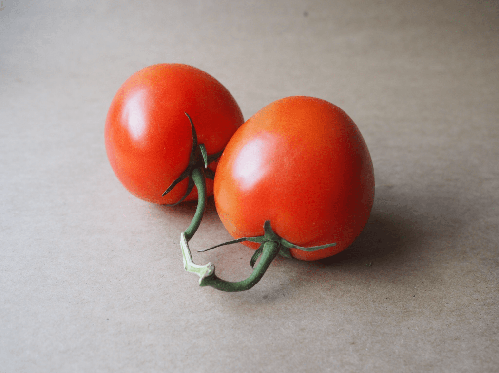
This week’s subject was a pair of tomatoes on the vine. The first two classes were graphite only, no colored pencils, so this was the first session that introduced color. I’m using a small set of 12 SoHo colored pencils, which are very vibrant and so far seem to do the trick. It’s going to be a challenge pivoting from oil painting, where colors are seemingly endless through mixing of a core set of hues. The colored pencils are a different challenge because there’s only so much layering of colors that the paper will tolerate. In oil painting, if you overdo it with oil paint colors it goes brown or a dirty grey, but you can wipe it off the canvas. The colored pencils, however, can only support a limited amount of mixing on paper, and it’s largely un-erasable. It’s a wee bit stressful at times!
I really like the challenge of capturing the reality of botanicals, which is at the heart of botanical drawing. It will be interesting to see how the various compositions evolve on the color and value front over the remaining 5 weeks of class.
This week’s composition vine tomatoes is done on standard paper and measures about 7 x 5”.
This composition is from a trip we made to Germany not too long ago, although after this awful year it seems like a hundred years in the past. Since traveling isn’t an option, I’ve decided to start painting great locations as a meager alternative.
If you Google Rothenburg ob der Tauber, this scene is what will show up in the list of photos. While I agree it’s an outstanding view, I wanted to drive the focal point to the clock tower instead of the orange wooden house in the foreground.
This is the end of a late Fall day, which wasn’t very clear without the addition of bundled up people walking through the streets. I struggled with the decision to add people to the piece, but in the end I wanted to convey the sense of season and a more idyllic time without tourists.
Trying out an eBay auction this week for a piece posted recently called Something Blue. If you’re interested in bidding check it out here. The auction runs through Sunday 5pm CT.
If you’ve been reading my blog for the past year, you’ll recall the familiar look of this battered tennis ball in theBall! Ball! Ball!composition. This was done on paper, while the original was on canvass board. I definitely prefer the teeth of the canvass board because it allows for a more textured look, lending to more realism in terms of teasing out the hairs of a well used tennis ball.
Ball! Ball! Ball! Ball!
The palette was simple, but I never got the clay court orange just right. I’ll have to experiment before doing it again on a larger scale. The green of the ball itself is a base of Permanent Green Light, straight out of the tube, with variations of Cadmium Yellow Light and a touch of red. The shadow side of the ball is more traditional green from Ultramarine Blue and Cadmium Yellow Deep.
Lastly, a comment on fine details. This ball doesn’t look like a tennis ball until the final white seam is added. It’s amazing how a very simple object such as this ball doesn’t come into focus until the one identifying element has been added. Without the seam, they’re all just yellow green fuzzy balls.
Oil on Canvass Board (left) | Oil on Paper (right)
I’ve been working on a very exciting piece in a program called Brushes With Cancer, which “provides psycho-social support to those touched by cancer to improve the quality of life for cancer patients, their family and loved ones, through a unique art experience.”
Emergent is a collaboration with JoAnn Sackett, another participant in the BWC program, who is a cancer survivor and the inspiration for the piece. You can learn more about our pairing and the creation of this piece at our page on the Brushes With Cancer Austin event site.
It’s an honor to be involved with Brushes With Cancer and their Austin 2020 program. I hope you enjoy learning about their mission and enjoy the artwork in the links provided in this post.
Yes, another flower! The Pink Rose started off as a white rose, but some prodding from my wife got me to adjust to something a bit more interesting and thus the improvisation towards pink.
I’ll confess I’m not thrilled with the outcome of this small piece, but I think it’s simply a matter of style preference. The style is less realistic than I’d like, although as a drawing it works well… but it’s not a drawing, so there’s that.
Pink Rose | Oil on Panel
The reference photo is a beautiful white rose, but in hindsight I can see that it’s flat and lacking variations in value. I didn’t figure this out until I was more or less finished with the piece, but it was a very valuable reminder that grinding through a painting isn’t always the right approach if your gut tells you something is off. I see a lot of paintings on-line that have this stylistic look, so I’m pretty sure it appeals to some folks, but, ironically, it’s not for me.
The 4th of a 5 part study series, Yellow Rose, came together very quickly. The gallery above shows the progression as well as the varied contrast in painting compositional styles. If you have a favorite thus far please make a comment and let me know.
Before diving into the details of the composition on the next page, I thought the history of the “Yellow Rose of Texas” and the song lyrics were really interesting to read in tandem. I typically haven’t looked into the history of my painting subjects, but having done it with something as innocuous as this yellow rose, I found it to be a curiously motivating way to start a project. I think I’ll add it to my painting process and see if it unlocks some additional artistic mojo in future compositions. And yes, I’ll try not to bore y’all along the way.
The Flower Study painting series continues moving forward. Now that we have 3 studies completed (click for previous posts on this series: Study #1 Poppies, Study #2 Hydrangeas), it makes sense to line them up at the start of each related post to see how things are moving along. I want to continue exploring different compositional ideas so I can make an informed decision, both with respect to my actual skills as well as artistic considerations (what looks good), before taking on a large, formal piece for the house.
This week’s composition is going to be auctioned off for charity to support the Central Texas Food Bank, which needs donations to support the growing demand generated by the Coronavirus pandemic. Despite the lighthearted nature of this painting, which is intended to inject some humor (at nobody’s expense) into a bleak situation, the Coronavirus is a serious challenge for the world that needs leadership and creativity to overcome. Details regarding the auction and how to participate are at the end of this post.
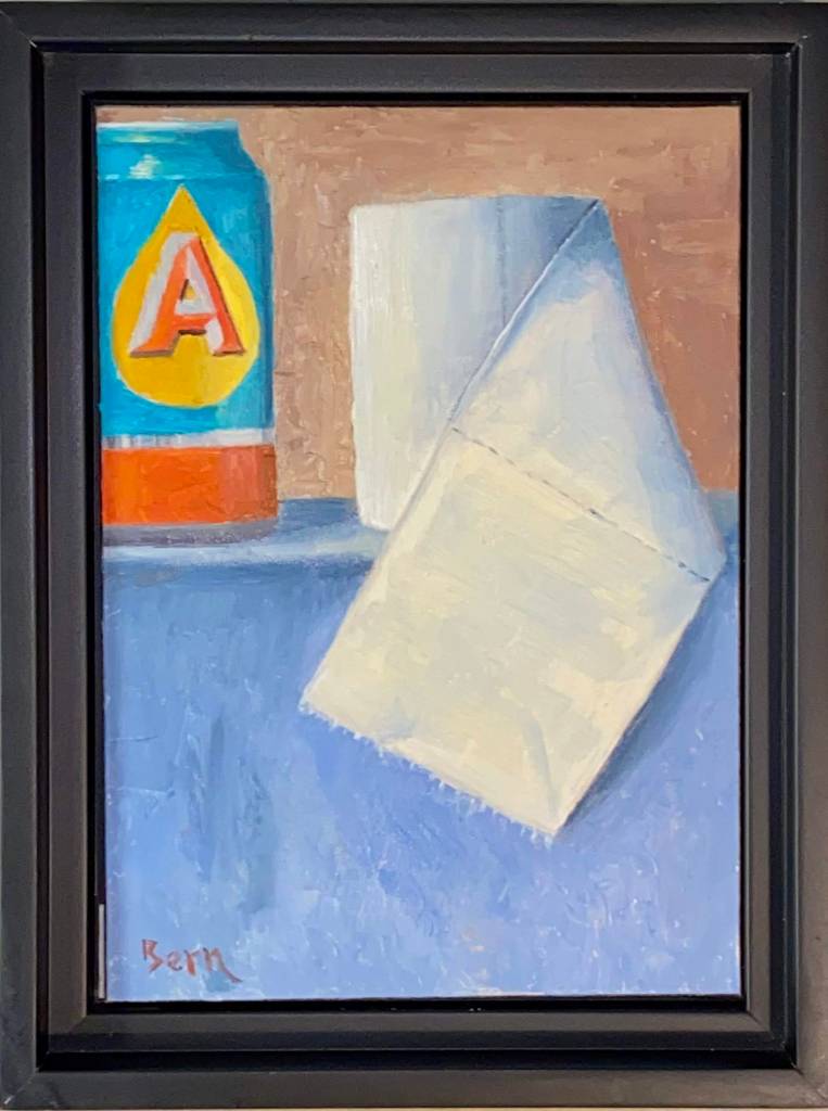
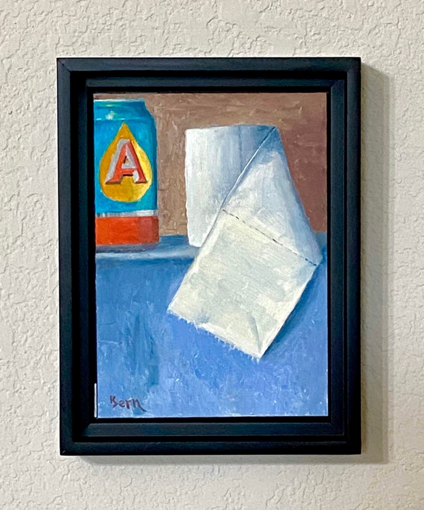
I’ve enjoyed working on more still life this year and I’m starting to get a better feel for various objects. The use of toilet paper and a beer can struck me as an interesting challenge because they are so contrasting in their own composition. In fact, if you really think about it, beer and tp have quite a strong relationship despite their contrasting structure, but that discussion is for another day. When I started this piece we had recently returned from a couple of trips to various grocery stores to stock up on supplies and at the very least, secure a couple weeks worth of toilet paper, beer, and wine. Priorities, right? Local news coverage continued to highlight hoarding and runs on tp (sorry, just can’t help myself), at which point my nervous laughter and need to find something positive in all the bad news led to the idea (hard to call any of this “inspiration”) for this composition. At the very least it gave me an outlet through art and a chuckle at the madness the world sometimes throws our way. I hope you get a guilty giggle from this piece too, but if the work is offensive in any way, please accept my heartfelt apologies as my goal was well intended. And ultimately, the related auction of this piece will provide a donation that will feed many people in need during this serious time.
Final Close Up
Final Framed
Progression
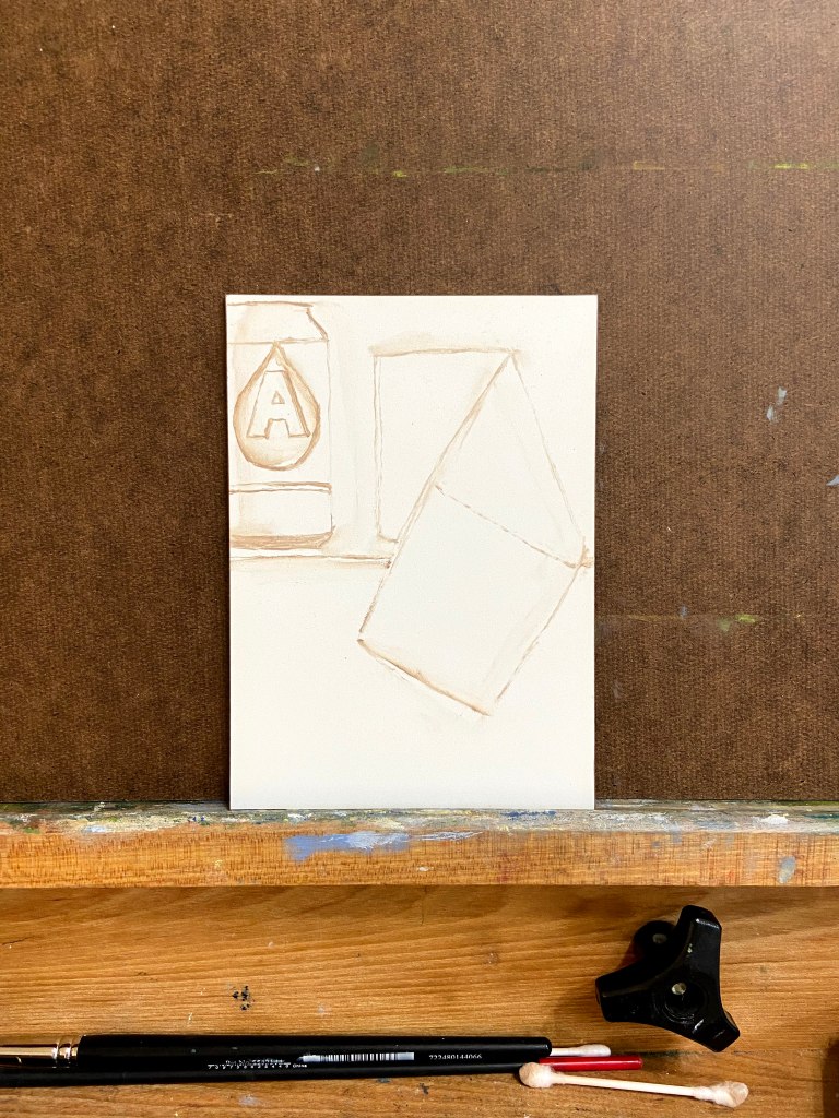
Rough In Sketch
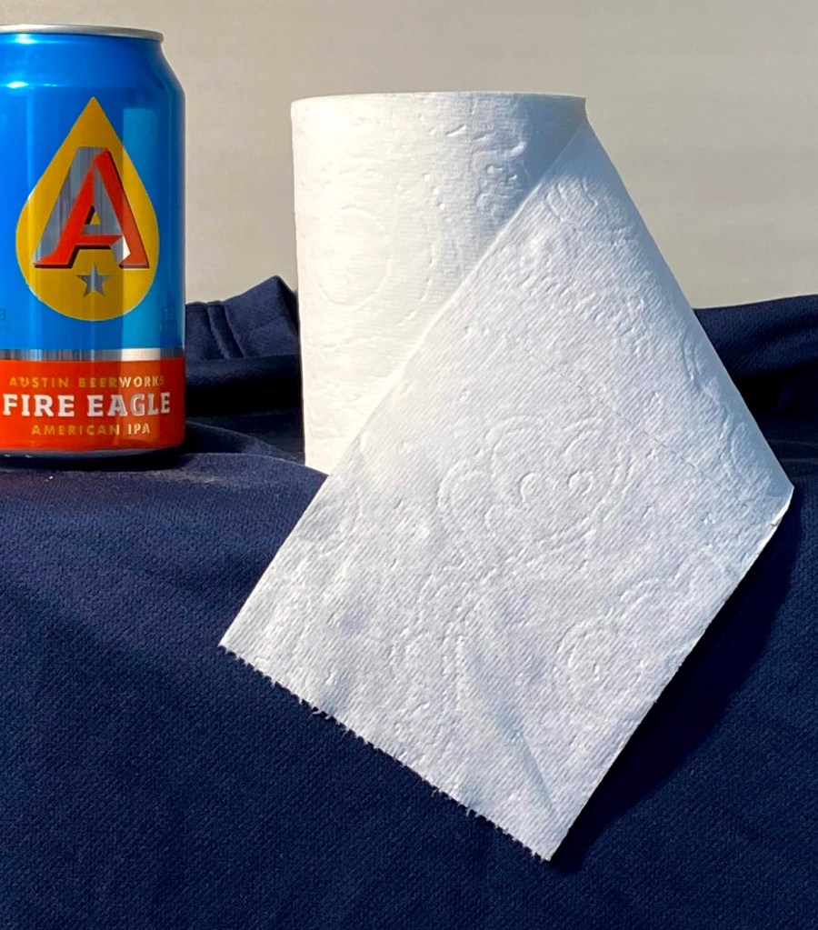
Reference Photo – TP and Austin Beerworks Fire Eagle IPA
Special Art Auction Details
This week’s composition is going to be auctioned off for charity to support the Central Texas Food Bank, which needs donations to support the growing demand generated by the pandemic.
Auction Overview
Artwork is called Pandemic. My Austin friends will recognize the beer can, but for the uninitiated, it’s Austin Beerworks’ Fire Eagle IPA. The source of the toilet paper, however, is uncertain.
This is original artwork, completed March 18th, 2020. The painting is done in oil on a 5″ x 7″ wood panel. The artwork is being sold framed.
The auction is being done as an Event on my Facebook art page, “Impasto”. Direct link to the Event is here.
100% of the winning bid will go directly to the aforementioned charity, Central Texas Food Bank. The winning bidder will receive a copy of the receipt from me showing the donation was made in full.
No shipping fees if sent to a United States address. International shipping rates will apply.
Letter of authenticity will be included (proves provenance and confirmation of original artwork).
Winning bid must pay via PayPal, Venmo or check. Artwork will be shipped upon processed payment.
If you want to participate in the auction, follow these simple steps:
Go to my Impasto Facebook page here, and navigate to the Events section, or navigate directly to the Eventhere; look for the event called “Special Art Auction Benefitting Central Texas Food Bank”. The About section of the Event will reiterate these auction guidelines and information about the artwork. Go the Discussion sectionto place bids via the Comments section.
BIDS MUST BE MADE IN THE COMMENTS SECTION OF THE EVENT.
The opening bid must be at least $50. Bidding must be done in no less than $5 increments, which means your bid must be at least $5 more than the previous high bid listed. Of course you can feel free to make incremental bids much higher than only $5!
The comments should sort old to new, so scroll to the bottom of the comments to see the latest high bid. WARNING – sometimes Facebook gets a mind of it’s own and the comment sorting logic gets whacky, so just make sure you pay attention.
Bidding opens at 12Pm CDST, Saturday, March 21, 2020. Bidding will close at 5pm CDST, Friday, March 27, 2020.
Winning bidder will be notified Friday, March 27th, 2020.