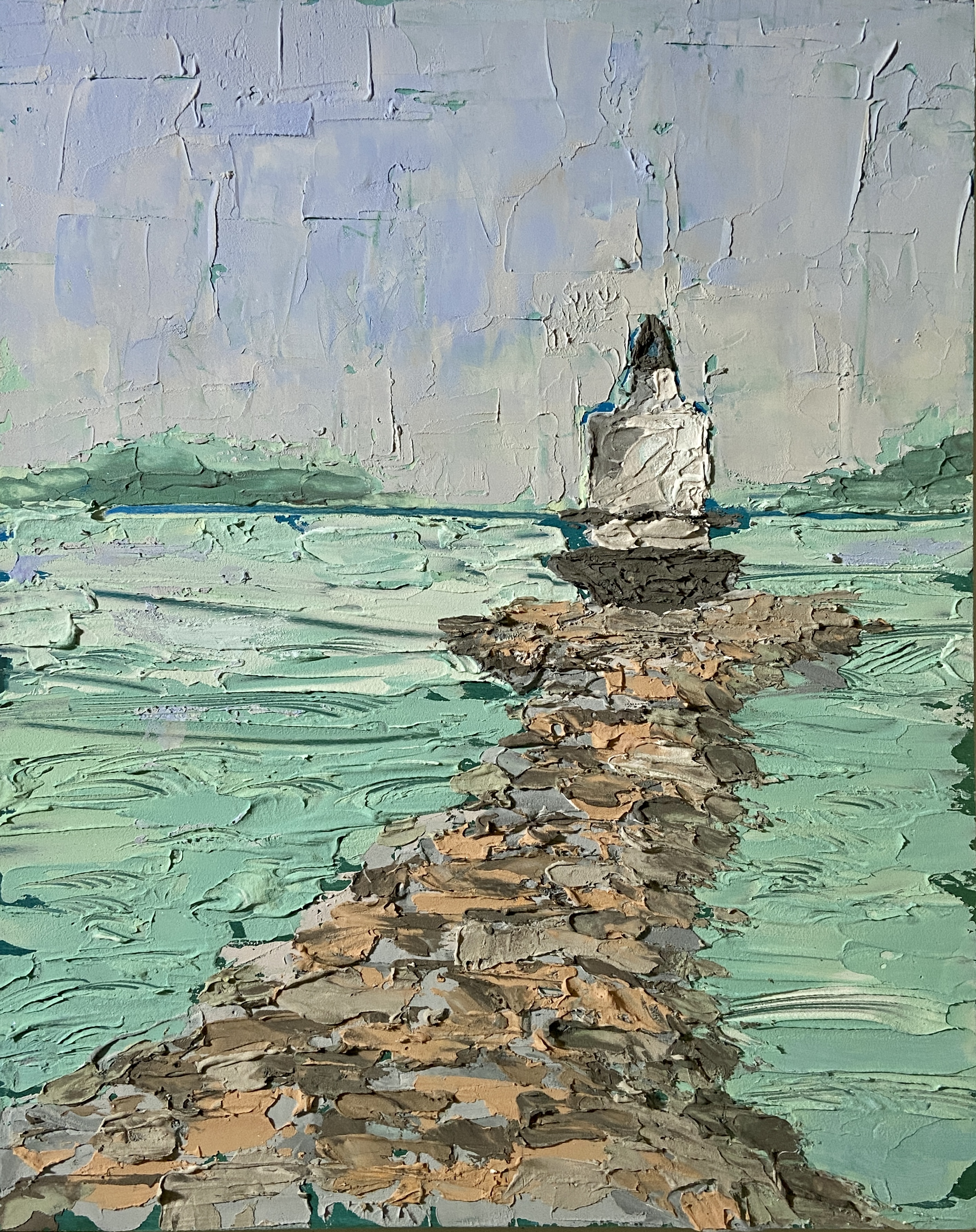
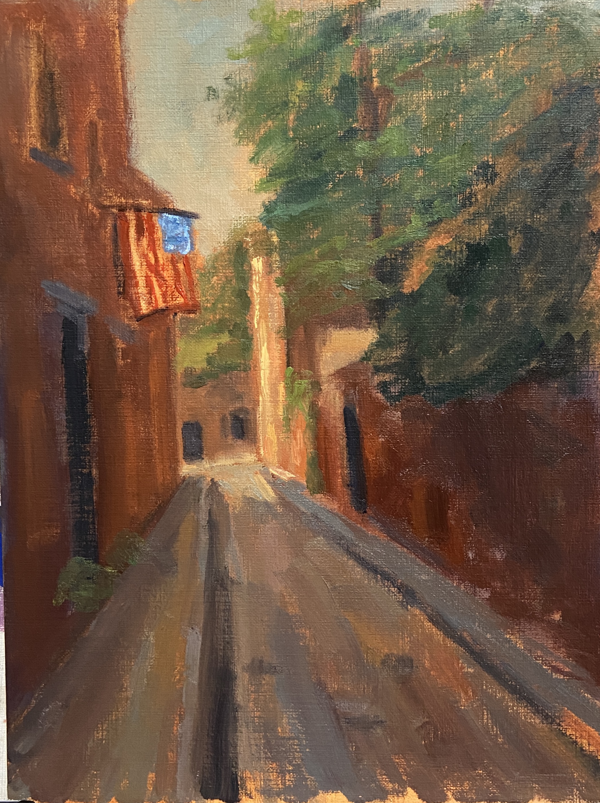
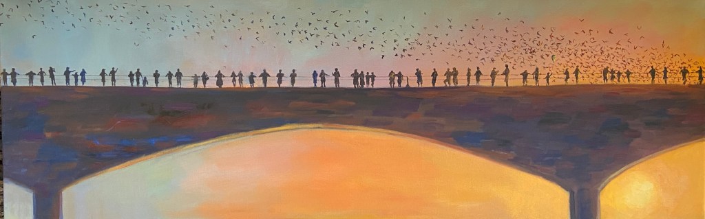
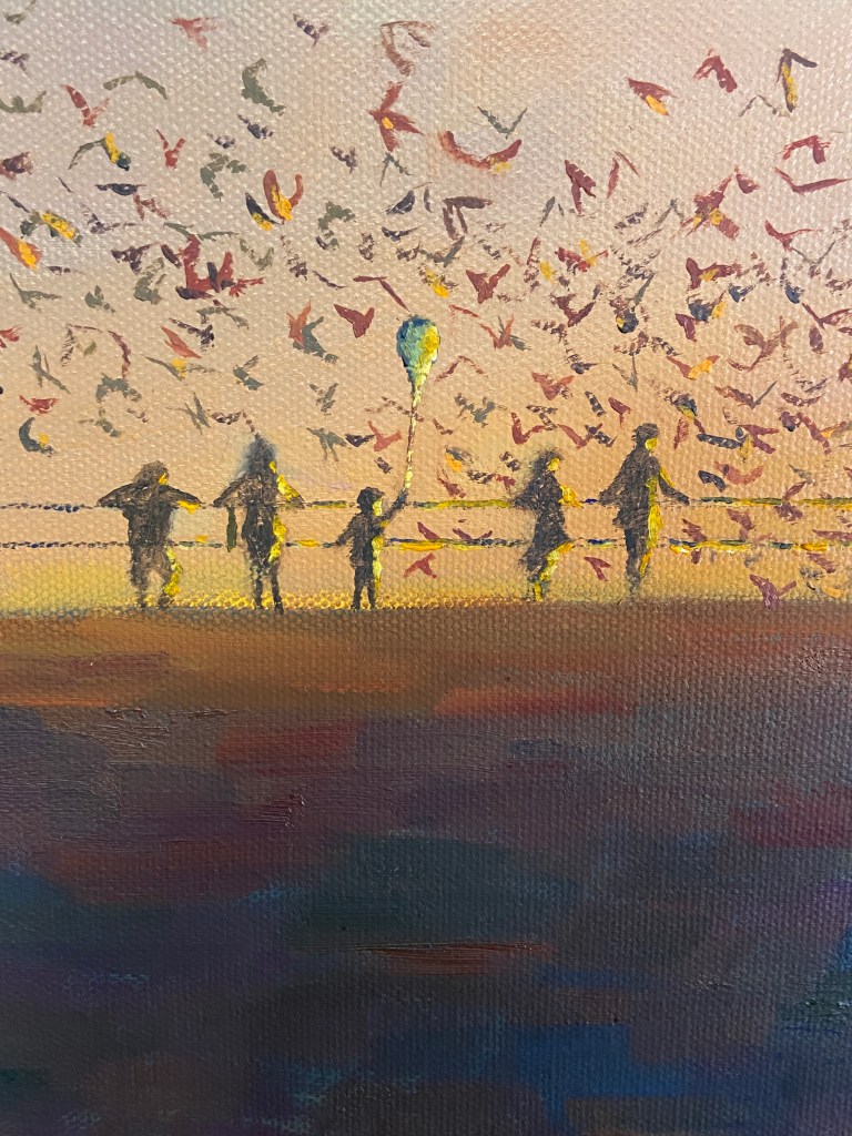
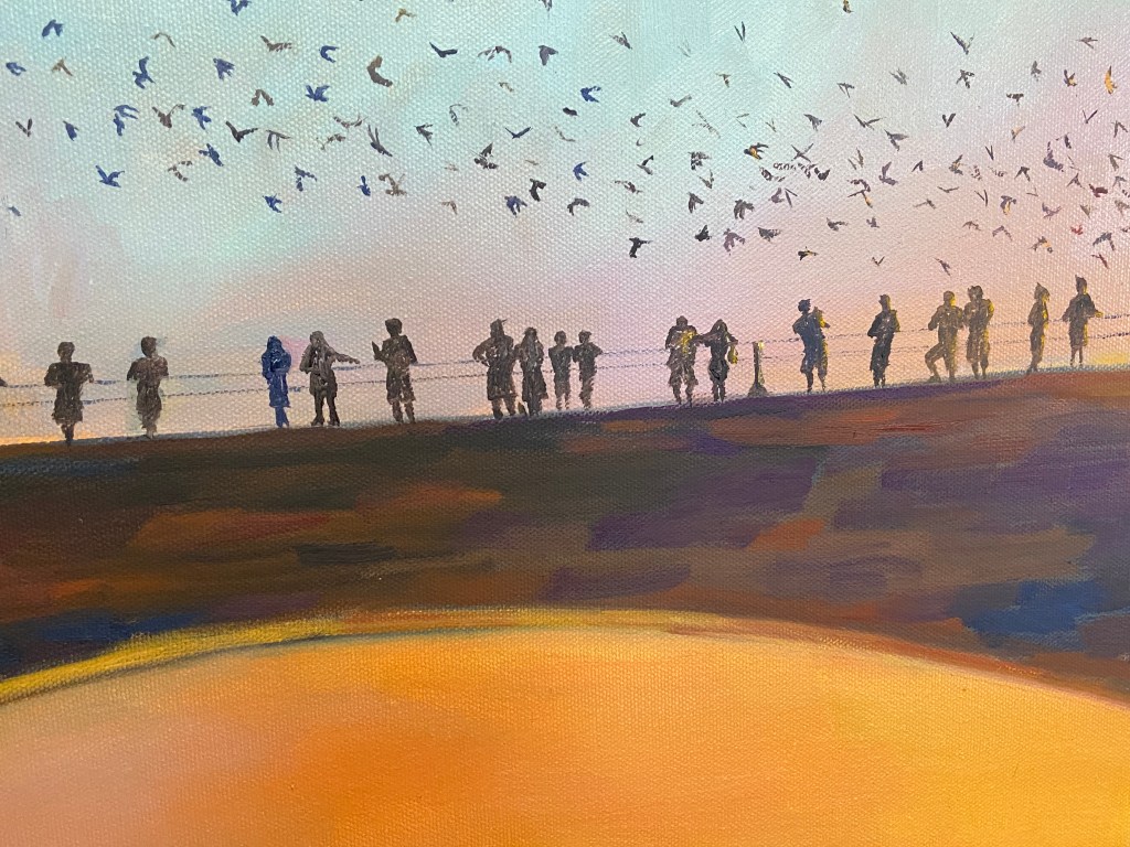
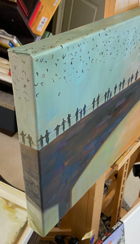
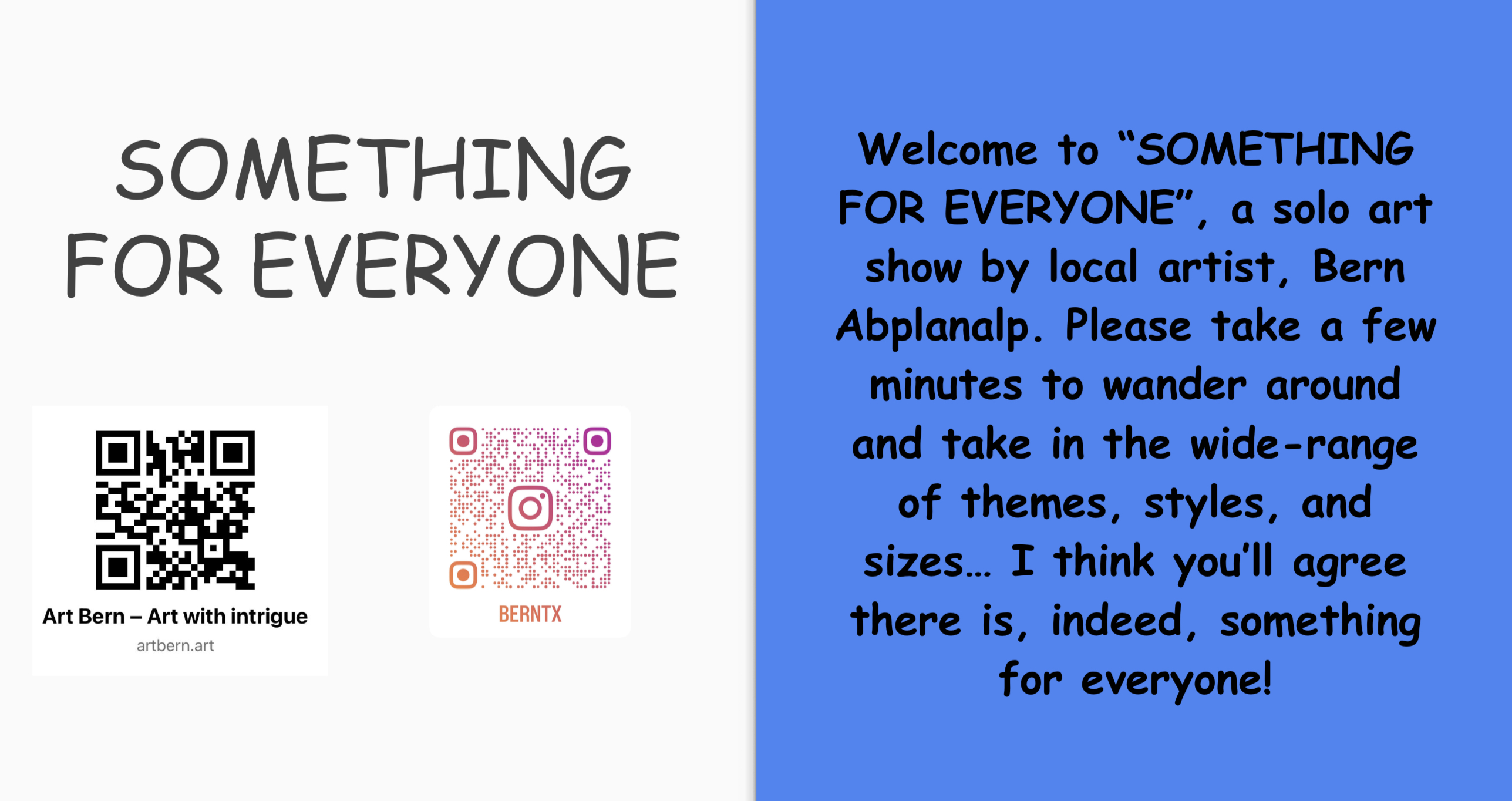
Greetings and Happy New Year!!! I’m kicking off 2025 with my first solo show courtesy of Kerbey Lane in San Marcos, TX! Given there are 25 pieces on display (all for sale btw), ranging in themes – still life, landscapes, even some pure whimsy – I’ve decided to call it “Something for Everyone”.
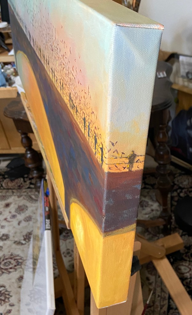
The process of hanging art at a restaurant during regular business hours was a bit intimidating, even on a slow Monday mid-afternoon. However, everything went well because it turns out my wife has a heretofore undiscovered talent for gallery design and hanging paintings! She was awesome… literally couldn’t have done it without her.
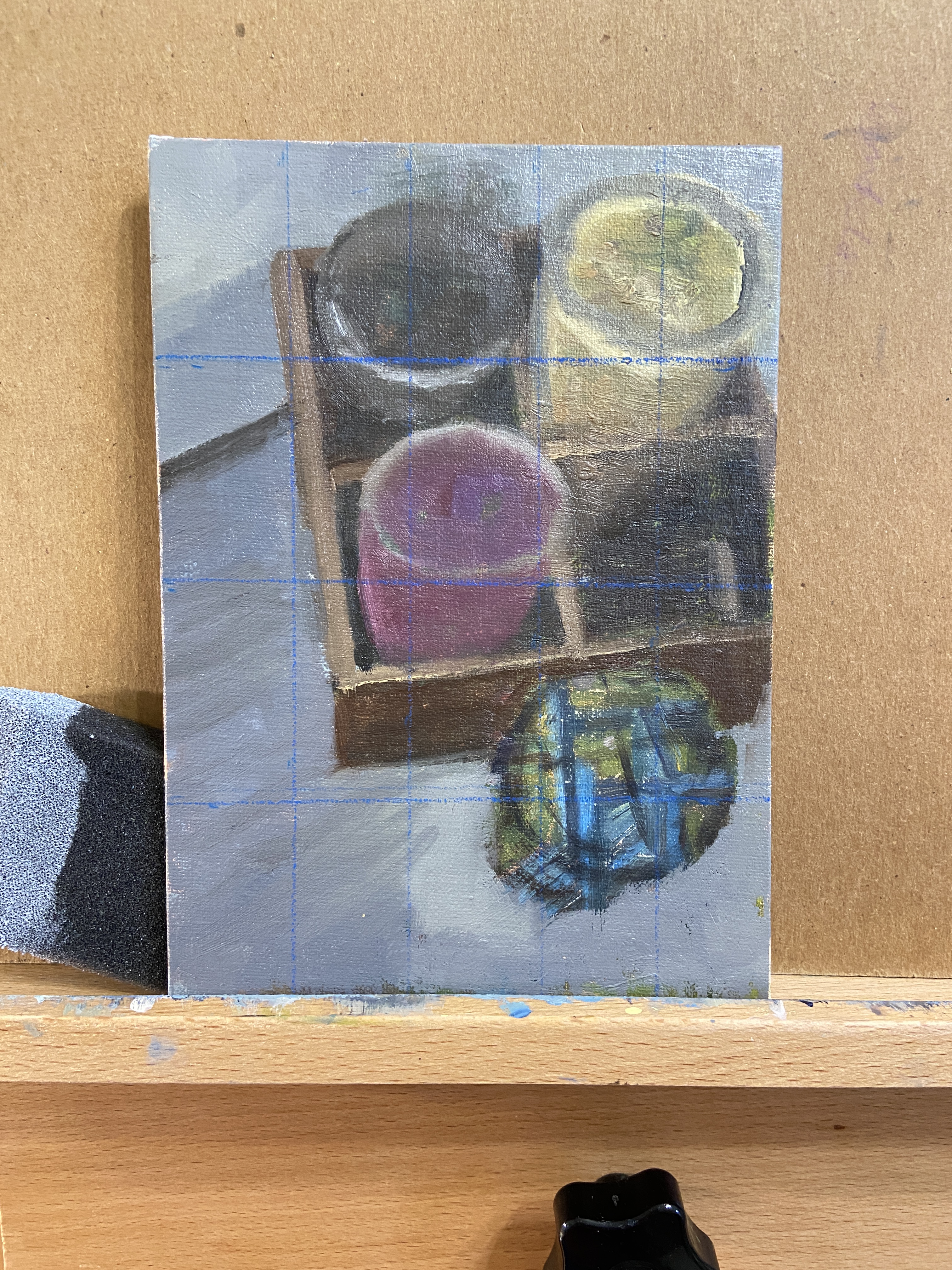
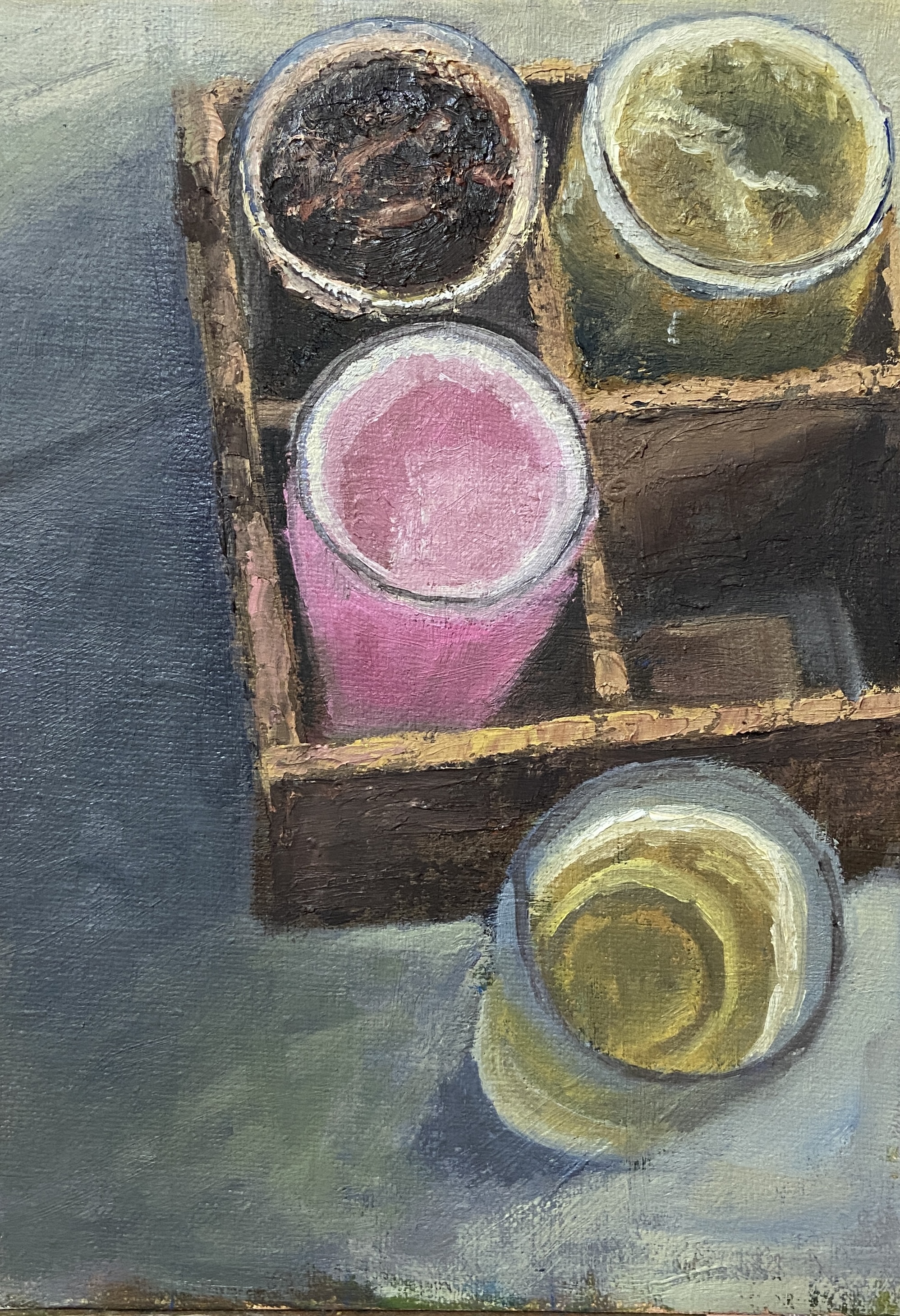
Some of the pieces on display are brand new – paint might not be entirely cured if I’m honest – while other pieces were part of my personal home collection, so this is their first foray into the real world. The show will run January through June, so be on the lookout for new works being added in the coming months.
I’ll be adding a special section to ArtBern that highlights the various pieces in “Something for Everyone”, so be on the lookout later this week.
One last item of note. A hearty THANK YOU to all the great staff at Kerbey Lane! They were welcoming, helpful, and wildly enthusiastic about the art. Knowing that they were excited to see the wide range of themes and subject matter, well, it was beyond rewarding for me to get that kind of feedback while hanging and effectively being in their way for 2 hours. Hey @kerbeylanecafe San Marcos, y’all are wonderful!
Thanks for reading!


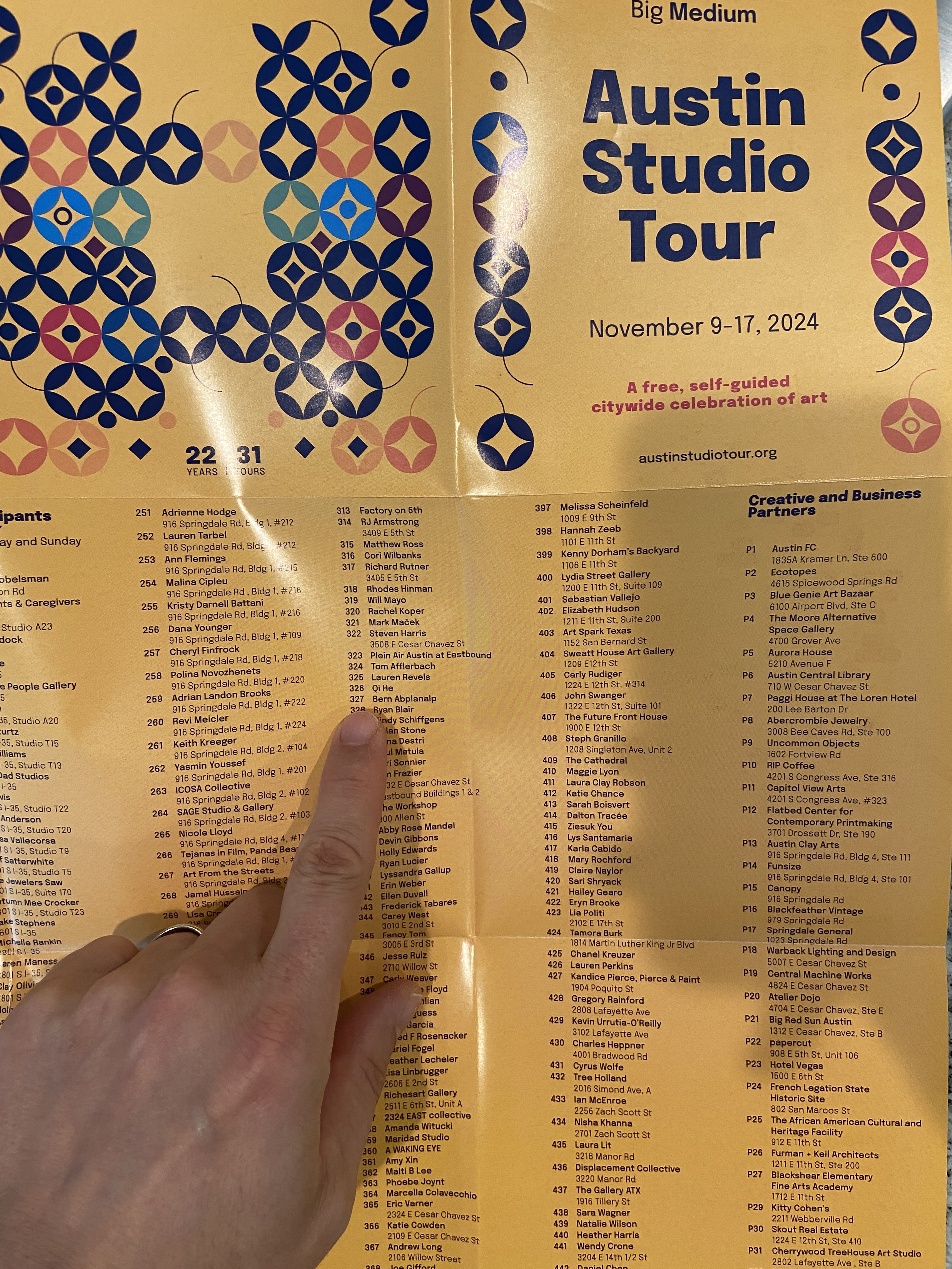
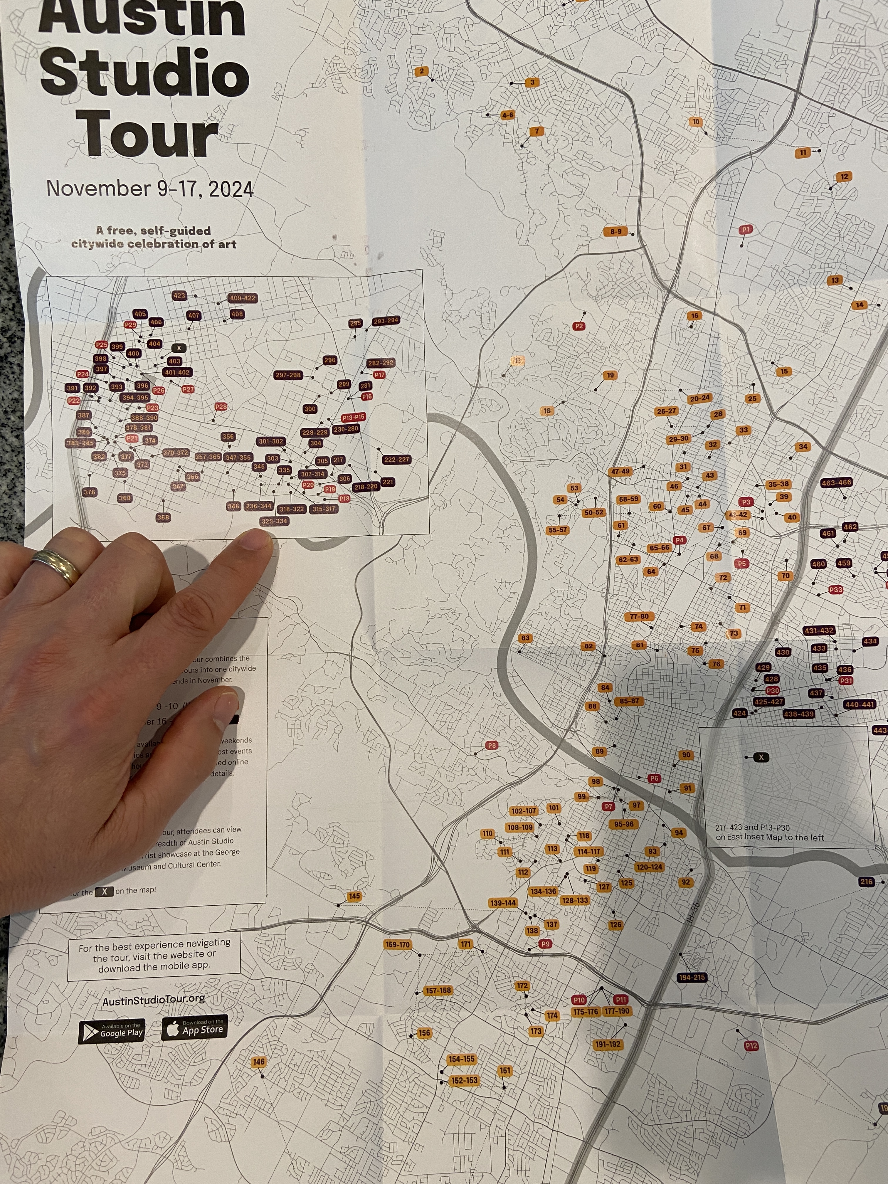
#austinart #artbern #berntx #crashboomzip #abplanalp #austinartists #pleinair #pleinairaustin #paa #austinstudiotour #sanmarcos #paintings #kerbeylanecafe #coffee #txst