Juicy

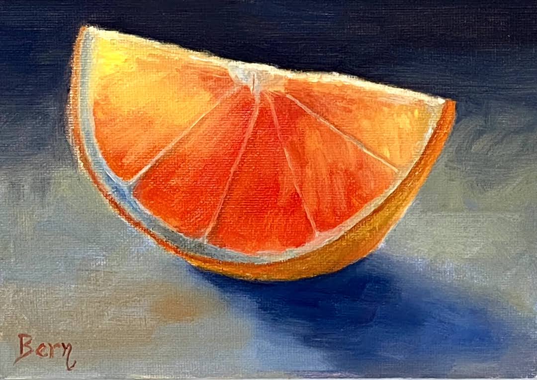
Juicy​ | 5” x 7” | Oil on Canvas Board  

JUICY

Small still life paintings are very gratifying because it’s possible to finish them in a single session, which is a nice change of pace after having worked on a number of larger pieces recently. 

Juicy is an orange (hopefully that’s abundantly clear) backlit with just enough light to see through the thinner areas. ​I used reference photos instead of an actual still life setup in the studio, but I think it would have been easier with a real orange slice as the subject. 

Lesson learned from this composition was the importance of relative values. I initially failed to darken the reds sufficiently, making it difficult to get the transparent light effect through the thin areas. I went back in and tamped down the saturation and darkened the value, which helped a great deal. I need to remember next time that instead of trying to use the lightest value for the transparency, focus first on emphasizing the adjacent darker areas to make it pop. 

Stay tuned for more small still life in the coming months… suggestions are welcome! 

#​orange ​#stilllife ​#dailypaintworks ​#berntx #crashboomzip #oil​painting #art ​#austinartists​

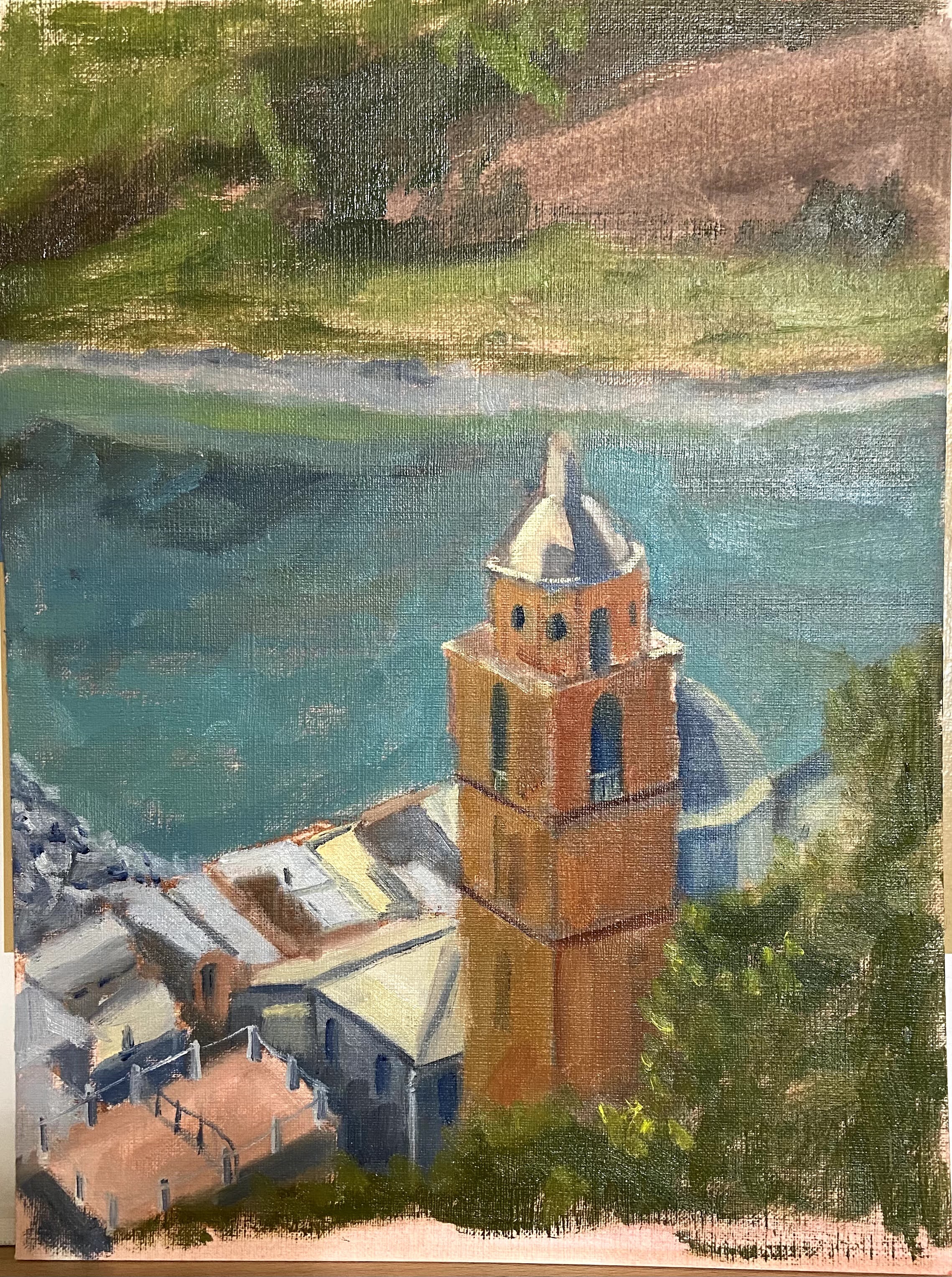
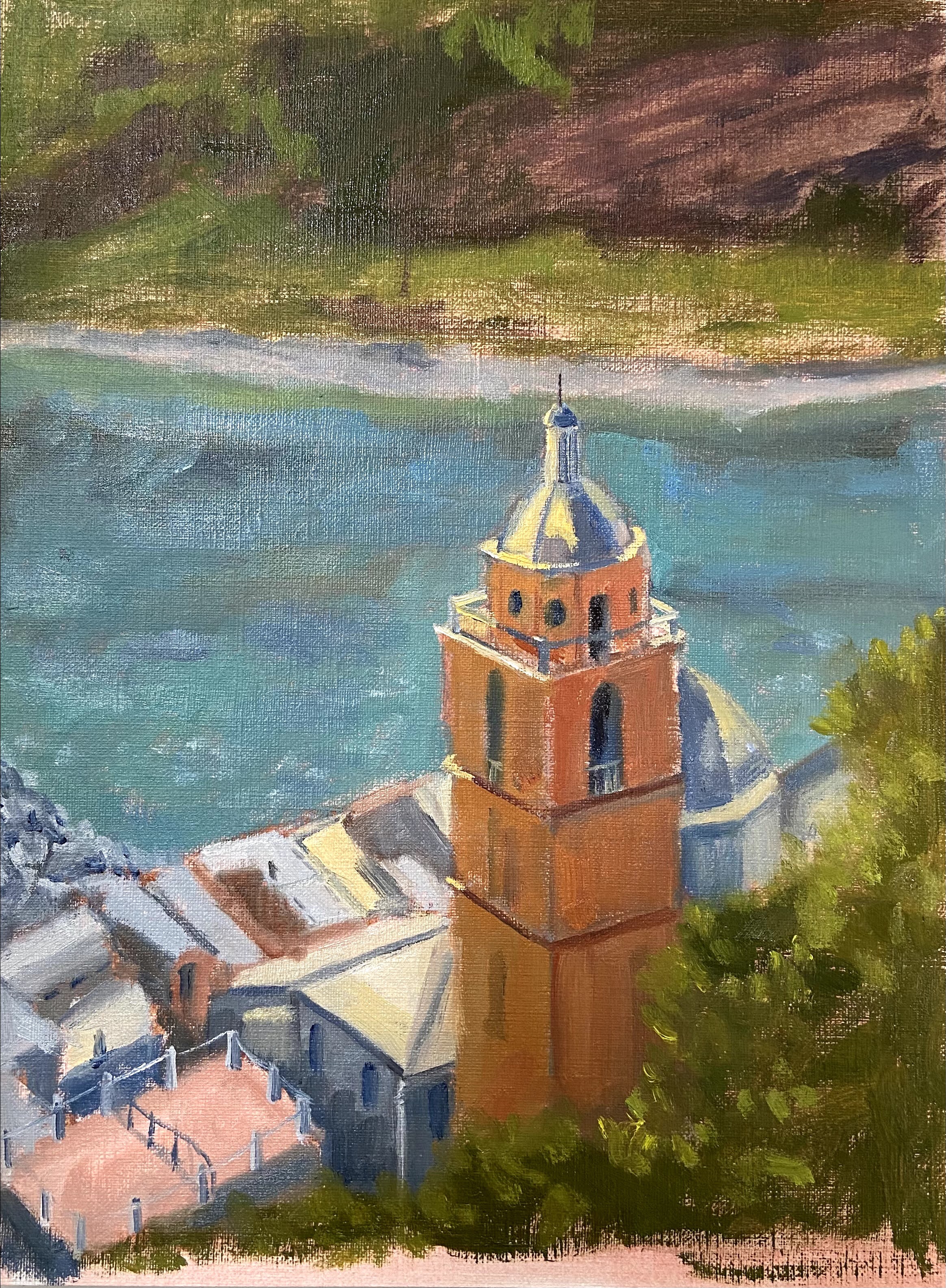
Porto Venere

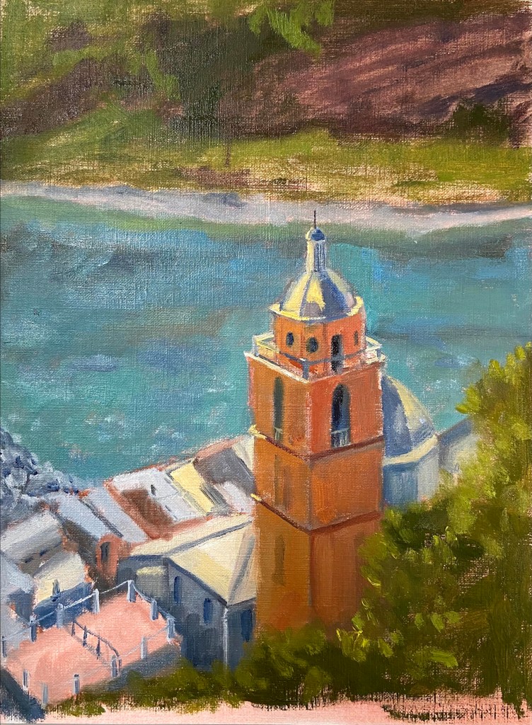
Porto Venere (study)| 9” x 12” | Oil on Canvas Paper

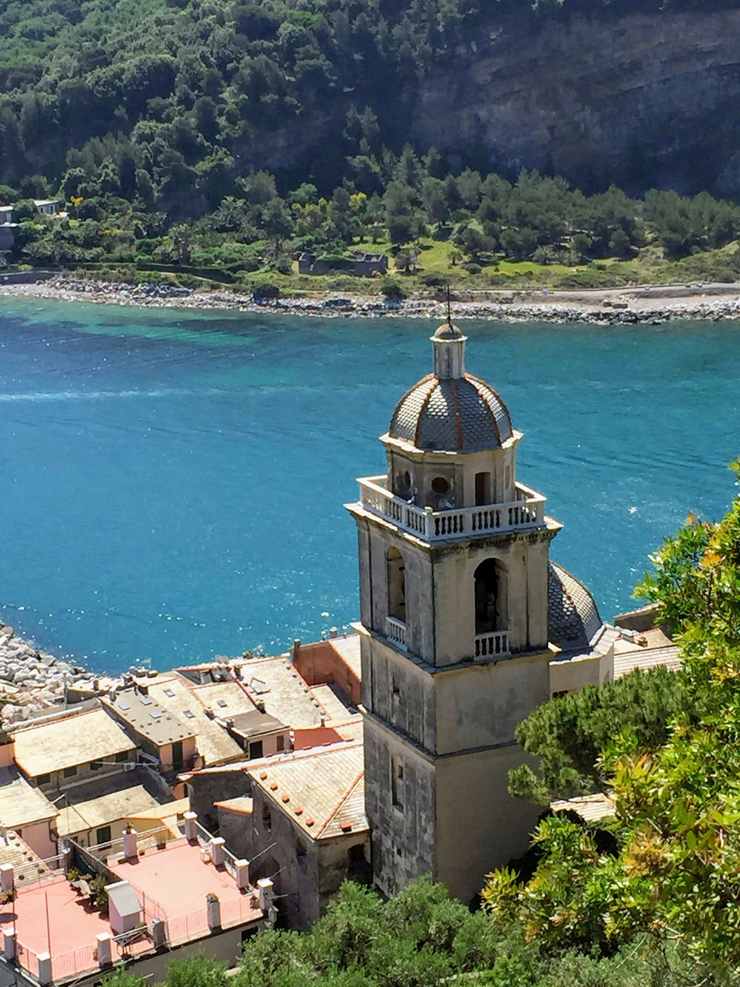
This composition has been on my short list for awhile, so I’m very excited to have put brush to canvas finally. The subject matter is a photo I took from the hillside in Porto Venere, Italy. The power of the sun shining on the church tower with the beautiful blue water in the background was an ideal setup for this piece. It kinda painted itself.

I’ve done a number of practice (studies) pieces in the past to get an idea of what I need to consider prior to tackling a larger composition. It’s extremely helpful to get a sense of proportions, values, and start thinking through edits that will make the piece work regardless of what’s in the photo or real life. My problem with doing a study is that I always end up getting sucked into the details – I just can’t help it – so they drag on and I lose the value of doing a practice piece.

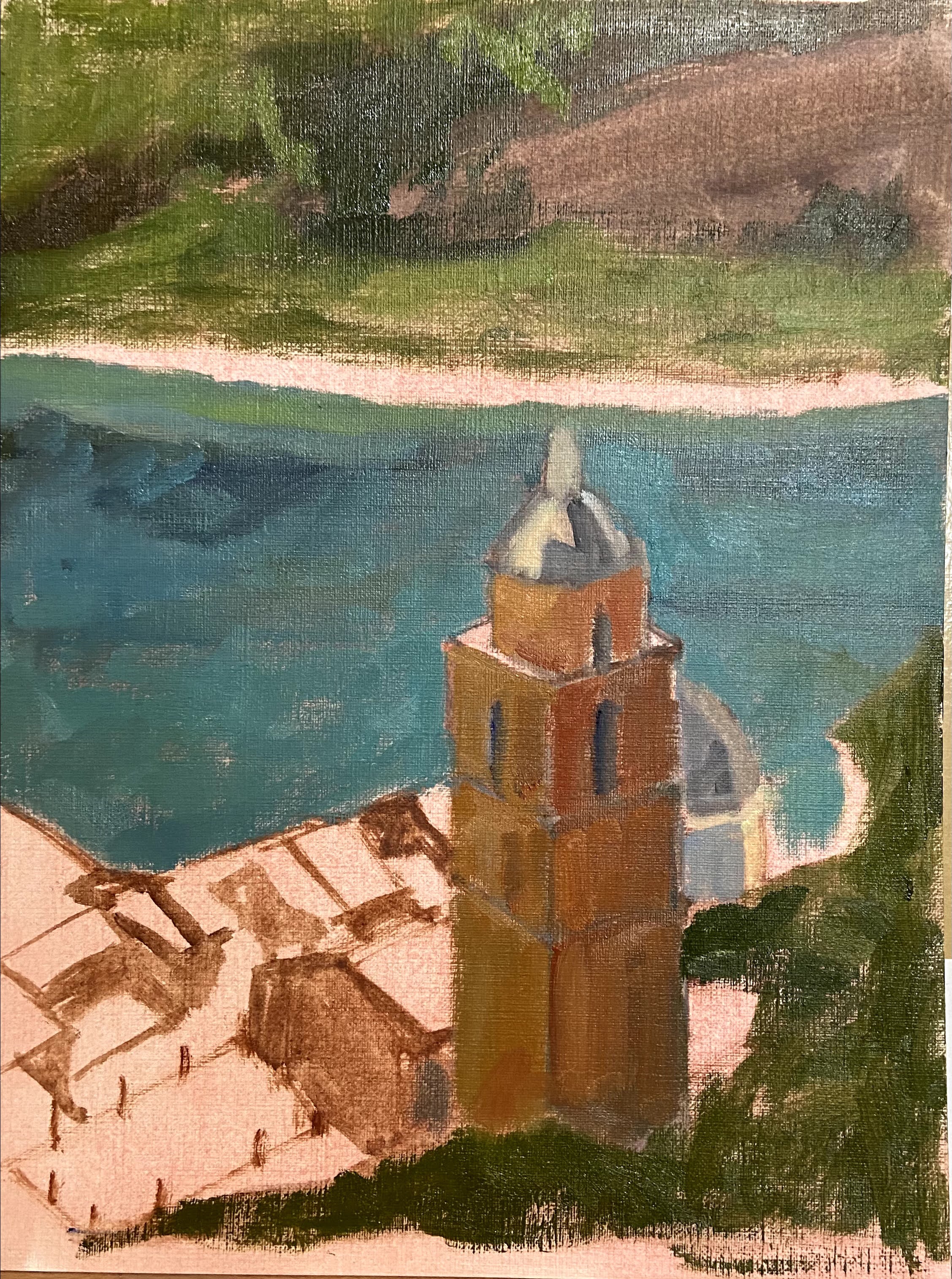
To solve this problem, Porto Venere was time bound to 2 hours after the block-in was done. I literally ran a stopwatch to ensure I stayed true to the spirit of the study and focus on the compositional core elements, not the fine details. It forced me to make quick decisions and gave the piece a more painterly style, which I like and will try to incorporate into the full-size painting.

#portovenere #italy #cinqueterre #berntx #crashboomzip #painting #art

Getting Thirsty

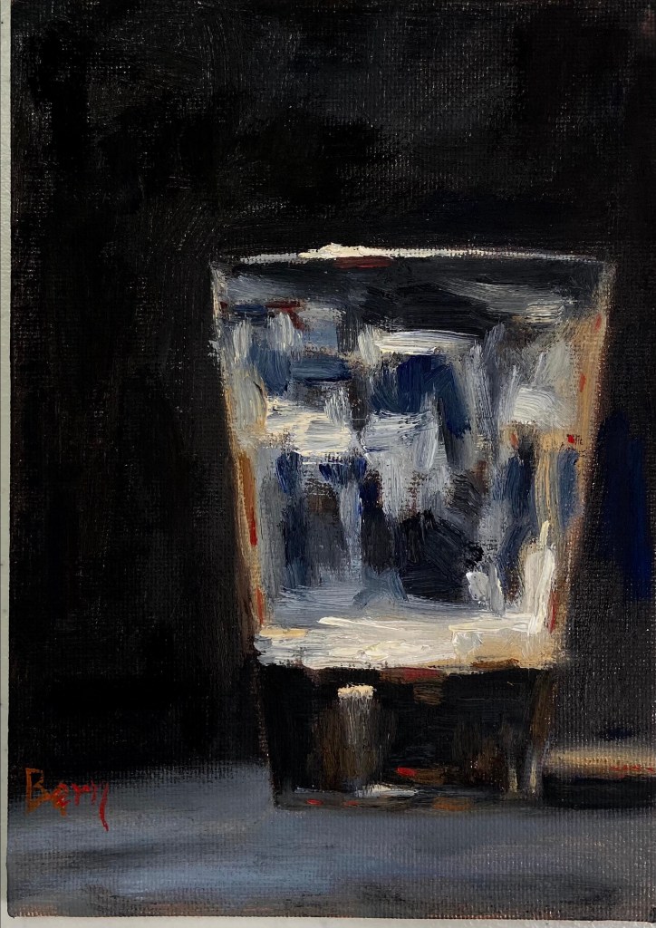
Last Sip | 5” x 7” | Oil on Canvas Board

Last Sip | Oil on Canvas

Dark beer as an inspiration seemed like a great idea for this quick still life. As you can guess, I do love a good dark porter, #512brewing!

This piece is also influenced heavily by the work of Neil Carroll, who has a great talent for making simple still life transform into beautiful, relatable art. In this case, also quite quaffable.

The Last Sip was a great piece for glassware still life. I liked the challenge of defining the pint glass despite having a dark beer on a very dark background. I thought that would be more difficult than it was, but the dominance of dark values actually made it easier to pull the glass reflections out of the piece.

I also tried to work in some warmer elements of sienna, orange, and out-of-the-tube red to distinguish the porter from the dark background coming through the clear glass.

Hope you’re thirsty… go grab a beer!

Yellow Rose Botanical

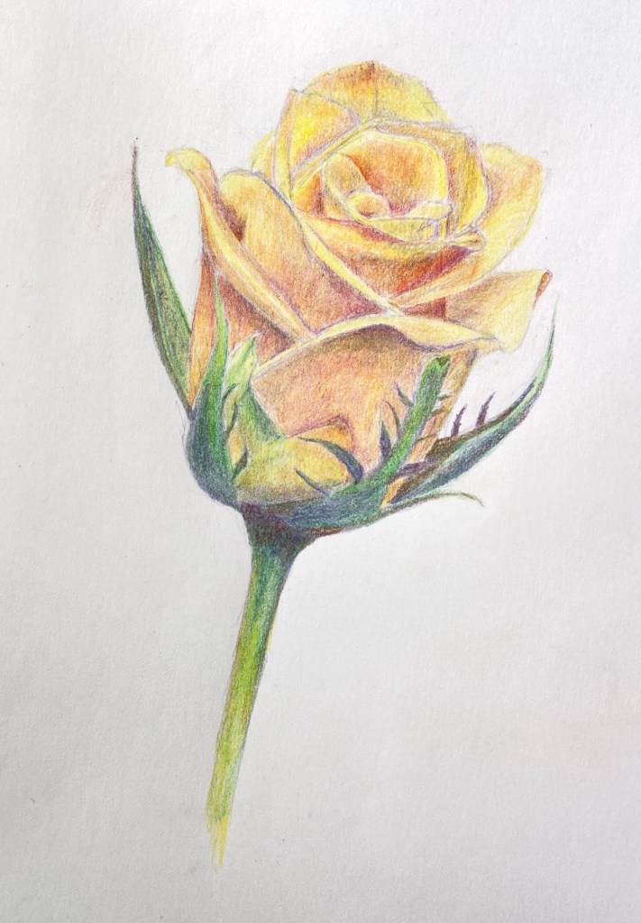
Yellow Rose Botanical | 8” x 10” | Colored Pencil on Paper

I finished my botanical drawing (virtual) classes last week and this Yellow Rose is my final project. The sessions were 2 hours weekly for 8 weeks, the instructor (Jenny Granberry – @jennygeeberry) was hilarious, and I learned a lot about both botanical artistry and how to use colored pencils properly.

Yellow Rose Botanical Drawing

The biggest challenge was figuring out how to incorporate a range of colors beyond basic yellows to add interest, value variations, and realism. I was using a limited palette (12 pencils), but through some trial and error I managed to land on a few color combinations that added a lot of depth to the overall piece.

I’m hoping to do a few botanical series over the course of this year. I like the idea of colored pencil drawing because it incorporates drawing and a lot of oil painting concepts, although the techniques are very different.

#contemporaryatx #berntx #crashboomzip #rose #art #drawing

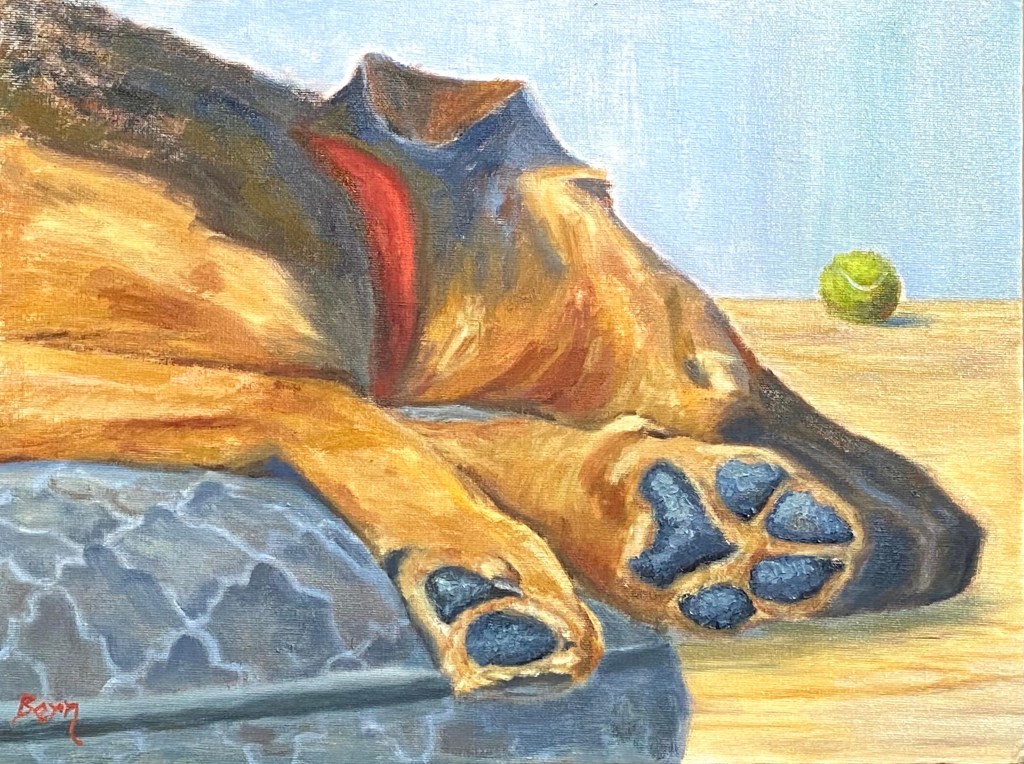
Dangling Paws

Dangling Paws | 18” x 12” | Oil on Canvas Board

This piece is inspired by playtime with Wolfy, who loves fetch despite the challenge of galloping around with his huge paws!

Dangling Paws

There were a few new challenges with this piece, namely capturing the various golden browns of Wolfy’s shepherd-hound coat, as well as the texture of his paws. The key to the coloring was working in various reds and warm yellows, but it took a lot of experimentation to get the right likeness. The paws were more about the texture from using a painting knife instead of a brush, which made the surface of the paws look rough and realistic.

However, the hardest part was the dog bed. I got it in my head that the pattern of the bed would help give the sense of plush comfort that Wolfy’s 85 pounds was enjoying as he slept with his head and paws dangling off the edges. It turned out to be effective, but the next time the bed will have no artistic flair.

Thanks for reading!