14 Palms at Sunset

14 PALMS | 20×16” | Oil on Canvas Board

Shoreline Park in Santa Barbara is one of those places that almost makes the cost of existing in California understandable. Stunning views of the ocean, cool breezes, and sunsets that make you say “C’mon! Seriously!”

If I lived in the area I would definitely do a number of plein air sessions at this location, but I had to settle for personal photos taken while strolling the shoreline. Interestingly, I started this piece a couple months ago, then set it aside and just didn’t get back to it for awhile. In that gap I managed to inadvertently delete my reference photo! 

Turns out my bonehead move was a bit of good fortune as it forced me to work from memory and not a photo reference. Turns out I rely too much on photo details, which often distort values and hues, and it was easier to capture the essence of this scene without the distraction. 

As to the composition itself, this was the first time I’d done something with such a strong sun. While it’s not meant to be the focal point, it’s the source of brilliant light that envelops the palms and makes them spectacular. From a design perspective, I wanted to incorporate some strong contrasts between the tops and bottoms of the palms, whereby the tops were more painterly and softened, while the bases were structured and crisp. The intent is to have the viewer drawn to the center of the palms bathed in sunlight, but then move up and down the trees to see the different light effects. 

Lastly I’ll note the intentional exclusion of people, picnic tables, cars, and other such signs of humanity. Sometimes that’s done because I’m lacking motivation (or skill) to tackle those details, but in this instance it’s a nod to Santa Barbara as the source of Earth Day, which was started here way back in 1969. 

#artbern #berntx #crashboomzip #abplanalp #austinartists #atxart #santabarbara #earthday #shorelinepark #palms #palmtrees #sunset #california

End of an Era

SHACKS OF GOLD | Oil on Canvas | 20×16”

If you’ve lived in South Portland, you knew the Fishing Shacks. If you don’t, please get out more and explore the wonders of your own backyard!

For the uninitiated, the last of the 3 remaining, dare I say “iconic”, Fishing Shacks were sucked into Casco Bay on January 13, 2024. Over their 120+ years, these historical structures had endured whatever the tumultuous Maine coast could throw at them, but a record tide (14.57 feet) coupled with a massive storm surge was a one-two punch they simply couldn’t withstand. 

Despite their absence, they leave many fond memories, a rare marriage of human structures and the natural environment which, together, made Fishermans Point a better place. As an artist, one of my primary inspirations is to return to a fond location and remember the time I spent there by recreating a view or experience on the canvas. Regarding the Fishing Shacks, my wife and I spent many happy hours soaking in the sights, sounds, and sea air on Fishermans Point, the shacks standing guard. It was, and still is, our happy place… just a little different now. 

The painting (not my first of the shacks, see Fishing for Edward Hopper) is meant to capture that unique light at the end of the day when the world is bathed in golden rays and everything looks just a little more inviting. I used very little artistic license regarding the shacks themselves, as I wanted to preserve their actual structure as much as possible, including their positioning on the rocky point. 

I used a painting knife and broken color on the illuminated side of the shacks to ensure they were the focal point of the work, most notably the railing leading to the first shack, guiding the viewer into the work. The use of high contrast values of the railing against the sunlit side of the shack should pull you back to that point every time you look at the piece, supported further by the diagonal cast shadows of the railing on the shack wall. 

Compositionally the piece could be unbalanced and wonky, the shacks and rocky point stacked on the right side.To offset this issue, I incorporated a lot of high value, strong chroma setting sun reflection in the still(ish) blue waters on the left side. This is a relatively new compositional strategy I learned from another artist, Jeanne Hougen , who I had the pleasure of taking a class earlier this year. 

Lastly, there is some hidden meaning in this composition, most notably the lack of the rocky point and the supporting stilts of the shacks in the water’s reflection. This was done intentionally and is meant to represent the physical disconnection of the shacks from Fishermans Point, but also a reminder of their powerful presence in the memories of all of us who shared time with them looking across the bay. 

#artbern #berntx #crashboomzip #painting #art #abplanalp #austinartists #atxartist #atxart #cascobay #portlandmaine #landscapesmaine #pleinair #maineart  #portlandmaineart  #southportland #seadogs #smccmaine #southportlandmaine #capeelizabeth #fishermanspoint #fishingshacks #willardbeach

Gray and Rainy… Perfect Day to Paint

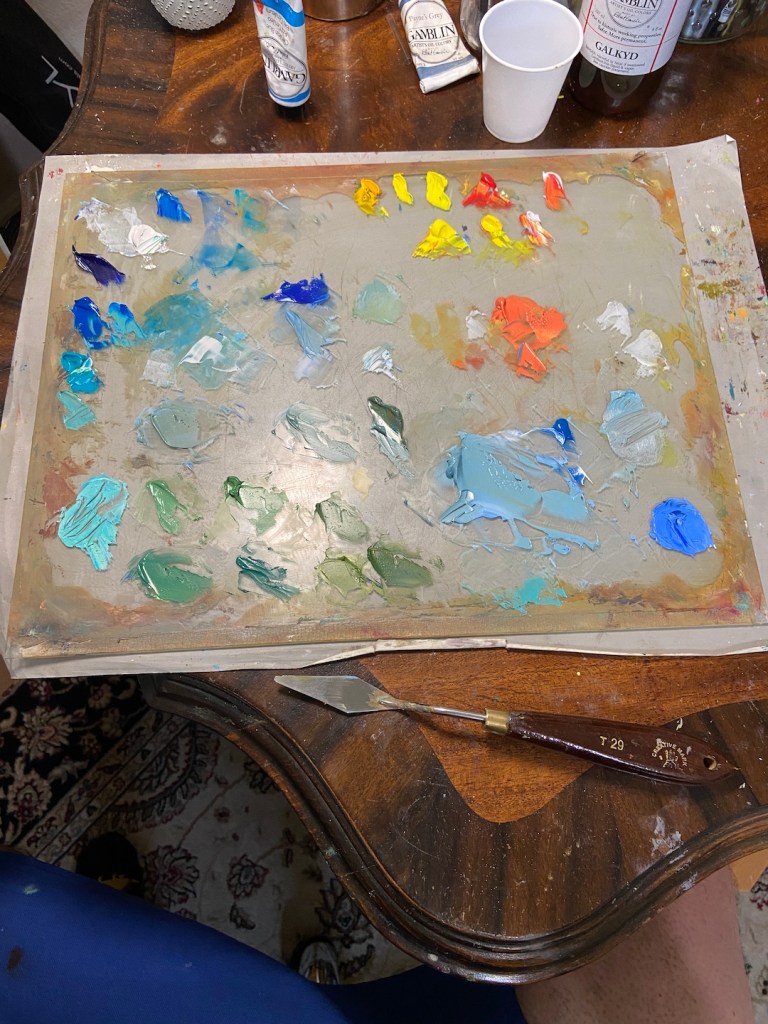
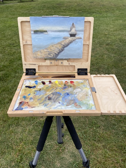
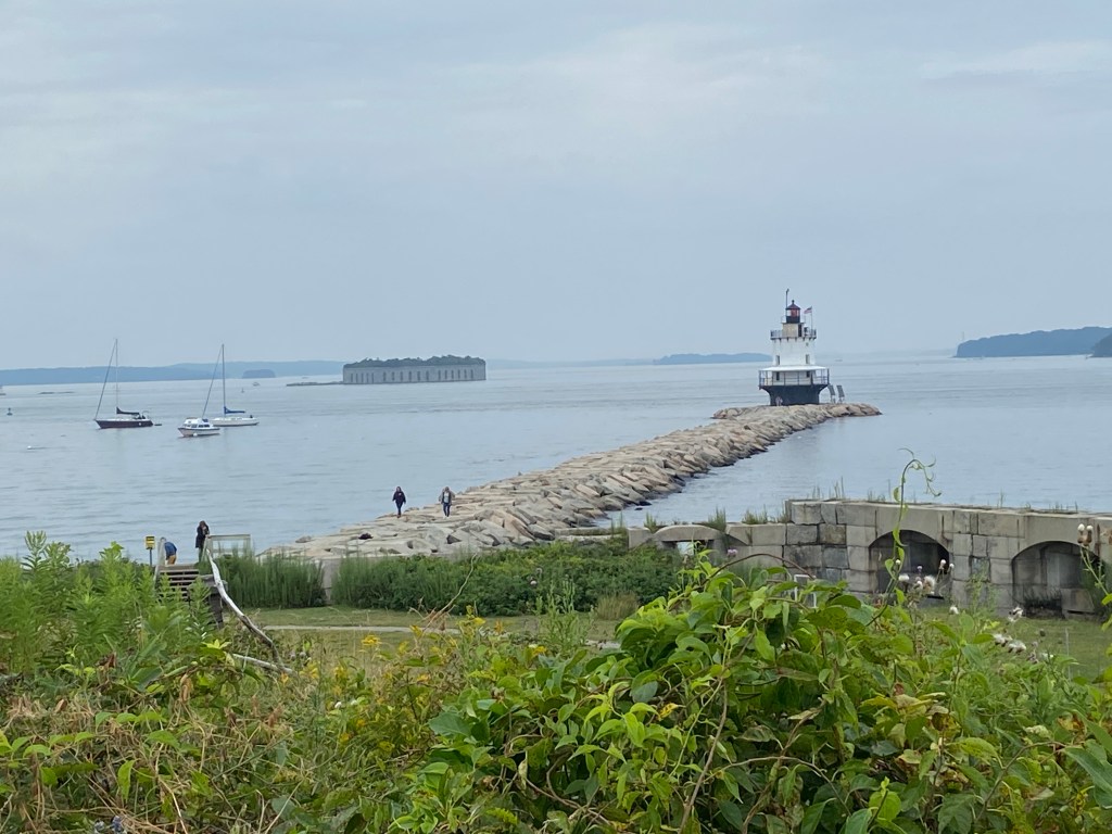
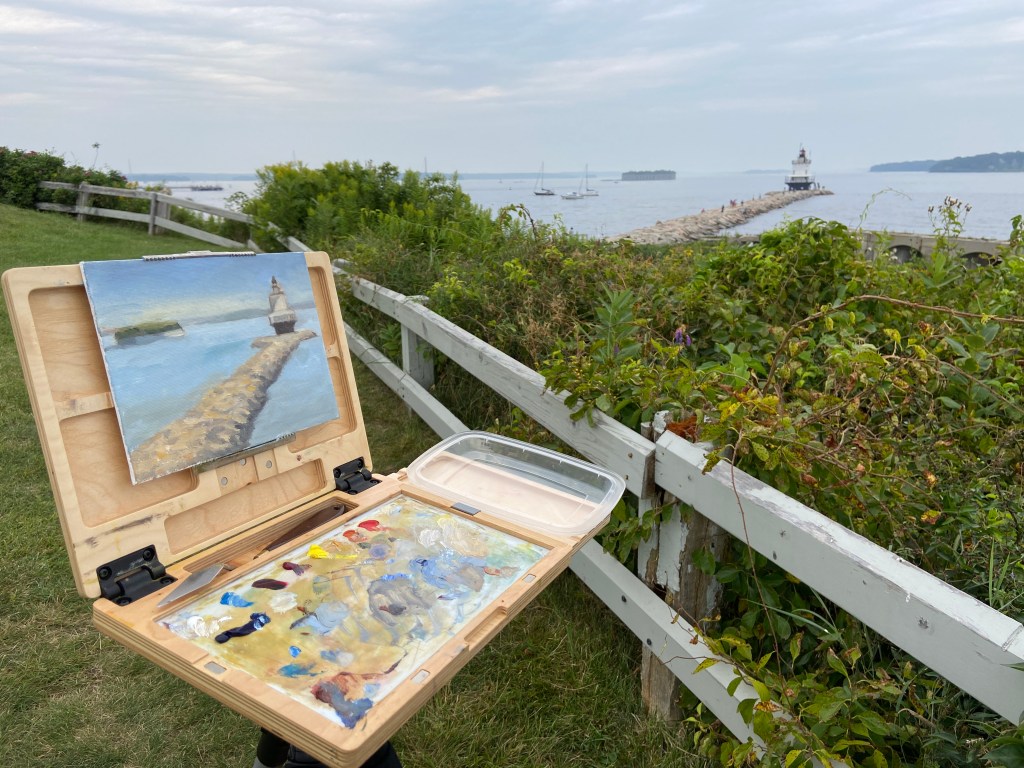
SPRING POINT LIGHTHOUSE | 8×10”| Oil on Canvas Board

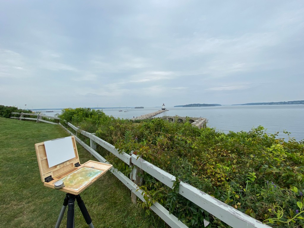
Presented with a sketchy weather forecast for the coming few days, my need to get out and tackle this lighthouse painting got the best of me and I made a rare late afternoon plein air session happen. Nothing about the timing or the weather made sense for an outdoor session, but when the temperature is in the lower 70s that’s all the motivation I really need. 

The drawing session from last week proved very helpful with this composition. I knew exactly how I wanted to orient everything, which in this case was the jetty, NOT the lighthouse. I need to remember this for future works, namely to find the piece of the composition that’s going to serve as the anchor for all perspective and measurements and start there, noting that this isn’t always going to be the focal point. The vertical orientation of everything on the horizon and the width/centering of the lighthouse relative to the jetty was also key. This made things move very fast so I could get to the business of putting oil on canvas. 

Starting with the sky and working forward was my approach this session. I’m ultimately ignoring the very gray, muted light because I know what this looks like on a sunny day and the plan is to polish things up in the studio or return to this location to finish it off with better contrasts. However, I’m very happy with what I finished today in just over an hour. A part of me says I should leave it as is and simply shore up the lighthouse details. Maybe I’ll put myself on an hour limit and refine whatever I can within that time constraint? Something to think about. 

Side note, a family with a young girl come by to ask if they could check out the painting. Apparently she likes to paint and seeing someone doing it outside on a day like today was either very cool, or just weird. Either way they seemed to be entertained and were very appreciative of our brief chat. I’ve never understood plein air painters who get so bent out of shape when people ask to check out what they’re working on. Doesn’t bother me, especially if what I’m painting doesn’t look like garbage. 

Thanks for reading!

#artbern #berntx #crashboomzip #painting #art #abplanalp #austinartists #atxartist #contemporaryart #southportlandmaine #abplanalp #bernabplanalp #springpointledgelighthouse #paintingintherain 

In the Waning Light of Day

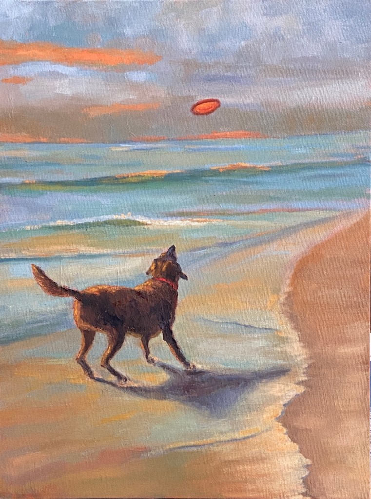
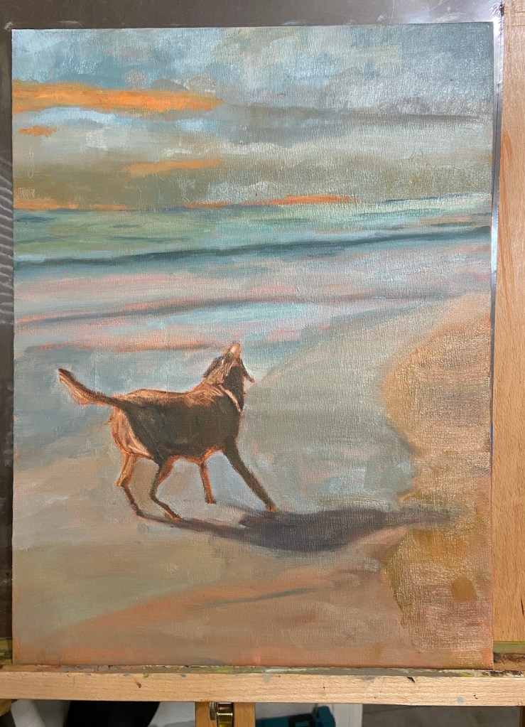
DISC DOG | 12 x 16″ | Oil on Canvas Panel

DISC DOG is inspired by the life we live with our canine family members and those bonding moments that form lifetime memories, like frisbee on a beach in the waning daylight hours. 

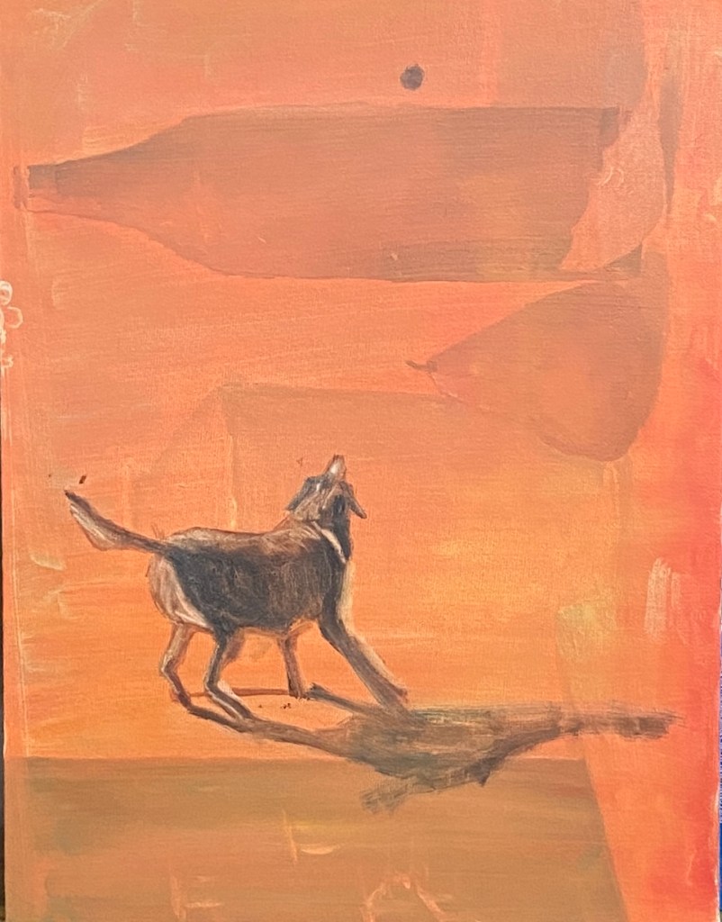
A few months ago I did a piece called BIRD DOG, which was a silhouette similar to DISC DOG, but it pushed the contrasts more intensely. DISC DOG incorporates more hues while maintaining the impact of a silhouette and the unbridled enthusiasm for life that only a dog, especially those thankful rescue dogs, can convey. The underpainting was a light cadmium red and burnt sienna, which shows through in some areas, but more importantly served as a helpful guide for laying down the clouds with a setting sun somewhere “off camera”. I painted over a previous composition for this piece, something I rarely do, so I was pleasantly surprised to essentially have a pre-treated surface on which to work. Somewhere under DISC DOG lurks a really bad painting of monochromatic wine bottles. 

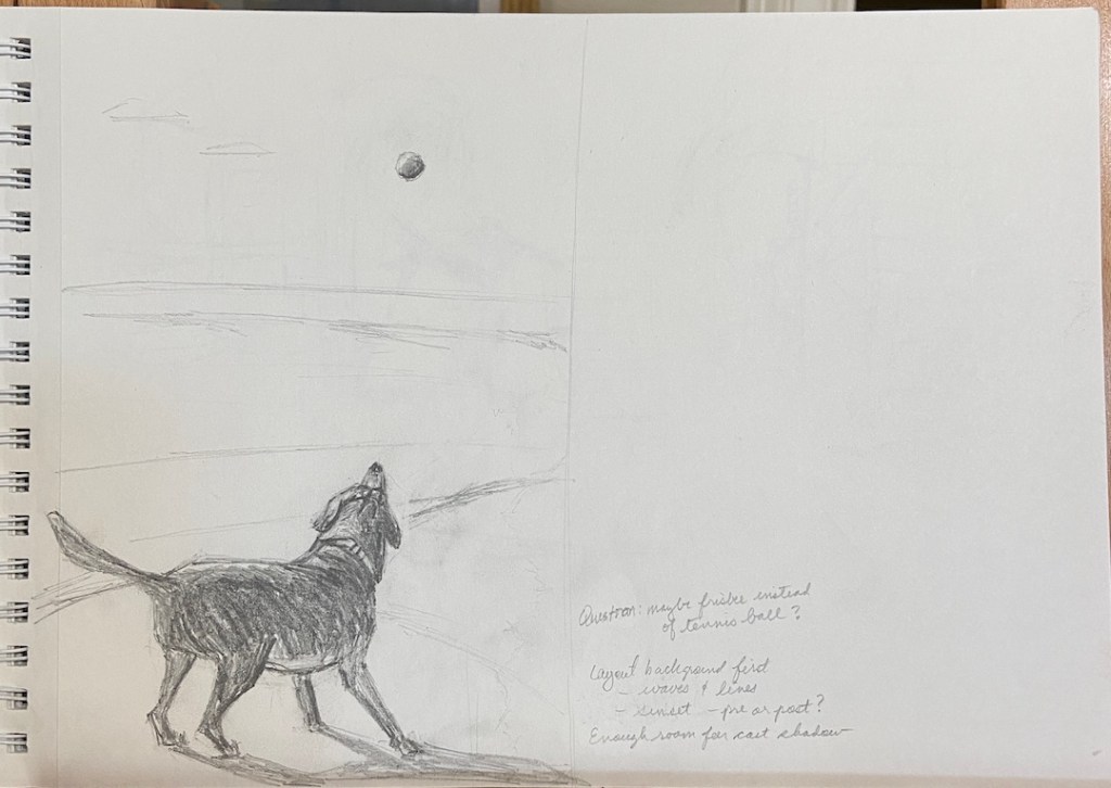
Oddly enough, the most challenging element of DISC DOG was the frisbee. As you can see from the sketch, I noted the idea of using a frisbee instead of a ball. While the ball would have been much easier, the body position of the dog is more akin to waiting to jump at a frisbee rather than chasing a ball in the air. The trick with the frisbee turned out to be the odd look it had as a silhouette. For the life of me I couldn’t get it to convey “FRISBEE”. I kept wiping out and repainting versions of what looked like UFOs. Ultimately I switched gears away from the dark shape and allowed the light from the setting sun to make it pop, but tried to do so without making it the focal point of the composition. The angle of the disc, the lines of the waves, the red collar, and various other elements try to move the viewer to the dog as the star of the piece.

Special thanks to Austin Pets Alive! for all the great rescue work they do for the animals of the city of Austin, the state of Texas, and various cities throughout the United States. In Austin alone, every year there are thousands of rescue dogs playing frisbee, like DISC DOG, thanks to the tireless work, innovation, love and compassion of APA! and their wonderful staff and army of volunteers.  

1 Hour Challenge – Run Sandpiper, Run

Moving these updates to the blog to motivate myself to do them more frequently. The goal is to hone my drawing skills by doing sketches in 1 hour.

This session is from a reference photo taken by my brother. Very challenging given the need to incorporate movement of the bird and the advancing waves. Oh, and drawing ocean foam is hard as hell. I think the key is to not draw it. 

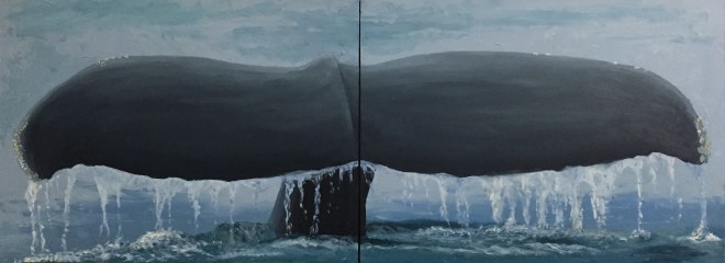
Diving Whale Tail

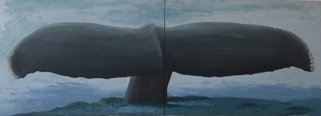
Stuck with the whale theme for this next project. This is a diving whale based loosely on a reference photo I found on-line. Also bought some Payne’s Gray to work on a more balanced value gradation on this piece that is dominated by the tail.

I think this is pretty close to done, but I don’t like the matte finish, so I’m going to do a final glaze layer in hopes of giving the entire piece a wet look.

This is a diptych, each panel measures 9″ x 12″. I was pretty specific with the panel choice so as to get good proportions for the tail. In fact, I think the painting looks better than it really is b/c of the diptych layout. Curious what others think, too.

Technical Details:

  • 2 gesso panel boards, 9″x12″ each
  • Brushes – 2 flats (sizes 2 and 4), 1 round (size 4)
  • Tail palette – Payne’s Gray, Titanium White, and variations of Black and Ultramarine Blue
  • Ocean – Ultramarine Blue + variations of Pthalo Blue, Pthalo Green, and Titanium White.
  • Water dripping off tail – Titanium White + Naples Yellow + Paynes Gray + Ultramarine Blue

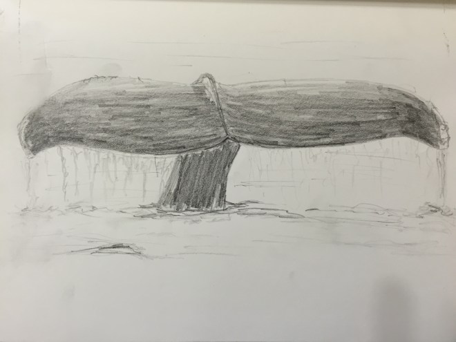
Quick practice sketch.

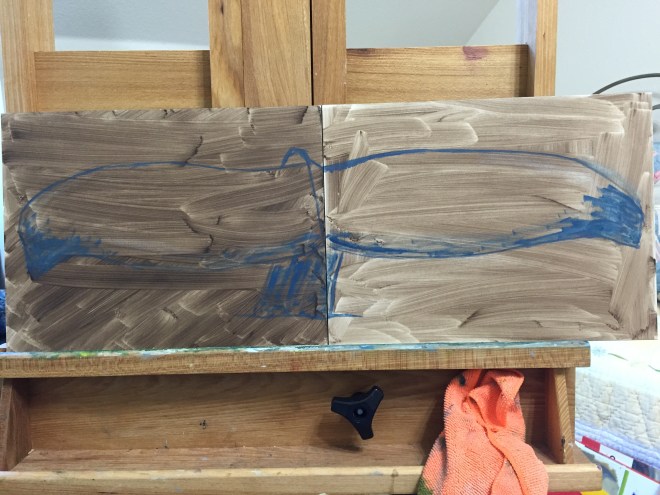
Rough in with diptych composition.

Ocean with initial tail shadow.

Tail almost done
Tail almost done

Water running off tail and updates to ocean near tail with ripples.

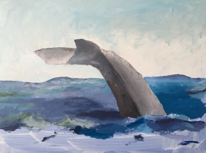
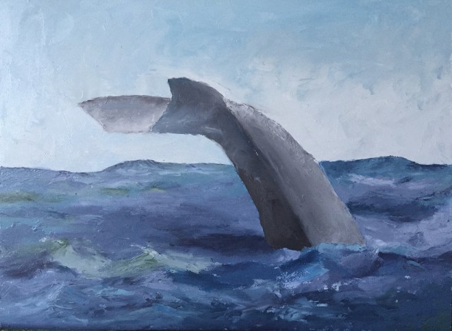
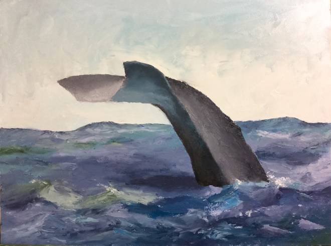
“Baleine!” c’est fini

This piece came together very quickly. Pretty happy with the end result. No brush work – all knife, so I pushed myself to develop more expertise with this tool. There were a few trying moments to get edges right, but it really opened my eyes to the nuances of manipulating the paint once it’s on the board.

The iPhone photos don’t capture the textural knife effects, but hopefully you get the idea of the progressive development in the time sequence below.

IMG_3652
Light pencil sketch as outline.

IMG_3660
Session 2 gets the initial values, sky, and some experimentation with the ocean colors.

IMG_3661
Session 3 made big strides. Figured out the right balance of ocean colors – blues and greens. Whale tail has initial form, but needs work – too flat.

IMG_0329
Session 4, lots of work to get the tail coloring and values right. Also figured out the water light reflection onto the bottom of the tail. Finally committed to having really tumultuous water, so added white caps and spray. Pure guesswork… no idea what I’m doing at this point. The painting knife and I were not on speaking terms for a brief span of time.

IMG_3667
Finished! Added touch ups in various places, but most notably updated the values on the horizon part of the ocean – it was too dark and contiguous, so broke it up with some white caps and lighter blue mixes.