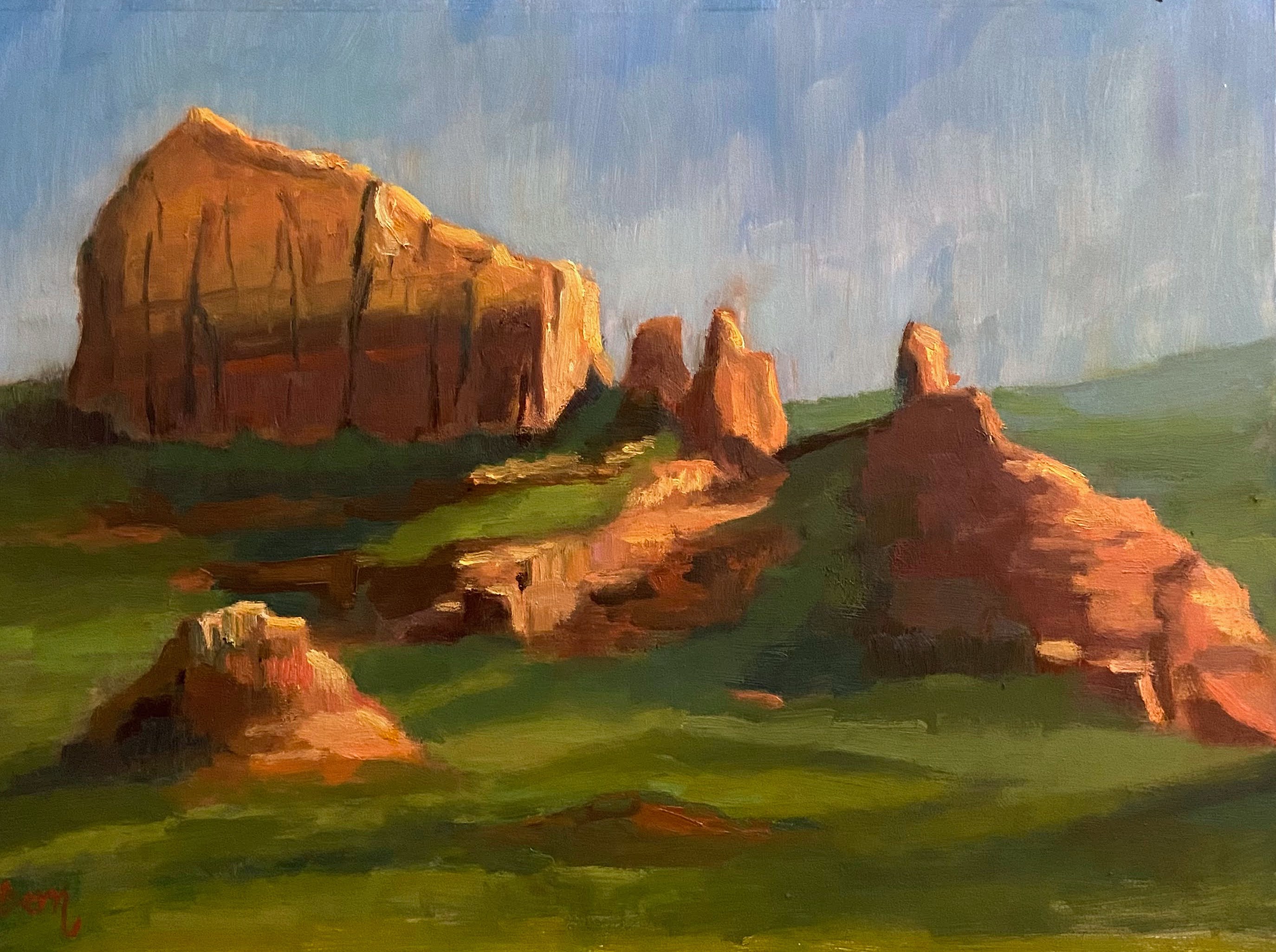
Sunrise Trail View, Sedona, AZ | 12” x 9” | Oil on Board


In November, I attended a plein air workshop in Sedona, Arizona, led by Bill Cramer. Bill is a very talented artist based in Prescott, Arizona, so he knows these landscapes very well. His artwork is captivating and a mastery of light and colors – I encourage you to take a look at his work when you get some time.
Our class size was a little large – 10 people – but it was a good mix of friendly artists, the vast majority of who were established professionals with a wide range of styles. Despite having so many students (I consider anything over 6 alot), what you miss out on 1on1 time with the instructor is in many ways made up by observing and chatting with the other artists in the class. This is especially true in plein air workshops because it seems plein air is not a beginner level pursuit of artists, so the attendees tend to be professionals, experienced hobbyists, or overzealous fans of the instructor. Ha! If you’re an artist, you know exactly what I’m talking about. 🙂
The best thing about this workshop was getting to experience this adventure with my mom. She has been painting as a back-up creative outlet to her true love, the piano, but over the years she’s come to appreciate plein air painting, something I’d been talking about for years (despite my lack of actual experience in getting outside to paint on a regular basis). We don’t live in the same state, so painting together is a very rare activity, although we talk about it all the time. To say this was a real treat for me is an understatement… painting side by side, cursing at the same geographical challenges, and experiencing the beautiful offerings of Sedona together was fantastic.
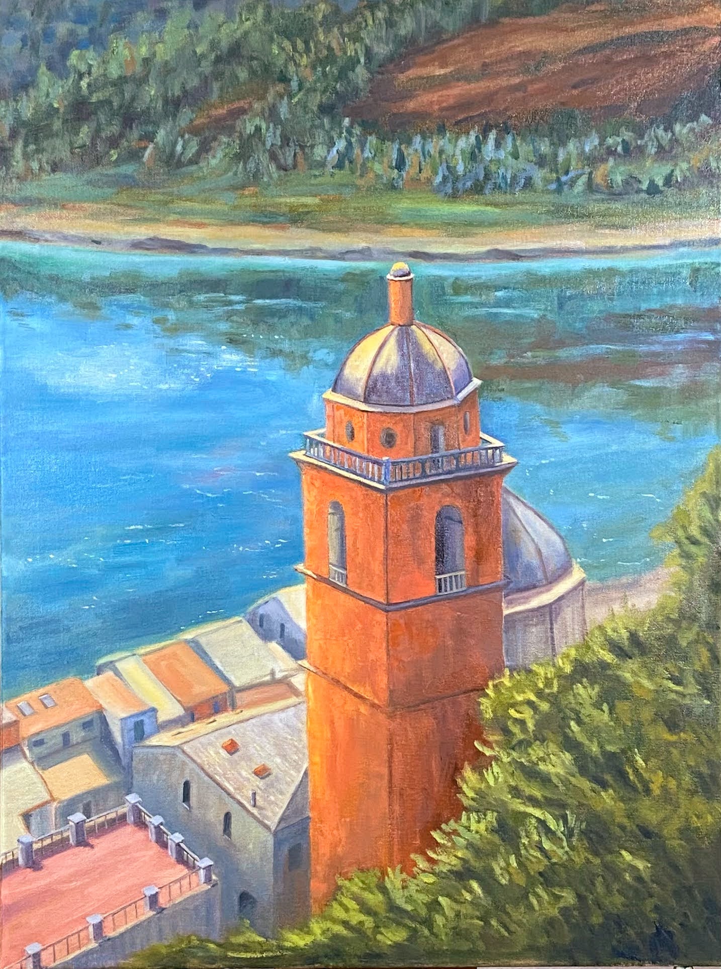
On to the composition, Sunrise Trail View. This piece is a painting in two stages. The first was plein air for a couple of hours in the early morning on location at the Sunrise Trail looking north east. For those of you who know the Sedona area, this is behind the West Sedona Elementary School and Community Pool. I believe the rock formation / mountain is Steamboat Rock, but I’m not 100% sure; maybe someone from Sedona can chime in and clarify.
The second stage was the studio refinement, which wasn’t too extensive for this piece, but it took a few sessions to get it done. One of the trickier parts for me was getting the hang of the technique and strokes to paint the rock formations. It turns out the best approach was to vary brush sizes a little and lay in strokes both horizontal and vertical. My reference photos don’t capture the very rich reds, yellows and oranges of the mountains, so having been on location for a couple days was invaluable in this regard.
Bill Cramer provided some great advice during the workshop and we covered 4 separate locations in the 2 days together. The sites were full of great painting options, plenty of room, and all very different from each other. It didn’t hurt that we had gorgeous weather on both days, so the early starts were worth it.
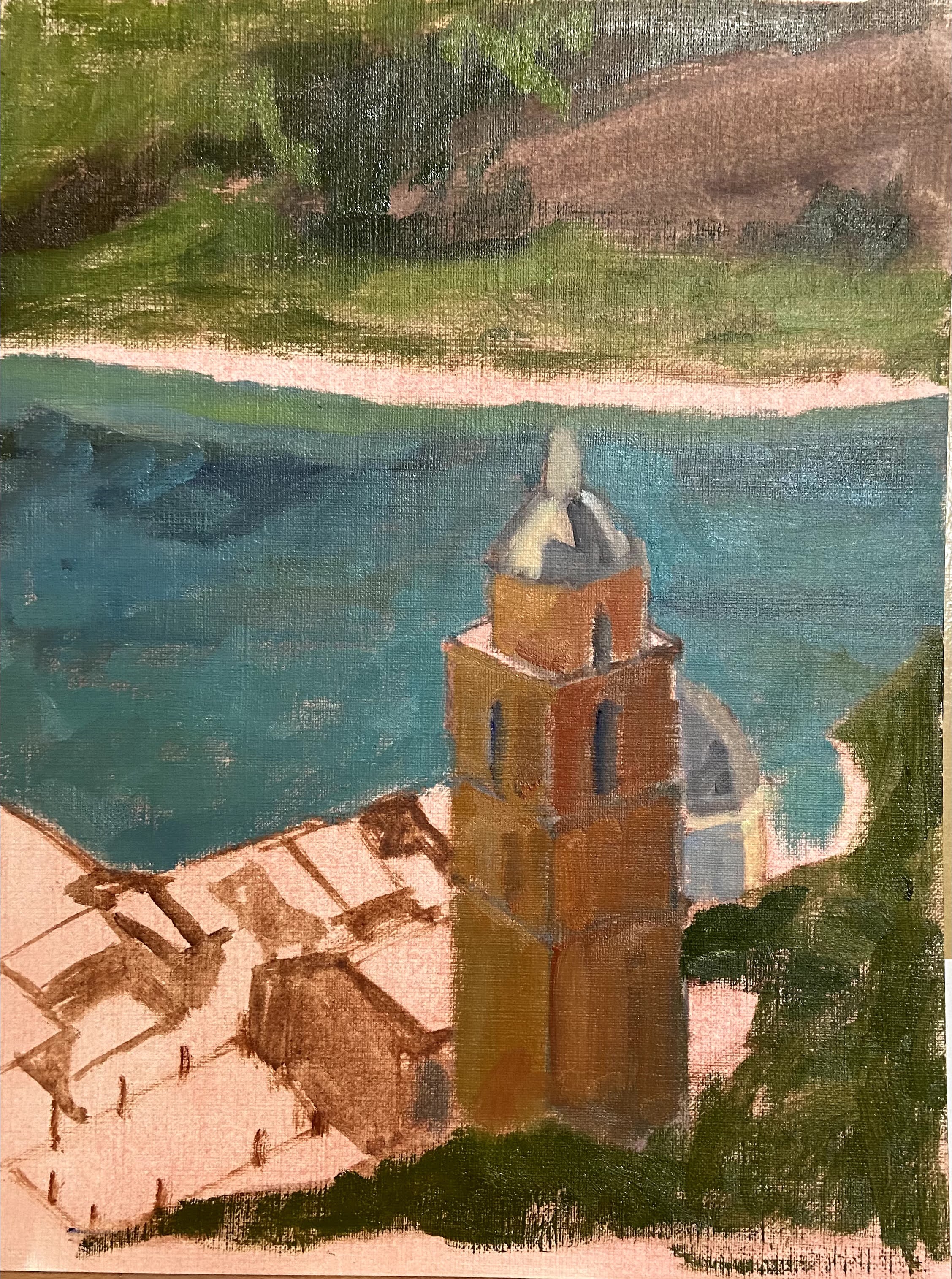
There are a few other pieces that are partially done from the workshop. I will likely tackle 2 of the 3 in the coming weeks to build on what I’ve learned. Stay tuned!
#berntx #crashboomzip #painting #art #sedona #billcramer #pleinair #arizona #painting #abplanalp