Lilliputian Italian Evening Painting

Italian Evening | Oil on Canvas Paper | 6 x 8

I’ve been working on a large seaside landscape piece for the past week and ran into a brutal reality… people! The focal point is a group of brightly colored boats sitting on very saturated blue green water, which has been enough of a challenge in and of itself. I had made good progress on that part of the composition and then realized how many people were in the photo along the harbor walkway. Initially, I thought I’d simply wave my artistic license wand and exclude them, but came to the realization that it would be very creepy and vacuous without people enjoying the sunny day.  

Here’s the problem – I can’t paint people!

The large landscape is on temporary hold while I figure this out; I’ve bounced over to this small piece as a way to practice painting Lilliputians. 
This is an evening landscape, I have no idea where, but I’ve declared it to be Italian, which aligns with my current artistic needs. I kept things loose and painterly, but tried to leverage high contrast values to emphasize the lighting on both the building walls as well as the light spilling out of the restaurants. The people were put in last, and I’m pretty happy with the outcome, although I used 5 or 6 different brushes to figure it out.

One thing about painting people into a landscape – it will make you remember to step away from the painting repeatedly to see if they look “right”. To look at them up close is a real horror show – oddly shaped legs, disproportionate torsos, and some of the worst wardrobe decisions ever made. But step back 6 feet and they look fine. 

There are also some areas of the window sills and exterior wall faces that were done with a palette knife, wet into wet paint, which worked well in terms of giving a realistic, aged look. 

Some notes on color mixing:

  • Green awnings = cobalt teal + variations of yellows including cad lemon yellow, cad yellow deep, and cad yellow light. Darker areas are a more traditional mix of ultramarine blue + cad yellow deep + alizarin.
  • Orange red exterior walls = another wide range that used burnt sienna, cad red medium, cad yellow light, and ultramarine blue. 
  • Lights = exterior lights leaned more towards Naples yellow and a touch of cad red light and white. Interior lights utilized the outside lighting mix plus cad yellow light. 

Lastly, I finally remembered to spread the palette around the entire painting to balance the hues. This was especially true across the vertical faces of the building exteriors, giving the scene a better sense of continuity. 

Thanks for reading!

Flower Study #5: Pink Rose

Pink Rose (study) | Oil on Panel | 5″ x 7″

Yes, another flower! The Pink Rose started off as a white rose, but some prodding from my wife got me to adjust to something a bit more interesting and thus the improvisation towards pink. 

I’ll confess I’m not thrilled with the outcome of this small piece, but I think it’s simply a matter of style preference. The style is less realistic than I’d like, although as a drawing it works well… but it’s not a drawing, so there’s that.

Pink Rose | Oil on Panel

The reference photo is a beautiful white rose, but in hindsight I can see that it’s flat and lacking variations in value. I didn’t figure this out until I was more or less finished with the piece, but it was a very valuable reminder that grinding through a painting isn’t always the right approach if your gut tells you something is off. I see a lot of paintings on-line that have this stylistic look, so I’m pretty sure it appeals to some folks, but, ironically, it’s not for me.

Painting Flower Study #4: Yellow Rose

The 4th of a 5 part study series, Yellow Rose, came together very quickly. The gallery above shows the progression as well as the varied contrast in painting compositional styles. If you have a favorite thus far please make a comment and let me know.  

Before diving into the details of the composition on the next page, I thought the history of the “Yellow Rose of Texas” and the song lyrics were really interesting to read in tandem. I typically haven’t looked into the history of my painting subjects, but having done it with something as innocuous as this yellow rose, I found it to be a curiously motivating way to start a project. I think I’ll add it to my painting process and see if it unlocks some additional artistic mojo in future compositions. And yes, I’ll try not to bore y’all along the way. 

Painting Flower Study #3: Exploding Bouquet

The Flower Study painting series continues moving forward. Now that we have 3 studies completed (click for previous posts on this series: Study #1 Poppies, Study #2 Hydrangeas), it makes sense to line them up at the start of each related post to see how things are moving along. I want to continue exploring different compositional ideas so I can make an informed decision, both with respect to my actual skills as well as artistic considerations (what looks good), before taking on a large, formal piece for the house.

Meteor Spray

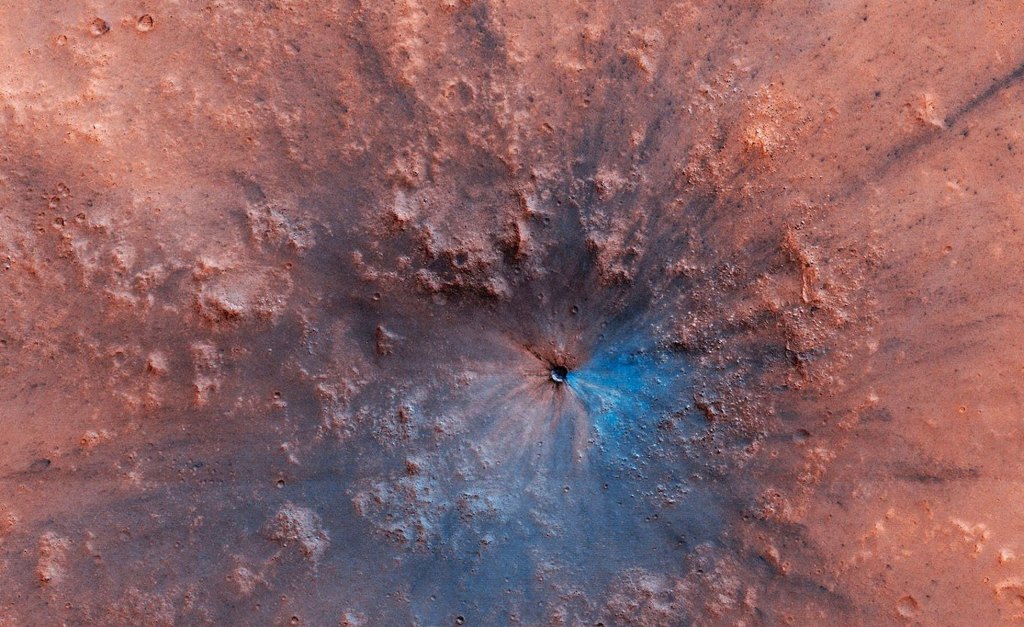
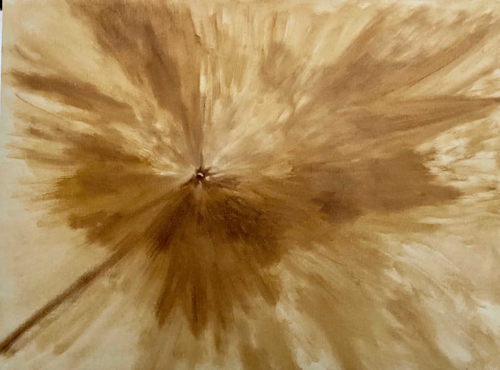
The mission to Mars is complete! This larger piece was a lot of fun on many fronts and allowed for some variations in technique and colors. This is largely an abstract project, although I worked to replicate the essence of the Martian surface, albeit with some wild colors. 

After the block-in, which was described in the Meteors and Squirrels post last month, I focused on the colors. It was at times infuriating trying to create other worldly space dust hues, but I kept at it until I found something that resonated with me. Along the way, I will admit, there was a lot of wasted paint. The solution was glazing, whereby I was able to push and pull the hue and intensity as needed through thin layers atop an initial color scheme. There were 3 glaze layers in total, but the first one was the most impactful, essentially making the whole piece pop and really come alive! It was an exciting moment and something I absolutely love as an artist, namely when you make a creative decision to change the approach and it actually works! Hell yeah! 

After 2 glazing layers, I made another compositional decision to invest more time and effort in multiple craters. The piece needed to convey the powerful impact of the main focal crater, but the addition of other craters enhances the overall painting and incorporates some needed texture. The craters also unwittingly added a strong sense of value contrast and lighting direction that I didn’t realize was lacking until I started dropping them into the Martian surface. 

The final glaze layer was more opaque than previous layers and it was selectively done across the composition to soften and blur many of the larger craters so one gets the sense of a dusty surface – otherwise they simply looked too crisp and clean, an effect I wanted on the focal point but not the other craters. 

Overall, this piece was fun to do, but I’m not excited about the outcome. I absolutely love the impact crater – still now sure how that came together so nicely – and the projection of colored Mars dust (meteor spray) worked well, but I realized the composition isn’t something that appeals to me visually. The final colors aren’t what I’d envisioned and I simply couldn’t get away from the red orange… and I don’t really like that hue, so in the end it was a stupid decision on my part. That said, I’ll be interested to see who likes this piece, either because of the pronounced coloring, or perhaps the Martian space theme, which isn’t a typical painting subject.

Technical details for my fellow art dorks:

  • Oil on canvas board, 30″x24″
  • Glazing done in final layers, but not atop the focal crater
  • Brush sizes were primarily 2 or 6, mostly Flats and Rounds,