Italian Evening | Oil on Canvas Paper | 6 x 8
I’ve been working on a large seaside landscape piece for the past week and ran into a brutal reality… people! The focal point is a group of brightly colored boats sitting on very saturated blue green water, which has been enough of a challenge in and of itself. I had made good progress on that part of the composition and then realized how many people were in the photo along the harbor walkway. Initially, I thought I’d simply wave my artistic license wand and exclude them, but came to the realization that it would be very creepy and vacuous without people enjoying the sunny day.
Here’s the problem – I can’t paint people!
The large landscape is on temporary hold while I figure this out; I’ve bounced over to this small piece as a way to practice painting Lilliputians.
This is an evening landscape, I have no idea where, but I’ve declared it to be Italian, which aligns with my current artistic needs. I kept things loose and painterly, but tried to leverage high contrast values to emphasize the lighting on both the building walls as well as the light spilling out of the restaurants. The people were put in last, and I’m pretty happy with the outcome, although I used 5 or 6 different brushes to figure it out.

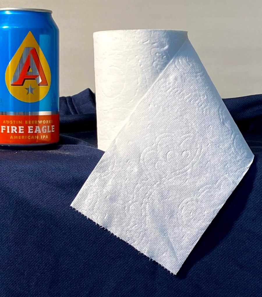
Italian Evening Final 
Italian Evening Progress 
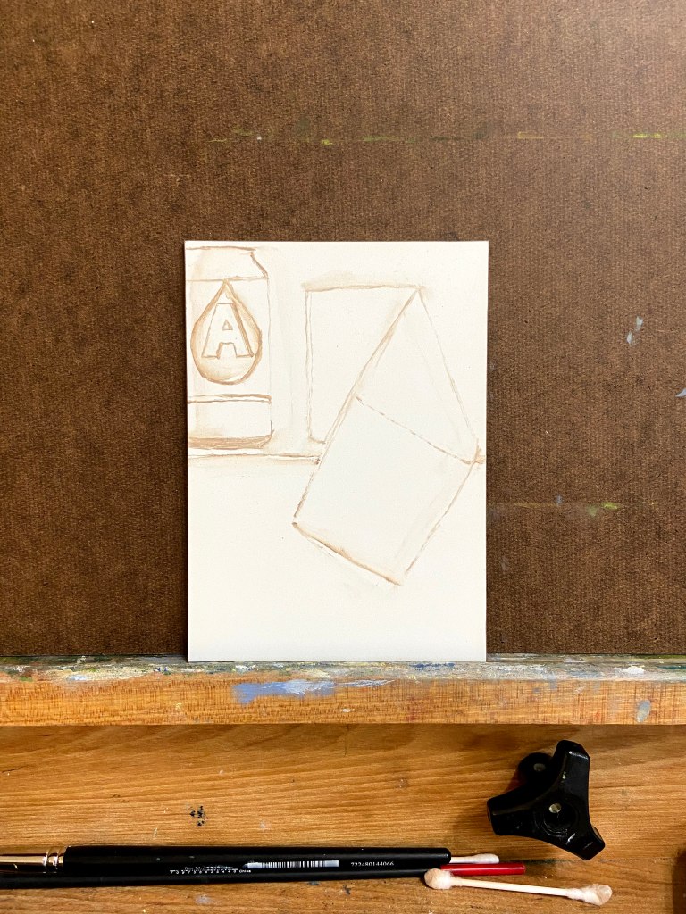
Block In
One thing about painting people into a landscape – it will make you remember to step away from the painting repeatedly to see if they look “right”. To look at them up close is a real horror show – oddly shaped legs, disproportionate torsos, and some of the worst wardrobe decisions ever made. But step back 6 feet and they look fine.
There are also some areas of the window sills and exterior wall faces that were done with a palette knife, wet into wet paint, which worked well in terms of giving a realistic, aged look.
Some notes on color mixing:
- Green awnings = cobalt teal + variations of yellows including cad lemon yellow, cad yellow deep, and cad yellow light. Darker areas are a more traditional mix of ultramarine blue + cad yellow deep + alizarin.
- Orange red exterior walls = another wide range that used burnt sienna, cad red medium, cad yellow light, and ultramarine blue.
- Lights = exterior lights leaned more towards Naples yellow and a touch of cad red light and white. Interior lights utilized the outside lighting mix plus cad yellow light.
Lastly, I finally remembered to spread the palette around the entire painting to balance the hues. This was especially true across the vertical faces of the building exteriors, giving the scene a better sense of continuity.
Thanks for reading!