Always fun to try and sketch something white using black graphite. This white magnolia flower is from my backyard last summer. The bees were having a field day. I decided to add them into the sketch last minute and I’m glad they did. I just wanted to see how hard it would be to include a few bees, but they ended up adding improved depth to the sketch. After sketching this flower I’ve decided to add it to my painting lineup, probably using a painting knife to add cool texture.
The darker shading was done using a 2B with light pressure. Everything else is an HB.
Today’s sketch is one of my dogs, Boom, curled into his comfy dream ball position. Always amazes me that a 60 pound dog can curl up like this. This is a 20 minute sketch done from the couch. I had to go fast because despite how soundly he sleeps, mind you he’s deaf, he has a creepy sixth sense that tells him when he’s being stared at. Invariably, when I try to draw him, he always moves before I have enough on he paper to improvise. Tonight, however, he waited long enough for me to get the outline down, after which he only moved his head a few times.
Boom is all black, so the use of hair direction and basic values was important to make this work. I’m happy with it as a quick sketch b/c it really captures the essence of Boom curled in a ball. I tried this a year ago and it didn’t go well, which reminded me that it can be rewarding to go back to an old subject and see if it’s easier the second time around.
The outline was done with an HB pencil; everything else was 2B.
The use of “SAD” for Sketch-A-Day is, well, sad. Therefore, renaming this quest for 30 days of consecutive drawings to “Daily Sketch”.
Had more time today to tackle a slightly complicated sketch. Still not worrying about completing a final composition, working quickly, and focusing on the skills development that daily discipline can bring.
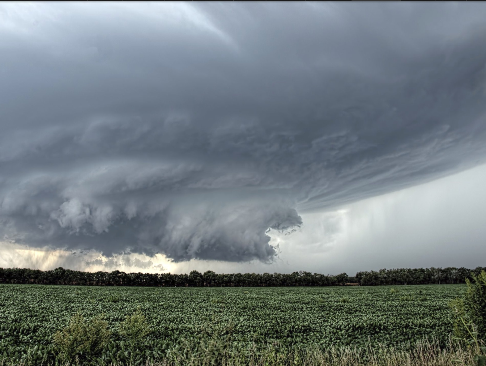
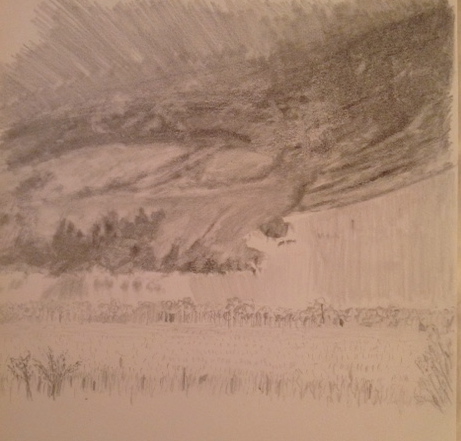
The storm clouds is another painting subject for later this year. It’s going to be a great exercise in the impact of value scales. I’ve included a reference photo this time so you can see how much further this has to go, but despite the incompleteness, the gist is already apparent. I spent about 90 minutes on this today, which is a little disheartening b/c it doesn’t look like much was done, but a lot happened in that time. Used all my pencils – HB, 2B, 4B, and 8B. Also used blending sticks and the gummy eraser to get some cloud effects.
Reference photo of summer storm
While I didn’t get this sketch to the point of realism, I feel confident that I can get it there eventually. I love sketching b/c it can move so fast, but it can be unforgiving in a piece like this as the incessant shading and value blending can do a number on the paper and smooth it out too much to allow for fixing mistakes.
Apologies for the poor photo quality. Sketch time was short today. This is a future painting project, so wanted to use SAD as a way to start gauging the composition. There is a very light reflection in the water, but nowhere near the time commit today to do anything more than a squiggly outline of the carousel in the water.
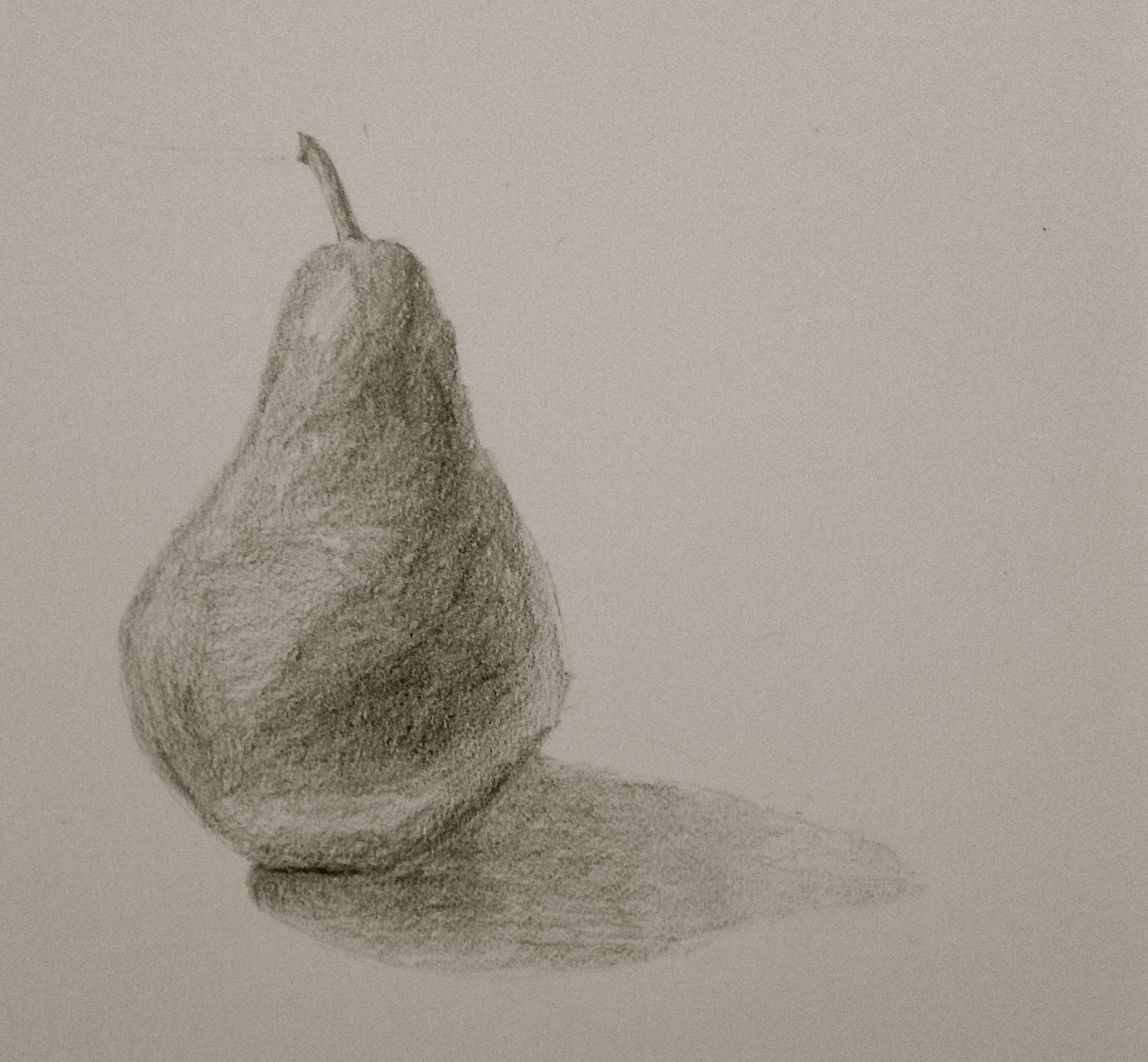
Painted today. Will post that update later this week. But for some sick reason, I wanted to keep the sketch streak going. Practice and all that. Today’s installment a boring pear. Made it interesting by doing it in 15 minutes and only used a 2b.
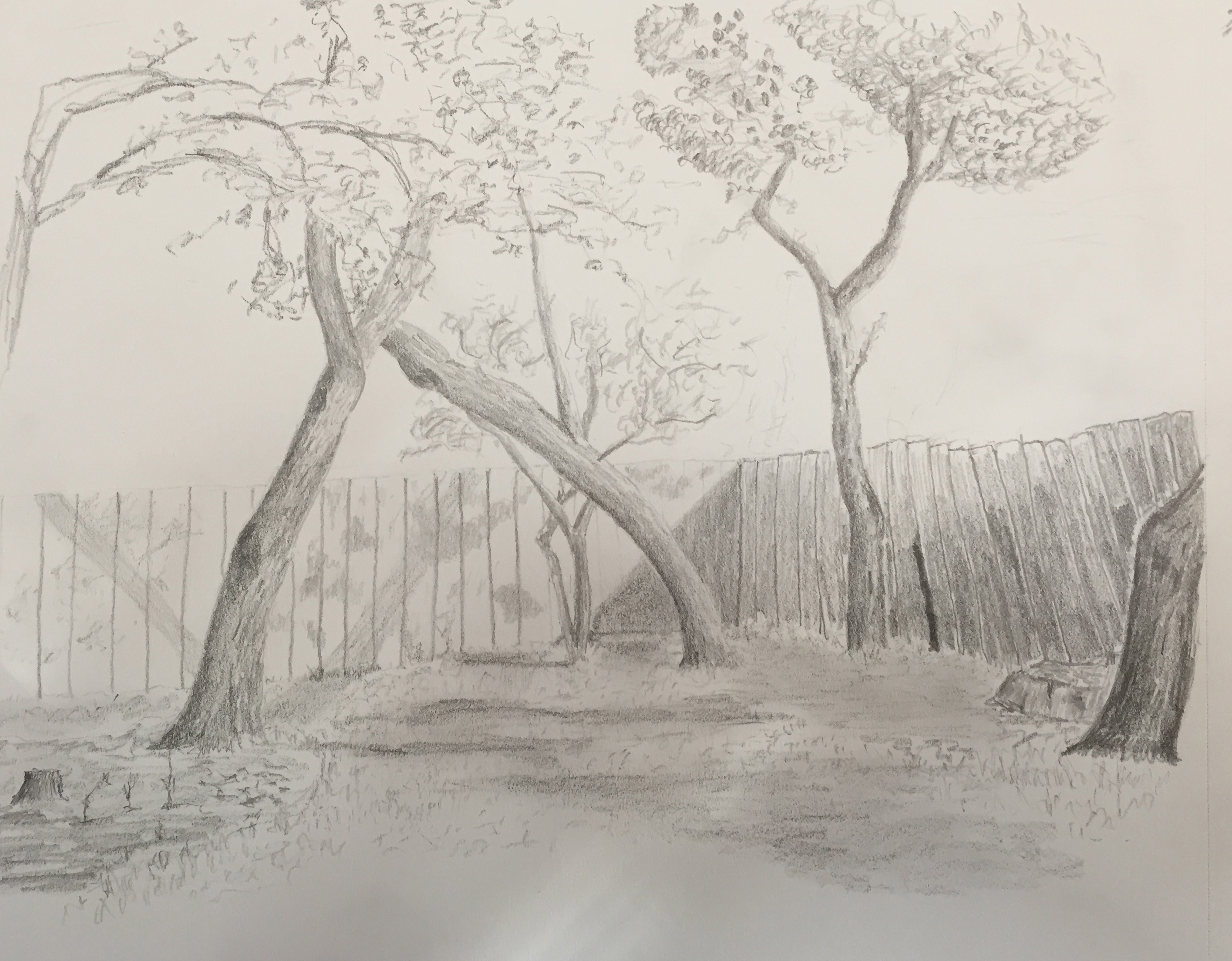
After a week of rainy weather, finally had a beautiful day and could sketch outside. This is from my patio into the back corner of the yard. In the spirit of sketching, namely not looking to get a complete drawing, I tried to get the essence of all the late afternoon shadows that make this space so tranquil.
Sketching tree leaves is an exercise in futility, but massing values and giving the hint of texture seems to work. I don’t have much practice with this type of landscape sketch, but it’s very rewarding when you get it right.
The cast shadows were all over the place – trees on trees, on the far fence, on the grass. I had to rework the values frequently, darkening the shadows on the trees to ensure things didn’t get flat, but also to make the far shadows on the fence look like shadows. Of course this was done outside, so the partly cloudy day made the shadows suddenly disappear for 10 minutes at a time. At first this was disruptive, but then I started using this time to review my work and realize where some of the holes were, then when the sun returned I could jump on the fix.
Used a wide range of pencils to get the necessary variations – HB, 2B, 4B and 8B.
Ok, if I can muster the motivation on a Friday night, tired, after a couple of cocktails, then maybe 30 days is doable. This is #2, “air guitar”, inspired by my all-encouraging wife and her suggestion to draw something from memory based on the movie we watched tonight. I think she was just messing with me, but turned out ok for a 30 minute effort. BTW, the movie was called “Rudderless”, and I highly recommend it.
Toying with the idea of trying to do a sketch a day for 30 days. Some might be really remedial, namely what can I sketch in 10 minutes while fighting off sleep. While others might be a full hour of practicing a new composition that will ultimately turn into a painting later. Either way, I’ll give it a try and see if I can do it. Actually, one exception to the “per day” rule – painting sessions count towards the sketch-a-day commit.
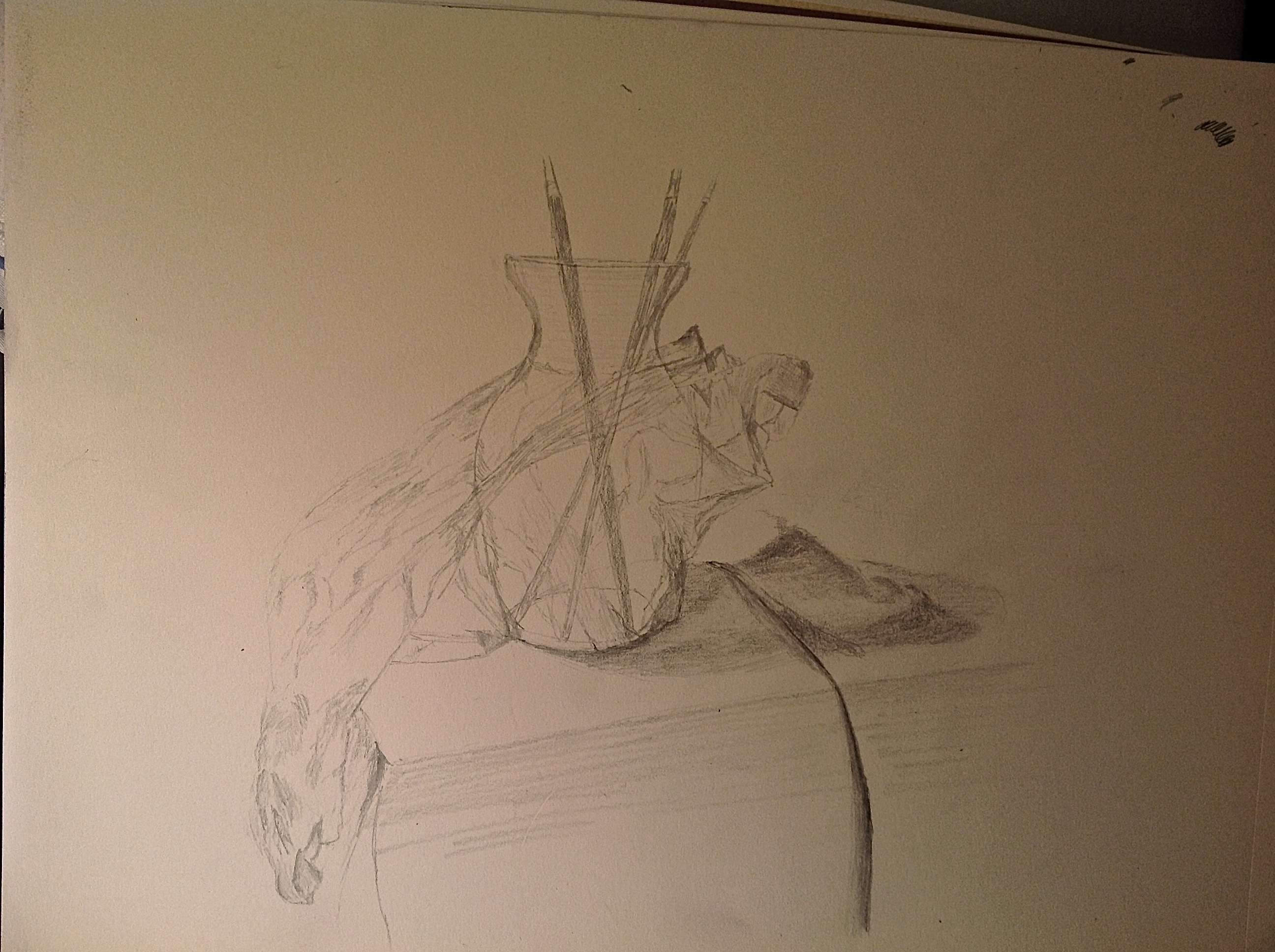
Here’s sketch #1 – the vase wrapped in cellophane, which is the very same subject I’ve been painting. Thought a sketch working through the values in the cellophane with graphite might help tackle the actual painting, which I hope to work on this weekend. This sketch was done in about 45 minutes. The photo sucks, but the lighting effect is kinda cool, with the light source over stated from the left side. For the drawing artists out there, this was done with a 2B mostly, but I used an HB for some of the lighter cellophane areas. I used a gummy eraser to pull off some of the cast shadow shading to get a transparent effect of the vase. Working the value ranges of the cellophane was insanity. It will probably be easier to manipulate with oil paint.
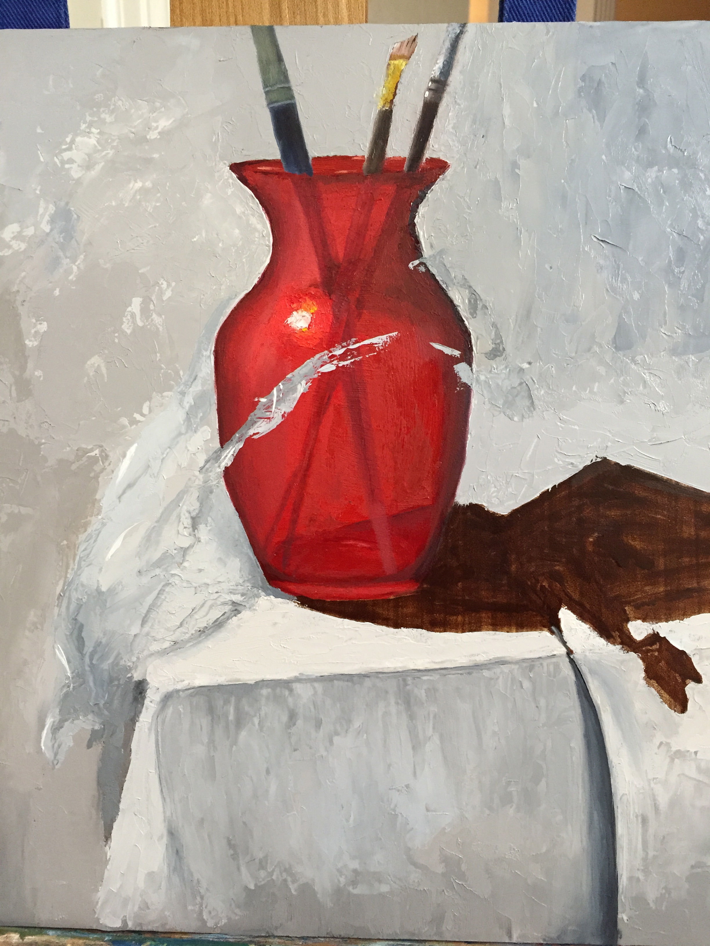
I’m probably just dodging the real challenge of wrapping my pretty vase in saran wrap, which essentially may ruin the piece, but at least I had the pleasure of completing my first white linen table cloth top and folds. Painting the palette knife (with a palette knife) was a little difficult with the gold/brass colors where the wood handle meets the metal neck, but it’s close enough given it’s not the focal point of the work. I also kept it a little soft so as to not draw too much of the composition’s attention. Also got some of the red of the vase in the cast shadow by simply working wet alizarin into the cast shadow darks – pure, dumb luck. Did all of this work with a palette knife, which is becoming an addictive tool.
Next session will tackle the cellophane challenge head-on. But for now I’m happy with the supporting cast.
With a few deep breaths, and some tasty wine for liquid courage, I dove into the cellophane stage of this composition. I carved out a little more than an hour tonight to get the ball rolling. I was pleasantly surprised with the progress, but I will admit that my inner artist was struggling with laying gray tones on top of the pretty red vase in the name of cellophane.
It was rough going initially b/c there weren’t enough value contrasts between the white table cloth and the wide range of cellophane grays and cast shadows. Then I remembered the advice from David Cheifetz during his workshop a couple weeks ago – “Value is king! A painting with the right values but wrong colors will still look pretty good.” I’m not about to put that on a tshirt or a bumper sticker, but its great guidance. I stepped away from what seemed like the right dark and light grays and made both ends of the spectrum more extreme, darker grays and lighter grays. It seems to have worked so far.
The real power of the cellophane image won’t really come together until the grays are laid in properly and then the bright, white highlights are added on top. That’s what gives the cellophane it’s shape and texture. I’m still not entirely convinced this will look like the real thing when I’m done, but stepping back from this first stab at it, I was able to see the shape of the cellophane starting to come together. The key is going to be establishing that clingy sensation with the highlights. Fingers crossed…
[The grays of the cellophane are primarily 2 setups: Ultramarine blue + burnt umber + white OR white + ivory black. I’ll probably add a 3rd option for the cooler side of the cellophane (right side, away from the light source) of UB+raw umber+white. ]