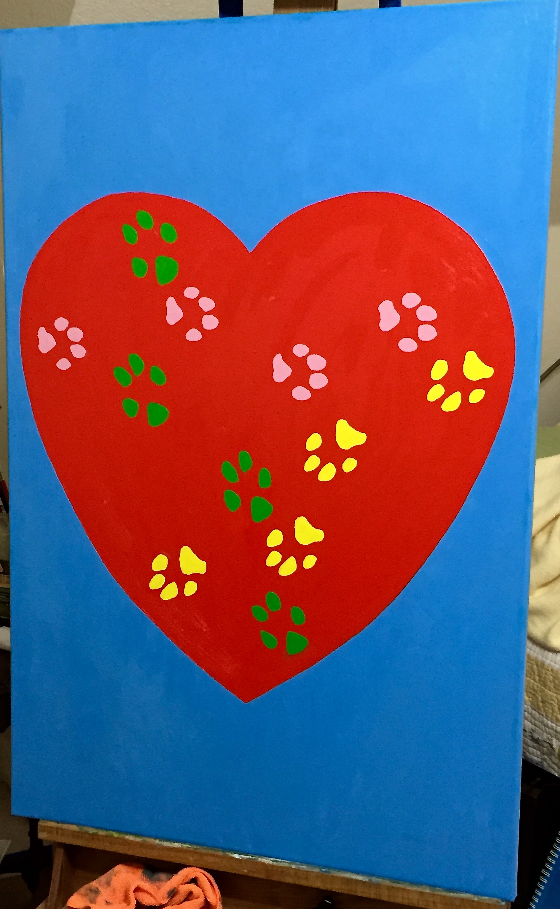
“Rescued” is done and hung on the wall downstairs in our powder room! This was my first “commissioned” piece, done for my wife who wanted something with a lot of saturated color and big! The design is entirely from her and the passion and love she has for rescuing dogs, of which we’ve had the pleasure of fostering 114… and counting. When my wife says “rescue”, she means literally rescued from the kill list at the Austin pound, not “rescue” from a pet store (don’t do it… just adds to the breeding problem), and these dogs are often in really bad shape – parasites, detached intestinal walls, starvation, neglect, flea infestations, ticks, kennel cough, Parvo and more. But she nurses them back to health, even waking at all hours of the night to feed them meds every couple of hours, and finds each one of them loving homes. She is amazing!
She also had the primary design in mind, of which you see in the picture – a large heart with the paw prints of our 3 dogs (yes, rescues all of them) on it. We had a lot of fun collaborating on the details, although she would say there was some stress involved in figuring out the right colors for each dog’s prints, which ended up as follows:
- Pink – Crash, female, age 13
- Green – Boom, male, age 12
- Yellow – Zip, female, age 3
The process for getting the dog’s paw prints on the painting is worthy of a separate post, so I’ll pause here today and give an update on that entertaining adventure in my next update.
Tech details of the painting for those interested:
- Canvass, 24″x36″
- Colors were almost straight out of the tube, but had to make some small tweaks:
- Blue background – Titanium White + a small amount of Pthalo Blue + tiny bit of Orange.
- Red heart – Cad red medium
- Green paws – Permanent Green Light + Titanium White
- Yellow paws – Lemon Yellow + Titanium White
- Pink paws – Titanium White + small amount of Alzarin Crimson
- I added the Titanium White in heavier doses with the yellow and pink paws because it helps add opacity to those more transparent colors. Sitting atop the red heart it was helpful to cut back on the bleed through.
For the dog rescue lovers out there, the group we work with, Austin Pets Alive, is fantastic and is by far the most influential and impactful rescue group in Austin, perhaps all of central Texas. If you want to learn more, check them out.