New Project: Giverny – La deuxième fois

Taking on a new, larger project based on another very green Giverny photo. The good news is that I took it in person, which means I was at the stunning Giverny gardens with my beautiful wife – pretty ideal to say the least. The bad news is all that intimidating green.

Reference photo is pretty good, and it’s readily apparent how one can be lead into the photo.

IMG_2561

I spent the better part of an hour tonight doing nothing but experimenting with mixing variations of greens, mostly using Permanent Green Light and Viridian Green, and testing how they change with the addition of various secondary colors – burnt siena, cad red, cad yellow light and medium, cad orange, and ultramarine blue. Staying away from pthalo green for now, but I’m happy with what the results are.

A couple weeks ago I got this painting started. After a quick reference drawing in my sketch book, I laid in very remedial base layers, emphasizing darks. This looks like total crap for now, but that was expected as the next session will build more value range and better greens to give it some life.

IMG_2847

Canvas size is 24×18″, which is large for me. I’ve done this size a couple times before, but very basic stuff, so this will be different. I may also try to do some large chunks of this with a palette knife instead of a brush. I have a workshop in February with David Cheifetz and my experience with painting with a knife is very limited. Fingers crossed!

“Play with Me?” – done… really

A few posts ago I had declared a drawing of one of my dogs completed, but was drawn back in. I didn’t like the floating head look and wanted to fix that problem. With some guidance from my drawing teacher (thanks again Laurie!), I got to the finish line with a drawing that I’m proud to hang on the wall.

Some significant enhancements: 1) added the wood floor, 2) a plain rug, 3) darkened some of the darkest areas of her face with an ebony pencil, and lastly 4) added a light cast shadow.

IMG_2828

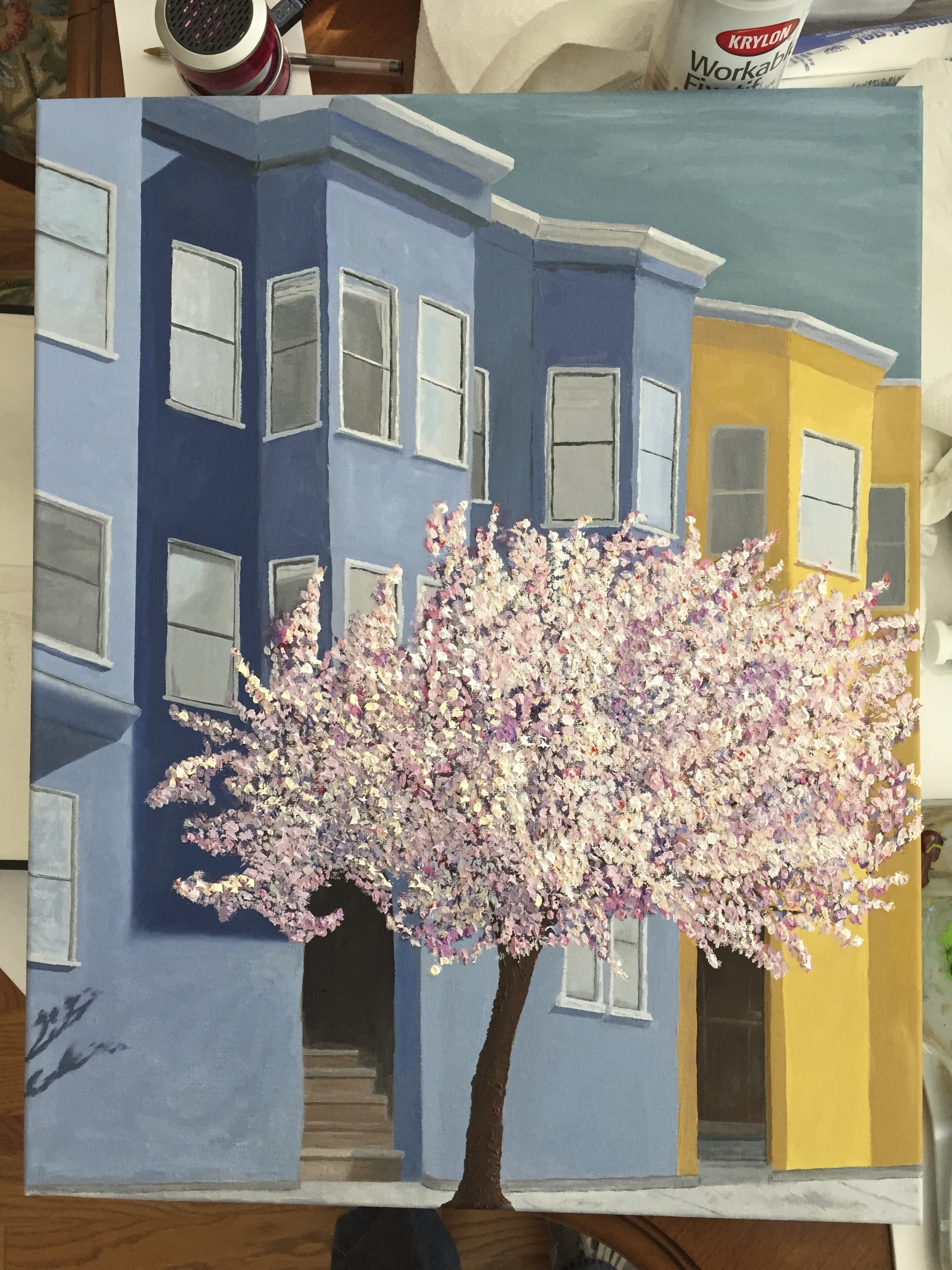
Lines and Blossoms – Finished!

Overdue for this post, given that I finished this one a few weeks past, but better late than never. The final “touches” took more time than I thought, but it was important to get the depth of the tree right, which took some long steps out of my comfort zone with a very high value white to represent the bursting blossoms in bloom. It was a bright day, so the photo looked washed out and a little flat, so I went with my gut on what would work on the pseudo shady side (left side). Probably could have gone a little darker to add the right value contrasts, but at some point you have to say “done”!

In addition to the density and value range updates for the cherry blossom, I added more focus to the windows directly above the main doorway. Notice the curtains in their various states of being drawn up or back.

Having taken time to consider the finished painting for the past month, I’m happy with the technical variation and palette. However, as a composition I think it’s lacking. I tried to draw the viewer into the painting in a few ways: 1) the shape of the tree on left side curled around the entrance to the 2) main doorway with the stairs leading light steps up into the darkness, and 3) with more crisp details in the windows immediately around the top of the tree. There’s also some good compositional layout with the various angles of the building lines. That said, I don’t feel that the painting does enough to engage the viewer. I’d be interested to know what others think, so please offer up your criticisms, comments, guidance.

IMG_2843

Drawing – Dog Curled on Bed

With a close-up of a dog face under my belt, it was time to tackle a different perspective. This is my mom’s dog, Dixie, in full dream mode. She’s very camera shy, so this is as good as reference photos get for her.


First session lasted a couple of hours, but only after having done an initial reference sketch, which helped get the difficult curled up shape and proportions of body parts just so. Once I had this much done I had to give my arm a break. All those hairs start to drive you nuts. Pretty good start, but a little creepy since she’s floating on the page. Dixie Drawing Lg Another session, probably 90 minutes, got the obvious dog bed in place, but also worked the ebony pencil to get the values right on the folds of Dixie’s coat. Dixie Drawing Finished

Pretty happy with the final composition. I’m genuinely surprised at how quickly this came together. There were 3 big challenges with this drawing.

1. The face and general complexity of dog parts involved in a curled canine. But the reference photo was really washed out for the face, so I had to draw what I knew was there rather than just what I saw, b/c I knew what I was looking at was wrong.

2. The hair is much different compared to my previous effort with Zip’s dog face. The strokes are longer and thinner. It was also very tricky to get the white dotted pattern and random splotches in some places just right. Used a 2B for most of the hairs, but in some spots experimented with an HB.

3. The values on a curled up dog SUCK! I’d love to blame it on the lighting in the photo, but even if the lighting was studio quality, I’m pretty sure the challenge of gradating values to show the change in depth in the curled center area would be the same. But I got it to a good point and decided I better leave it alone.

Overall very happy with this one. I’ll have to do a similar composition of my dogs curled on their beds.

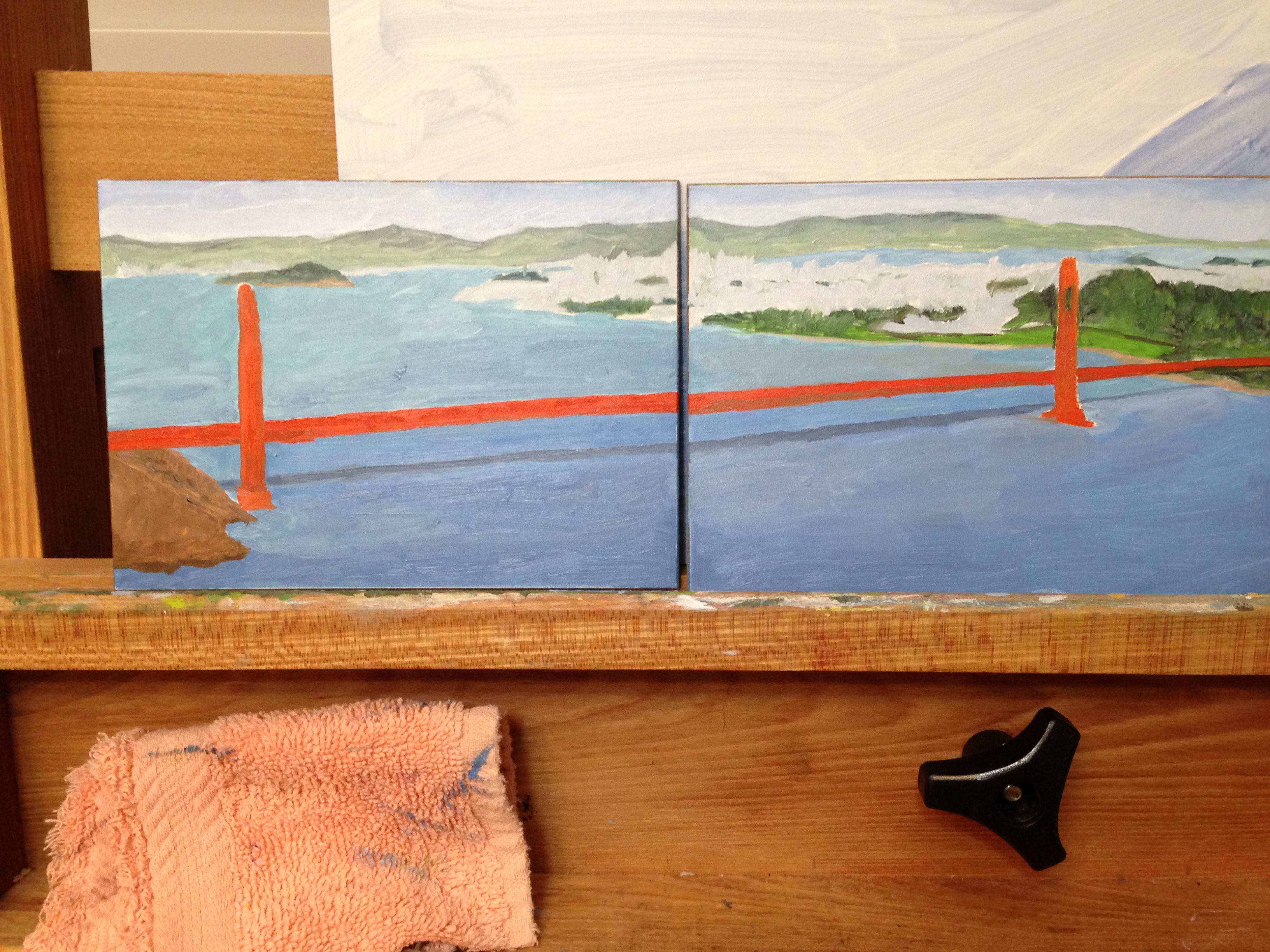
San Francisco and Golden Gate Diptych

Long overdue for a post. Been working a lot on drawings (animals), finishing the Lines & Blossoms piece, and started this new diptych.

Reference photo was taken by me a couple years ago. It’s an amazing vantage point from the Marin headlands looking back towards the city. Breathtaking!

SF and Golden Gate reference photo

This is my first true diptych, as well as my first painting on wood. The panels are small (5″x7″) and pre-treated. Below is the rough drawing outline, which I had practiced in my sketch book a couple times prior. What worked best for me, which wasn’t the way I first tried to do it, was to draw from the horizon/back of the composition “forward” to the bridge and foreground. It was much, much easier to get the angle and proportion of the GG bridge with the city roughed into the background for reference points.

rough drawing to get scale on panels

This first session was short by my standards, perhaps a couple of hours. It moved quickly because of the small size and the color mixes came together faster than usual. The details will come in the next session, but I think getting the lighting on the cityscape is going to be tricky but critical to ensure the piece has the right depth.

IMG_2813