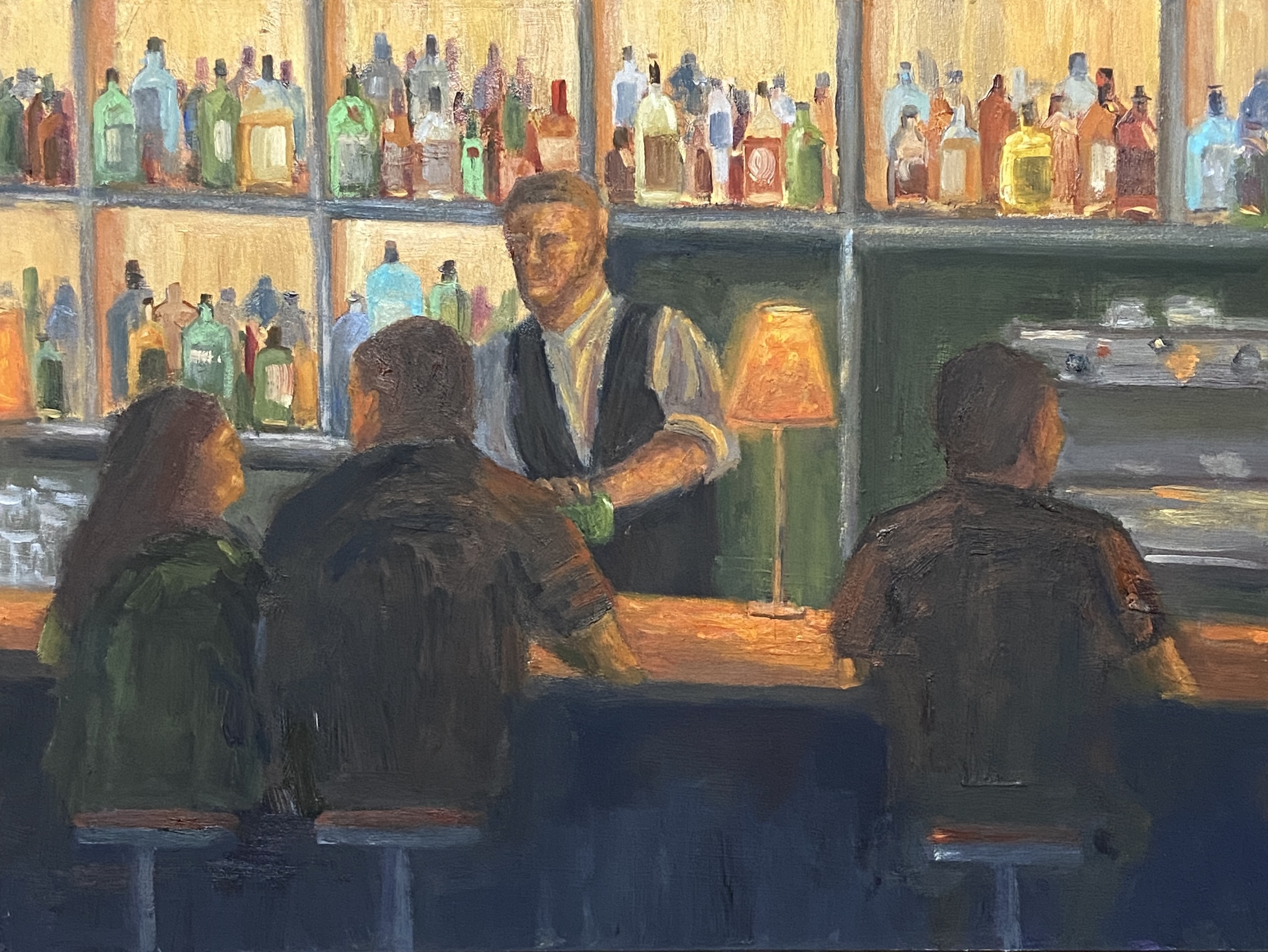
Oftentimes I use my own photos as inspiration for my paintings, but I also use pics from people I don’t know. This is something I believe most painters do, typically for a couple of possible reasons. First, I paint, I’m no photographer, so my photos are, well, not very good. Some things even an iPhone can’t fix. So I might use my own photo as the main reference, but find other options online of the same area to enhance the view. The other main reason for using a reference shot from someone else, be it an individual, magazine, etc., is because it’s something or some place I’ve never seen or been to personally. It’s this latter reason that applies to this new piece, LAMP GLOW.
I spent a lot of time on the canvas with this one, which was expected given my lack of experience painting people in detail. In fact, I must have wiped the face of the bartender no less than 6 times, and reshaped the bar patrons many times as well. Ultimately, I’m happy with the result and I learned a lot in terms of technique and what NOT to do.
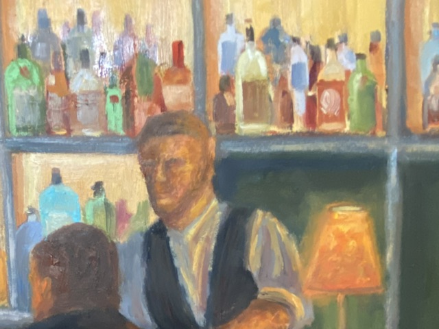
Lamp Glow Detail
The focal point of LAMP GLOW is the glow from the lamp on the bar, not the lamp itself. Because the glow is a soft light with a mid-range value, it was a little tricky to make it work. Usually, the focal point of a composition is highlighted by things such as high contrast values or sharp edges. Lacking these options I pushed the saturation and ensured the soft, orange light bathed the primary elements in the painting, which (hopefully) makes the glowing lamp a clear focal point given it emanates throughout the scene.
In terms of design decisions, I’m not sure I took the right approach regarding the liquor bottles in the background. While they turned out nicely, I think they’re ultimately a distraction and might be more effective if they were softer and less saturated. Oh, and painting 67 individual bottles is a wee bit tedious.
I’m privileged to be included in another group show at Art for the People Gallery in Austin! I’ll have two pieces in the show, FISHERMANS POINT and SMOKY ON ICE. I’m especially stoked at this opportunity because these pieces showcase two very distinct painting styles, namely landscape and still life.
The show runs June 7th – August 17th, 2024, opening reception NEXT SATURDAY, June 8th, 12-4pm CDT at the new location of Art for the People Gallery in Austin, Texas.
Note that the Art for the People Gallery has moved locations and is no longer on South 1st street. They are part of Good Dad Studios located at 2801 S. I-35 Frontage Rd. Good Dad Studios is Texas’ largest artist complex, which means they have a lot of artist studio space, and within the facility are galleries and other businesses, one of the most notable being Art for the People Gallery.
Reach out if you have any questions, or better yet go to the gallery and check out all the art.
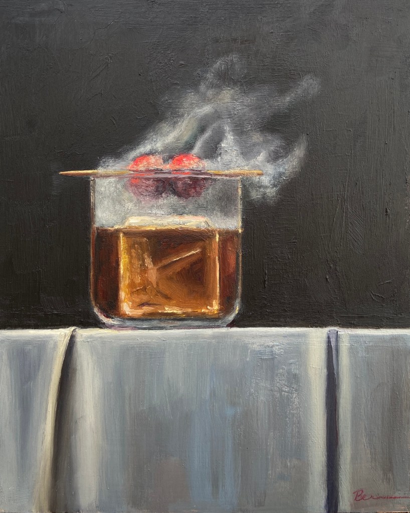
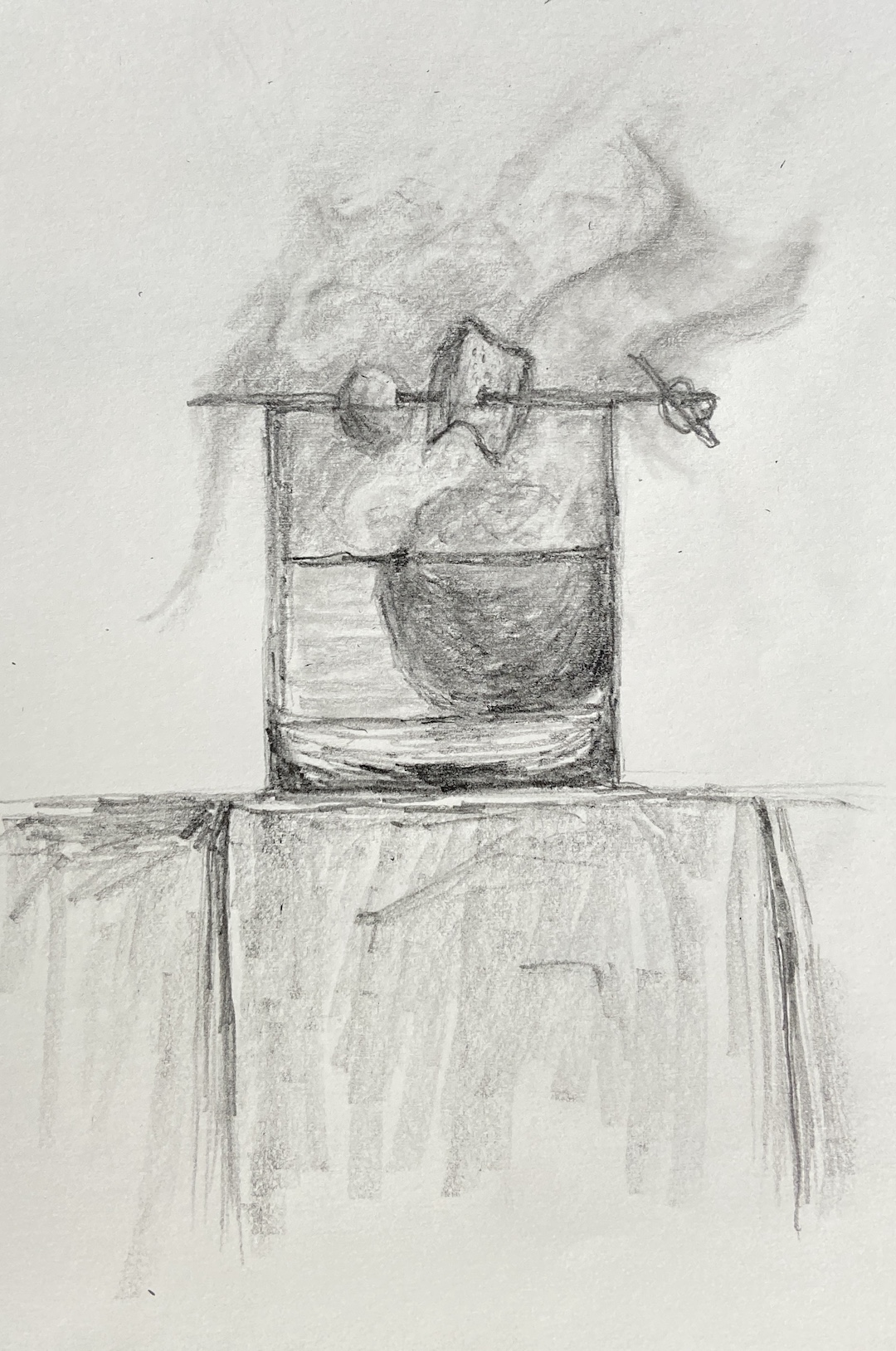
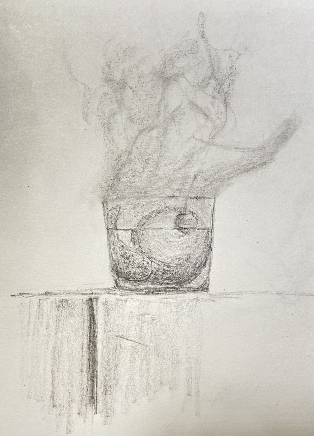
Building off my most recent still life, SMOKY OLD FASHIONED, I wanted to finish another piece with smoke effects so I could refine the process and build on the original. SMOKY ON ICE changes some core compositional structure, none of which is hard to miss, but obviously the focal point is the massive ice cube. The challenge, in addition to that pesky smoke, was making sure the other key elements worked the viewer back to the ice.
First, let’s talk about that ice cube. Even clear ice cubes have flaws, but they’re hard to see in standard light. Ironically, if you drop one in a low ball of whisky and incorporate some mood lighting, the imperfections will jump out. And these imperfections are the coolest part of a clear cube!
The cherries hovering over the glass, immersed in smoke, are a design decision to keep the proverbial “you” in the glass… with the imperfect ice cube… and all that tasty whisky (GlenAllachie for me, please)… you’re welcome! Lastly, I used a palette knife for the cherries to give them a different texture. It also worked out better with manipulating the red colors into the smoke without smudging, which was hard to avoid when using a brush. The ice cube was done with thinner paint and brushes, ensuring a smooth, glassy look. Thanks for reading!
Every once in awhile I find the motivation, and patience, to make a time lapse video of a painting. I did this for Smoky Old Fashioned, but it was done over the course of numerous short painting sessions (1-2 hours), so it gets a bit frenetic at times with lighting and zoom variations. Tight cropping and good music are included so as to distract from the lack of cinematography talent.
I’ve learned a lot about the process and iterations artists have to endure to get a composition just right by watching time lapse videos. Having done a few of my own this year, I’ve learned they’re also a great way to capture how I did something and be able to return to it later as reference for future work that harnesses the same subject matter.
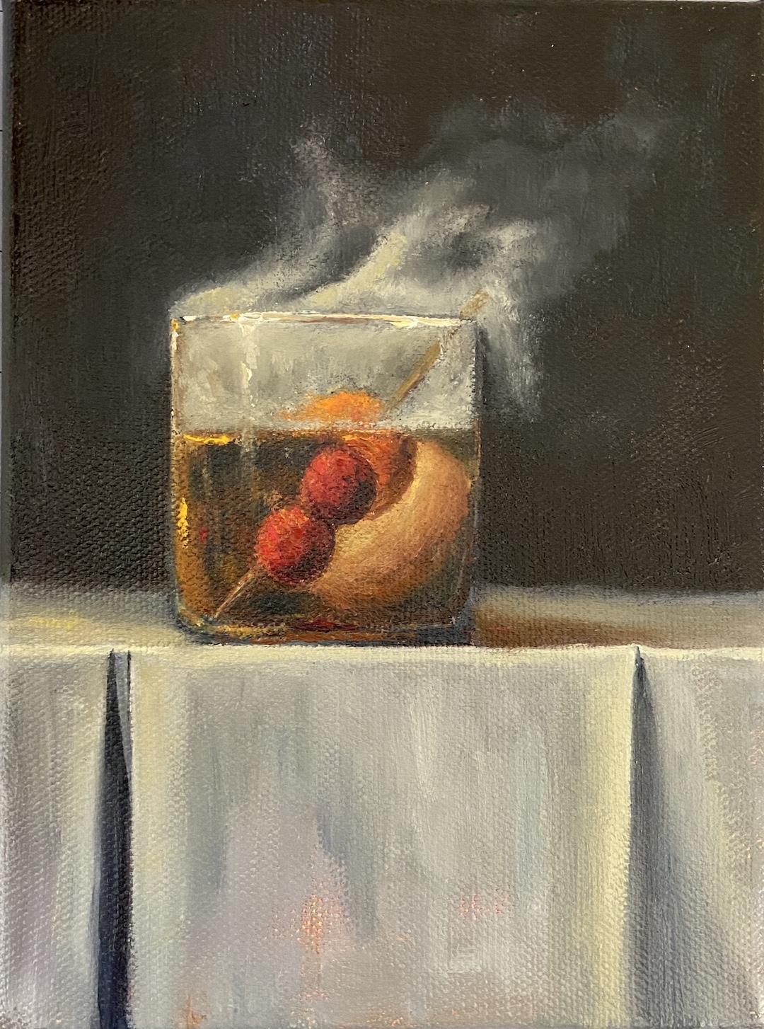
SMOKY OLD FASHIONED is a recent commission piece, something I love doing, especially when it’s for a gift or something sentimental. In this instance, the painting is for a gift for someone who apparently has everything. Painting to the rescue!
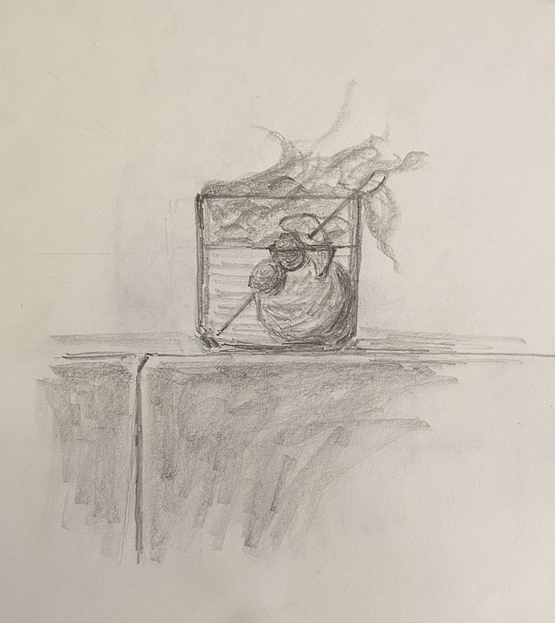
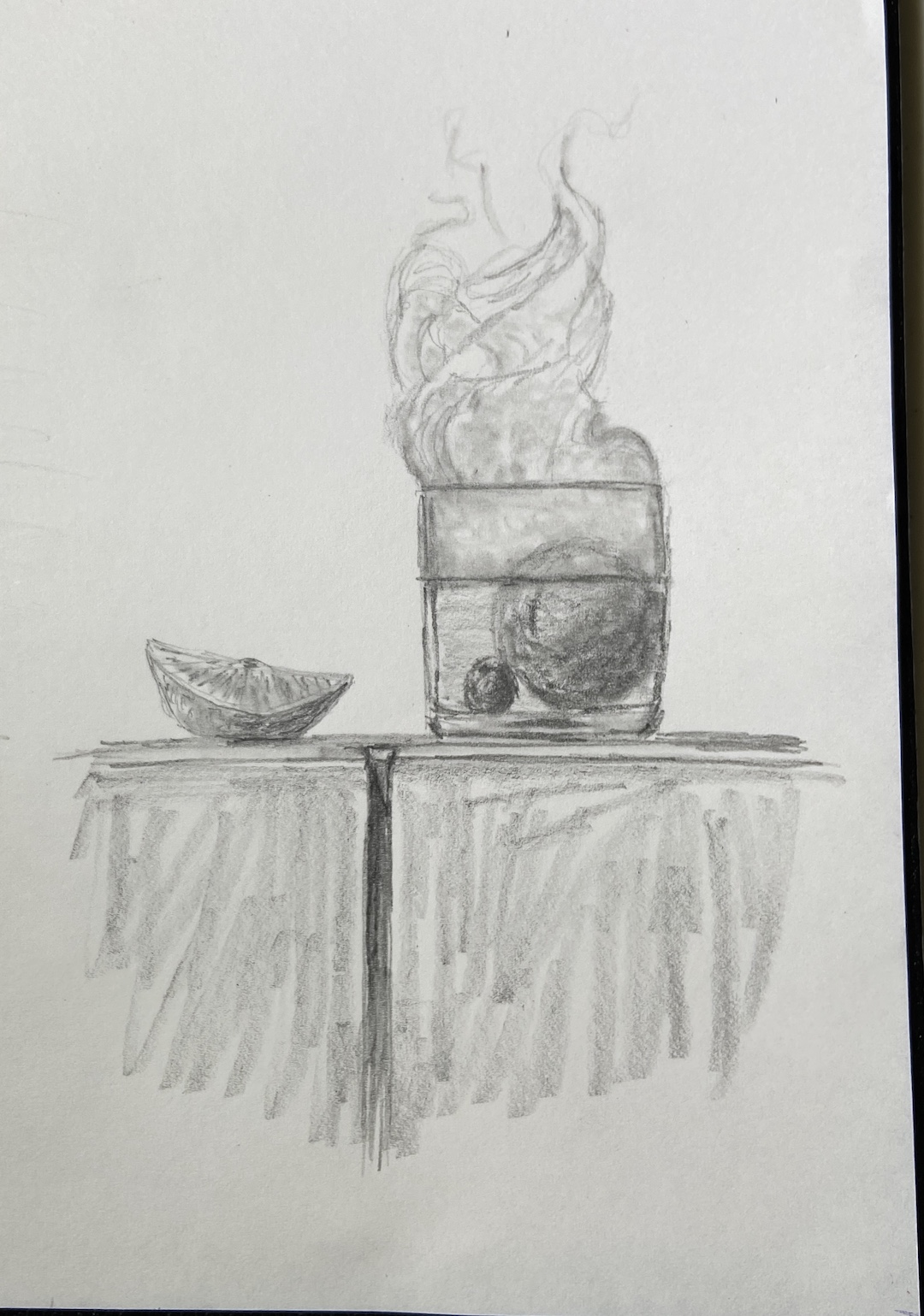
My process for custom work involves a number of preliminary discussions followed by sketches that give compositional options. Just like blocking in the value structure of the actual painting is key to a good outcome, with a custom piece, coming to an agreement on the core elements and structure of the composition is vital.
I’ve painted a number of libation-based still life compositions, but nothing with smoke. It required me to investigate if painting smoke was similar to creating fog, mist, or larger fire-based plumes.
The answer, it turns out, was an emphatic NO! It seems that once you pump smoke into a cocktail glass, weird shit happens and it becomes lifelike and animated. Looking at reference photos further complicates matters, introducing possibilities of upward windy smoky tendrils, or smoky bits that spill over the edge toward the table. Come to discover both of these considerations are smoked red herrings! Smoky tendrils are “fresh” burning anomalies, and the only smoke that sinks seems to be dry ice based smoke, which you can imagine is in a lot of cocktail glamour shots.
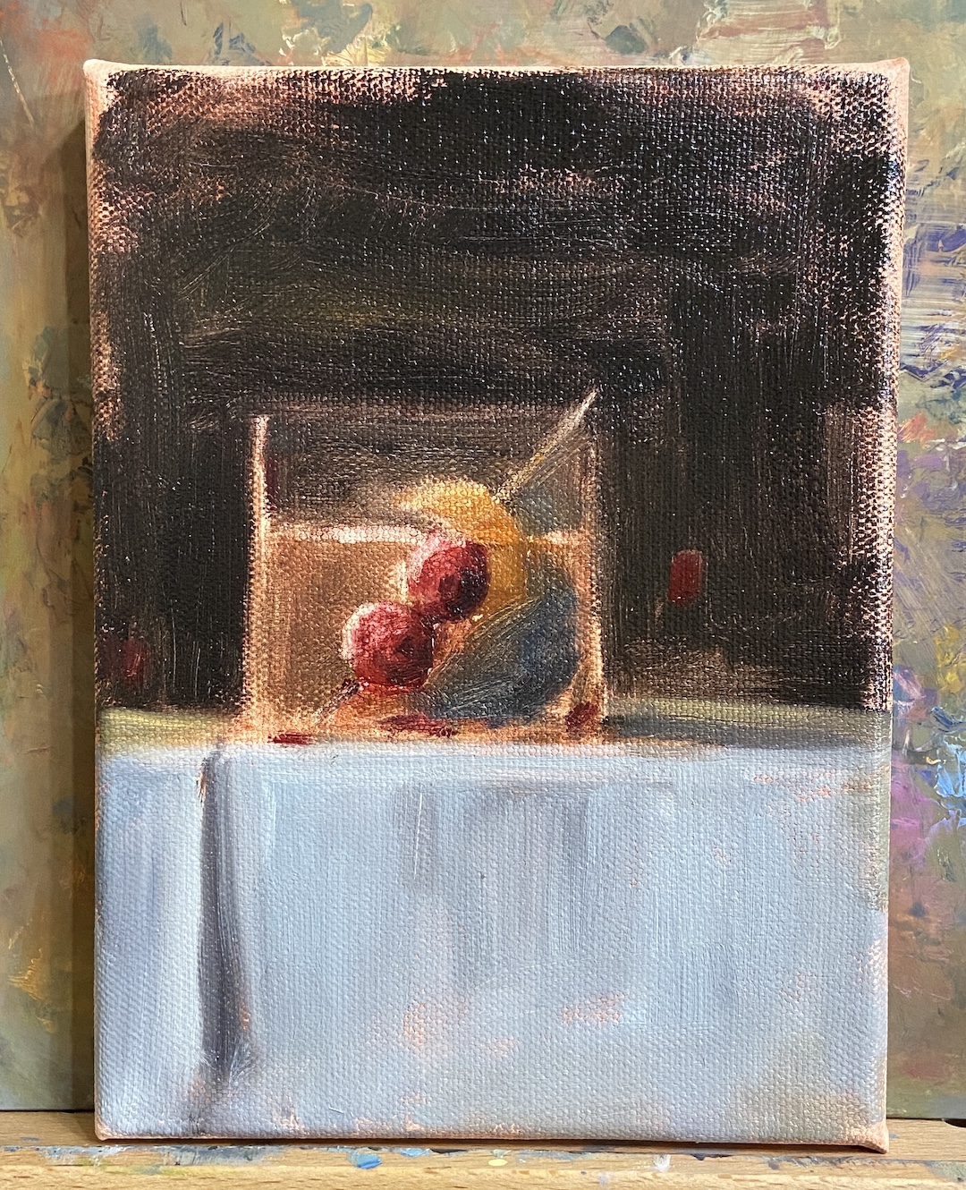
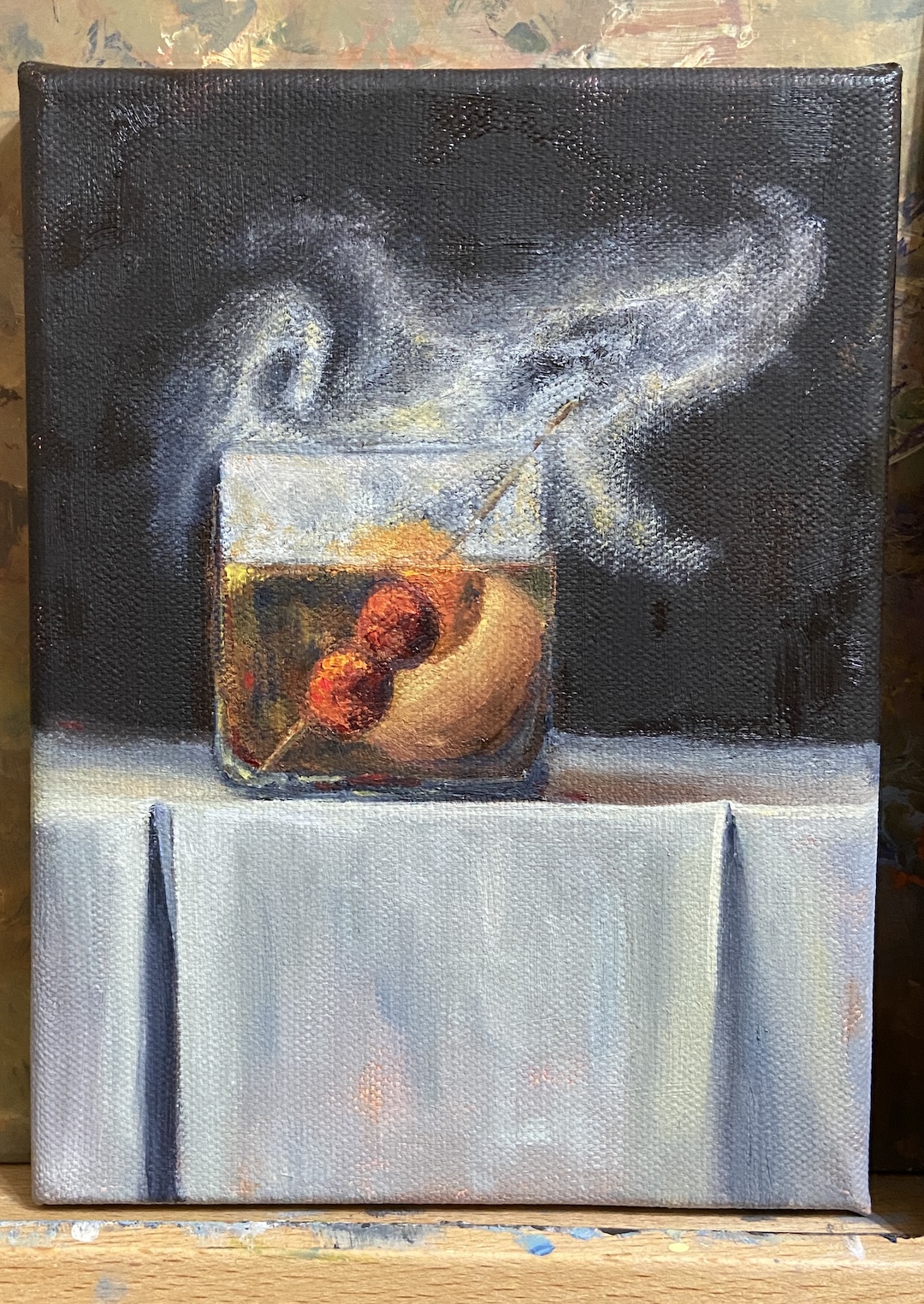
The trick with this piece was clearly… smoke! But before getting to that challenge, there was the issue of compositional tension. Technically, an Old Fashioned isn’t so much a cocktail as an origins story of composition. The Meehan’s Bartending Guide, my personal true North for all things cocktail, notes “the cocktail was first defined on May 6, 1806, in The Balance and Columbian Repository as ‘a stimulating liquor, composed of spirits of any kind, sugar, water and bitters’. By the time it showed up in a professional bar manual for the first time in Theodore Proulx’s 1888 The Bartender’s Manual, it was already “old-fashioned”.” My personal preference is rye whiskey, simple syrup, bitters, 1 cherry and an orange twist. Now back to the painting…
The request for this piece was to incorporate Luxardo cherries, orange peel, and a large round ice cube. Figuring out how best to structure this as a piece of art was trickier than I thought, even without the smoke. Once you put all that stuff into a lowball glass, it’s impossible to not notice the tension of so many things jammed into a small space. To tackle this problem we simply talked through various sketches that presented different solutions, and we ultimately landed on cherries on a toothpick, angled into the glass, orange peel also on the toothpick but above the whiskey line, and lastly a demotion of the round ice to the background. As a pleasant surprise, once the smoke was added, it significantly improved the compositional structure because it broadened the view and seems to have further reduced the tension, essentially granting the viewer a larger viewing room.
Lastly, the smoke technique. I still need to refine the approach, so stay tuned for more smoky cocktails, but the core approach seems sound. The smoke is not white, that’s the first thing. Turns out it’s about 20 variations of gray, leaning warm (cad yellow deep) above the glass, and a little cool (lemon yellow) below the rim. The brushwork boils down to a lot of push and pull between the light grays and the black background, using a lot of scumbling with an oversized round brush. As the smoke expands above the glass, it was important to make sure there was a very thin layer on the outside edges of the core smoke to lend it a sense of movement. The person who commissioned this piece has a cocktail smoker top, which sits on the top of the glass and is then pulled off in a flourish when the smoking is done, which pulls some of the smoke up and out of the glass. It’s all very entertaining, until you try to paint it!
It’s happy hour time again! Before moving forward, it’s time to reveal the name of the cocktail from the Happy Hour – Roosevelt post from a few weeks ago… the Sazerac! It’s a great drink and the next time you’re in New Orleans I highly recommend a visit to The Roosevelt for the original recipe.
This latest addition to the series should be much easier for you to figure out, although it wasn’t necessarily easier to paint. Happy Hour – Shaken is an iconic cocktail indeed and something that James Bond fans will recognize instantly, although 007 preferred a stirred version.
This cocktail is a top choice in my household – even the dogs like it! Well, they probably would love it, but they just get to have the ice cubes after the drink has been strained. Yes, it’s hilarious – they hear the shaker, come running to the bar, and proceed to sit (without a command mind you) until I’m done, at which point they each get a piece of ice. They are, without a doubt, very lovable booze hounds.
Back to the painting…
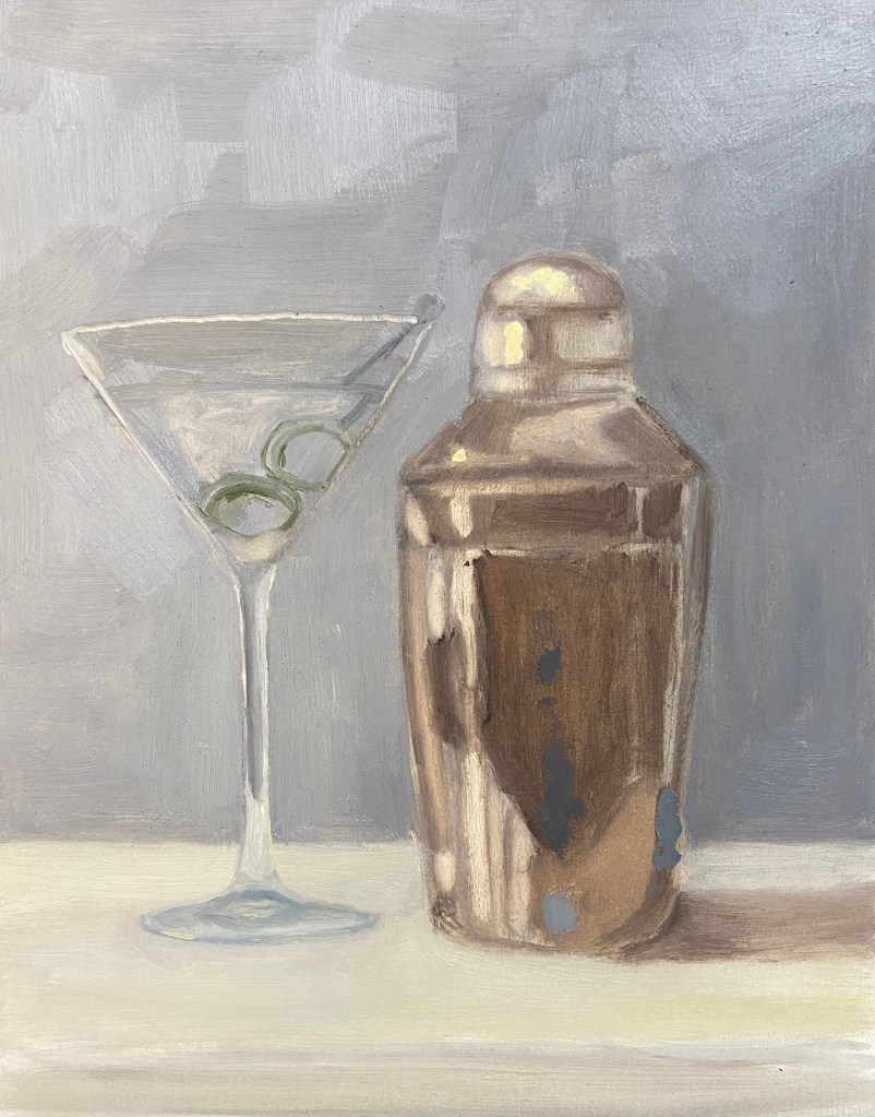
I’m very happy with the outcome and feel like the repeated efforts on this Happy Hour series is starting to show demonstrable improvements in the artwork. This was a challenge on 2 fronts. First, the ongoing challenge of glassware in a still life has been tricky to refine, but I finally figured out the right value scheme to make it work – the solution for me was simply being more aggressive with the darker values. Secondly, I lacked experience painting truly reflective metal in still life compositions. Again, a more concerted approach with the darker values made a difference, but more importantly was simply waving the wand of artistic patience and working through the various reflected elements.
A few additional observations and details about the composition:
Reference Photo: As you can tell the shaker is not exactly the same as what’s in the photo. I used a reference photo blending technique, using the real shaker as my primary source, but simplifying the object by looking at other photos and paintings on-line that were, quite frankly, better cocktail shakers.
Brush and Knife: The vast majority of the piece is done with a Flat #4 and Round #2 brush, but the olives are all knife work. They are the focal point of the composition, and as such I wanted them to have some more texture and a reflective quality of their own.
Size: This is more than twice the size of previous Happy Hour series pieces, 8″x10″ vs 5″x7″ boards. Usually when I go bigger, the work is harder technically, but this time it seemed easier. Like I said, progress.
I haven’t figured out what the next cocktail in the series will be, but I’m leaning towards something with a shaker. Cheers!
We’re returning to the still life series called Happy Hour. Cocktail #2 is hot off the easel and ready for your guesses. But first, time to reveal the answer to cocktail #1 fromHappy Hour – Angostura… it was a Whiskey Old Fashioned! The Old Fashioned is one of the classic cocktails, but despite the simplicity of it’s composition, there are a number of subtle changes one can make in the base ingredients to create a wide range of variants. A very good recipe can be found here on PUNCH, my go to resource for all things cocktail. If you have a favorite riff on the Old Fashioned, please share in the comments!
Returning to Happy Hour – Roosevelt, the hints are few but specific. I excluded the city name from the napkin, but suffice to say it’s arguably the most important cocktail (and food) city in North America (although I defer to our Canadian readers for any challenges to this claim), birthplace of many classic libations. Any guesses? The answer will be revealed in the next cocktail series piece in a couple weeks.
The Roosevelt is another oil composition on an 8″x6″ gesso board. The type of cocktail glass is not something I would have tackled at this point, as it’s very complex and a bit beyond my comfort zone, but it was true to the cocktail, so I gave it a go. The other challenge was the color of the drink itself, a mix of cadmium red medium, cadmium yellow deep, titanium white and ultramarine blue; there are also some bits with cadmium yellow.
Next time I’ll pay more attention to the dark values in the drink itself, as I strayed from that tenet early on, getting a bit obsessed with trying to nail down the elusive pink/orange color of the drink. If you look at the block-in picture, it’s obvious that I knew there were very dark values in the drink itself, but I didn’t paint them in properly.
And beware the challenge of painting words, especially words with fancy letters… with lots of curves… on an undulating cocktail napkin! Definitely not something to do if you’re jacked up on caffeine – it requires a steady hand and a lot of patience. I had to make a big withdrawal from my limited Bank of Zen to get through it.
I was pleasantly surprised with the ease of doing the blurry, colored bar of illuminated bottles in the background. This is also true to the actual setting of The Roosevelt and a handy approach to call upon in future compositions.
Thanks for visiting and don’t forget to post your critiques and cocktail guesses in the comments!