Squirrel Watch

Pivoting from painting to drawing last week and finally made the time to finish this one. Squirrel Watch is pretty self explanatory – Wolfgang, my 3 year old rescue mutt, sitting in the yard watching the tree tops for the infiltrators! 

One of my artistic goals this year is to improve my dog related art skills. I’m not a big fan of dog portraits, however, I thoroughly enjoy what I like to call “dogs doing stuff”, creating intrigue through motion and activity. Over the coming months I’ll work on various dog related pieces that capture the essence of dogs being dogs as they do their thing. 

Squirrel Watch | graphite on paper

Squirrel Watch was done over the course of a few weeks – I have no idea how long it took, but I wouldn’t be surprised if I spent 6 hours on this relatively small piece. There were a lot of mistakes along the way, but nothing an eraser and some patience couldn’t remedy. 

This isn’t a piece I would frame and hang, but I’m pleased with it from a progress perspective. It’s also riddled with lessons learned, so if you zoom in to see the details you can spot various styles and techniques.

Here’s what I learned and need to remember for future drawings:

  • It’s not necessary to draw hair detail throughout the subject. In this piece, the emphasis should have been on shading and shape foremost, whereas hair detail should be secondary. 
  • Draw hair details with a clear understanding of actual direction of the hair on the dog.
  • Work hair dark to light. 
  • Most of the hair detail can be accomplished using 2B, HB, and H pencils.
  • Show wrinkles in the coat by changing the density of hairs, i.e. closer together or further apart.
  • Dog paws are hard to draw, dammit! 
  • Blades of grass can be done by either individual strokes or by lifting out shading with a thin eraser. 

A Stuffed Kong and Its Dog

I recently saw a question on Quora asking “when does drawing end and painting begin?”, which was a timely inquiry given a new approach I’ve been taking with some recent paintings. It’s always a bit tricky and, frankly, pretty intimidating to take on a new type of composition. For me, that tends to be something that involves shapes and/or subject matter that’s new or unfamiliar. In one of my current projects, A Stuffed Kong and Its Dog, I came to realize that while the subject of a dog toy was not a new compositional challenge, the complexity of a dog chewing and pawing something was really friggin’ hard!

My normal process, and what’s been reinforced at workshops by artists far more experienced and talented than myself, is to do a study of the subject to help get a feel for the composition (see Dances With Squirrels blog post for more on studies). I prefer sketching as opposed to small paintings, largely because I like to sketch, it’s more expedient than painting, and it’s more flexible, i.e. erasing graphite is infinitely easier than wiping out paint. Lately, however, I’ve been refining this process whereby I still do an initial sketch before starting the painting, but as I work through the project and run into challenges, I go back to the sketch and either do another or simply refine the one I was working on earlier.

In hindsight it’s frankly a brilliant idea, of which I don’t have many, because the pause from the painting a) makes me breathe as I gather my thoughts to overcome the problem, and b) let’s me return to an existing sketch and figure out how to navigate a solution based on a similar composition. What I’ve found thus far is that I often find the same problem in the original sketch, kicking myself for not having seen the problem in the first place, but I can quickly figure out how to make changes and move forward.

In A Stuffed Kong and Its Dog, you can see the original sketch being reworked (I forgot to take a picture of the original state of the sketch) when I ran into 2 problems. First, there was something fundamentally wrong with the Kong dog toy shape, which became clear when I returned to the sketch and saw that the bottom planes of the humps were misaligned. Secondly, I thought the size of the Black Lab’s right paw was too big once I painted it, but when I returned to the sketch and redrew it, I found that the size was actually fine and the issue was the related to the size of the black fur shadow gaps between the toes. Clear as mud, right?

The final painting will need a few minor refinements, but I want to let it dry before I make those updates. I’ll update this post when it’s really done. The intrigue with this piece is to make the viewer wonder what in the world is in that stuffed dog toy Kong! It was very hard to translate the focus and excitement of the dog as it diligently worked to get to the yummy treats out of this toy. While the focal point is the Kong, the supporting cast is the nose and that huge right paw, which in combination should convey the canine treat obsession.

Lastly, I’m not pleased with the sketch or the painting. The sketch is not supposed to be a finished work, and is muddled with various experiments to see what was going to work, so I’m. not flustered it. However, the finished painting, while not intended to be a refined piece of exceptional artwork, is ultimately a composition that doesn’t work well. The angle of the nose looks wrong relative to the muzzle, but it’s actually accurate as most dogs are able to bend that nose around in weird ways. That said, it doesn’t convey well in the painting. The large paw also creates visual confusion and seems out of place even though it’s proportionally accurate.

This exercise has taught me that all compositions aren’t destined for a “real painting”, but that’s why we do studies and small pieces to see how it plays out. I’ve also learned that my dog portrait skills need a lot of work, something I knew already, but this work has highlighted the gap and is proving to be quite motivating to start sketching my dogs’ faces!


1 Hour Challenge – Run Sandpiper, Run

Moving these updates to the blog to motivate myself to do them more frequently. The goal is to hone my drawing skills by doing sketches in 1 hour.

This session is from a reference photo taken by my brother. Very challenging given the need to incorporate movement of the bird and the advancing waves. Oh, and drawing ocean foam is hard as hell. I think the key is to not draw it. 

“Rescued”

IMG_3636

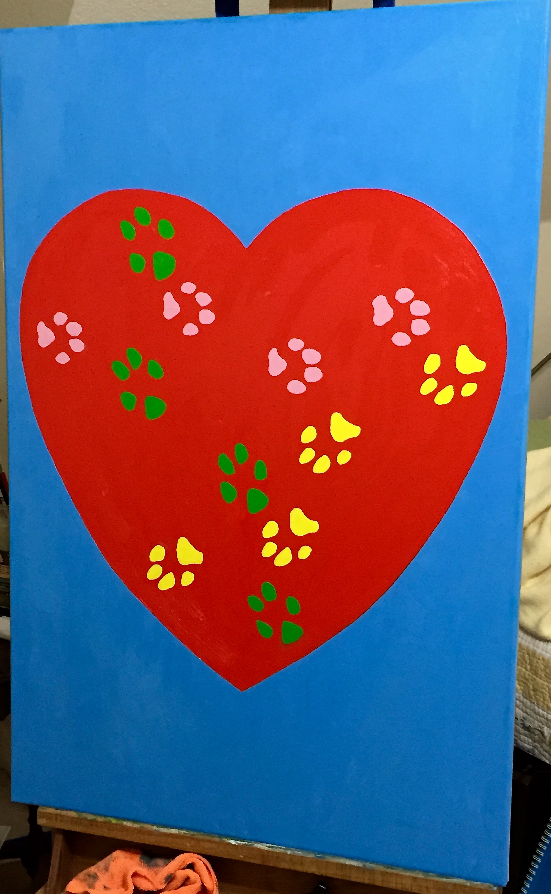
“Rescued” is done and hung on the wall downstairs in our powder room! This was my first “commissioned” piece, done for my wife who wanted something with a lot of saturated color and big! The design is entirely from her and the passion and love she has for rescuing dogs, of which we’ve had the pleasure of fostering 114… and counting. When my wife says “rescue”, she means literally rescued from the kill list at the Austin pound, not “rescue” from a pet store (don’t do it… just adds to the breeding problem), and these dogs are often in really bad shape – parasites, detached intestinal walls, starvation, neglect, flea infestations, ticks, kennel cough, Parvo and more.  But she nurses them back to health, even waking at all hours of the night to feed them meds every couple of hours, and finds each one of them loving homes. She is amazing!

She also had the primary design in mind, of which you see in the picture – a large heart with the paw prints of our 3 dogs (yes, rescues all of them) on it. We had a lot of fun collaborating on the details, although she would say there was some stress involved in figuring out the right colors for each dog’s prints, which ended up as follows:

  • Pink – Crash, female, age 13
  • Green – Boom, male, age 12
  • Yellow – Zip, female, age 3

The process for getting the dog’s paw prints on the painting is worthy of a separate post, so I’ll pause here today and give an update on that entertaining adventure in my next update.

Tech details of the painting for those interested:

  • Canvass, 24″x36″
  • Colors were almost straight out of the tube, but had to make some small tweaks:
    • Blue background – Titanium White + a small amount of Pthalo Blue + tiny bit of Orange.
    • Red heart – Cad red medium
    • Green paws – Permanent Green Light + Titanium White
    • Yellow paws – Lemon Yellow + Titanium White
    • Pink paws – Titanium White + small amount of Alzarin Crimson
  • I added the Titanium White in heavier doses with the yellow and pink paws because it helps add opacity to those more transparent colors. Sitting atop the red heart it was helpful to cut back on the bleed through.

For the dog rescue lovers out there, the group we work with, Austin Pets Alive, is fantastic and is by far the most influential and impactful rescue group in Austin, perhaps all of central Texas. If you want to learn more, check them out.

French Countryside Loire Valley – Practice sessions continue on 2 fronts

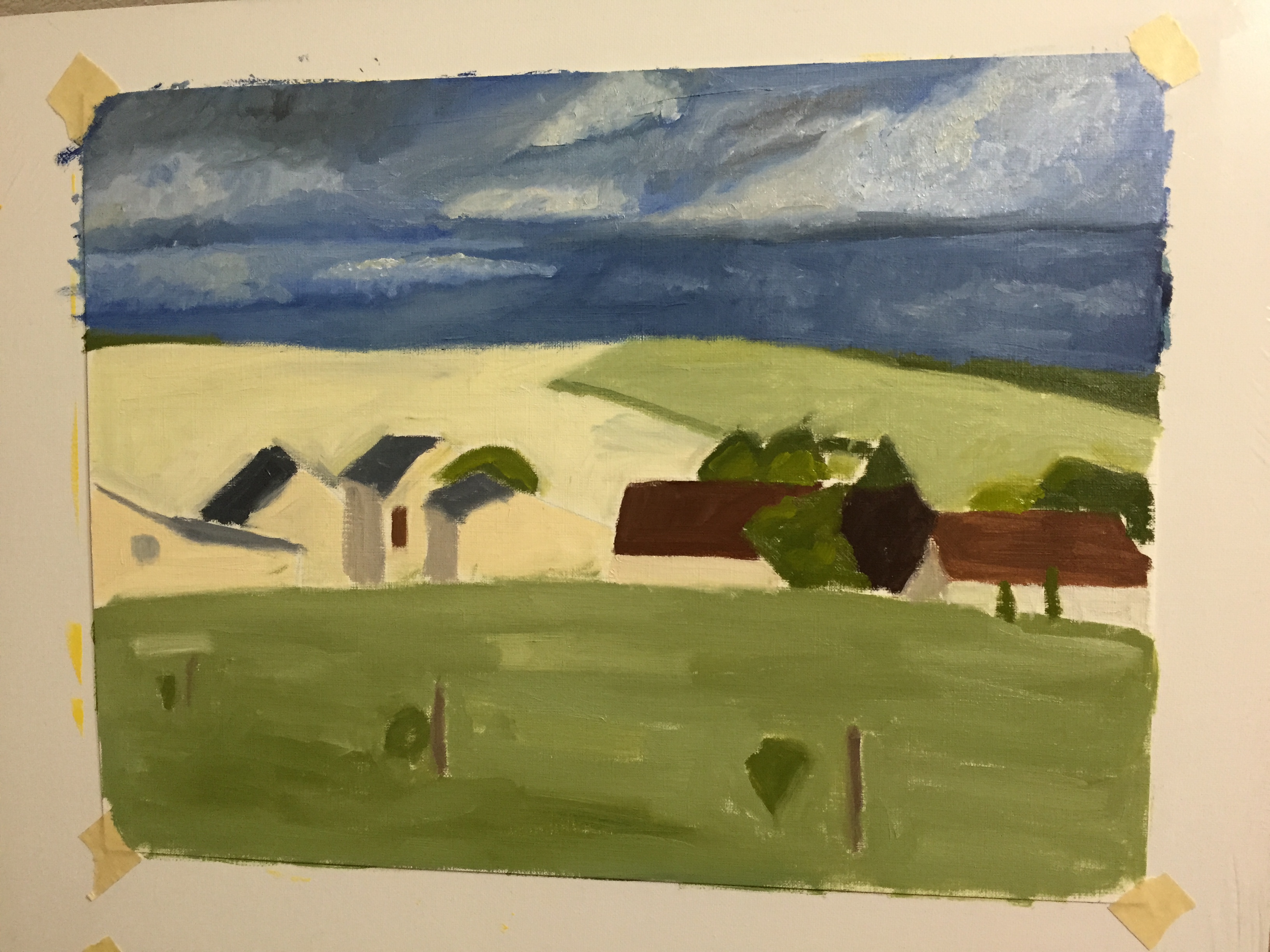
More progress this weekend on the practice sessions for the Loire Valley countryside piece. Added the first pass at details to the sky on the oil on paper. I’ve done clouds in graphite before, but never detailed painting. Learned a lot about what not to do, most notably trying to be too precise and layered paint to thickly. Need to go with looser brush strokes and thinner paint, I think. Advice is welcome, so comment if you have some helpful guidance please.

The second pic below is a practice session on my iPad. Still getting the hang of the Paper 53 app tools, but it’s been very helpful in drafting possible compositional elements that I wouldn’t otherwise have taken the time to do with paint. It’s very limited when compared to real painting and drawing, but it’s an invaluable drafting tool for layout and testing ideas.

IMG_3617 IMG_0002