Red Vase and Cellophane – Update

With a few deep breaths, and some tasty wine for liquid courage, I dove into the cellophane stage of this composition. I carved out a little more than an hour tonight to get the ball rolling. I was pleasantly surprised with the progress, but I will admit that my inner artist was struggling with laying gray tones on top of the pretty red vase in the name of cellophane.

It was rough going initially b/c there weren’t enough value contrasts between the white table cloth and the wide range of cellophane grays and cast shadows. Then I remembered the advice from David Cheifetz during his workshop a couple weeks ago – “Value is king! A painting with the right values but wrong colors will still look pretty good.” I’m not about to put that on a tshirt or a bumper sticker, but its great guidance. I stepped away from what seemed like the right dark and light grays and made both ends of the spectrum more extreme, darker grays and lighter grays. It seems to have worked so far.

The real power of the cellophane image won’t really come together until the grays are laid in properly and then the bright, white highlights are added on top. That’s what gives the cellophane it’s shape and texture. I’m still not entirely convinced this will look like the real thing when I’m done, but stepping back from this first stab at it, I was able to see the shape of the cellophane starting to come together. The key is going to be establishing that clingy sensation with the highlights. Fingers crossed…

[The grays of the cellophane are primarily 2 setups: Ultramarine blue + burnt umber + white OR white + ivory black. I’ll probably add a 3rd option for the cooler side of the cellophane (right side, away from the light source) of UB+raw umber+white. ]
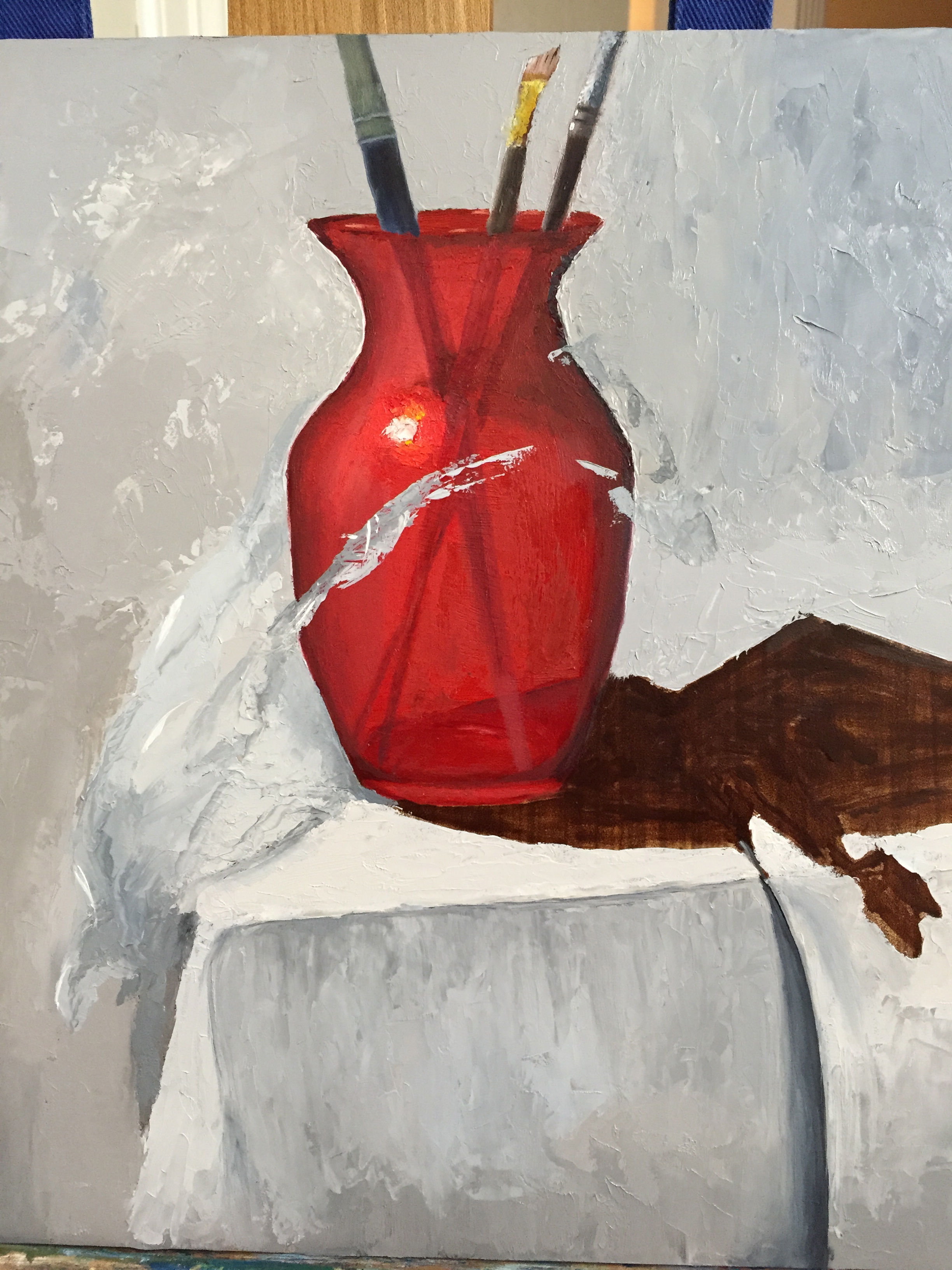
IMG_3064

Workshop Day 2 – knives aren’t just for cooking, slicing, and stabbing!

Another great day at the workshop. We did a lot more painting today, but things started off with an hour of David doing a demo. He picked up where he had left his painting off from yesterday. Very interesting as he demonstrated more technique and color strategies for the support cast of objects. I learned another volume of painting secrets, well secret to me at least, and was able to apply many things immediately to my painting later in the day. Watching David create one of his signature compositions before my very eyes was worth the price of the workshop alone.

David doing a demo  to start off day 2.

We spent more time working on our paintings today than the first day. I spent a lot of time working slowly and carefully with the painting knife, never picked up a brush today. After 5 hours of painting I started to get much more comfortable with the painting knife, getting a feel for how to manipulate the paint on the surface of the board, as well as gaining more comfort in knowing where the paint was on the knife and where it needed to be on the knife for tricky angles.

David continued to work the room constantly during our workshop today. I spent numerous sessions of 1on1 time with him as we worked through some of the challenges in my painting, of which there are many. He told me that I was tackling a very difficult subject on many fronts – the water pitcher is hard to do b/c it’s reflective, has a wide range of values, the shape is tricky, and the coloring is far from straightforward. No better time to dance out of my comfort range and skill level. Needless to say, David was willing to demonstrate solutions to me directly on my painting.

David Helping

The lighting in the studio is great for our painting work, but it’s awful for taking pictures of the work. I’ve posted my progress below, but will try to get a better shot tomorrow with some decent lighting. It has a long way to go, but I’ve already learned so much that it’s hard to believe it’s only been 2 days.

Progress and Layout Progress 1

Day 3 we shift gears to a new composition, so I’ll have to finish my first knife painting back home later this month.

Giverny Update

Spent a few more hours on the sea of green. Since the last post, I’ve worked on the back of the landscape, working in more dark tones to get things pushed backwards. But the bulk of time was spent on the large grouping of ferns on the left bank, and the bright pink flowers that are the focal point. Also added some life to the darkest part of the stream and the long grass hanging over it.

Prior to these past two sessions, I spent a little time experimenting with color mixing to get a wide array of greens. Greens are tricky, in my opinion, because there are so many subtle differences, even in the most innocuous of landscapes. It’s also takes some time to control the saturation values properly so the tone of the entire composition is consistent, which seems harder to do with a natural landscape full of green plants.

Next up is the stream, which is really out of whack in the current state, but I don’t think it will take a lot to get it firmed up.

IMG_2863

New Project: Giverny – La deuxième fois

Taking on a new, larger project based on another very green Giverny photo. The good news is that I took it in person, which means I was at the stunning Giverny gardens with my beautiful wife – pretty ideal to say the least. The bad news is all that intimidating green.

Reference photo is pretty good, and it’s readily apparent how one can be lead into the photo.

IMG_2561

I spent the better part of an hour tonight doing nothing but experimenting with mixing variations of greens, mostly using Permanent Green Light and Viridian Green, and testing how they change with the addition of various secondary colors – burnt siena, cad red, cad yellow light and medium, cad orange, and ultramarine blue. Staying away from pthalo green for now, but I’m happy with what the results are.

A couple weeks ago I got this painting started. After a quick reference drawing in my sketch book, I laid in very remedial base layers, emphasizing darks. This looks like total crap for now, but that was expected as the next session will build more value range and better greens to give it some life.

IMG_2847

Canvas size is 24×18″, which is large for me. I’ve done this size a couple times before, but very basic stuff, so this will be different. I may also try to do some large chunks of this with a palette knife instead of a brush. I have a workshop in February with David Cheifetz and my experience with painting with a knife is very limited. Fingers crossed!

Lines & Blossoms – Update

This continues to be a rewarding effort, despite the learning curve. Updates from last post include adding details to the tree blossoms, tree trunk texture, improvements to the door to the right of the tree, and some small line detailing in the buildings.

IMG_2806

Still need to figure out how to get the cherry blossoms to look more realistic, while figuring out how to transition the values in the tree to give it a sense of volume. While I love the colors thus far, the result is still flat and lacking depth. It’ll get there, but I haven’t figured out how just yet.