The very fun, energetic and popular Austin art gallery, Art for the People Gallery, will include 3 of my pieces in the new show called ART SPREE! The show runs from January 29th – April 9th, 2022.
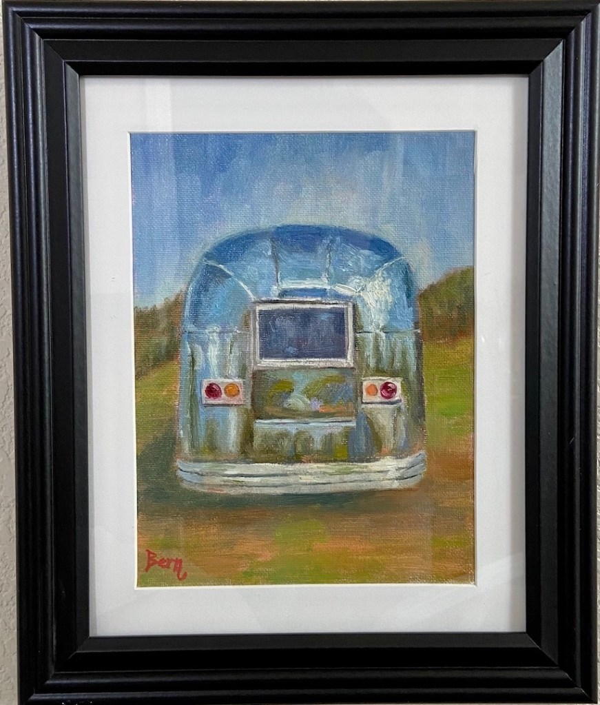
Airstream
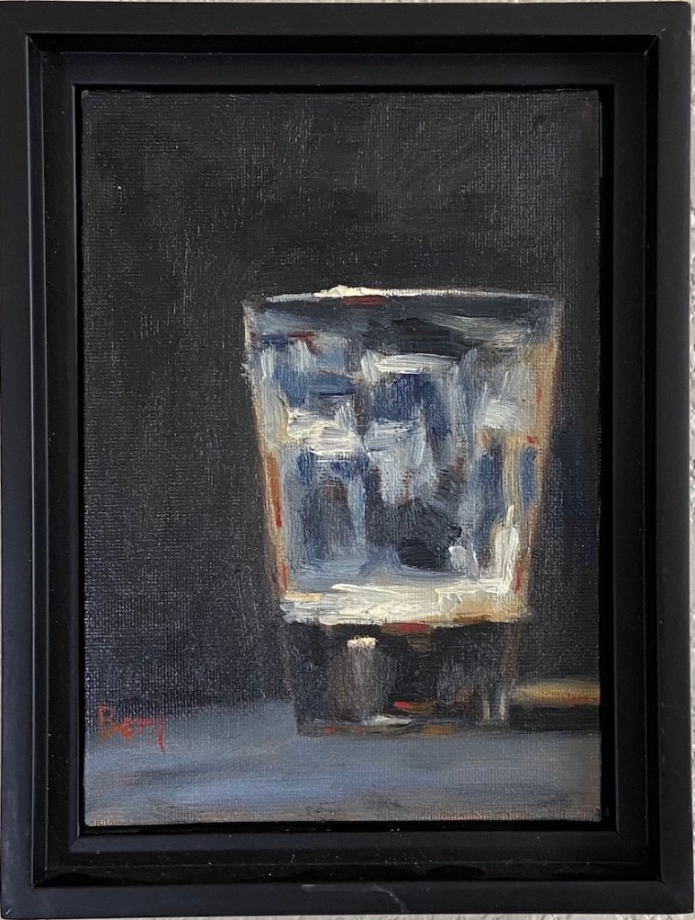
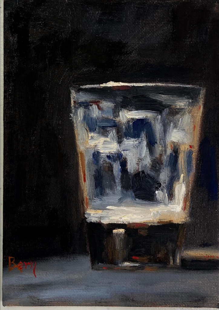
Last Sip
Puppy Butts!
It’s always an honor to work with Lynnie, Hallie and of course, Charm Charm Sparkles and Tassel PomPom. Unfortunately the in-person opening reception for February had to be cancelled – damn you COVID! – but the gallery is open regular hours and the staff is as warm and welcoming as ever, so swing by if you’re in Austin and check out the art.
I’ve written blog posts about all of these pieces, but as a grouping they do a pretty good job representing me and my world. Airstream is clear nod to my love of travel (no, I don’t own an Airstream, but I know some very cool people who do); anyone who knows me can attest to my love of beer, especially a tasty porter as represented in Last Sip; and lastly, Puppy Butts! for my adoration of dogs and all they can bring to the world.
If you’re interested in any of these pieces, or anything in the ART SPREE show, you can also browse and shop using their online store. From the Art for the People Gallery store go to Shop > ART GALLERY – All Original Artwork > ART SPREE – Exhibition. I can attest that Lynnie and the AFTPG staff will do an excellent job fielding questions and making any purchasing seamless and fun.
First still life of 2022 inspired by the fun of popcorn! It’s basically the champagne of food if you think about it. And my wife absolutely loves popcorn, so I knew this would make her happy.
I try to do these small still life compositions alla prima, basically in one sitting. I had to do some highlight adjustments the next day after the paint had settled, but that’s pretty typical for me because it seems wet paint is just hard to “read” as final.
I had a lot of fun with this piece, working from a photo… real popcorn never would have lasted. If you like progression details, I made a time lapse of this piece which you can see on YouTube called “Popcorn Playalong” embedded below.
Earlier this year, I did a quick study of this composition and instantly loved the bones of the work. Sometimes you get a sense for a painting right away and you just know it’s going to be fun to paint!
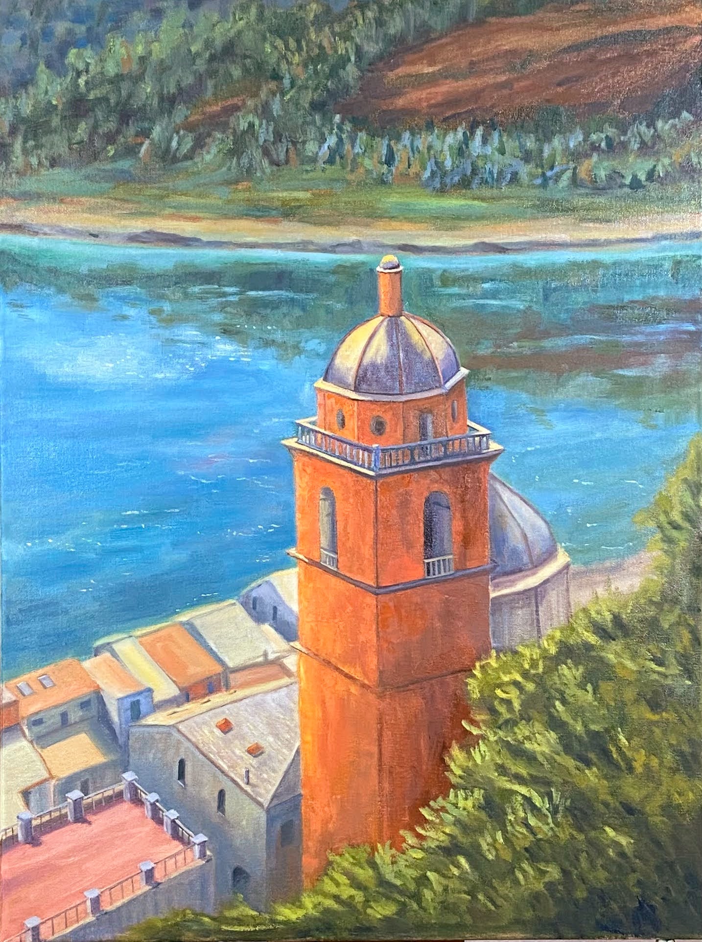
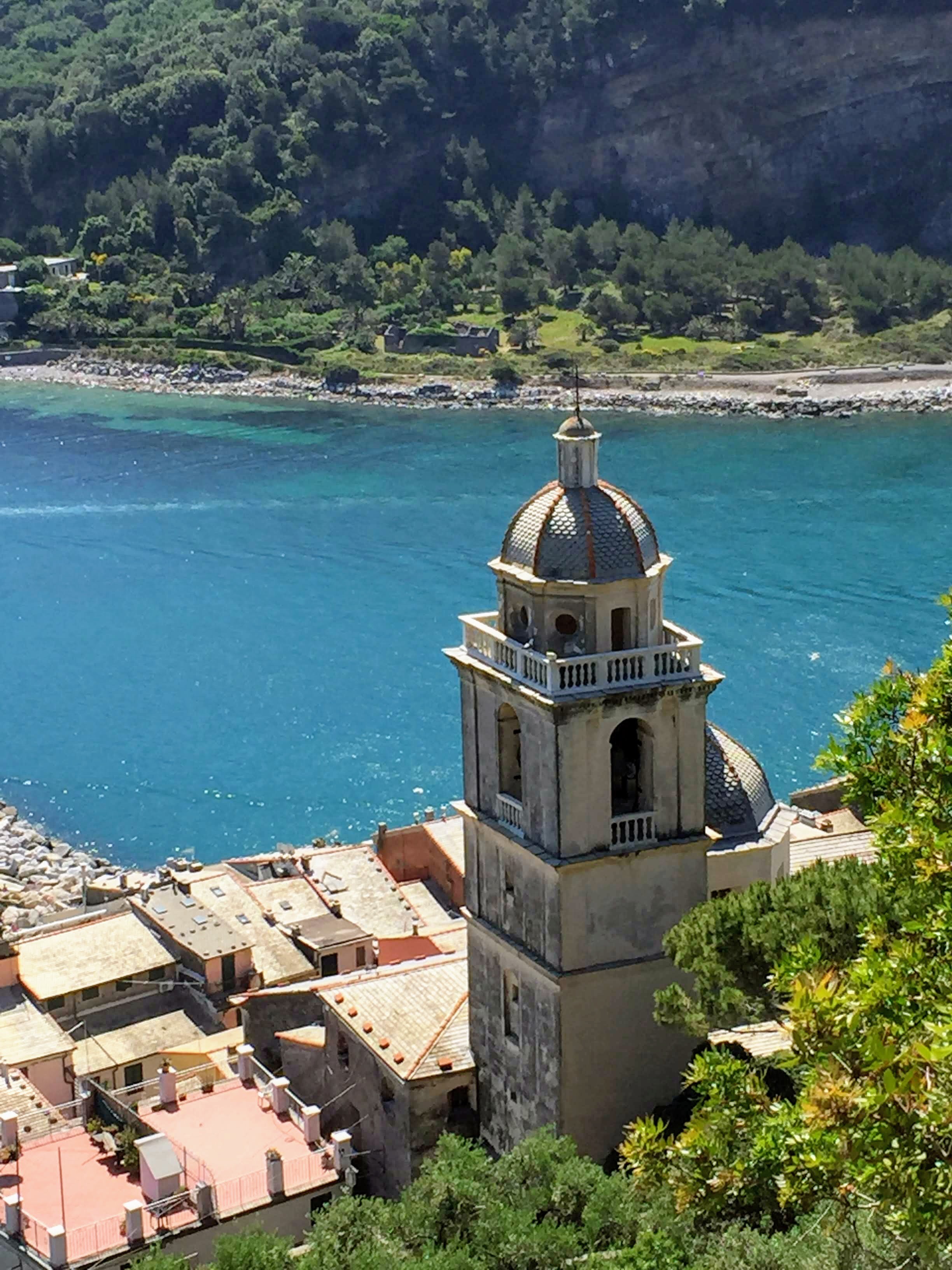
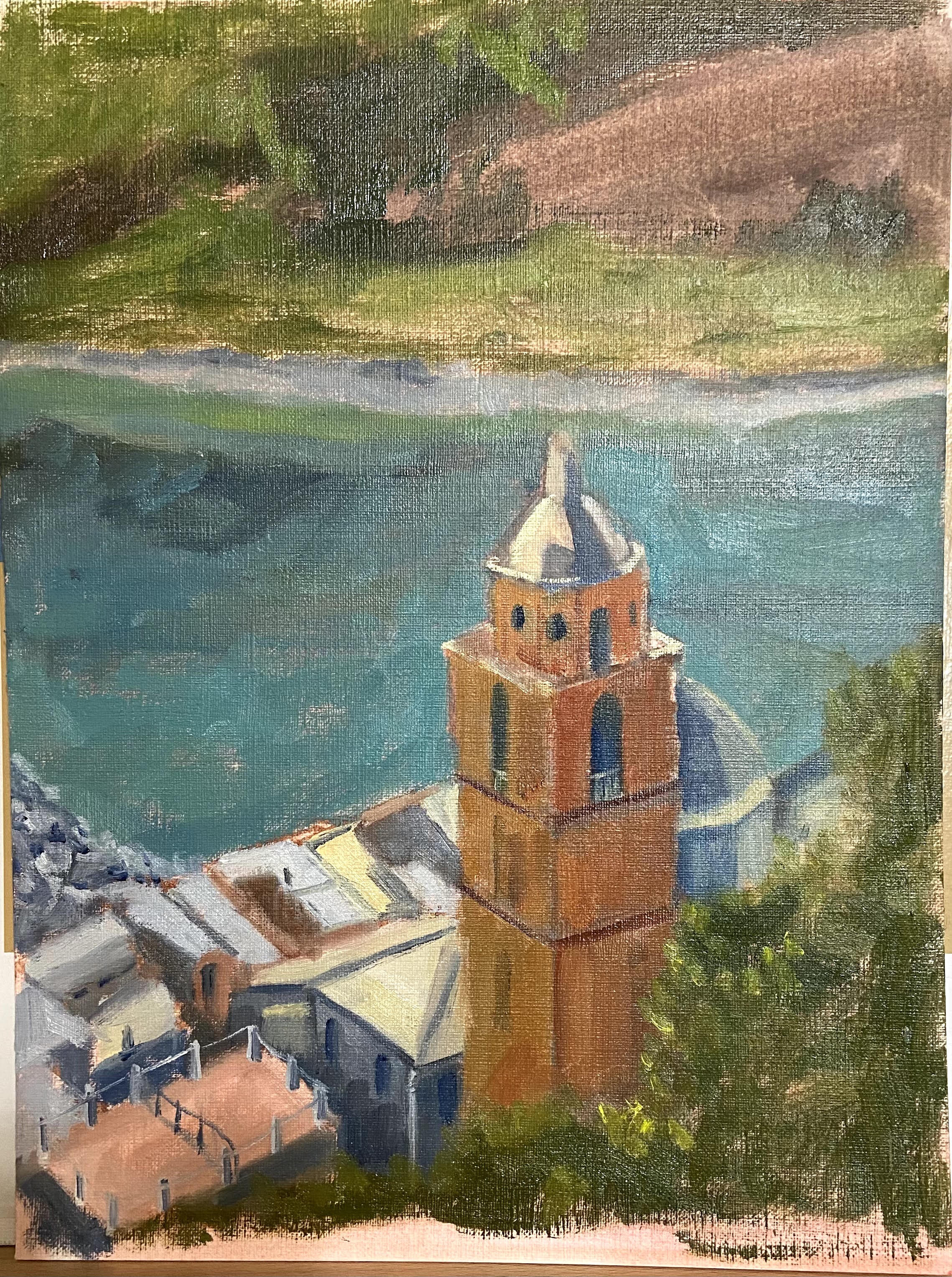
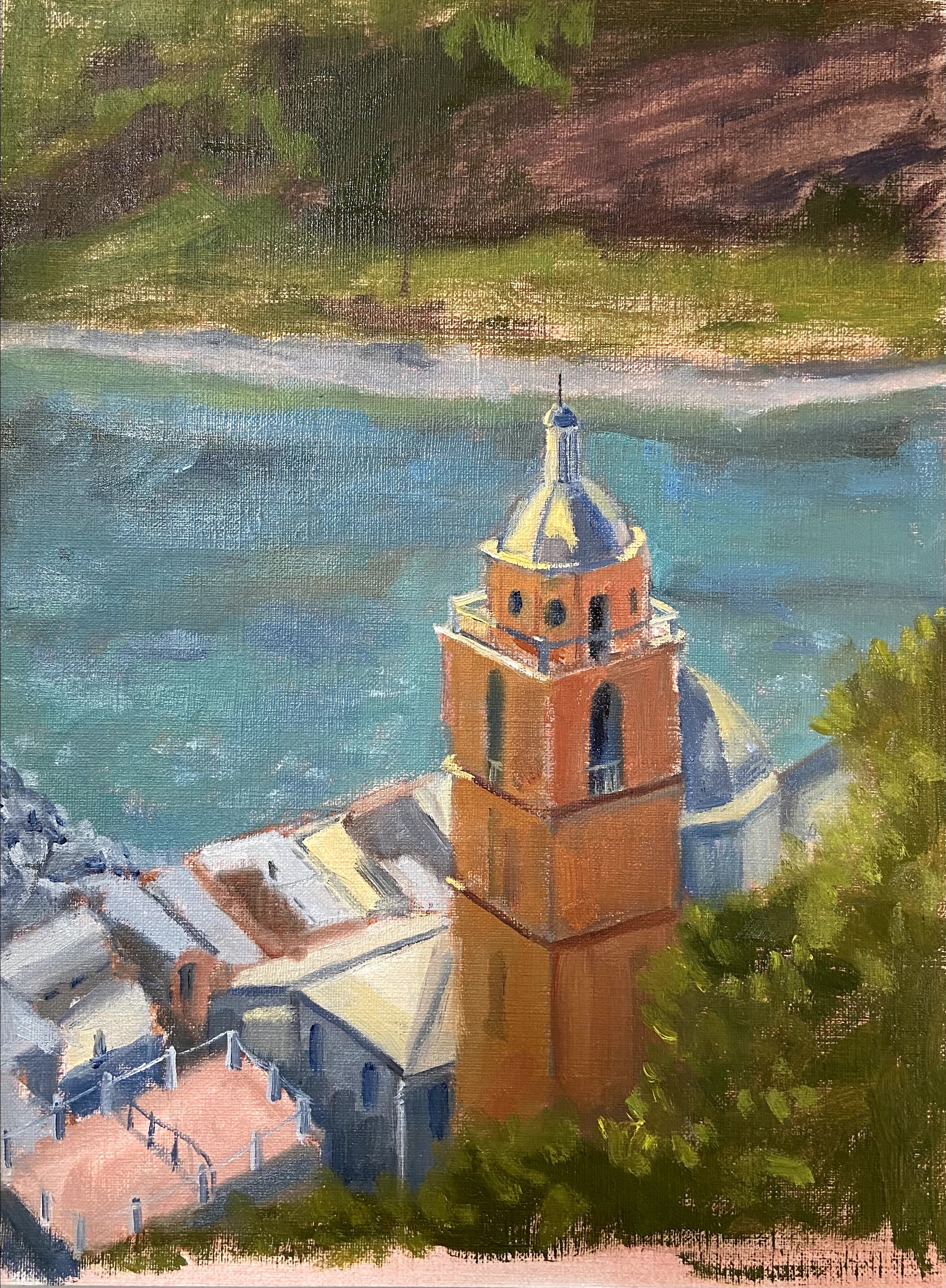
The original study can be found in this previous post, Porto Venere (study), which was much smaller, 9 x 12” on paper. It was clear that the key elements to this piece were lighting and linear perspective. The values in the photo are crap (midday, washed out), so it required some improvisation and memory recall from the day I was actually in Porto Venere. I wanted to make sure the sense of the very bright sun was captured in the light and shadow contrasts, but still find a way to make the rooftops surrounding the main tower look interesting and not entirely washed out. To help get an idea of what good looks like, I referenced some works by Kanna Aoki (https://www.kannaaoki.com), who has a great talent for capturing the essence of bright sunny days in San Francisco.
The linear perspective is always a challenge (albeit a fun one) when dealing with cityscapes, but this piece was all about the tower. I took the reference photo from the castle on top of the hill upon which the town is built, so my vantage point was above the tower, but getting the lines right was still very important to convey the size of the building. The trickiest part, however, was the dome. Rather than try and explain the myriad ways it tripped me up, go ahead and try to draw just that part of the building. Too many lines and curves for a mere mortal to tackle.
There was also a wonderful Bob Ross moment as I experimented with the tower. I was mixing some orange color options on my palette and decided to quickly lay down a little paint on the canvas with a palette knife. The intent was to simply dab a little on the canvas, but my hand slipped and spread a big splotch! That happy accident, turns out, gave the impression of old time stucco, or whatever these old buildings are crafted from, and I loved the texture and realistic result. Nowhere else on the composition did I use a palette knife technique, so it helps add complexity to the piece and focus the viewer to the tower.
Last note is the use of reflections of the landscape in the water, which is not in the reference photo. I redid the water numerous times, and each time I used a variation of blue without reflections it dominated the painting and became a distraction. The reflections, I think, give a lot more depth and perspective, which I’m happy with, but one day I’ll have to learn how to do muddled reflections so the water doesn’t look so still.
If you get a chance to go to this part of Italy, stay in Porto Venere and avoid the crushing crowds of the Cinque Terre. Just don’t tell anyone else – it’s a wonderful place because it’s still a bit of a secret.
This composition was one of the more complex and difficult pieces I’ve done to date. I’ll admit that after painting close to 100 umbrellas, I seem to have developed a bit of an umbrella-related phobia, which apparently is a thing called “Umbrellaphobia or “Pellebaphobia”.
This piece was a commission for a good friend from my college days, who was very patient and helpful throughout the process. I couldn’t have taken longer to get this done, but the size was a new challenge for me, and because it was for a friend, I really wanted to get it just right. Initially there was going to be an empty street with beautiful, bright buildings and a canopy of umbrellas. But the end result was less than festive, so we agreed that adding some people would liven things up a bit.
The guidance for this piece was to capture the vibe and beauty of San Juan, Puerto Rico. Fortaleza Street was a prime choice, as it’s not only beautiful with the umbrellas, but its a very significant landmark that leads to La Fortaleza, the residence of the Governor of Puerto Rico. The residence is essentially a fortress that is a UNESCO World Heritage Site.
When it comes to painting people, there was a lot of additional practice needed “off canvas”. I’d done street scenes previously, but for this piece there were some new twists to figure out. First, and probably most challenging of all, the scale of people on this street seemed out of whack. The doorways and size of the windows seemed far too large, but when I checked numerous reference photos for Fortaleza Street, I found that the reality was, well, kinda Lilliputian. It’s very hard to paint reality when reality doesn’t align with expectations, like a very old city with strangely gargantuan doorways. Not sure what was going on in San Juan when Fortaleza street was conceived, but it should be investigated… something strange was going on. The second obstacle was how many people to drop into the scene. In highsight, I think a few more could have been added, but I also like the sense of either early morning or early evening timing with this scene, when fewer people would be wandering around.
The focal point of this composition was initially going to be the glowing element of the most crisply painted umbrellas, which I know is something that would piss off all of my past workshop instructors and teachers because it breaks about every rule out there for compositional structure, but it’s what was important to my friend. That said, when I added in the people, I had a lightbulb moment and made a point to really focus on the couple holding hands in the lower right foreground. They are literally walking into the scene, which works really well at also drawing in the viewer to look left for the rest of the street activity (couple sitting at cafe table), and then up to the umbrella canopy, which effectively redirects the view back down to the governor’s residence at the end of the street.
Lastly, to the umbrellas… lordy lordy, so many umbrellas! The geometry of an umbrella is hard for me, but the added element of linear perspective as they fade back into the horizon line of the composition was a real brain teaser. Additionally, the power of value contrasts that ultimately made each individual umbrella get the right shape, namely they looked like blobs of color until I painted the actual metal rods within each umbrella. At that point it started to work better and things moved along quickly.
If you’re ever in San Juan, go check out Fortaleza Street and let me know if the doorways are really that large!
This small piece is brought to you by caffeine and Carly Simon. I thought painting clouds in my coffee would be a little more straightforward, but it presented some tricky bits that will need to be tackled again in future still life. The resulting composition of this first effort is good, but I’m missing something on the technique and it ended up losing some of the cloudy effect.
This is an ideal composition for practicing the technique of blending wet-on-wet oil paint. While I’m very familiar with the technique, it’s part of the standard tool kit for painting in oils regardless of one’s skill level, I hadn’t really considered the fact that this composition was going to be dominated by wet-on-wet. It became abundantly clear that was to be the challenge once I got started, the realization making me chuckle aloud in the studio… idiot!
Next time I’ll use a smooth surface (board) instead of a canvas, which should make for easier blending. I’ll also make more time to pre-mix a range of coffee browns to give the “cloudy” effect a more realistic look.
This piece was also inspired by all the neighborhood coffee shops around the country and the world, all of which have their own unique vibe and appreciation for a cup well poured. Ignoring the occasional douchey independent shop filled with anti-social Wifi leeches, there’s a lot of great coffee being brewed in these shops.
My neighborhood favorite is Trianon, which has been a caffeinated cornerstone of this area since the 80s. They have dozens of coffees from around the globe and the owner, or any of his friendly staff, will take the time to walk you through the nuances of each farmer’s crop and what makes them unique. When was the last time that “barista” from Starbucks took the time to walk away from the register and come chat with you about the 20 rotating coffee beans on the wall… never!
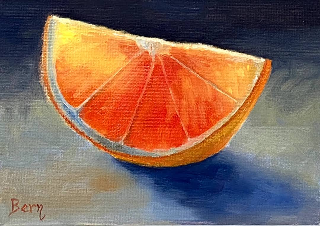
Small still life paintings are very gratifying because it’s possible to finish them in a single session, which is a nice change of pace after having worked on a number of larger pieces recently.
Juicy is an orange (hopefully that’s abundantly clear) backlit with just enough light to see through the thinner areas. I used reference photos instead of an actual still life setup in the studio, but I think it would have been easier with a real orange slice as the subject.
Lesson learned from this composition was the importance of relative values. I initially failed to darken the reds sufficiently, making it difficult to get the transparent light effect through the thin areas. I went back in and tamped down the saturation and darkened the value, which helped a great deal. I need to remember next time that instead of trying to use the lightest value for the transparency, focus first on emphasizing the adjacent darker areas to make it pop.
Stay tuned for more small still life in the coming months… suggestions are welcome!
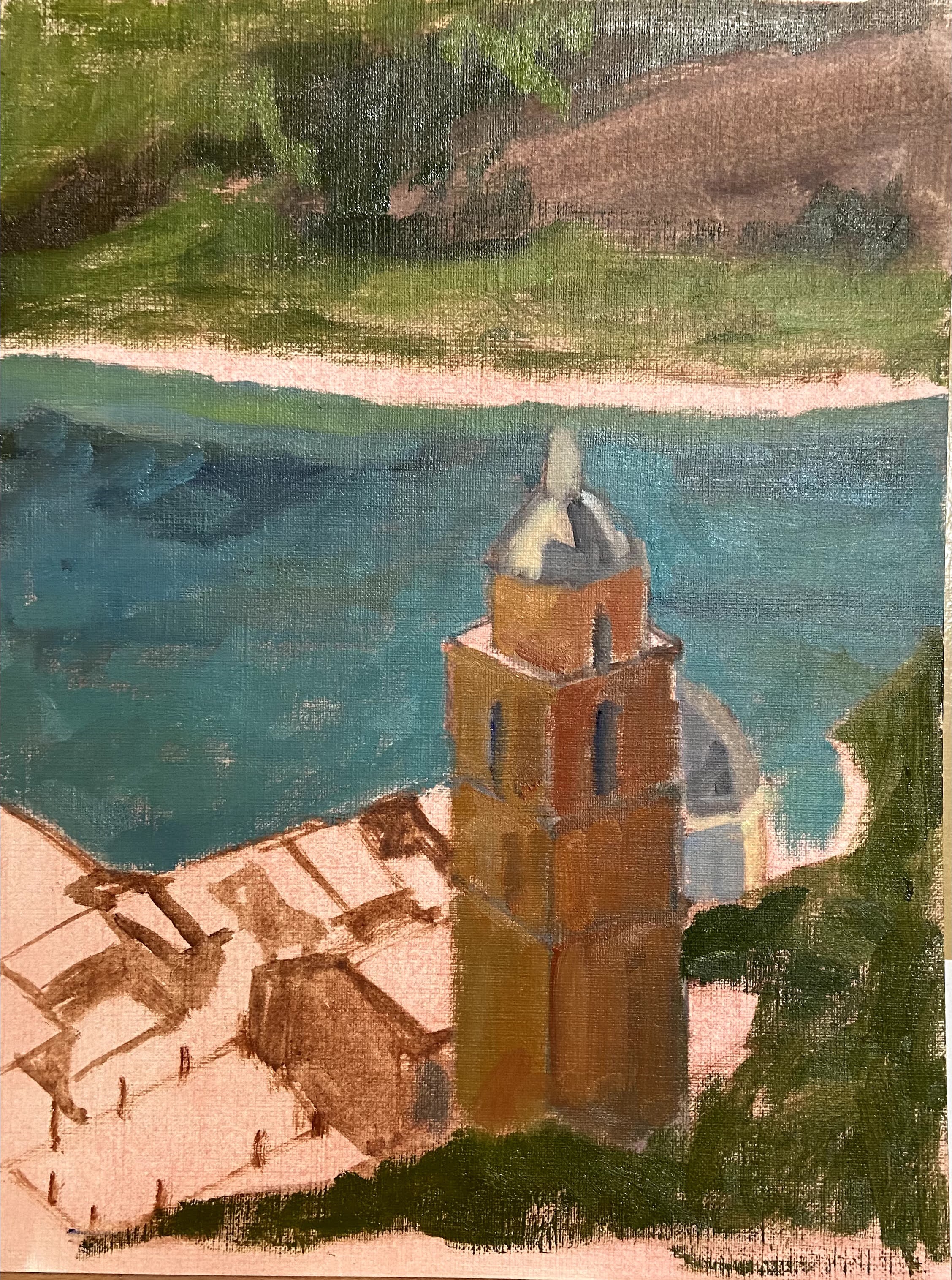
Porto Venere (study)| 9” x 12” | Oil on Canvas Paper
This composition has been on my short list for awhile, so I’m very excited to have put brush to canvas finally. The subject matter is a photo I took from the hillside in Porto Venere, Italy. The power of the sun shining on the church tower with the beautiful blue water in the background was an ideal setup for this piece. It kinda painted itself.
I’ve done a number of practice (studies) pieces in the past to get an idea of what I need to consider prior to tackling a larger composition. It’s extremely helpful to get a sense of proportions, values, and start thinking through edits that will make the piece work regardless of what’s in the photo or real life. My problem with doing a study is that I always end up getting sucked into the details – I just can’t help it – so they drag on and I lose the value of doing a practice piece.
To solve this problem, Porto Venere was time bound to 2 hours after the block-in was done. I literally ran a stopwatch to ensure I stayed true to the spirit of the study and focus on the compositional core elements, not the fine details. It forced me to make quick decisions and gave the piece a more painterly style, which I like and will try to incorporate into the full-size painting.
Dark beer as an inspiration seemed like a great idea for this quick still life. As you can guess, I do love a good dark porter, #512brewing!
This piece is also influenced heavily by the work of Neil Carroll, who has a great talent for making simple still life transform into beautiful, relatable art. In this case, also quite quaffable.
The Last Sip was a great piece for glassware still life. I liked the challenge of defining the pint glass despite having a dark beer on a very dark background. I thought that would be more difficult than it was, but the dominance of dark values actually made it easier to pull the glass reflections out of the piece.
I also tried to work in some warmer elements of sienna, orange, and out-of-the-tube red to distinguish the porter from the dark background coming through the clear glass.
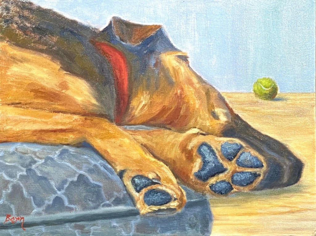
This piece is inspired by playtime with Wolfy, who loves fetch despite the challenge of galloping around with his huge paws!
Dangling Paws
There were a few new challenges with this piece, namely capturing the various golden browns of Wolfy’s shepherd-hound coat, as well as the texture of his paws. The key to the coloring was working in various reds and warm yellows, but it took a lot of experimentation to get the right likeness. The paws were more about the texture from using a painting knife instead of a brush, which made the surface of the paws look rough and realistic.
However, the hardest part was the dog bed. I got it in my head that the pattern of the bed would help give the sense of plush comfort that Wolfy’s 85 pounds was enjoying as he slept with his head and paws dangling off the edges. It turned out to be effective, but the next time the bed will have no artistic flair.
This composition is from a trip we made to Germany not too long ago, although after this awful year it seems like a hundred years in the past. Since traveling isn’t an option, I’ve decided to start painting great locations as a meager alternative.
If you Google Rothenburg ob der Tauber, this scene is what will show up in the list of photos. While I agree it’s an outstanding view, I wanted to drive the focal point to the clock tower instead of the orange wooden house in the foreground.
This is the end of a late Fall day, which wasn’t very clear without the addition of bundled up people walking through the streets. I struggled with the decision to add people to the piece, but in the end I wanted to convey the sense of season and a more idyllic time without tourists.