Yes, another flower! The Pink Rose started off as a white rose, but some prodding from my wife got me to adjust to something a bit more interesting and thus the improvisation towards pink.
I’ll confess I’m not thrilled with the outcome of this small piece, but I think it’s simply a matter of style preference. The style is less realistic than I’d like, although as a drawing it works well… but it’s not a drawing, so there’s that.
Pink Rose | Oil on Panel
The reference photo is a beautiful white rose, but in hindsight I can see that it’s flat and lacking variations in value. I didn’t figure this out until I was more or less finished with the piece, but it was a very valuable reminder that grinding through a painting isn’t always the right approach if your gut tells you something is off. I see a lot of paintings on-line that have this stylistic look, so I’m pretty sure it appeals to some folks, but, ironically, it’s not for me.
The 4th of a 5 part study series, Yellow Rose, came together very quickly. The gallery above shows the progression as well as the varied contrast in painting compositional styles. If you have a favorite thus far please make a comment and let me know.
Before diving into the details of the composition on the next page, I thought the history of the “Yellow Rose of Texas” and the song lyrics were really interesting to read in tandem. I typically haven’t looked into the history of my painting subjects, but having done it with something as innocuous as this yellow rose, I found it to be a curiously motivating way to start a project. I think I’ll add it to my painting process and see if it unlocks some additional artistic mojo in future compositions. And yes, I’ll try not to bore y’all along the way.
The Flower Study painting series continues moving forward. Now that we have 3 studies completed (click for previous posts on this series: Study #1 Poppies, Study #2 Hydrangeas), it makes sense to line them up at the start of each related post to see how things are moving along. I want to continue exploring different compositional ideas so I can make an informed decision, both with respect to my actual skills as well as artistic considerations (what looks good), before taking on a large, formal piece for the house.
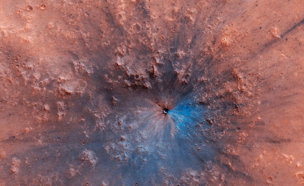
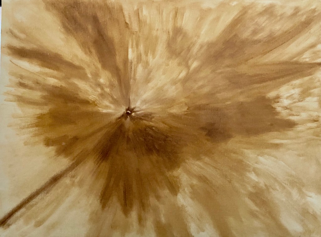
The mission to Mars is complete! This larger piece was a lot of fun on many fronts and allowed for some variations in technique and colors. This is largely an abstract project, although I worked to replicate the essence of the Martian surface, albeit with some wild colors.
Reference Photo
Block In
First Layer
Final Composition
Focal Crater Zoom In
Meteor Spray Progression
After the block-in, which was described in the Meteors and Squirrels post last month, I focused on the colors. It was at times infuriating trying to create other worldly space dust hues, but I kept at it until I found something that resonated with me. Along the way, I will admit, there was a lot of wasted paint. The solution was glazing, whereby I was able to push and pull the hue and intensity as needed through thin layers atop an initial color scheme. There were 3 glaze layers in total, but the first one was the most impactful, essentially making the whole piece pop and really come alive! It was an exciting moment and something I absolutely love as an artist, namely when you make a creative decision to change the approach and it actually works! Hell yeah!
After 2 glazing layers, I made another compositional decision to invest more time and effort in multiple craters. The piece needed to convey the powerful impact of the main focal crater, but the addition of other craters enhances the overall painting and incorporates some needed texture. The craters also unwittingly added a strong sense of value contrast and lighting direction that I didn’t realize was lacking until I started dropping them into the Martian surface.
The final glaze layer was more opaque than previous layers and it was selectively done across the composition to soften and blur many of the larger craters so one gets the sense of a dusty surface – otherwise they simply looked too crisp and clean, an effect I wanted on the focal point but not the other craters.
Overall, this piece was fun to do, but I’m not excited about the outcome. I absolutely love the impact crater – still now sure how that came together so nicely – and the projection of colored Mars dust (meteor spray) worked well, but I realized the composition isn’t something that appeals to me visually. The final colors aren’t what I’d envisioned and I simply couldn’t get away from the red orange… and I don’t really like that hue, so in the end it was a stupid decision on my part. That said, I’ll be interested to see who likes this piece, either because of the pronounced coloring, or perhaps the Martian space theme, which isn’t a typical painting subject.
Technical details for my fellow art dorks:
Oil on canvas board, 30″x24″
Glazing done in final layers, but not atop the focal crater
Brush sizes were primarily 2 or 6, mostly Flats and Rounds,
It’s happy hour time again! Before moving forward, it’s time to reveal the name of the cocktail from the Happy Hour – Roosevelt post from a few weeks ago… the Sazerac! It’s a great drink and the next time you’re in New Orleans I highly recommend a visit to The Roosevelt for the original recipe.
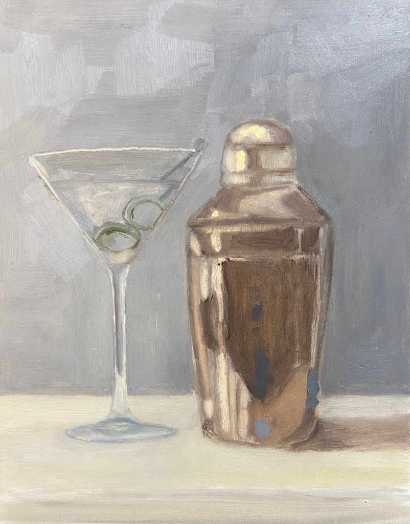
This latest addition to the series should be much easier for you to figure out, although it wasn’t necessarily easier to paint. Happy Hour – Shaken is an iconic cocktail indeed and something that James Bond fans will recognize instantly, although 007 preferred a stirred version.
This cocktail is a top choice in my household – even the dogs like it! Well, they probably would love it, but they just get to have the ice cubes after the drink has been strained. Yes, it’s hilarious – they hear the shaker, come running to the bar, and proceed to sit (without a command mind you) until I’m done, at which point they each get a piece of ice. They are, without a doubt, very lovable booze hounds.
Back to the painting…
I’m very happy with the outcome and feel like the repeated efforts on this Happy Hour series is starting to show demonstrable improvements in the artwork. This was a challenge on 2 fronts. First, the ongoing challenge of glassware in a still life has been tricky to refine, but I finally figured out the right value scheme to make it work – the solution for me was simply being more aggressive with the darker values. Secondly, I lacked experience painting truly reflective metal in still life compositions. Again, a more concerted approach with the darker values made a difference, but more importantly was simply waving the wand of artistic patience and working through the various reflected elements.
A few additional observations and details about the composition:
Reference Photo: As you can tell the shaker is not exactly the same as what’s in the photo. I used a reference photo blending technique, using the real shaker as my primary source, but simplifying the object by looking at other photos and paintings on-line that were, quite frankly, better cocktail shakers.
Brush and Knife: The vast majority of the piece is done with a Flat #4 and Round #2 brush, but the olives are all knife work. They are the focal point of the composition, and as such I wanted them to have some more texture and a reflective quality of their own.
Size: This is more than twice the size of previous Happy Hour series pieces, 8″x10″ vs 5″x7″ boards. Usually when I go bigger, the work is harder technically, but this time it seemed easier. Like I said, progress.
I haven’t figured out what the next cocktail in the series will be, but I’m leaning towards something with a shaker. Cheers!
This simple study piece is done, although I invested more time in the composition than originally planned. I rarely do a study as a painting (if you’re not familiar with the term “study” in this context, here’s a short summary on Wikipedia here), opting for a drawing instead (which I had already done previously, as noted in the Meteors and Squirrels post last week), but my goal was to practice the brushwork needed to capture a dog in motion from a short distance. I also wasn’t sure how well this composition would translate to the canvass. I learned a lot in this exercise.
Dances with Squirrels – Finished Study
Dances with Squirrels – Progress
Dances with Squirrels – Sketch Study
First, I was surprised that the dog (Wolfgang) portion of the painting wasn’t very difficult, probably due in part to the various practice sketches done previously. The trick was to apply the darker parts of his coat last, which might technically be incorrect, but it was easier to manipulate the black shapes on his coat if it was the last step.
There are a number of compositional changes that will need to be made for the “real” piece:
The fence was both boring, distracting, and worst of all had many of the same values and hues of the trees and the dog, which made it hard to work into the layout effectively. I think the fence will be removed going forward.
The trees were tricky from a color perspective. In real life, they’re a weird gray black, basically a color graveyard, so making them interesting took time. The other problem, which I haven’t yet solved, is ensuring their coloring isn’t too similar to the Wolfgang’s black and golden brown coat.
The coloring of the grasses are fine, but the shadows will need more attention in a formal composition. They’re a real highlight of the work because they give a more comprehensive feel of the height and breadth of the tree tops, which are out of the frame.
Last but not least, that pesky squirrel. I was so focused on how to paint the dog that I hadn’t given any thought to the squirrel. Have you tried to paint a squirrel? The good news is that my lack of practice painting rodents might have worked to the benefit of the composition because the squirrel is very hard to see against the light blue sky background, so the viewer has to follow the gaze of the dog to find the squirrel. And there’s our compositional intrigue!
I’m going to wait a few weeks before firing up an actual painting based on this study, but I think it’ll be an eye catching, tall, narrow canvass layout that should be fun to create.
When I read other blogs/websites, one of the topics that’s always compelling is a real life “how to” experience, especially those that include the nasty bits of failure and how to adjust. Narcissism is, after all, rather unbecoming… UNLESS it’s so over the top AND on national television that everyone can see what a fool you are. But I digress.
I’ve recently changed the logo for the Impasto website. Did you notice? Deep down I feel this should have been an enjoyable exercise, but I have a short memory and forget how entirely bereft I am of logo design skills, which means I can get to an end result that’s pleasing, but for crying out loud it takes forever. My most recent relapse into logo design insanity was a good learning experience and something I think many of you might find elements of the process to be helpful, either as useful process tips or design excrement to avoid.
My approach to logo selection had a few baseline tenets. It had to be free, art related, and something that was personally meaningful. Ultimately I explored 3 paths:
Image Search: There are various images online that can be used for free, which would be a great option if I could find something that really resonates with my website. I found a few that would work, but then I had to worry about finding out if the image could be used legally, or track down the owner and ask for permission.
Customize Personal Photo: I had been using a cropped portion of an impasto style painting of my own making as my logo. I had grown tired of that image and out of context it was hard to tell what you’re looking at, even if you were an artist. I looked at a lot of my photos to see if there was a fresh look I could use, but nothing struck me. It might be there somewhere in my image library, but I didn’t find it.
Create a Custom Design: After exhausting the first 2 options, it occurred to me that I could create my own logo digitally. Pretty obvious choice given that I’m capable of drawing and painting after all! This is ultimately what I did, and whilst I’m not 100% satisfied with the end result, I feel like the spirit of my current artistic world is captured in the new logo. That said, I can almost guarantee that you’ll see many iterations of the logo over the coming months as I refine the artwork itself.
I created the logo on my iPad Pro using an app called Art Set 4 by LOFOPI. I use the free version (duh!) and am pretty happy with the overall usability. I’ve done a few dozen digital pieces of artwork using this method, but nothing very refined, rather it’s a convenient way to practice sketch or draft new compositions while watching TV – no graphite mess or paint to setup, so its very pragmatic.
Impasto’s New Logo – Dog Tail Painbrush
The logo is a dog’s tail that has a paintbrush head on the end. I used digital pastels to get a textured look to the tail. I feel the tail structure needs some refinement, perhaps some more pronounced tapering, and the white background is distracting, but overall I’m happy to use it as a working draft.
Once I had the digital artwork done on the app, which took a few tries, I zoomed in the view and took a screen shot. From this point all I had to do was upload the image into the WordPress media library and add it as my logo.
What do you think? Don’t hold back, I’d really like to make changes, and your insights would be helpful, so don’t hesitate to make your suggestions in the comments.
We’re returning to the still life series called Happy Hour. Cocktail #2 is hot off the easel and ready for your guesses. But first, time to reveal the answer to cocktail #1 fromHappy Hour – Angostura… it was a Whiskey Old Fashioned! The Old Fashioned is one of the classic cocktails, but despite the simplicity of it’s composition, there are a number of subtle changes one can make in the base ingredients to create a wide range of variants. A very good recipe can be found here on PUNCH, my go to resource for all things cocktail. If you have a favorite riff on the Old Fashioned, please share in the comments!
Returning to Happy Hour – Roosevelt, the hints are few but specific. I excluded the city name from the napkin, but suffice to say it’s arguably the most important cocktail (and food) city in North America (although I defer to our Canadian readers for any challenges to this claim), birthplace of many classic libations. Any guesses? The answer will be revealed in the next cocktail series piece in a couple weeks.
The Roosevelt is another oil composition on an 8″x6″ gesso board. The type of cocktail glass is not something I would have tackled at this point, as it’s very complex and a bit beyond my comfort zone, but it was true to the cocktail, so I gave it a go. The other challenge was the color of the drink itself, a mix of cadmium red medium, cadmium yellow deep, titanium white and ultramarine blue; there are also some bits with cadmium yellow.
Next time I’ll pay more attention to the dark values in the drink itself, as I strayed from that tenet early on, getting a bit obsessed with trying to nail down the elusive pink/orange color of the drink. If you look at the block-in picture, it’s obvious that I knew there were very dark values in the drink itself, but I didn’t paint them in properly.
And beware the challenge of painting words, especially words with fancy letters… with lots of curves… on an undulating cocktail napkin! Definitely not something to do if you’re jacked up on caffeine – it requires a steady hand and a lot of patience. I had to make a big withdrawal from my limited Bank of Zen to get through it.
I was pleasantly surprised with the ease of doing the blurry, colored bar of illuminated bottles in the background. This is also true to the actual setting of The Roosevelt and a handy approach to call upon in future compositions.
Thanks for visiting and don’t forget to post your critiques and cocktail guesses in the comments!
Framing artwork used to be a dreaded task, but over the years I’ve come to really enjoy it. This is especially true as we start 2020 because I recently had 4 dog related pieces accepted to an Austin art show at Art for the People gallery called Celebrities – Pet & People Portraits. Future posts this week will provide more details about the show and the inspiration behind the pieces, but I wanted to share some creative custom framing ideas I used with 2 of the pieces in the show.
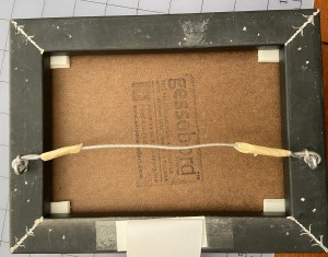
One of the troubling issues with framing is the commitment, secondarily the cost and complexity. The process of “properly” framing a painting often involves sealing it inside a frame in a way that makes getting it out an ordeal. When I hang finished art in my home, I can easily get bored of the frame after a year, or simply want to change the art that’s in the frame. To solve this problem, I came up with a Velcro based solution that works great with small pieces in floater frames, whereby you affix the piece with Velcro instead of glue or some other fixative, which allows you to swap out pieces in the same frame. This is handy for your personal art at home, gallery shows or events.
The steps to frame using Velcro, a process I’ve trademarked as “framecro“, are very simple, fast, and inexpensive. Let me know if you opt to framecro any of your paintings; improvements to the process are always welcome.
Most Velcro types will work, but the Command line of snap-type from 3M is what I prefer. They market it as a picture hanging velcro because it snaps together very tightly, but you can still pull it apart easily.
Cut 4 twin sets of velcro rectangles, which means you have 8 total rectangles of Velcro. These should be relatively small and easily fit into the 4 corners of the frame.
Affix the velcro to the corners of the frame and the corners of the back of the artwork.
Align the artwork and press it onto the frame.
You’re done! If you want to swap out a piece, just pop out the existing piece of art and press in a new one that has Velcro in it’s corners.
Snap style Velcro
Cut Velcro into matching pieces
Velcro attached to corner of floater frame and corner of artwork
Oftentimes 2 of 4 cornes is sufficient for small pieces
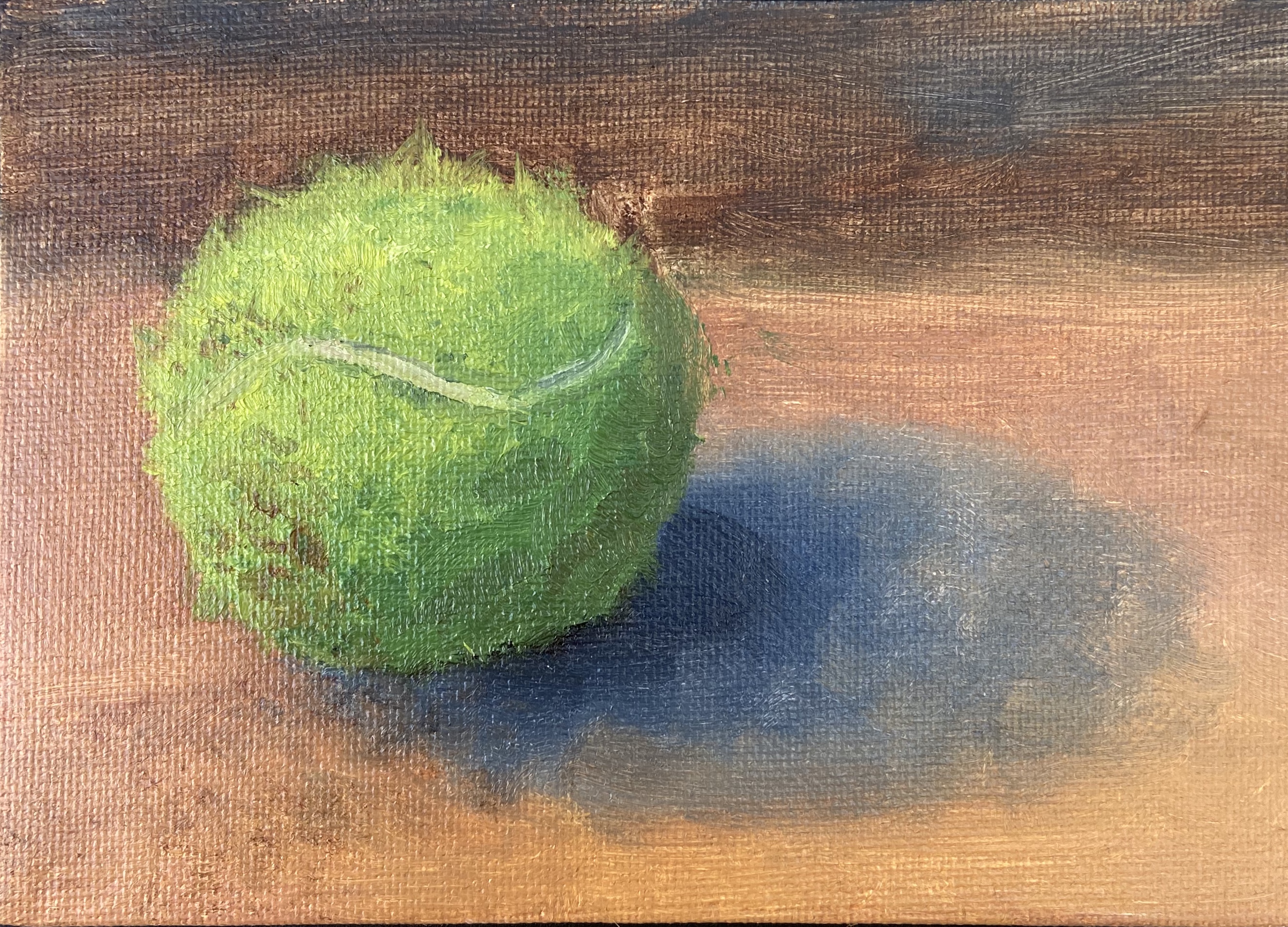
My dogs are a big part of my life, which means I live to serve their needs, in large part because I love them and, well, they don’t have thumbs. My oldest dog, Zip, is a 7 year old Aussie Catahoula rescue mutt from Austin Pets Alive!. Her world revolves around two things – food and “ball”. To that end, I serve as her chef and throwing machine.
The lifespan of a Zip tennis ball is a couple weeks. She chews on them while bringing the ball back for another throw, as if they’ve offended her and need to be destroyed. It’s the epitome of a love hate relationship.
This piece is a tennis ball after 1 throwing session. The fuzz and color have been adequately altered, making what had been a boring, new green smooth tennis ball into something with depth and intrigue. Thank you Zip!
I like to do these small dog toy pieces on a canvass board to help with texture. In this piece, it was very helpful with the need to pull out strands of tennis ball fuzz because the rough surface helped scatter the stringy look in a random pattern, thus making it look more natural. The hardest part was getting the dirt just right, which took some experimentation with Burnt Sienna, Raw Umber, and various puddles of orange.
Finally, I was pleasantly surprised how effective the white line of the tennis ball added realism. It was also important to put a small hint of shadow along the edge of the white line to give just enough depth on the surface of all that green fuzz.