
Ball! Ball! Ball!


As the saying goes, “It’s happy hour somewhere in the world”, but seeing as it’s 10am here in Austin, a post about cocktails is about all I can muster.

This is a small piece, oil on board, 5″x7″. This is the first in a series I’m going to do over the course of this year called “Happy Hour”. I’m always trying to think of ways to make art creative and engaging, which can be done in a number of ways. Instructors and workshops will often stress composition and technical prowess, which is very important, but I consider that table stakes. What’s often missing is intrigue, of which I’m plenty guilty of excluding in my works. To get the interest piqued with the Happy Hour series, I’m not going to reveal the specific cocktail in the name of the piece or initial blog post. The intrigue is for the viewer to figure it out based on bartender savvy hints.
Take this initial piece, “Angostura”, which is very simple in terms of composition. What do you consider valid and helpful hints in the painting? When putting this together, I wanted to provide 3 hints that a savvy bartender – professional or simply someone like me with a well stocked bar at home – would be able to use to identify the drink. In this case, those hints are some, but not all of the ingredients, color of the cocktail, and glassware. Can you figure it out?
If you want some help, PUNCH is a fantastic libation focused publication that is a notch above pretty much everything else out there, at least as far as I’ve been able to find. Once you crack the mystery of “Angostura” (hint: think simplicity… I’m not being clever with this one), dive into PUNCH and see what I mean about great cocktail insights.
Maybe 2020 should be the year of artistic intrigue?
Started a new project this week, El Capitan in Yosemite National Park. This is a massive wall of rock that is a marvel to see in person. I haven’t been able to find them on the photo, but there are a number of climbers on the wall. If I hadn’t taken the picture myself I wouldn’t believe it either.
This composition is actually a study to get some key aspects of the hues and values figured out prior to doing a much larger piece. This particular effort is being done on a 12×18 canvass board, all oils, using palette knife only.
Figuring out the variations of grays, both sunlit and shaded, is proving to be an enjoyable challenge. This is a great way to really learn the subtleties of warm and cool grays.
Another session or two and this preliminary piece should be done. Still need to get the right half of the shadow area done, but it’s moving along at a faster clip now that the value scale has finally been figured out. There’s more paint on this piece than I’d like to admit.
This was a fun one! This is Heceta Head Lighthouse on the Oregon Coast. Breathtaking coastline and this area is particularly rugged and beautiful. One day I’ll replicate this painting en plein air, but for this iteration I had to use a reference photo. At least the photo was taken by myself, so I had a sense for the place; hoping some of that personal experience made it into the final work.
This piece is on 12″x18″ gesso panel and took about 8 hours to complete. While I still have a couple of minor highlights to add, this is close enough to the final product to call it done. I have never painted ocean, so the waves were a challenge, but I’ve started taking some lessons with a new instructor for a few hours every other week, and she was a tremendous guide when I ran into problems. If you like landscapes, check out her work at Mary Watkins Fine Art.
The palette is what I’m most excited about with this piece. While there’s a lot of (for me) technical skills that come into play with the water/waves/rocks, it’s the hues that I’m most excited about. Mary was very instrumental in teaching me about landscape warming and cooling using hues I hadn’t considered. Previously I had thought in terms of strict color wheel compliments to adjust saturation, but I learned how to think through the balance of what makes up colors that trend towards one end of the spectrum or another. For example, the use of Lemon Yellow, Cad Yellow Medium, or Yellow Ochre was actually a critical decision for this entire piece. Can you guess the winner and why?
Reference photo and progression timeline below. Enjoy!
Stuck with the whale theme for this next project. This is a diving whale based loosely on a reference photo I found on-line. Also bought some Payne’s Gray to work on a more balanced value gradation on this piece that is dominated by the tail.
I think this is pretty close to done, but I don’t like the matte finish, so I’m going to do a final glaze layer in hopes of giving the entire piece a wet look.
This is a diptych, each panel measures 9″ x 12″. I was pretty specific with the panel choice so as to get good proportions for the tail. In fact, I think the painting looks better than it really is b/c of the diptych layout. Curious what others think, too.
Technical Details:


Got back to the first painting study of the French Countryside (Loire Valley) landscape. Been awhile since I had worked on this one, but past post for reference here.
I liked how this came out, and ended up investing more time than originally planned. I definitely learned a lot about how I will change the composition when I do the “real” thing on a larger canvass (as opposed to this paper session), but enjoyed working in a lose style and worked very hard on not sweating the details.
I was pleased with a number of things:
What to do differently next time:
This piece came together very quickly. Pretty happy with the end result. No brush work – all knife, so I pushed myself to develop more expertise with this tool. There were a few trying moments to get edges right, but it really opened my eyes to the nuances of manipulating the paint once it’s on the board.
The iPhone photos don’t capture the textural knife effects, but hopefully you get the idea of the progressive development in the time sequence below.


Started another piece called “Baleine!”. This is a humpback whale diving. Going to do this as a knife painting to get some texture that will reflect light and give the sense of water/wet on the whale. This is a small gesso board, which works well for knife work.
The palette is pretty straight forward, but the water will be a little tricky, largely b/c I’m a water moron. But it will be a good exercise. The whale tail itself should move quickly, as the tricky part is the initial dimensions and shape, which I spent some time already working through before putting gone the board to paint.
I roughed in the sky as part of this first session, thinking I just wanted to get the right value on the board so the contrast with the tail would work. But it turns out that the “rough” in is pretty good and likely I’ll just keep it as is.
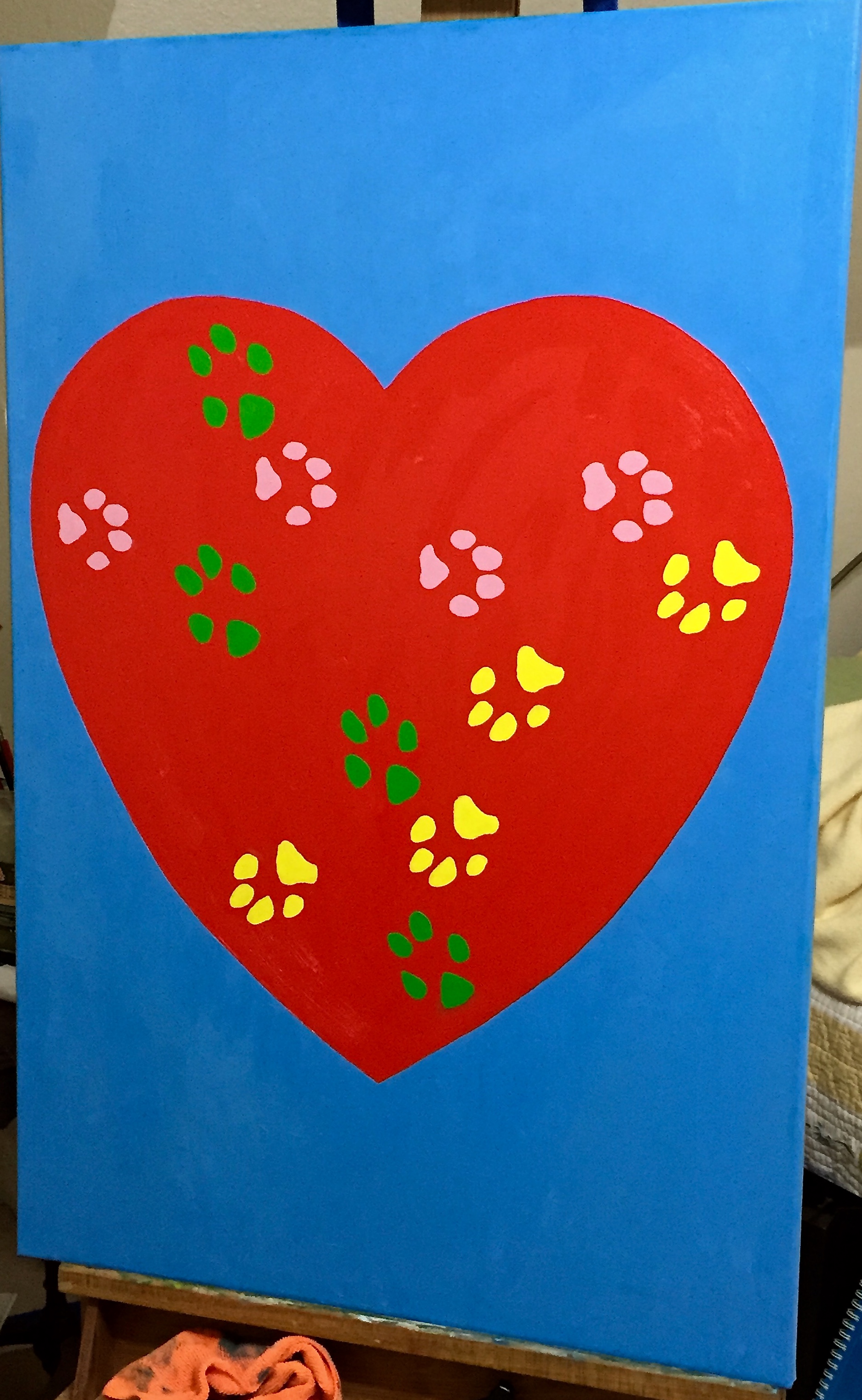
As mentioned in the previous post, the process for creating the dog paw prints wasn’t straightforward. The challenge was finding a way to get the real prints of all 3 dogs on the canvass without having it look like a distorted mess. Sure, there are plenty of reasons to do a piece with the messy prints splayed across the canvass, and I’ll readily admit that is a good idea, too. However, that was not the direction for this project.
The other challenge was ensuring the actual prints of Crash, Boom, and Zip were used. I didn’t want to do a photo-based, realism approach, i.e. take a picture of the paws and free paint the shapes. I really wanted to have the touch and active presence of CBZ on the canvass. This became very important to me as the work progressed because it would be a forever connection to our beloved pups; a way to always reach out and touch their “real” paws.
So if you haven’t barfed from the sentimentality, you appreciate the concept… hopefully. The original thought was to slather some non-toxic kid paint on the dog’s paws and let them run on the canvass. That’s such a bad idea for so many reasons. Just think about it for a minute if you don’t know what I mean. The next idea was to paint the dog’s paws and then press their paws on the canvass myself, in a more or less controlled fashion. Aside from the obvious battle of wills that would ensue, of which I would surely be on the losing side, this doesn’t work well because the prints are muddled with hair marks, making the prints largely indiscernible. I know this because I did a trial with Boom, the mellow dog, by shaving his paws and following the technique noted above on a practice canvass. It looked like poo.
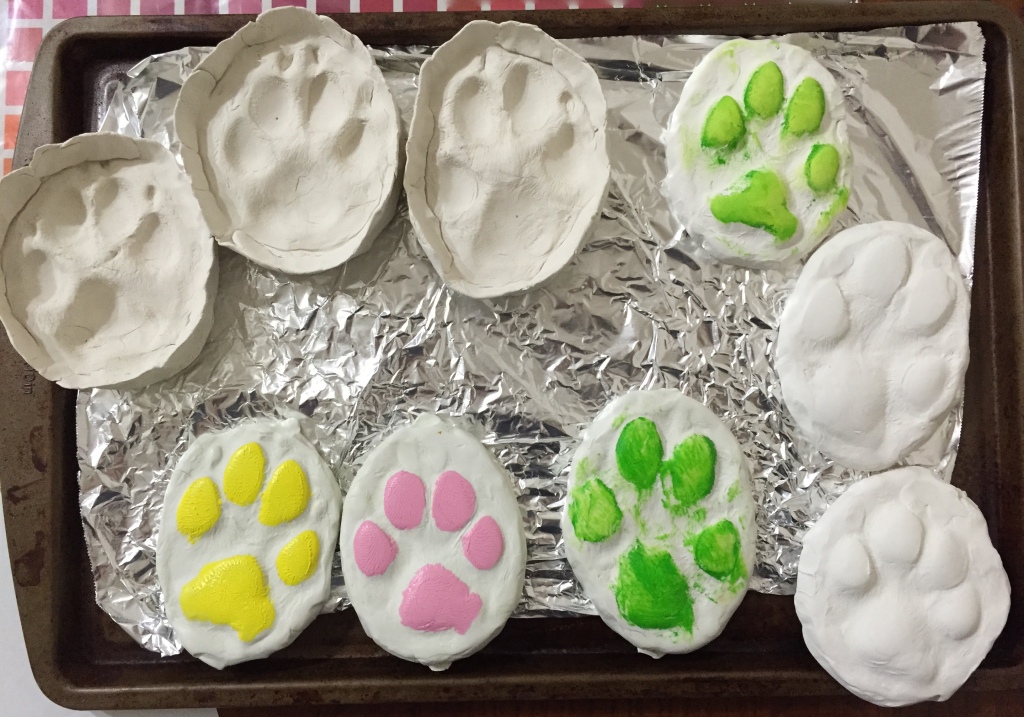
The final answer was molds in molds. The photo included has the molds I used plus one set I didn’t. The 3 molds on the top left and the set of 3 on the bottom left. Process went like this:
The other 3 molds (on right side of photo) are a failed attempt to create oven dried impression molds as described with the non-drying clay above. They are great 3D molds of the dog’s prints, but turns out the paint doesn’t transfer well to the canvass because the paw pads are too well done, i.e. they are rounded and can’t be pressed flat to make a good stamp. One of those things you try and then feel like a moron for having overlooked such a simple mistake.
All the molds are reusable, so I can recreate this project again if I wanted to. The best part is that my wife gets the painting she asked for, plus a mold of each dog’s front left paw.
“Rescued” is done and hung on the wall downstairs in our powder room! This was my first “commissioned” piece, done for my wife who wanted something with a lot of saturated color and big! The design is entirely from her and the passion and love she has for rescuing dogs, of which we’ve had the pleasure of fostering 114… and counting. When my wife says “rescue”, she means literally rescued from the kill list at the Austin pound, not “rescue” from a pet store (don’t do it… just adds to the breeding problem), and these dogs are often in really bad shape – parasites, detached intestinal walls, starvation, neglect, flea infestations, ticks, kennel cough, Parvo and more. But she nurses them back to health, even waking at all hours of the night to feed them meds every couple of hours, and finds each one of them loving homes. She is amazing!
She also had the primary design in mind, of which you see in the picture – a large heart with the paw prints of our 3 dogs (yes, rescues all of them) on it. We had a lot of fun collaborating on the details, although she would say there was some stress involved in figuring out the right colors for each dog’s prints, which ended up as follows:
The process for getting the dog’s paw prints on the painting is worthy of a separate post, so I’ll pause here today and give an update on that entertaining adventure in my next update.
Tech details of the painting for those interested:
For the dog rescue lovers out there, the group we work with, Austin Pets Alive, is fantastic and is by far the most influential and impactful rescue group in Austin, perhaps all of central Texas. If you want to learn more, check them out.