Vernazza

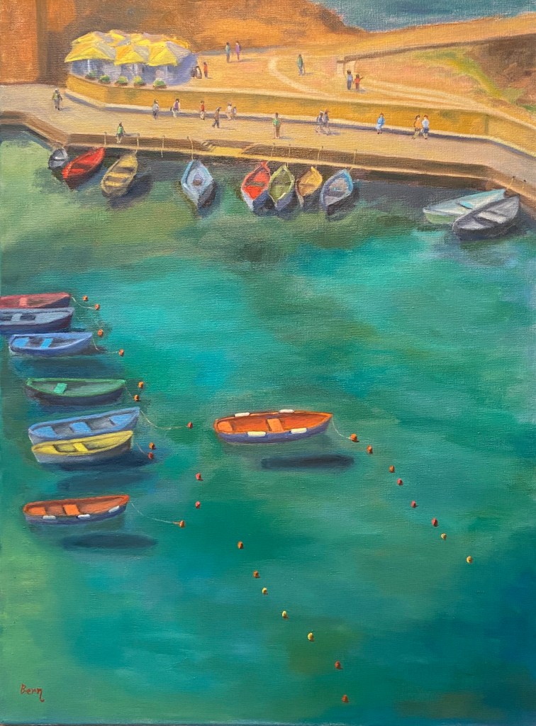
Vernazza | Oil on Canvas | 18” x 24” 
Vernazza-Italy-Cinque-Terre-painting-art-Bern-Abplanalp
Vernazza Harbor

It’s hard to declare any of the hundreds of bucolic coastal towns of Italy “the” iconic Italian coast, but Vernazza makes a lot of those lists for good reason. Granted, the crowds make it down right awful, but the windows of time outside of the hordes, or better yet beyond the tourist season entirely, show how perfection can be achieved. When it comes to painting, however, it gets a bit intimidating.

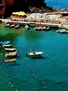
The reference photo is from a lookout along the from Monterosso al Mare to Vernazza, a beautiful stretch of the Cinque Terre that affords stunning views of the coastline, vineyards, and even some live music along the way. As we neared Vernazza on a cloudless day, the late morning sun lit up the colorful boats of the small harbor. It just had to be painted! 
Vernazza-Italy-Cinque-Terre
Vernazza, Italy
(Cinque Terre)

The challenges with this composition were varied and steep. I actually started it in early April, then had to set it aside for a month because it wasn’t progressing as I wanted and a breather can help recharge the artistic part of my brain in ways that sheer obstinance cannot. 

To be clear, it’s very unlikely I will ever paint another landscape from this angle, i.e. from hillside looking down at a steep perspective. Aside from all the unusual shapes it creates and skewing of details that you simply don’t see from a more familiar horizontal angle, it’s really hard to create a painting with depth when THERE IS NONE! I rarely yell in these posts, as I tend to be pretty even tempered and patient, so yelling isn’t part of my communication style, but in this instance I had to yell at myself after I came to the realization after having spent numerous sessions and countless hours on this painting that the reason I was having trouble creating depth was because there was virtually none. When you look down on a landscape at this angle, you absolutely kill the depth because there’s no reference in the distance. Hell, there isn’t even a horizon line, which means many of our painterly tricks to create depth as the scene recedes are non existent. 

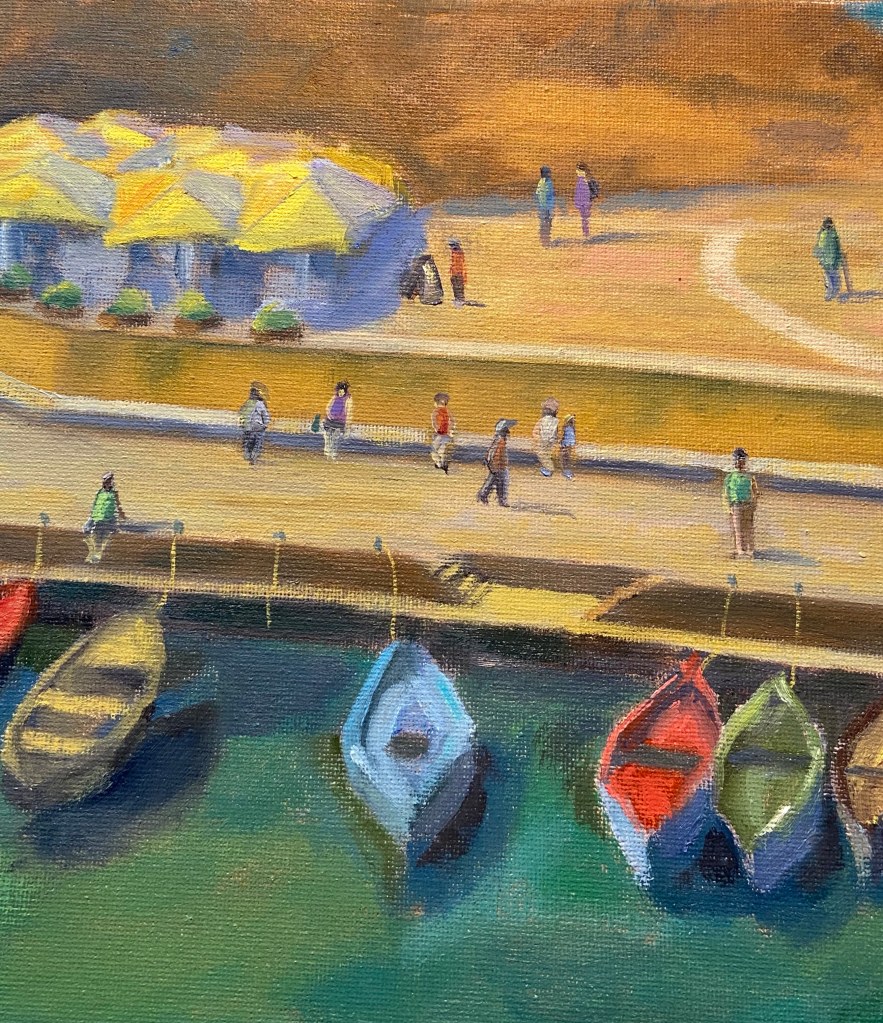
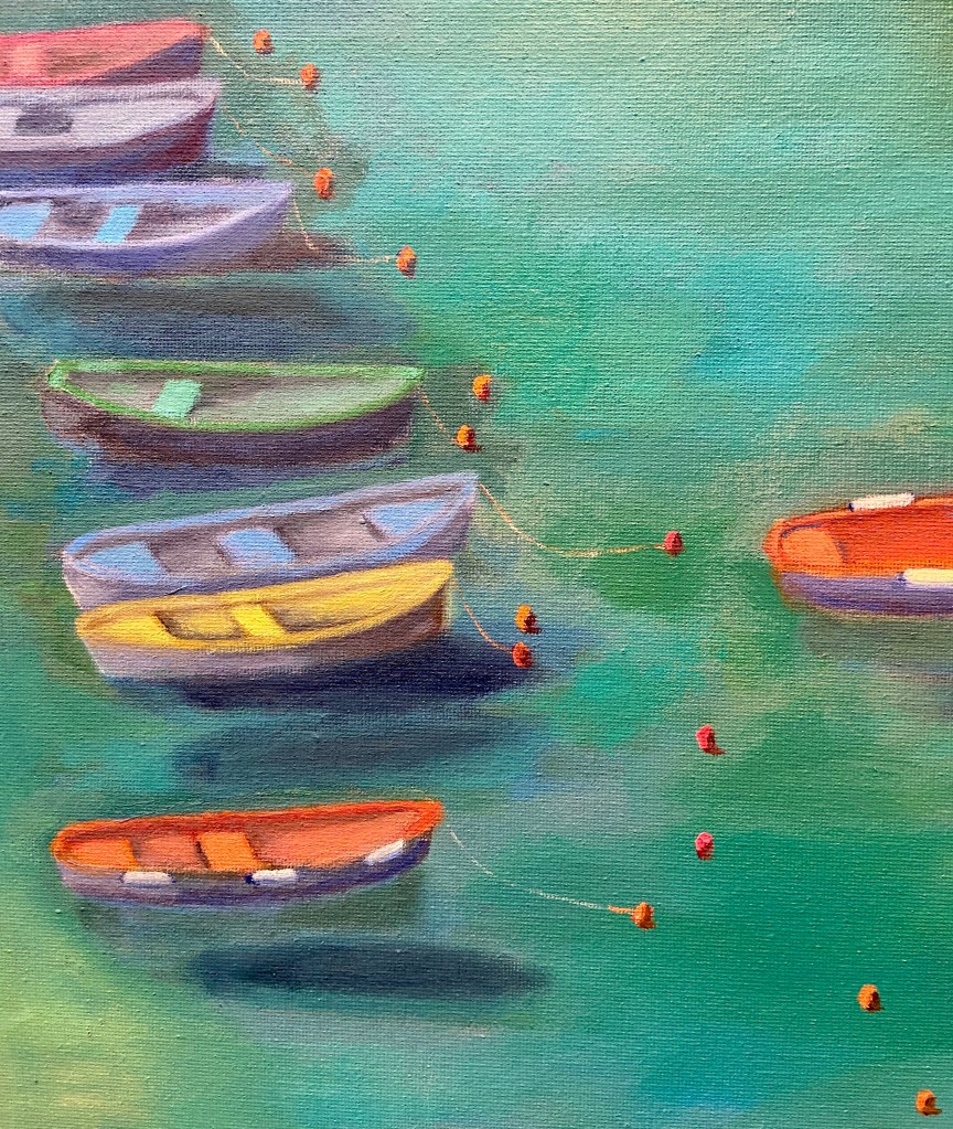
Despite the compositional challenge, I’m pleased with the outcome and I love the wide range of colors. And to some degree there is “depth” to the composition, namely in the dark shadows of the boats on the shallow harbor sea floor as well as the buoys floating on the water, helping guide the viewer around the painting. They look like they’re floating on a sea of blue-green, and, well… believe me, they are. Go see for yourself one day.
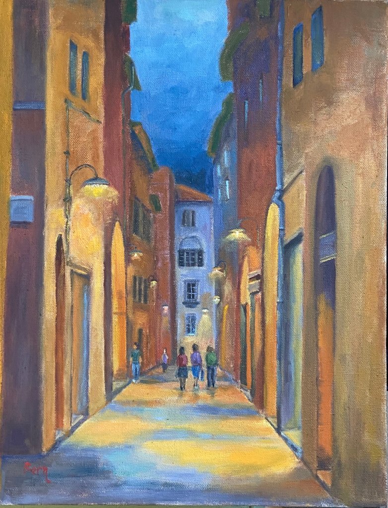
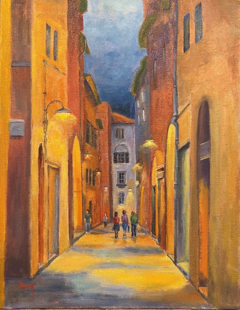
Aperitivo Time!

Painting | Oil on Canvas Panel 11” x 14” 

I’ve had the privilege of spending multiple vacations in Italy and am of the opinion that it is simply one of the most fantastic places in the world. The people, food, wine, traditions and, of course apperitivo time! 

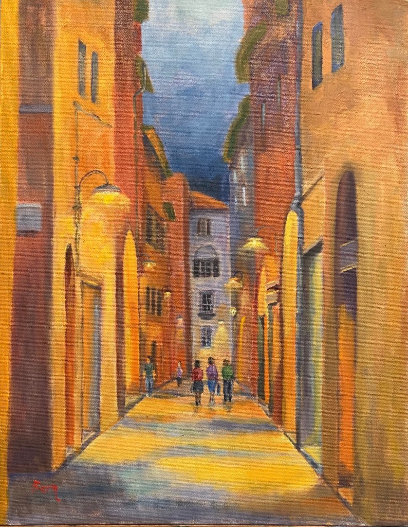
Final painting of Aperitivo Time
Aperitivo Time!

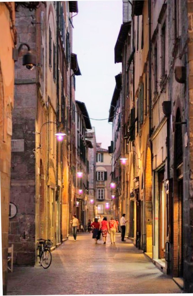
This particular scene is from a street in Lucca, Italy. The reference photo is earlier in the evening, just when the street lights go on, but I pushed the timing back a few hours so the lighting was more prominent. And just like magic, it was apperitivo time – break out the Aperol and snacks! If you don’t know what I’m talking about, rather than stumble through an explanation, just Google it yourself and promise yourself that one day you’ll go experience it first hand. Now back to the art…

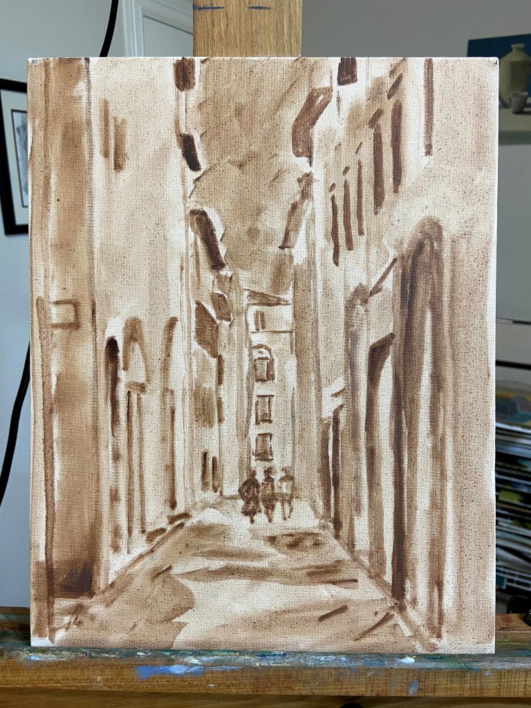
This was another session to work on street scenes with people milling about their business (see the previous composition on this topic here, Lilliputian Italian Evening Painting). Ironically, the people were the easiest part of the composition, as the rest of the street and buildings took a lot of rework and adjustments along the way. Not sure why, but sometimes things don’t go smoothly. The other challenge was the surface of this particular canvas board. I had to really load up paint on the brushes in order to make progress, which was due to either the very toothy surface or the fact that it was very absorbent – this canvas board really drank down paint. 

This piece is also meant to be displayed in softer, yellow lighting. It was an experiment that I haven’t purposefully tried to do in the past, but the result is pretty cool. See the side-by-side comparison below, one with “normal” lighting, the other under the yellow/orange soft light. I feel like it adds to the mood and to some degree makes the street glow. 

Progression gallery below shows the block-in, early color layout, and final composition.

Lilliputian Italian Evening Painting

Italian Evening | Oil on Canvas Paper | 6 x 8

I’ve been working on a large seaside landscape piece for the past week and ran into a brutal reality… people! The focal point is a group of brightly colored boats sitting on very saturated blue green water, which has been enough of a challenge in and of itself. I had made good progress on that part of the composition and then realized how many people were in the photo along the harbor walkway. Initially, I thought I’d simply wave my artistic license wand and exclude them, but came to the realization that it would be very creepy and vacuous without people enjoying the sunny day.  

Here’s the problem – I can’t paint people!

The large landscape is on temporary hold while I figure this out; I’ve bounced over to this small piece as a way to practice painting Lilliputians. 
This is an evening landscape, I have no idea where, but I’ve declared it to be Italian, which aligns with my current artistic needs. I kept things loose and painterly, but tried to leverage high contrast values to emphasize the lighting on both the building walls as well as the light spilling out of the restaurants. The people were put in last, and I’m pretty happy with the outcome, although I used 5 or 6 different brushes to figure it out.

One thing about painting people into a landscape – it will make you remember to step away from the painting repeatedly to see if they look “right”. To look at them up close is a real horror show – oddly shaped legs, disproportionate torsos, and some of the worst wardrobe decisions ever made. But step back 6 feet and they look fine. 

There are also some areas of the window sills and exterior wall faces that were done with a palette knife, wet into wet paint, which worked well in terms of giving a realistic, aged look. 

Some notes on color mixing:

  • Green awnings = cobalt teal + variations of yellows including cad lemon yellow, cad yellow deep, and cad yellow light. Darker areas are a more traditional mix of ultramarine blue + cad yellow deep + alizarin.
  • Orange red exterior walls = another wide range that used burnt sienna, cad red medium, cad yellow light, and ultramarine blue. 
  • Lights = exterior lights leaned more towards Naples yellow and a touch of cad red light and white. Interior lights utilized the outside lighting mix plus cad yellow light. 

Lastly, I finally remembered to spread the palette around the entire painting to balance the hues. This was especially true across the vertical faces of the building exteriors, giving the scene a better sense of continuity. 

Thanks for reading!

Frisbee Dog!

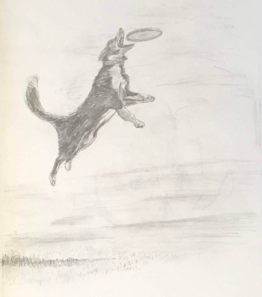
Frisbee Dog | Graphite on Paper

One of my dogs, Zip, is obsessed with 2 things in life: food and anything thrown. I used to think her love was exclusive to tennis balls, but over the years I’ve learned that not unlike her willingness to eat anything thrown into her food bowl, she will retrieve anything thrown across her yard. The day she trained me to sling a frisbee was a fond day indeed… for both of us. It’s her insatiable drive (dare I say “lust”?) to retrieve that inspired this drawing of Frisbee Dog

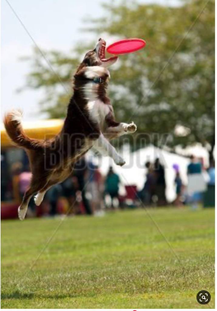
No, this is not Zip, but the reference photo captures all the key elements of a dog in motion doing her thing. The face is particularly tricky, in large part because it’s obscured and squinty, which mutes distinguishing features like eyes and ears. But you gotta love the open mouth and all those frisbee hungry teeth! 

The gallery includes a reference photo and two versions of the drawing. Granted, the drawing is a rough study and not intended to be a refined composition, I thought it was interesting to see how different photo settings can change the look and feel of a piece of art. Using the same source photo of the final drawing, one is set to sharper detail while the other uses a soft setting to remove some of the detail of the pencil strokes. Bear in mind this drawing is done in my sketch book on thin, see-through pages; there’s not a lot of teeth in the paper, thus the relatively rough nature of the drawing. Also, the entire piece was done with only 3 pencils – 2B, HB, and H. 
I think this type of subject would make for a good painting.

I’ll try a few more drawings of frisbee dogs and then make the jump to the canvass. 

Flower Study #5: Pink Rose

Pink Rose (study) | Oil on Panel | 5″ x 7″

Yes, another flower! The Pink Rose started off as a white rose, but some prodding from my wife got me to adjust to something a bit more interesting and thus the improvisation towards pink. 

I’ll confess I’m not thrilled with the outcome of this small piece, but I think it’s simply a matter of style preference. The style is less realistic than I’d like, although as a drawing it works well… but it’s not a drawing, so there’s that.

Pink Rose | Oil on Panel

The reference photo is a beautiful white rose, but in hindsight I can see that it’s flat and lacking variations in value. I didn’t figure this out until I was more or less finished with the piece, but it was a very valuable reminder that grinding through a painting isn’t always the right approach if your gut tells you something is off. I see a lot of paintings on-line that have this stylistic look, so I’m pretty sure it appeals to some folks, but, ironically, it’s not for me.

Squirrel Watch

Pivoting from painting to drawing last week and finally made the time to finish this one. Squirrel Watch is pretty self explanatory – Wolfgang, my 3 year old rescue mutt, sitting in the yard watching the tree tops for the infiltrators! 

One of my artistic goals this year is to improve my dog related art skills. I’m not a big fan of dog portraits, however, I thoroughly enjoy what I like to call “dogs doing stuff”, creating intrigue through motion and activity. Over the coming months I’ll work on various dog related pieces that capture the essence of dogs being dogs as they do their thing. 

Squirrel Watch | graphite on paper

Squirrel Watch was done over the course of a few weeks – I have no idea how long it took, but I wouldn’t be surprised if I spent 6 hours on this relatively small piece. There were a lot of mistakes along the way, but nothing an eraser and some patience couldn’t remedy. 

This isn’t a piece I would frame and hang, but I’m pleased with it from a progress perspective. It’s also riddled with lessons learned, so if you zoom in to see the details you can spot various styles and techniques.

Here’s what I learned and need to remember for future drawings:

  • It’s not necessary to draw hair detail throughout the subject. In this piece, the emphasis should have been on shading and shape foremost, whereas hair detail should be secondary. 
  • Draw hair details with a clear understanding of actual direction of the hair on the dog.
  • Work hair dark to light. 
  • Most of the hair detail can be accomplished using 2B, HB, and H pencils.
  • Show wrinkles in the coat by changing the density of hairs, i.e. closer together or further apart.
  • Dog paws are hard to draw, dammit! 
  • Blades of grass can be done by either individual strokes or by lifting out shading with a thin eraser. 

Painting Flower Study #4: Yellow Rose

The 4th of a 5 part study series, Yellow Rose, came together very quickly. The gallery above shows the progression as well as the varied contrast in painting compositional styles. If you have a favorite thus far please make a comment and let me know.  

Before diving into the details of the composition on the next page, I thought the history of the “Yellow Rose of Texas” and the song lyrics were really interesting to read in tandem. I typically haven’t looked into the history of my painting subjects, but having done it with something as innocuous as this yellow rose, I found it to be a curiously motivating way to start a project. I think I’ll add it to my painting process and see if it unlocks some additional artistic mojo in future compositions. And yes, I’ll try not to bore y’all along the way. 

Painting Flower Study #3: Exploding Bouquet

The Flower Study painting series continues moving forward. Now that we have 3 studies completed (click for previous posts on this series: Study #1 Poppies, Study #2 Hydrangeas), it makes sense to line them up at the start of each related post to see how things are moving along. I want to continue exploring different compositional ideas so I can make an informed decision, both with respect to my actual skills as well as artistic considerations (what looks good), before taking on a large, formal piece for the house.

Varnishing Made Simple

Today I wanted to share some simple varnishing techniques that can quickly and easily protect a painting. Nothing earth shattering here, but if you haven’t done a lot of varnishing of finished artwork before, or simply curious about other techniques, hopefully there are some tidbits for you in this post.

Supplies:

  • Varnish – I use Gamblin Gamvar Picture
  • Cosmetic Wedges
  • Rubber gloves
  • Paper towels

There are various types of varnish that can be used to get a good protective coat on a finished painting, but I like this particular varnish because it’s virtually odorless and very easy to use because it doesn’t become tacky too quickly. Instead of a wide soft brush to spread the varnish around the painting, I like to use cosmetic wedges instead because a) they don’t shed hairs like a brush does, b) they’re cheap, and c) it’s easier to spread varnish. 

I’m varnishing 2 pieces, one large canvas and one small panel. I’ll focus on the larger canvas piece, but I wanted to provide the smaller panel periodically to illustrate another surface. 

Varnishing Setup

This painting, Zip’s Flowers, was finished a couple months ago and has been stored on a drying rack, largely away from dusty conditions. Even in a nicely controlled drying condition such as this, I still take the time to wipe down the painting surface to get rid of the dust. What I find works best is first sweeping the surface with a wide clean brush, preferably one that hasn’t been used before, followed by a few wipes with a Swiffer dust cloth. The idea is to ensure that there isn’t a fine coating of dust anywhere on the painting, otherwise it’ll clump up when you apply the varnish.

To apply the varnish, lay the painting flat on a covered surface with some bright light overhead. Pour some varnish directly onto the painting. I like to pour a small puddle, about the size of quarter, in the middle of the painting, then slowly spread it around using one of the cosmetic wedges. Don’t overthink this part – just pour and spread. This allows me to see how the varnish will spread and the kind of coverage I can get with a small amount to start. It’s much easier to add more varnish than it is to try and gracefully remove excess; trust me, it’s not pretty. For every one of the DIY YouTube videos demonstrating varnishing techniques out there, I assure you there are 10 deleted videos of instructors slopped in varnish and/or furious at brush hairs drowning in tacky varnish.

Add more varnish as needed to get the entire painting surface covered, but remember it’s not about thickness, just coverage. The reason I suggested having a bright light overhead is to allow you to see the reflection of the surface and thereby quickly find spots that you missed.

First Coat Complete

Another advantage of using the cosmetic wedges over a brush is the complete mindlessness involved in spreading the varnish over the surface. Again, go back to any of the DIY YouTube videos and you’ll see how obsessed they are with brushing carefully so you a) don’t end up with too many brush hairs in the varnish, and b) getting a smooth surface. By contrast, the wedges are very soft and don’t even snag on impasto areas of the painting, so you can easily manipulate the varnish around the painting. Note that you might end up with some very tiny bubbles if you’re spreading quickly or pressing down too firmly, but they will go away in a few minutes and in my experience are never an issue.

After the varnish has been applied, I return the painting to its dust-friendly rack and let it dry. The varnish I’m using dries pretty fast, but I wait another week before applying a second coat. You can see in the gallery at the end of this post the results, but to set expectations remember this is not a high gloss finish, although you can use varnishes that give a more intense finish. Ultimately I’m looking for what I like to call fresh protection for the painting, meaning the varnish recharges the hues and vibrancy of the painting which also providing a protective layer that will allow your masterpiece to last a few hundred years.

The whole process takes about 15 minutes for the initial session and it’s very simple so there’s not a lot of trial and error involved.

Have a great week!

Pandemic

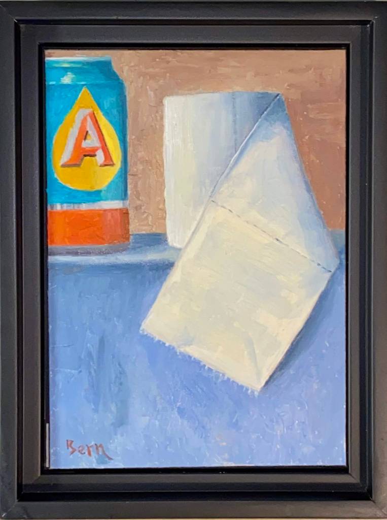
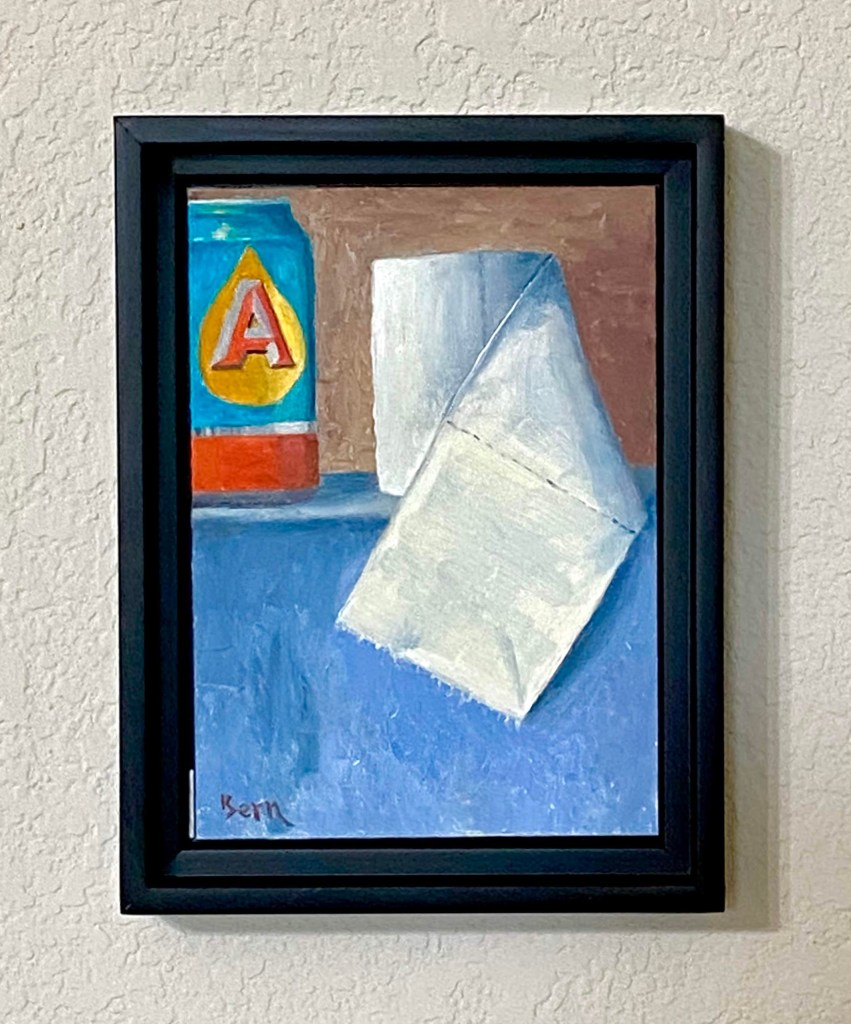
Pandemic | Oil | 5″ x 7″ Panel

This week’s composition is going to be auctioned off for charity to support the Central Texas Food Bank, which needs donations to support the growing demand generated by the Coronavirus pandemic. Despite the lighthearted nature of this painting, which is intended to inject some humor (at nobody’s expense) into a bleak situation, the Coronavirus is a serious challenge for the world that needs leadership and creativity to overcome. Details regarding the auction and how to participate are at the end of this post. 

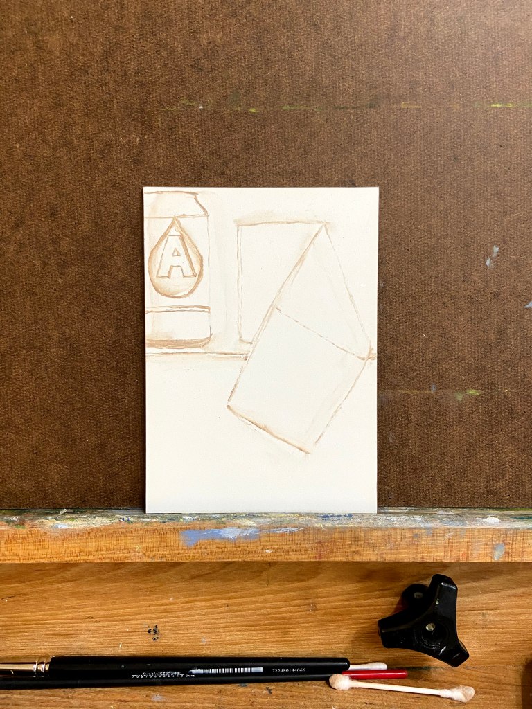
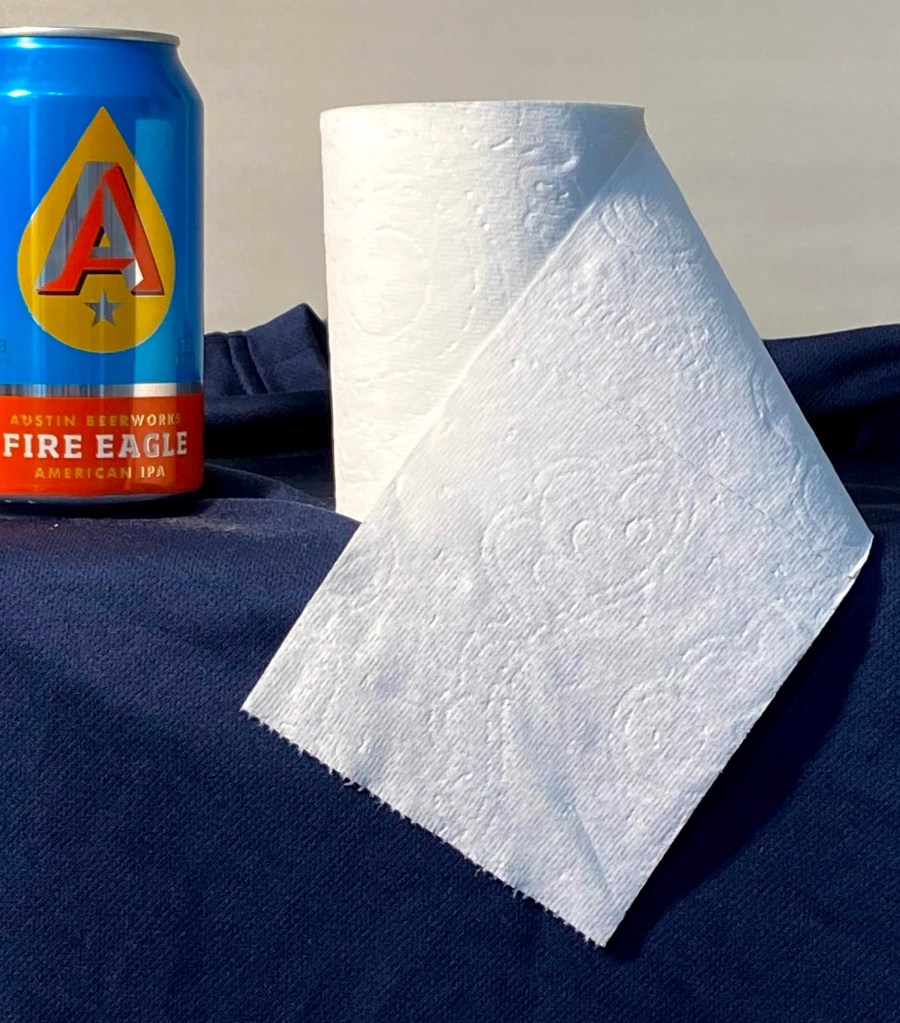
I’ve enjoyed working on more still life this year and I’m starting to get a better feel for various objects. The use of toilet paper and a beer can struck me as an interesting challenge because they are so contrasting in their own composition. In fact, if you really think about it, beer and tp have quite a strong relationship despite their contrasting structure, but that discussion is for another day. 
When I started this piece we had recently returned from a couple of trips to various grocery stores to stock up on supplies and at the very least, secure a couple weeks worth of toilet paper, beer, and wine. Priorities, right? Local news coverage continued to highlight hoarding and runs on tp (sorry, just can’t help myself), at which point my nervous laughter and need to find something positive in all the bad news led to the idea (hard to call any of this “inspiration”) for this composition. At the very least it gave me an outlet through art and a chuckle at the madness the world sometimes throws our way. I hope you get a guilty giggle from this piece too, but if the work is offensive in any way, please accept my heartfelt apologies as my goal was well intended. And ultimately, the related auction of this piece will provide a donation that will feed many people in need during this serious time. 

Special Art Auction Details

This week’s composition is going to be auctioned off for charity to support the Central Texas Food Bank, which needs donations to support the growing demand generated by the pandemic. 

Auction Overview

  • Artwork is called Pandemic. My Austin friends will recognize the beer can, but for the uninitiated, it’s Austin Beerworks’ Fire Eagle IPA. The source of the toilet paper, however, is uncertain.
  • This is original artwork, completed March 18th, 2020. The painting is done in oil on a 5″ x 7″ wood panel. The artwork is being sold framed.
  • The auction is being done as an Event on my Facebook art page, “Impasto”. Direct link to the Event is here.
  • 100% of the winning bid will go directly to the aforementioned charity, Central Texas Food Bank. The winning bidder will receive a copy of the receipt from me showing the donation was made in full. 
  • No shipping fees if sent to a United States address. International shipping rates will apply.
  • Letter of authenticity will be included (proves provenance and confirmation of original artwork).
  • Winning bid must pay via PayPal, Venmo or check. Artwork will be shipped upon processed payment. 

If you want to participate in the auction, follow these simple steps:

  • Go to my Impasto Facebook page here, and navigate to the Events section, or navigate directly to the Event here; look for the event called “Special Art Auction Benefitting Central Texas Food Bank​”. ​The About section of the Event will reiterate these auction guidelines and information about the artwork. ​Go the Discussion section to place bids via the Comments section.
  • BIDS MUST BE MADE IN THE COMMENTS SECTION OF THE EVENT.  
  • The opening bid must be at least $50. Bidding must be done in no less than $5 increments, which means your bid must be at least $5 more than the previous high bid listed. Of course you can feel free to make incremental bids much higher than only $5! 
  • The comments should sort old to new, so scroll to the bottom of the comments to see the latest high bid. WARNING – sometimes Facebook gets a mind of it’s own and the comment sorting logic gets whacky, so just make sure you pay attention. 
  • Bidding opens at 12Pm CDST, Saturday, March 21, 2020. Bidding will close at 5pm CDST, Friday, March 27, 2020. 
  • Winning bidder will be notified Friday, March 27th, 2020.