New Orleans Street Car

Oil on Paper | 8” x 10” 

This is a study of one of New Orleans’ iconic street cars, specifically the Saint Charles line, which are a national treasure and are on the register of National Historic Landmarks.  

The intent of this study was to capture the fantastic late afternoon light as it enveloped the street car scene. There’s a lot of green, but the metallic nature of the street car is reflective and a distinct texture against the backdrop of the old New Orleans oak trees. 

This study gets me excited to do a larger composition, which will have similar lighting but some additional details that I didn’t want to tackle with this test drive. I’m happy I took careful notes regarding the color mixtures, too. Always take color notes! 

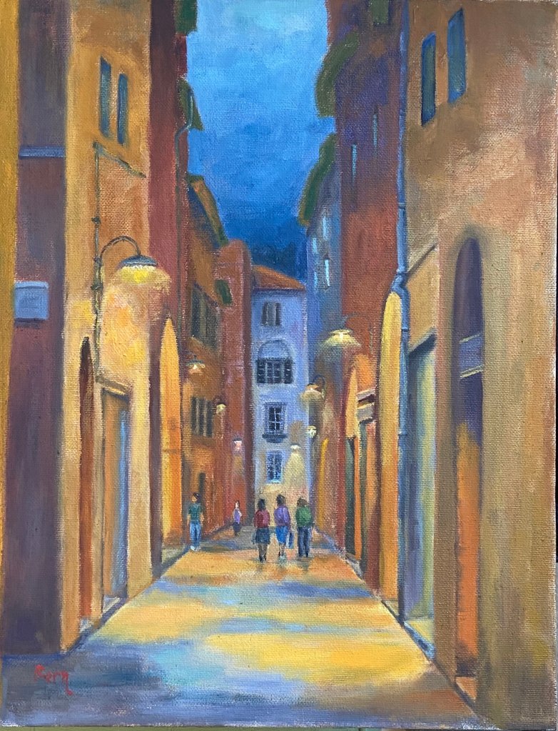
Aperitivo Time!

Painting | Oil on Canvas Panel 11” x 14” 

I’ve had the privilege of spending multiple vacations in Italy and am of the opinion that it is simply one of the most fantastic places in the world. The people, food, wine, traditions and, of course apperitivo time! 

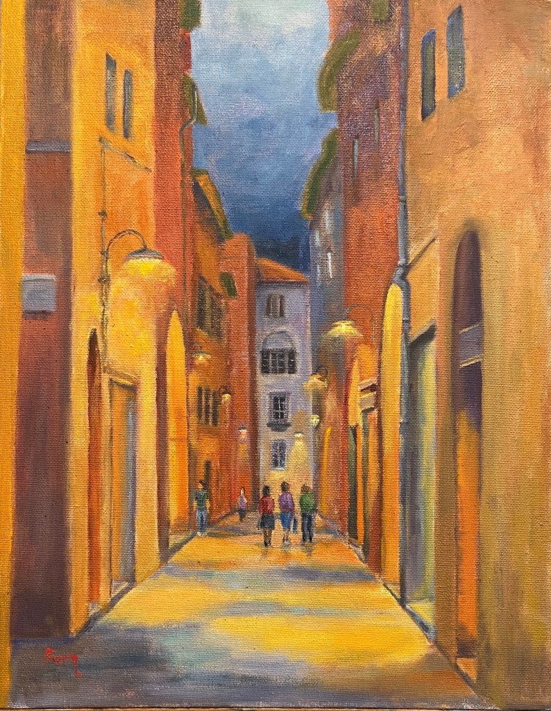
Final painting of Aperitivo Time
Aperitivo Time!

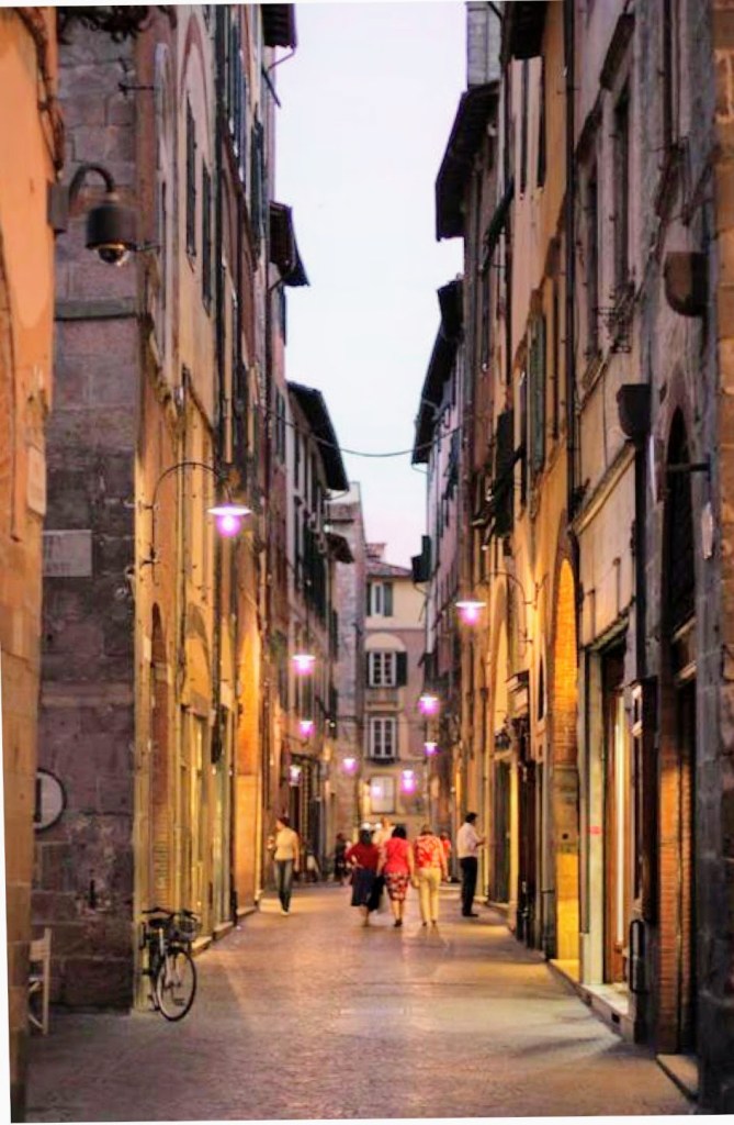
This particular scene is from a street in Lucca, Italy. The reference photo is earlier in the evening, just when the street lights go on, but I pushed the timing back a few hours so the lighting was more prominent. And just like magic, it was apperitivo time – break out the Aperol and snacks! If you don’t know what I’m talking about, rather than stumble through an explanation, just Google it yourself and promise yourself that one day you’ll go experience it first hand. Now back to the art…

This was another session to work on street scenes with people milling about their business (see the previous composition on this topic here, Lilliputian Italian Evening Painting). Ironically, the people were the easiest part of the composition, as the rest of the street and buildings took a lot of rework and adjustments along the way. Not sure why, but sometimes things don’t go smoothly. The other challenge was the surface of this particular canvas board. I had to really load up paint on the brushes in order to make progress, which was due to either the very toothy surface or the fact that it was very absorbent – this canvas board really drank down paint. 

This piece is also meant to be displayed in softer, yellow lighting. It was an experiment that I haven’t purposefully tried to do in the past, but the result is pretty cool. See the side-by-side comparison below, one with “normal” lighting, the other under the yellow/orange soft light. I feel like it adds to the mood and to some degree makes the street glow. 

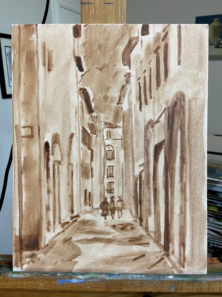
Progression gallery below shows the block-in, early color layout, and final composition.

Lilliputian Italian Evening Painting

Italian Evening | Oil on Canvas Paper | 6 x 8

I’ve been working on a large seaside landscape piece for the past week and ran into a brutal reality… people! The focal point is a group of brightly colored boats sitting on very saturated blue green water, which has been enough of a challenge in and of itself. I had made good progress on that part of the composition and then realized how many people were in the photo along the harbor walkway. Initially, I thought I’d simply wave my artistic license wand and exclude them, but came to the realization that it would be very creepy and vacuous without people enjoying the sunny day.  

Here’s the problem – I can’t paint people!

The large landscape is on temporary hold while I figure this out; I’ve bounced over to this small piece as a way to practice painting Lilliputians. 
This is an evening landscape, I have no idea where, but I’ve declared it to be Italian, which aligns with my current artistic needs. I kept things loose and painterly, but tried to leverage high contrast values to emphasize the lighting on both the building walls as well as the light spilling out of the restaurants. The people were put in last, and I’m pretty happy with the outcome, although I used 5 or 6 different brushes to figure it out.

One thing about painting people into a landscape – it will make you remember to step away from the painting repeatedly to see if they look “right”. To look at them up close is a real horror show – oddly shaped legs, disproportionate torsos, and some of the worst wardrobe decisions ever made. But step back 6 feet and they look fine. 

There are also some areas of the window sills and exterior wall faces that were done with a palette knife, wet into wet paint, which worked well in terms of giving a realistic, aged look. 

Some notes on color mixing:

  • Green awnings = cobalt teal + variations of yellows including cad lemon yellow, cad yellow deep, and cad yellow light. Darker areas are a more traditional mix of ultramarine blue + cad yellow deep + alizarin.
  • Orange red exterior walls = another wide range that used burnt sienna, cad red medium, cad yellow light, and ultramarine blue. 
  • Lights = exterior lights leaned more towards Naples yellow and a touch of cad red light and white. Interior lights utilized the outside lighting mix plus cad yellow light. 

Lastly, I finally remembered to spread the palette around the entire painting to balance the hues. This was especially true across the vertical faces of the building exteriors, giving the scene a better sense of continuity. 

Thanks for reading!

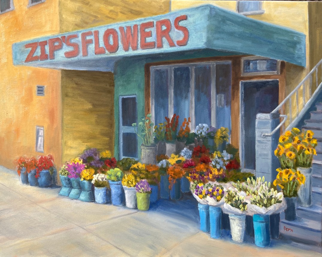
Zip’s Flowers

Zip’s Flowers: 20″x16″, oil on canvass

Sometimes art is very cathartic, but at times it can be maddening. However, I’ve learned over the years to rethink the frustration and consider those pull-my-hair-out-of-my-head moments as learning experiences, and more often than not it works. When I just can’t get a piece to work, either compositionally or from a technical skills perspective, if I focus on what I need to learn to fix it rather than become irritated at my shortcomings, I tend to get back that Zen painting zone.

Zip’s Flowers has been a long learning experience! Wars have taken less time to finish. That said, it’s chock full of newly acquired knowledge, of which I’m very excited about. There’s also some personal interest in terms of the background of this photo. This flower shop is a few blocks down the street from where I lived one summer in San Francisco. We lived in a great neighborhood along the border of the Mission and Castro districts, on 18th between Hartford and Noe. This flower shop, now called Urban Flowers, was along the way to the dog park. My wife would take the dogs at least once a day to the dog park. One day, the 1 year old puppy, Zip, decided smelling the flowers was no longer satisfying, so she opted to taste them. As the story goes, she reached out and grabbed a dangling flower from one of the pots and proceeded to knock the whole thing over! I wasn’t there, but my wife said the people at the shop were very friendly and weren’t concerned about Zip’s flower chomping. Of course I had to see this for myself, and a few days later I was walking Zip past this flower shop and sure enough, she tried to gobble down a basket of roses as we walked by.

The composition itself was probably the hardest hurdle to overcome, which I took license to adjust reality to make things work. The reference photo shows a wide variation of building colors and construction materials, so some adjustments had to be made on various fronts to make it look less contrived – ironically, the reality in the photo was too hard to believe in a painting. The values also had to be exaggerated to give depth and a sense of place, whereas the photo was very flat. Finally, the amount of tissue papered flowers was overwhelming and a bit distracting, so that was scaled back significantly.

My favorite part of this painting is the right foreground. First, the flowers in white paper came out much better than I had anticipated and they really frame that side of the painting. I also like the realism they add to the scene. Secondly, I’m very happy with the tall yellow sunflowers going up the stairs. These two elements combine to draw the viewer into the painting (hopefully) and consider wandering through the rest of the composition.

The sheer multitude of color is initially distracting for me, but once I stepped away from it for a day and returned to the completed piece, the colors were more welcoming and a source of excitement.

Do you like this piece? I’m guessing people either love it or hate it, given the colors and somewhat busy nature of the scene. Suggestions and observations are welcome.

Lamar Bridge into Austin

Getting close to finishing this Austin urban landscape piece. The view is from the south across the river towards downtown. The city has grown a lot since this photo was taken, so those familiar with the area might wonder why I excluded some buildings; not the case, they just weren’t there a few years ago.

Oil on gesso board, mostly brush work, done in studio with photo reference (included below). The bridge was tricky, despite having done a couple of practice drawings. It’s been an exercise in patience, having to redo various parts, but it’s been a great “learner” piece, specifically with the sky and water. I’ve started taking some formal art lessons every other week, and my teacher gave some great guidance with the sky and the water reflections. Confidence with these elements is 10x what it was a month ago. Not sure if it comes through in the photos, but the colors are rich, probably a tad too saturated, but the values and reflections are solid enough to carry the composition.

The bridge needs some tweaks to the facade so it’s not so flat, the addition of cars on the road, and a few street lights. At that point I’ll call it done. One more short session should do the trick. I’ll post the final product this coming weekend.