Practice Session #2: Alhambra Reflection Success!

Ding dong the witch is dead, the wicked wicked reflection witch is dead! Sorta.

Remember, this is a practice session on painting paper, so was just looking to get the hang of a basic (read: decent) reflection in a relatively still pond. Pretty happy with how this came out. Spent an hour of actual painting on this tonight (which brings the total effort to about 3 hours), but remixing the paints was fast b/c I actually made notes from the first session so I could recreate without much effort.

Focused on darker values for most everything in the reflection, which seems to have worked out really well. Initially, I had taken it too far to the dark side, which I noticed once I started on the sienna walls, which were so dark there wasn’t going to be any chance I could get the doors and windows to show up very well in the reflection, even if I had used tube black. The solution was to work some white back into the paint on the “canvas” while everything was still wet – all praise oil paints!

IMG_2698

Below is the zoom in view of the reflection area. In addition to the darker values, the lines are also softened so things are more fuzzy. Then I took a dry round #4 brush and pulled some paint from one area into it’s neighbor, i.e. start the brush in the green of the bushes, drag it lightly across the green and into the sienna of the building to give the appearance of a ripple in the water. Next was introducing some of the blue sky into the water, which was simply done with a lightened blue (with white) stroked in random areas of the pool; used a smaller, stiff brush, #2 flat. All the large block sections were also painted with long, broad horizontal strokes. It’s amazing to me how well horizontal strokes can make a surface look like water. The final step was to soften the entire water area by making long horizontal strokes across large sections with a very soft, very wide, very cheap 2″ wide flat brush. 

IMG_2699

I was genuinely surprised at the effectiveness of the last step with the cheap big brush. I also avoided doing any vertical brush strokes down the reflection area, which simply wasn’t necessary with this type of pond. Might need that for a larger lake landscape, to elongate and distort tree reflections in the water, but for this highly reflective, still water pond, it would have detracted from the composition. This is where things started to fall apart with the Giverny wipeout which was exacerbated by the use of too much paint. 

Calling this good and the practice session finished. I’ve now sketched this scene a couple times and painted it once, so I think I will tackle an actual full size painting of this for my next project before attempting Giverny again. I’ll need to distort reality a little bit, though, b/c the composition with the palm tree in the center of the frame is boring. But there are nice curved lines from the palm fronds, and some awesome diagonal lines from both the building and the hedgerow bushes that it could prove to be a very well structured painting that draws the viewer in and through the space. Stay tuned…
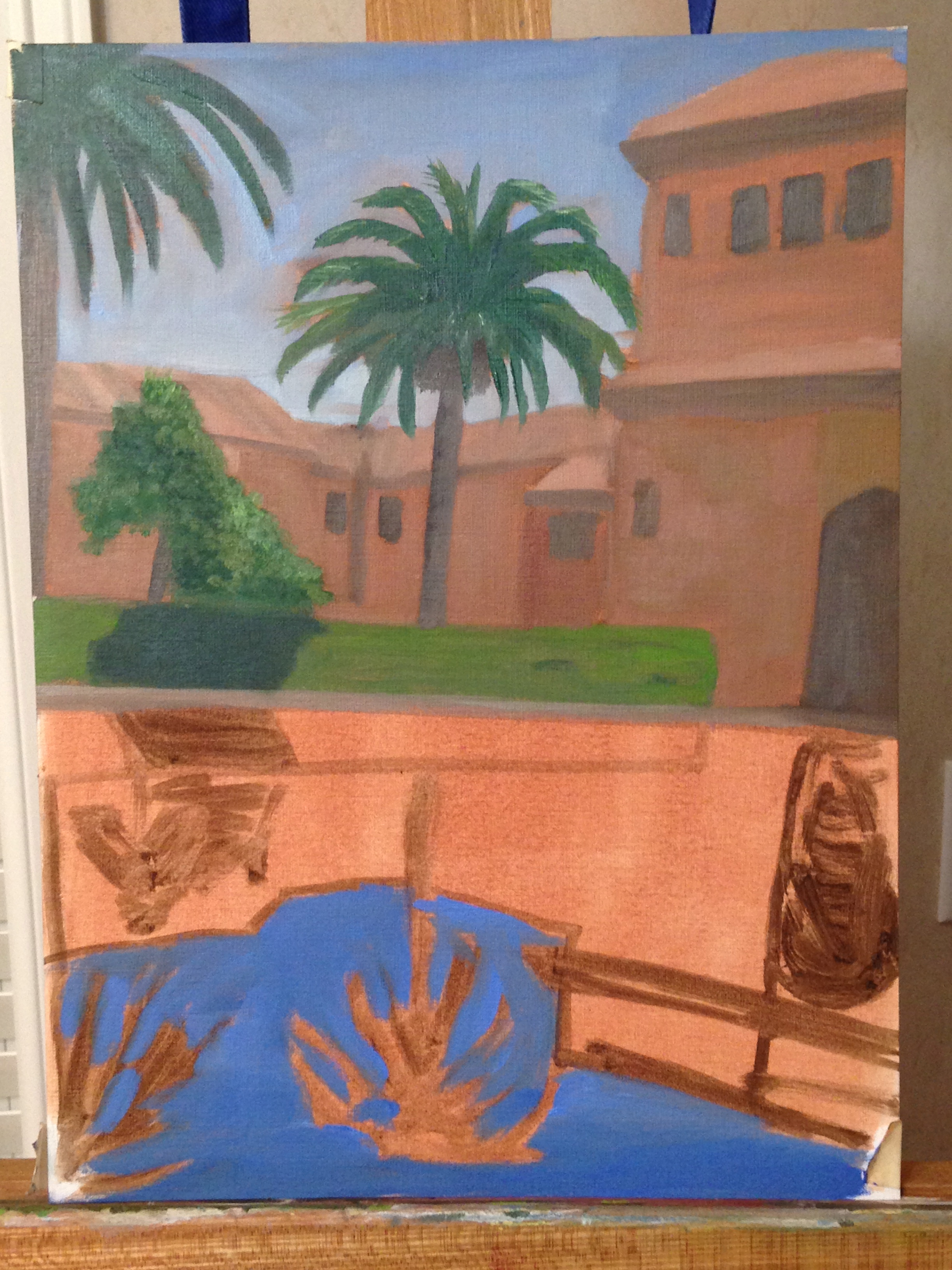
Practice Session: Reflecting Pool at Alhambra

Finished licking my Giverny wounds, did more research, watched some vids, and got back on the art horse tonight. 

Decided to do a few practice works on paper before tackling Giverny again, or any other water reflections for that matter. Spent a couple hours on this to get it teed up for another attempt at the water reflections. Not really worried about details or the exactness of the composition, but I am paying particular attention to the color palette and values, in large part b/c those components can be integral to creating good water reflections. My plan is to tackle the reflections during my next session, which should largely wrap up this practice piece, but we’ll see how that goes. 

BTW, this is a picture I took while in Granada, Spain, visiting the Alhambra – this is an amazing place! Breathtaking!

IMG_2693


Here is the reference photo.

Alhambra palm1

Giverny – Wipeout!

Well, I shouldn’t have called the painting gods “persnickety” in my last post. In my effort to paint the reflections of the trees into the pond, the painting lemmings swept me over the cliff of inexperience. I knew things were going to be tricky since I’d made the mistake of laying in the lily pads before the water reflections, but figured I could dance around them and do some touchups afterwards. WRONG! 

IMG_2685

My assessment of the causes of the Giverny Disaster of 2014 is as follows:

1. Arrogance or ignorance, or in this case, both! Not sure what I was thinking not doing a few practice sessions with water reflections prior to trying my maiden attempt on an actual working painting. 

2. I knew what to do in principle, had seen demos, and it seemed pretty straight forward. However, the actual execution has nuances that only practice can reveal.

3. Pretty sure I used paint that was too thick. I’ve read post-wipeout that water reflections should be done with a thin layer of paint. Not sure if that’s true, but thick clearly didn’t work for me, so sounds right about now.

4. Used the wrong type of brush to do the vertical and horizontal dry-wipes that would give the reflected images that shimmer. 

5. Even if the technique had been sound, and I had figured out how to deftly get around the prematurely painted lily pads, I had the colors of the reflection images wrong (pretty close though), in large part because I did them in completely separate painting sessions from when I painted the actual trees on the bank of the pond. Not a big deal, but I think it’s something I should remember for next time.

6. Panicked! Rule #1 of painting, at least for me, is don’t panic. Its supposed to be relaxing as the creative juices flow, but when I ran into this problem, instead of just walking away and coming back another day, I started guessing and made hasty decisions.

In the end, I wiped the disaster with a paper towel and spread the remaining paint around the canvas. While it can’t be “saved”, I’m pretty sure I can come back to this wipeout in the future and get it right. Gonna chalk this up as one of those steeps in the learning curve, and a clear indicator that my best painting is done with wine in hand. Cheers!

Giverny – Bridge and Lily Pad Session

IMG_2682


Been sketching the past couple of days, but nothing worth posting. Spent a short session on Giverny a couple days ago, working in the bridge and finished the first pass at the lily pads. I’m happy with the bridge itself – proportion, hue are solid – but the reflection in the water is a total fail. For a closer look at the water reflection fail, see the zoom-in view below. 

IMG_2683


Good news is I’m fairly confident it can be fixed. The canvas soaked in the very light layer of paint I tried to use in the reflection, so I wasn’t able to get the right look when I tried to incorporate the water shimmer effects using a dry brush. There simply wasn’t enough wet paint on the surface to manipulate. Another slap-me-in-the-face lesson from the persnickety painting gods. 

Glazing of The Heart

Finally worked up the nerve to take the glazing technique I learned in a recent workshop and apply it to one of my finished paintings. The red heart on green background got a real upgrade! 


Starting point was this heart painting, which had good colors and was a basic, but pleasant piece. I liked the finished product because of the hues and free form brush strokes. 

IMG_2677

But it lacked pop, vibrancy, and finish. Not much I could do about artistic value or interest of composition, but at least it’s pretty, right? 🙂 The glazing was done in a single session of about 20 minutes. I added an Indian Yellow glaze to the green background, and a very diluted Alizarin Crimson glaze to the heart. The result was subtle in color effects, but it really brought out the yellow highlights of the background, and made the reds of the heart pop. What was interesting was that the background highlights of yellow were almost imperceptible prior to the glaze. The Alizarin glaze, on the other hand, added a lot more brightness to the main focal point.

Finished product below, but not sure the photos do it justice. Took the pictures of before and after in the same room, same angle, same iPhone camera. 

IMG_2680

Giverny – Water and first pass at lily pads

IMG_2673

Got the first pass at the water and lily pads done yesterday. Short 2 hour session, but was pleasantly surprised with how quickly the lily pad palette came together. Hard to see in this photo, but the range of colors includes greens, purples, and blues. The water is also darker than it appears in the photo – deeper blue gray – which makes the lily pads in the foreground sit up as if they’re on top. I think glazing will have to be done for a couple of final steps later in order to get sections of the lily pads to appear under water. 

Next session will be completion of the remaining lily pads (dark areas in water on left side), rough in the bridge, and a rough in of the tall white flowers in the foreground, which re the key component to the painting. We’ll see… gonna be tough, but should be fun. 

Giverny – Distant greens

2 more sessions have passed since the previous Giverny base layer post. One was spent basically redoing the underpainting, toning it down and getting better base for the water. The next session was spent on the foliage along the far bank of the lilly pond. Struggled with taming Thalo Green, but after some trial and error, I finally got some workable greens. Its amazing how much variation can be achieved in the green spectrum.

Most of the palette is Thalo green, cad red, cad yellow, burnt sienna, and white. Used some purple and blue to cool things off, or get darker variations so it wasn’t too flat, but that’s tough to do with these greens.

Next session will be a nose dive into the water, rough in the iconic Monet bridge, and maybe take a whack at some initial structure on the foreground flowers.

 IMG_2671

Bull Ring – Finished!

IMG_0151

Finally got the Bull Ring finished! Lots of rework and detailing since last post. This was a real challenge, but I learned a lot of valuable lessons that I won’t soon forget. The final chunks of work included:

1. A rework of the columns in shadow.

2. Detailing of the columns in sunlight, including shadow details and accents to give texture and depth.

3. Lines on the roof and more variable values from top to bottom to fix the “flat” view from earlier.

4. Added the matador. First person I’ve painted, so that took some practice, including the hat. But it really anchors the composition.

5. Added to the sand in the ring, mostly to improve contrast and allow for a dry brushing of the new paint up onto the wooden ring so it gives the impression of sandy dust stuck on the walls of the ring. 

That’s it. Next and final step is a glaze, but can’t do that for a month or so until things really dry. Will post that final view, but the painting is done! Time for wine!

Giverny - Underpainting

Finally got the canvass covered with a first layer. Tried to block in the base values, but I tend to over think details even at this early stage, so instead of looking like a well structured set of values, it looks like a kindergarten project. But maybe that’s how it’s supposed to look with this many details to deal with. Should be fun if I can figure out the water and lily pads, which dominate the middle of the painting and will need to be balanced just so to get this to work.

Giverny - Sketch

Did a single practice sketch in my small sketch pad and got the perspective pretty quickly.

Not happy with the choice in turpsy green as a starting base, but next time I’ll take some time to mix a more appropriate mid-range green.

I like the vertical and horizontal compositional components; but not sure if the final painting will have the engaging effect I’m hoping for on the viewer. We’ll see…