Lines & Blossoms – Update

This continues to be a rewarding effort, despite the learning curve. Updates from last post include adding details to the tree blossoms, tree trunk texture, improvements to the door to the right of the tree, and some small line detailing in the buildings.

IMG_2806

Still need to figure out how to get the cherry blossoms to look more realistic, while figuring out how to transition the values in the tree to give it a sense of volume. While I love the colors thus far, the result is still flat and lacking depth. It’ll get there, but I haven’t figured out how just yet.

Lines & Blossoms – Impasto Strikes!

Spent a couple of sessions working through the latest challenges with this fun, albeit difficult composition.

Since the last update, a number of things have been tackled, some more than once.

First, the focus remained on the buildings and supporting cast of what will be the cherry blossom tree. This set of sessions updated a number of touchup items, but the primary focus was a) laying in the window woodwork, and b) getting the base layer of the tree on the canvas. It turns out I don’t have a great brush for the type of detail work on the window frames, but I made do with what was available. Adding narrow detail brush to my supply list, but anyone with specific brand/type suggestions is welcome to make comments with the details.

IMG_2799

Next session worked on elements of the composition and the next stage of the tree, including some experimentation with impasto effects.

The most significant update aside from the tree was the addition of a sidewalk (thank you Nina), which added missing structure to the bottom of the work, and gave more strength to the 3-point perspective I was working towards. It’s also going to be a critical part of the composition because it plays an important part in leading the viewer into the painting, whereby there is a clear break in the curb of the sidewalk that leads one into the stairway of the main doorway. The framing of the cherry blossom will enhance this effect.

The impasto on the tree are hard to see in the photo, but believe me they’re there. I dove into my first true impasto medium experience, mixing conservative amounts into the purples and pinks. Its very addictive, especially after having spent hours working on very exacting lines and angles of the homes, then being able to run wild with an array of brushes and styles in exploring how best to represent the beauty of the tree blossoms.

Some other minor updates were made in this session, but things are close to completion. Still need to work a significant layer on the cherry blossom, ensuring there is the right balance of light pinks and whites on the right side of the tree, whereas the values on the left are in shadow and more subdued and less saturated. Furthermore, the black door down the street needs work, as well as some updates to the window panes and their reflections of the sky on this particularly sunny day.

IMG_0165

Giverny – Water and first pass at lily pads

IMG_2673

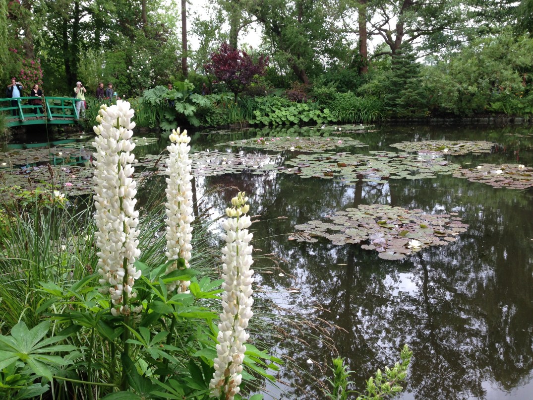
Got the first pass at the water and lily pads done yesterday. Short 2 hour session, but was pleasantly surprised with how quickly the lily pad palette came together. Hard to see in this photo, but the range of colors includes greens, purples, and blues. The water is also darker than it appears in the photo – deeper blue gray – which makes the lily pads in the foreground sit up as if they’re on top. I think glazing will have to be done for a couple of final steps later in order to get sections of the lily pads to appear under water. 

Next session will be completion of the remaining lily pads (dark areas in water on left side), rough in the bridge, and a rough in of the tall white flowers in the foreground, which re the key component to the painting. We’ll see… gonna be tough, but should be fun. 

Giverny - Underpainting

Finally got the canvass covered with a first layer. Tried to block in the base values, but I tend to over think details even at this early stage, so instead of looking like a well structured set of values, it looks like a kindergarten project. But maybe that’s how it’s supposed to look with this many details to deal with. Should be fun if I can figure out the water and lily pads, which dominate the middle of the painting and will need to be balanced just so to get this to work.

Giverny - Sketch

Did a single practice sketch in my small sketch pad and got the perspective pretty quickly.

Not happy with the choice in turpsy green as a starting base, but next time I’ll take some time to mix a more appropriate mid-range green.

I like the vertical and horizontal compositional components; but not sure if the final painting will have the engaging effect I’m hoping for on the viewer. We’ll see…

New Project - Giverny

After a 3 month break for shoulder surgery, the painting arm is back – achy, but good enough for a few hours at a time.

Returned from a trip to France with some new material. This will be a tough one, but I’m hoping to learn a lot about a) greens and b) underpainting. Don’t have high expectations for realism with this, but it should be a great way to get the creative juices flowing again.

Sketch - dog body (rt hand)

Stage 2 incorporating values, hair, and some of her coat patterns. Saving the challenge of the face for last. Liking the way this is shaping up. First time attempt at complete dog drawing.

This took a couple of 30 minute sessions, so another hour or so.

Sketch - dog outline (right hand)

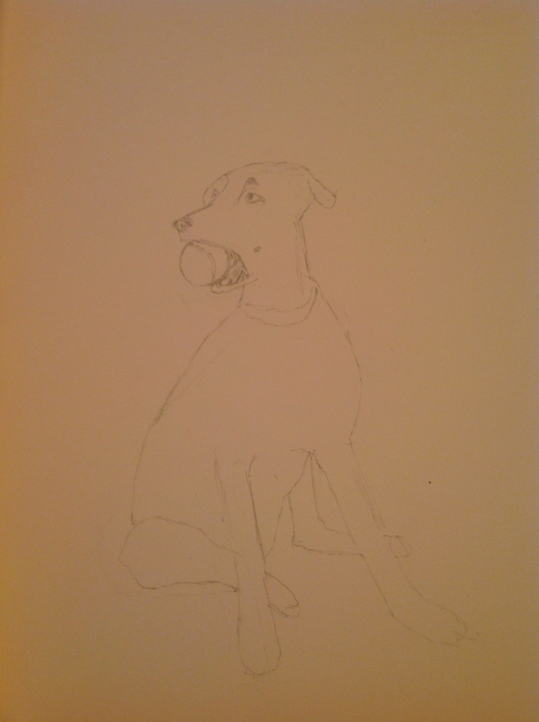
Started some sketching of the dogs. This is the ball-obsessed puppy. About a 30 minute effort, focused on proportions and various angles of the sitting pose. Bad lighting on the photo, but you get the idea.

This was done with my right hand, my dominant hand by far.

Sketch - bananas in bowl

Did some work on the bull ring today, but only a couple of hours and not enough progress worth posting. So, changing gears for a sec and going with a recent sketch of still life. Did this about a week ago and toyed around with some colored pencils. This was before my most recent sketching class that covered the value scale. Probably would have helped with the depth of the bowl. This took about an hour over 2 sessions. Next up is a sketch of one of the dogs and her ball obsession.

Palette for Arches

No new painting updates today – been a busy week at work, so no play time in the studio. But in the spirit of blogging discipline I wanted to post.

To the untrained eye, this post could look like, well… vomit. But it’s actually the painful reality of painting variations of sand hues. Gotta love that ochre and gray mashup!

The base mix for the arch yellow/sand was ochre, white, a little raw umber, and a spec of cad yellow. The grey is a standard mash of equal parts ultramarine blue and burnt sienna. To move the range of yellow ochre around, I experimented with varying values of the gray mixture. Fun stuff!