Art for the People Gallery in Austin Tx, is a showcase for 100 local artists.
Art for the People Gallery in Austin has included 3 of my compositions in their Summer group show “ABUNDANCE”, which runs July 2nd through August 26th, 2022. I’m thrilled to be a part of this talented group of artists! If you’re interested in original artwork by Austin artists, check out AFTPG either in person in Austin or browse their online store.
The following paintings are part of the show (links lead to previous blog posts about these compositions):
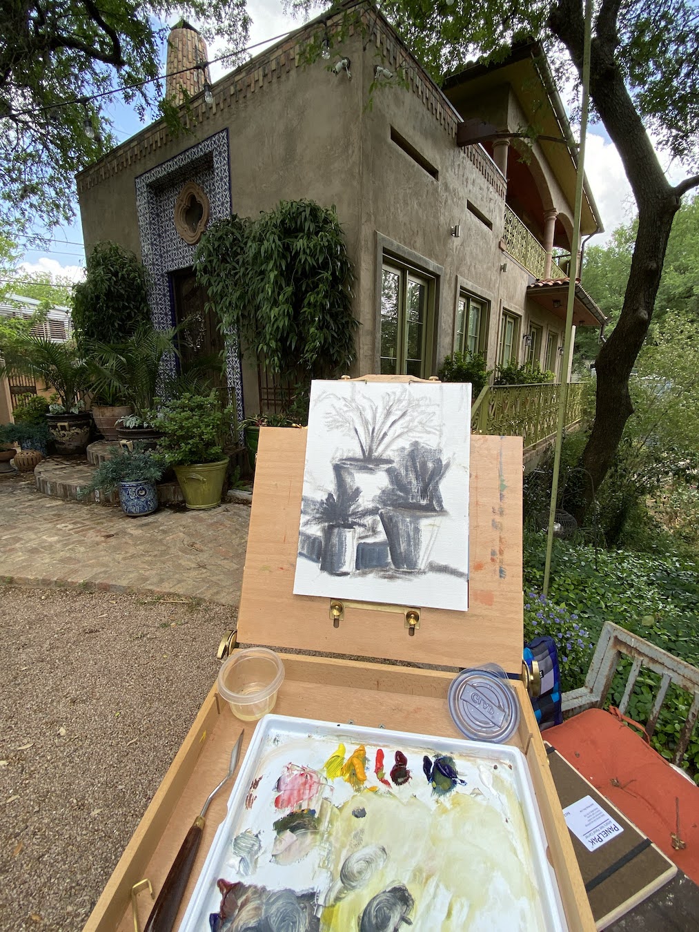
A composition comes around sometimes and slaps you in the face, a hard reminder that you don’t know jack squat about painting. In this case, 3 Pots told me I need to work harder on my plein air compositions, starting with the basics. There’s something addictive about plein air painting, even on the bad days that seem like you can’t get anything right.
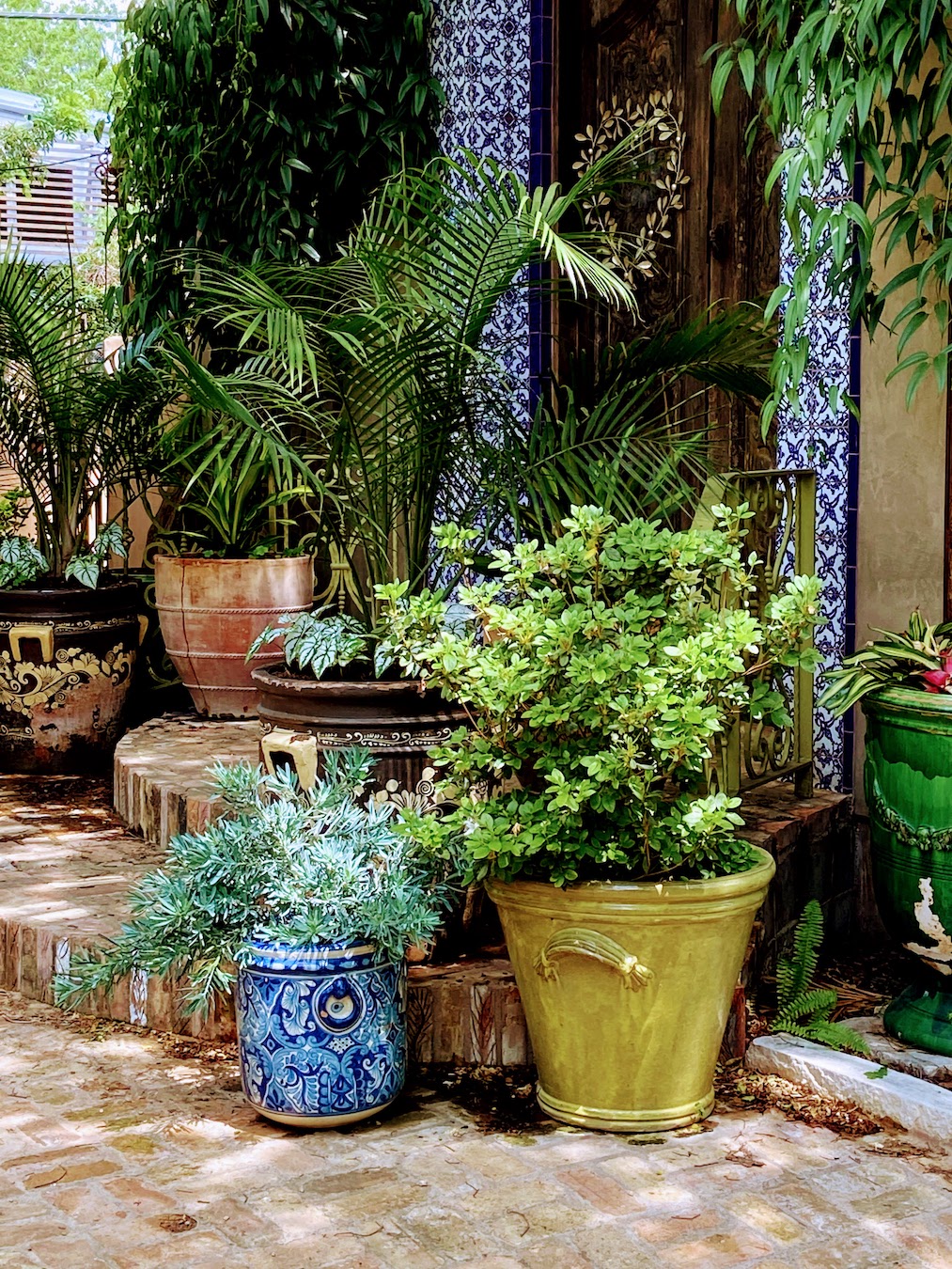
This plein air session was at a workshop in Austin with Laurel Daniel, an exceptional artist and talented instructor. We were at Jennifer’s Gardens in central Austin and during the afternoon session I focused on 3 pots that were sitting on some terra cotta steps. They were in the shade, error #1. The green plant was in a green pot and the blue plant was in a blue pot, error #2. I decided to paint them anyway, error #3.
Despite the challenges in the field, one thing I did get right and was pretty excited about, was the initial block in. I was able to quickly get all 3 pots laid in properly and to scale without issue, something a few years ago I would have needed a few sessions to get right. Then everything went flat.
Chronic Muted / Flat Plein Air Work
For the life of me I couldn’t get enough value contrast going, as if I was actually ignoring that basic design tenet. I really noticed in when I returned to the studio a few days later and was frankly amazed at the mono-value of the entire composition. There was also no getting around the design error of green pot on green plant and blue pot on blue plant.
I considered throwing it in the bin, but opted to spend a dedicated 2 hours, and not a minute more, to see how I could fix the core elements. The first step was to really push the darks throughout, which I would find later was the crux of the issue. I need to really recognize what “dark” looks like in outdoor lighting – more practice should remedy this issue. The next step of the fix was to blast the contrast in values next to the darkest darks with the brightest, most saturated hues. While I ended up painting over some of these areas later, the establishment of what the value range should entail was very helpful. Remember, error #1 was shitty composition selection, everything shaded and no lighting contrasts.
Reference Photo3 Pots Block In3 Pots – Field Work3 Pots – Fixed and Final
The remainder of the rework was trying to establish nuanced color differences between the artificial color of the pots and the “same” natural colors of the plants. This part was surprisingly interesting, something I’d never done before, but it proved a valuable learning experience that I know will come in handy with urban landscapes in the future.
I have another “flat” plein air piece to fix, but likely won’t have the patience to tackle it for a few weeks, but I will do a side by side comparison with 3 Pots when it’s done so we can see if I learned anything… or if I’m just a hopeless idiot sometimes.
The very fun, energetic and popular Austin art gallery, Art for the People Gallery, will include 3 of my pieces in the new show called ART SPREE! The show runs from January 29th – April 9th, 2022.
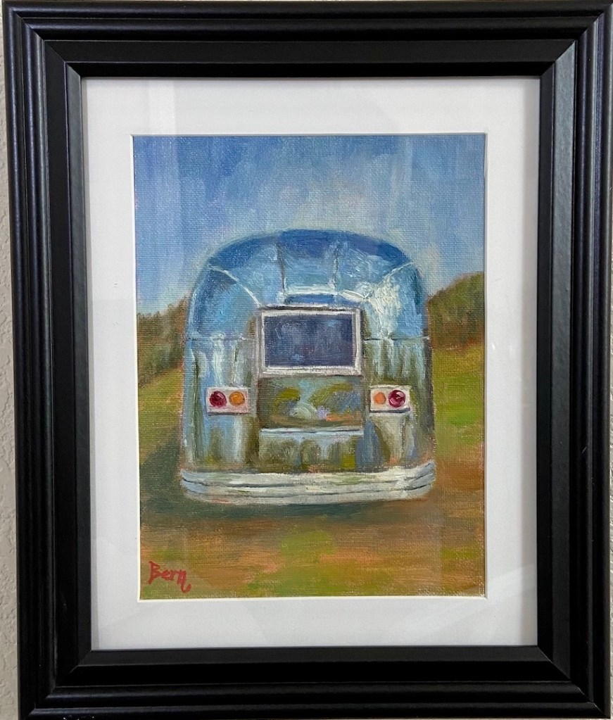
Airstream
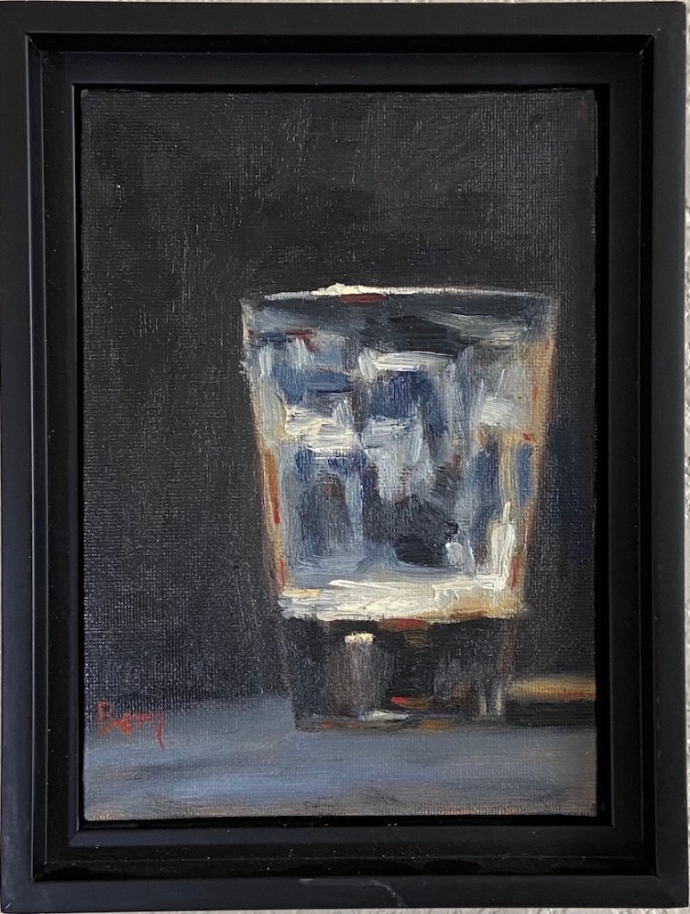
Last Sip
Puppy Butts!
It’s always an honor to work with Lynnie, Hallie and of course, Charm Charm Sparkles and Tassel PomPom. Unfortunately the in-person opening reception for February had to be cancelled – damn you COVID! – but the gallery is open regular hours and the staff is as warm and welcoming as ever, so swing by if you’re in Austin and check out the art.
I’ve written blog posts about all of these pieces, but as a grouping they do a pretty good job representing me and my world. Airstream is clear nod to my love of travel (no, I don’t own an Airstream, but I know some very cool people who do); anyone who knows me can attest to my love of beer, especially a tasty porter as represented in Last Sip; and lastly, Puppy Butts! for my adoration of dogs and all they can bring to the world.
If you’re interested in any of these pieces, or anything in the ART SPREE show, you can also browse and shop using their online store. From the Art for the People Gallery store go to Shop > ART GALLERY – All Original Artwork > ART SPREE – Exhibition. I can attest that Lynnie and the AFTPG staff will do an excellent job fielding questions and making any purchasing seamless and fun.
First still life of 2022 inspired by the fun of popcorn! It’s basically the champagne of food if you think about it. And my wife absolutely loves popcorn, so I knew this would make her happy.
I try to do these small still life compositions alla prima, basically in one sitting. I had to do some highlight adjustments the next day after the paint had settled, but that’s pretty typical for me because it seems wet paint is just hard to “read” as final.
I had a lot of fun with this piece, working from a photo… real popcorn never would have lasted. If you like progression details, I made a time lapse of this piece which you can see on YouTube called “Popcorn Playalong” embedded below.
Just the Ripe Size | 5” x 7” | Oil on Paper Board
If you love a ripe avocado as much as I do, you can appreciate the moment you cut one open and just hope that a) it’s ripe and b) the pit isn’t so big there’s no actual avocado to eat. Just the Ripe Size is meant to elicit that gratification. Not quite as satisfying as a great batch of guacamole from Jack Allen’s Kitchen, but it’s a good start!
This piece was a little tricky because it’s painted on a paper-based board – basically a really nice piece of cardboard that you pay a lot more than you should at the art store. I think it will be great for graphite and maybe colored pencil drawing, but it was too quick to soak up oil paint. However, I do like the finished piece and the flat finish it has, which gives something like this avocado a more realistic look in terms of texture. I’ll try to varnish it in a couple weeks and post an update of the outcome.
This small piece is brought to you by caffeine and Carly Simon. I thought painting clouds in my coffee would be a little more straightforward, but it presented some tricky bits that will need to be tackled again in future still life. The resulting composition of this first effort is good, but I’m missing something on the technique and it ended up losing some of the cloudy effect.
This is an ideal composition for practicing the technique of blending wet-on-wet oil paint. While I’m very familiar with the technique, it’s part of the standard tool kit for painting in oils regardless of one’s skill level, I hadn’t really considered the fact that this composition was going to be dominated by wet-on-wet. It became abundantly clear that was to be the challenge once I got started, the realization making me chuckle aloud in the studio… idiot!
Next time I’ll use a smooth surface (board) instead of a canvas, which should make for easier blending. I’ll also make more time to pre-mix a range of coffee browns to give the “cloudy” effect a more realistic look.
This piece was also inspired by all the neighborhood coffee shops around the country and the world, all of which have their own unique vibe and appreciation for a cup well poured. Ignoring the occasional douchey independent shop filled with anti-social Wifi leeches, there’s a lot of great coffee being brewed in these shops.
My neighborhood favorite is Trianon, which has been a caffeinated cornerstone of this area since the 80s. They have dozens of coffees from around the globe and the owner, or any of his friendly staff, will take the time to walk you through the nuances of each farmer’s crop and what makes them unique. When was the last time that “barista” from Starbucks took the time to walk away from the register and come chat with you about the 20 rotating coffee beans on the wall… never!
Small still life paintings are very gratifying because it’s possible to finish them in a single session, which is a nice change of pace after having worked on a number of larger pieces recently.
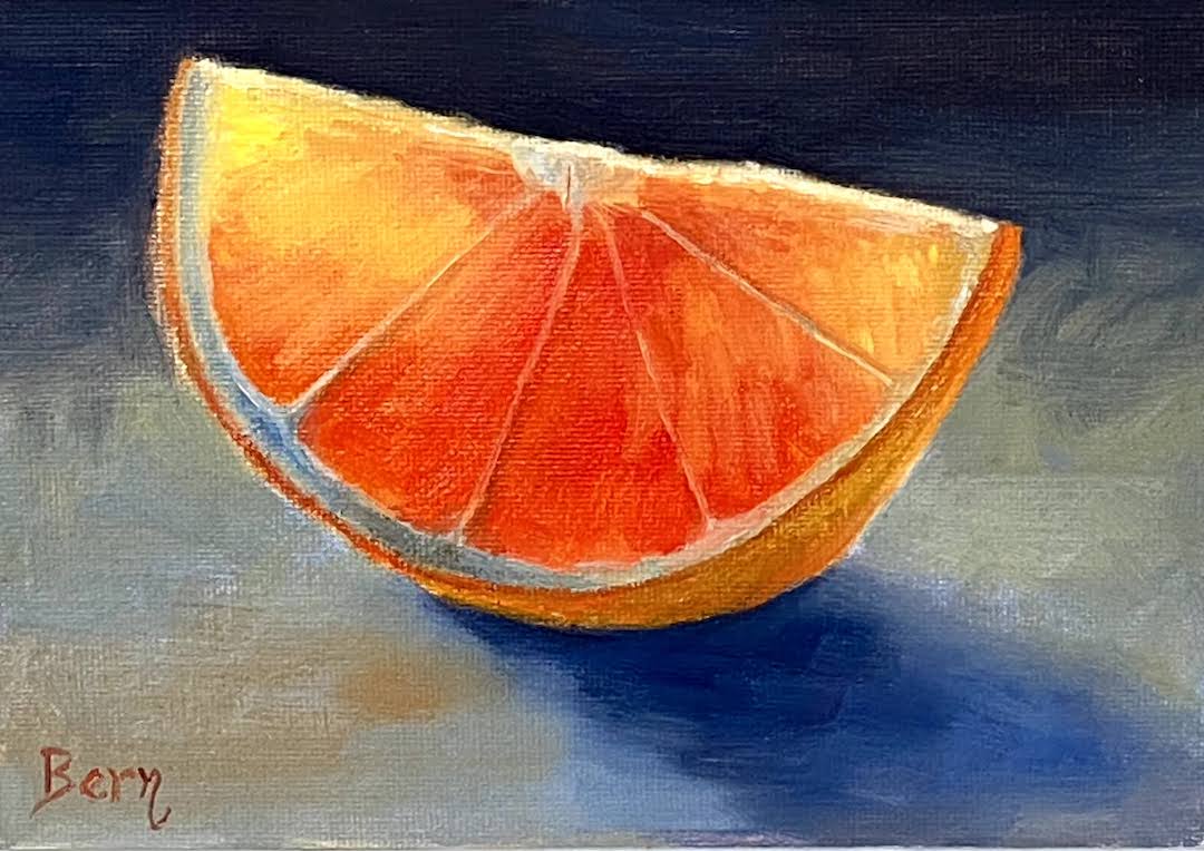
Juicy is an orange (hopefully that’s abundantly clear) backlit with just enough light to see through the thinner areas. I used reference photos instead of an actual still life setup in the studio, but I think it would have been easier with a real orange slice as the subject.
Lesson learned from this composition was the importance of relative values. I initially failed to darken the reds sufficiently, making it difficult to get the transparent light effect through the thin areas. I went back in and tamped down the saturation and darkened the value, which helped a great deal. I need to remember next time that instead of trying to use the lightest value for the transparency, focus first on emphasizing the adjacent darker areas to make it pop.
Stay tuned for more small still life in the coming months… suggestions are welcome!
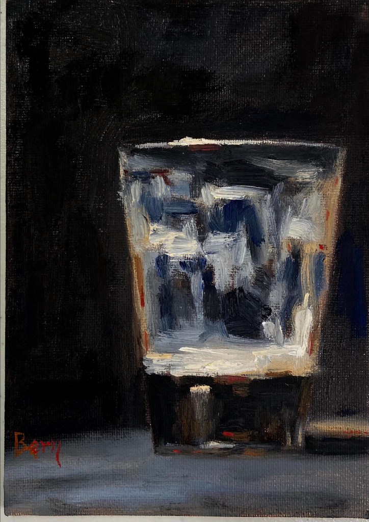
Dark beer as an inspiration seemed like a great idea for this quick still life. As you can guess, I do love a good dark porter, #512brewing!
This piece is also influenced heavily by the work of Neil Carroll, who has a great talent for making simple still life transform into beautiful, relatable art. In this case, also quite quaffable.
The Last Sip was a great piece for glassware still life. I liked the challenge of defining the pint glass despite having a dark beer on a very dark background. I thought that would be more difficult than it was, but the dominance of dark values actually made it easier to pull the glass reflections out of the piece.
I also tried to work in some warmer elements of sienna, orange, and out-of-the-tube red to distinguish the porter from the dark background coming through the clear glass.
Say hello to PB&K the latest addition to the Dog Toys series, although it might be more appropriate to start a new sub-category called “Cheeky Still Life”.
The Kong was done with a painting knife to give it the subtle texture of a well worn, go-to Fido favorite. As any dog lover would attest, especially the big chewers, a peanut butter stuffed Kong is a great source of entertainment… and protein. Even the most hearty chewers have trouble putting a dent in one of these rubber wonders, but they do lose their sheen and get a roughed up look over time. By contrast, the (creamy) peanut butter and the remainder of the composition is all impasto-free brushwork.
Ultimately, the intent of the composition is to make every dog parent look, nod, and laugh at the reality of what we’re all willing to do for our lovable canine companions.
Oil on canvas paper, 8″x10″
Palette knife and an array of brushes (rounds and flats)
Key colors
Peanut Butter – Yellow Ochre, Naples Yellow
Kong – Ivory Black + Ultramarine Blue, Burnt Sienna + Ultramarine Blue
It’s happy hour time again! Before moving forward, it’s time to reveal the name of the cocktail from the Happy Hour – Roosevelt post from a few weeks ago… the Sazerac! It’s a great drink and the next time you’re in New Orleans I highly recommend a visit to The Roosevelt for the original recipe.
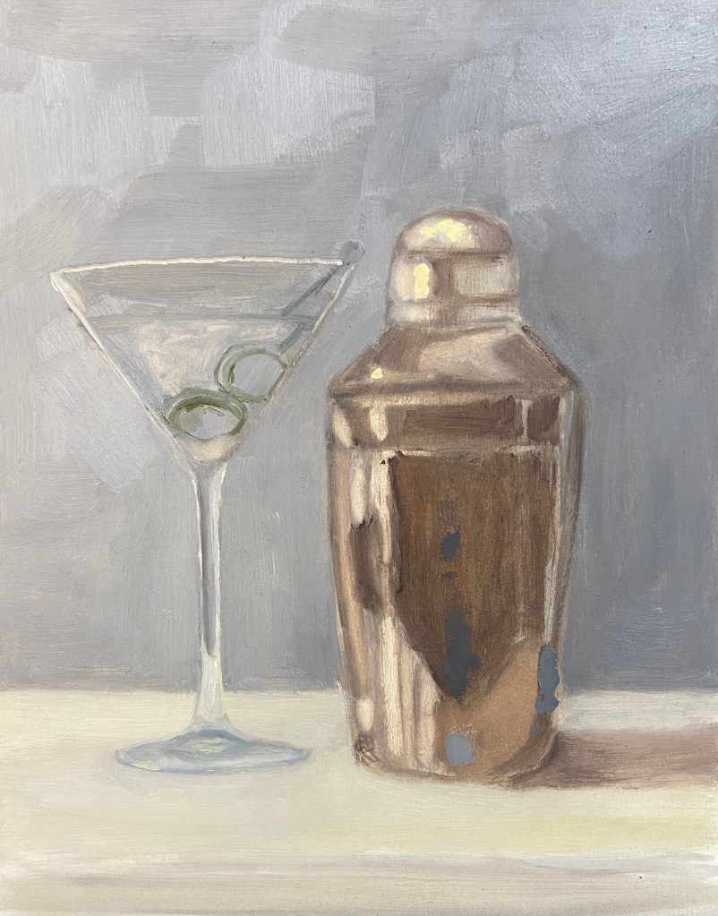
This latest addition to the series should be much easier for you to figure out, although it wasn’t necessarily easier to paint. Happy Hour – Shaken is an iconic cocktail indeed and something that James Bond fans will recognize instantly, although 007 preferred a stirred version.
This cocktail is a top choice in my household – even the dogs like it! Well, they probably would love it, but they just get to have the ice cubes after the drink has been strained. Yes, it’s hilarious – they hear the shaker, come running to the bar, and proceed to sit (without a command mind you) until I’m done, at which point they each get a piece of ice. They are, without a doubt, very lovable booze hounds.
Back to the painting…
I’m very happy with the outcome and feel like the repeated efforts on this Happy Hour series is starting to show demonstrable improvements in the artwork. This was a challenge on 2 fronts. First, the ongoing challenge of glassware in a still life has been tricky to refine, but I finally figured out the right value scheme to make it work – the solution for me was simply being more aggressive with the darker values. Secondly, I lacked experience painting truly reflective metal in still life compositions. Again, a more concerted approach with the darker values made a difference, but more importantly was simply waving the wand of artistic patience and working through the various reflected elements.
A few additional observations and details about the composition:
Reference Photo: As you can tell the shaker is not exactly the same as what’s in the photo. I used a reference photo blending technique, using the real shaker as my primary source, but simplifying the object by looking at other photos and paintings on-line that were, quite frankly, better cocktail shakers.
Brush and Knife: The vast majority of the piece is done with a Flat #4 and Round #2 brush, but the olives are all knife work. They are the focal point of the composition, and as such I wanted them to have some more texture and a reflective quality of their own.
Size: This is more than twice the size of previous Happy Hour series pieces, 8″x10″ vs 5″x7″ boards. Usually when I go bigger, the work is harder technically, but this time it seemed easier. Like I said, progress.
I haven’t figured out what the next cocktail in the series will be, but I’m leaning towards something with a shaker. Cheers!

 Sniffer | 16 x 20″ | Oil on Canvas Board
 Dog Tired | 16 x 12″ | Oil on Canvas Board
 Shaken | 8 x 10″ | Oil on Board