Yosemite – El Capitan

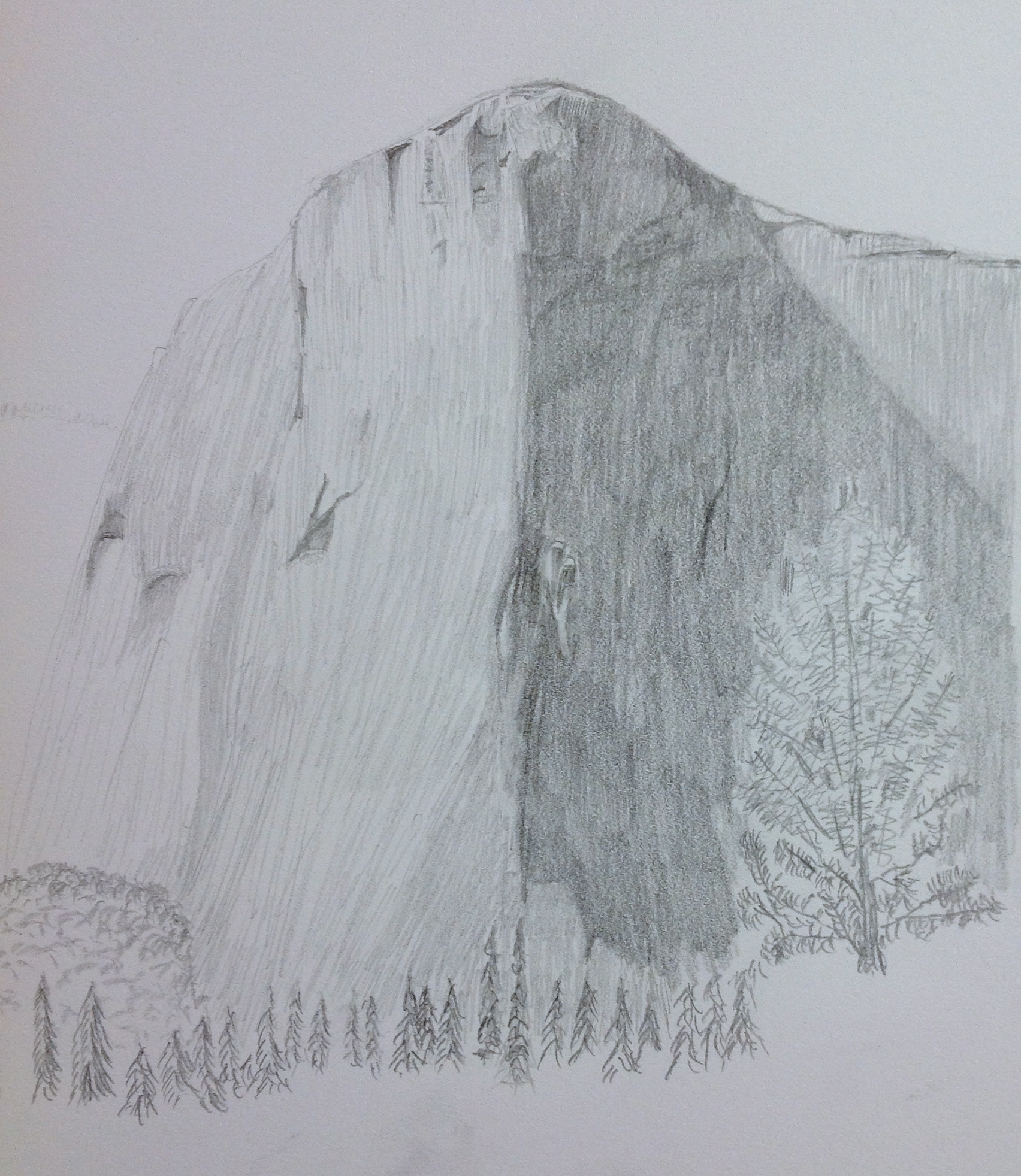
Started a new project this week, El Capitan in Yosemite National Park. This is a massive wall of rock that is a marvel to see in person. I haven’t been able to find them on the photo, but there are a number of climbers on the wall. If I hadn’t taken the picture myself I wouldn’t believe it either.

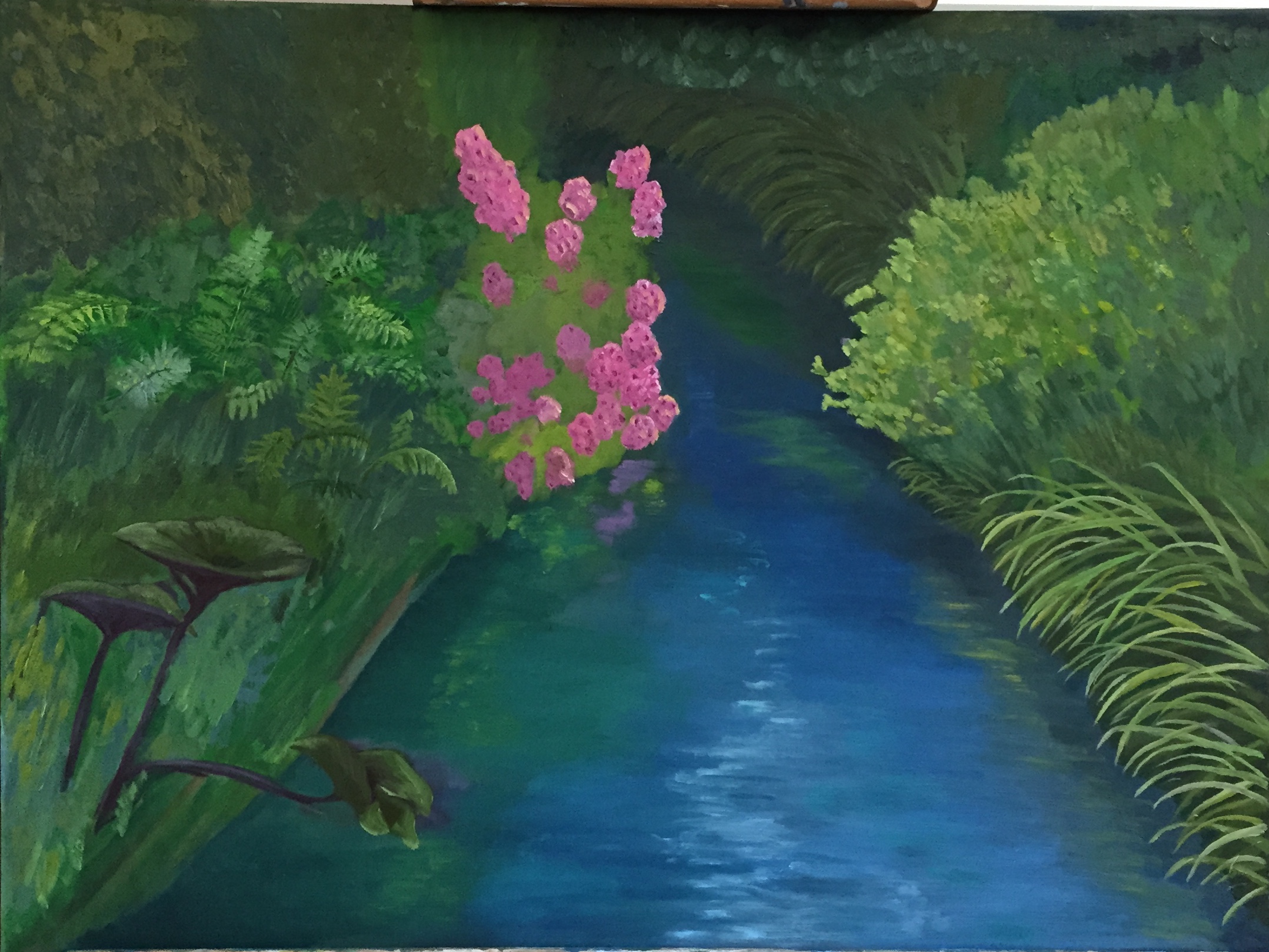
This composition is actually a study to get some key aspects of the hues and values figured out prior to doing a much larger piece. This particular effort is being done on a 12×18 canvass board, all oils, using palette knife only.

Figuring out the variations of grays, both sunlit and shaded, is proving to be an enjoyable challenge. This is a great way to really learn the subtleties of warm and cool grays.

Another session or two and this preliminary piece should be done. Still need to get the right half of the shadow area done, but it’s moving along at a faster clip now that the value scale has finally been figured out. There’s more paint on this piece than I’d like to admit.


Back on the Canvass! Giverny Stream

Went on a short hiatus, but getting back in the swing of things. Getting ramped up on a few new projects, but knocking the rust off by revisiting an old foe – the love / hate relationship with Giverny. Original post is here.

There is a post of earlier progress on this green monster, but I’m finally starting to get my head around the challenge of reflections in moving water. See for yourself…

IMG_3451
Water Session #1

First, tried doing variations of blue water with white highlights, which didn’t look right. Roughed in the purple flowers in the lower left front corner.

IMG_3472
Water Session #2

Next idea was to do more greens with more aggressive use of whites/grays to give the sense of moving water. That didn’t work, but the additional work on the ferns on the right side was productive.

IMG_3474
Water Session #3

Third swing was building up much more gradual and interlaced mix of greens and grays. This photo is poor quality and doesn’t show the water very well, but it’s actually better in reality. Next session I’ll work in more of the greys to really give the sensation of moving water under a grayish sky. Also spent time reworking the reflections of the pink flowers and yellow flowers, both of which look really good in terms of glassy look on the water.

Daily Sketch #14: “On Belay”

IMG_0202

Inspiration for today’s sketch is El Capitan in Yosemite National Park. Another reference photo from a very memorable trip a few years ago. I actually did a sketch at the site en plein air while we had a picnic and watched the climbers work their way up the wall, so small I can’t even find them on the reference photo. Amazing feats of strength. Look out Festivus, here they come!

Even as a quick sketch – took about 90 minutes – I learned some interesting techniques that I was too inexperienced to consider when I first attempted this drawing. First, the simple long sketch lines naturally help define the contour and direction of the granite face, which means this is one of the rare occasions that you don’t have to worry too much about “hiding” a mass of disorganized sketch lines. Secondly, the challenge of value transitions from the light side to the shaded side is not as straight forward as it looks. The reference photo throws you off b/c it’s not accurate, but I didn’t figure that out until I had a black and white cookie on the paper instead of a iconic rock mountain. In other words, the shadow side has more variations than what it appears to have in the photo. But most importantly, the random cracks and crevices that aren’t in the shade can easily be worked too dark, which makes them jump to the front of the sketch, so I had to use a lesser value by about 2-3 scales to ensure those areas stayed tucked into the rock face instead of looking like they were dark bumps popping onto the surface.

This is one of those projects that I could stay glued to for hours. The complexity of the rock face is a fun challenge, and would be a fantastic drawing on a much larger scale (this sketch is on 9″x12″). I’ve also come to realize that compositions like this are probably much more interesting with graphite instead of paint.

Daily Sketch #13: Giverny bamboo

IMG_0201

Please excuse the hasty sketch today. This is the non-lily pad part of Giverny. The whole place is amazing, despite the crowds, and it’s easy to overlook this reflective pond bathed in green bamboo, green underbrush, and green boats – trust me, its a lot. The pond reflections of the bamboo are more detailed than the actual real bamboo b/c the angle of reflection reveals a larger swath. Needless to say I ignored that reality in this quick sketch. Hope the spirit of the place conveys despite the roughness.

Daily Sketch #11: French countryside calm

IMG_0200IMG_2423

Today’s sketch inspired by my wife and our anniversary trip to the French countryside in the romantic Loire Valley region. The light was very strong from the right side of the sketch, so the shadows were very pronounced, as was the coming storm, which never materialized by the way. The rose bushes in the foreground are testers – not part of the actual reference photo, but rather a suggestion from my wife in hopes of adding some bright color to the soon-to-be painted version. Never sketched a rose bush before, but I think it’s a great addition to the sketch.

Red Vase in Cellophane: DONE

IMG_3083

Did a pivot back to the “canvas” today, so Daily Sketch continues tomorrow.

I returned to the challenge of the cellophane wrapped vase, having run into numerous problems that I just couldn’t figure out. But after some time to think through why the cellophane just didn’t look right, I came up with 3 primary issues to fix:

  1. Too many highlights. The painting looked like it had run into a bird poop tornado! Luckily I had learned how to remove these with a painting knife from the Cheifetz workshop last month; added some pics of the removal of one of the offending highlights.
  2. The highlights were to rounded. The cellophane highlights should be at hard angles which helps give the sense of stiff shapes, as opposed to softer material like fabrics.
  3. The values were wrong. Needed warmer grays on the light source side (left) and a wider range of lights.

In the end, I’m pleased with the results given it was a first effort with this somewhat complicated medium. Next time I will make sure the wrapping of the still life object is done with more purpose and in tighter bunches. This composition was poorly designed on my part. The cellophane was a loose gathering on the left side and lacked enough tight fitting accents, which would have made it easier to interpret.

Light pressure on knife…
IMG_3081
… and the highlight slides right off!