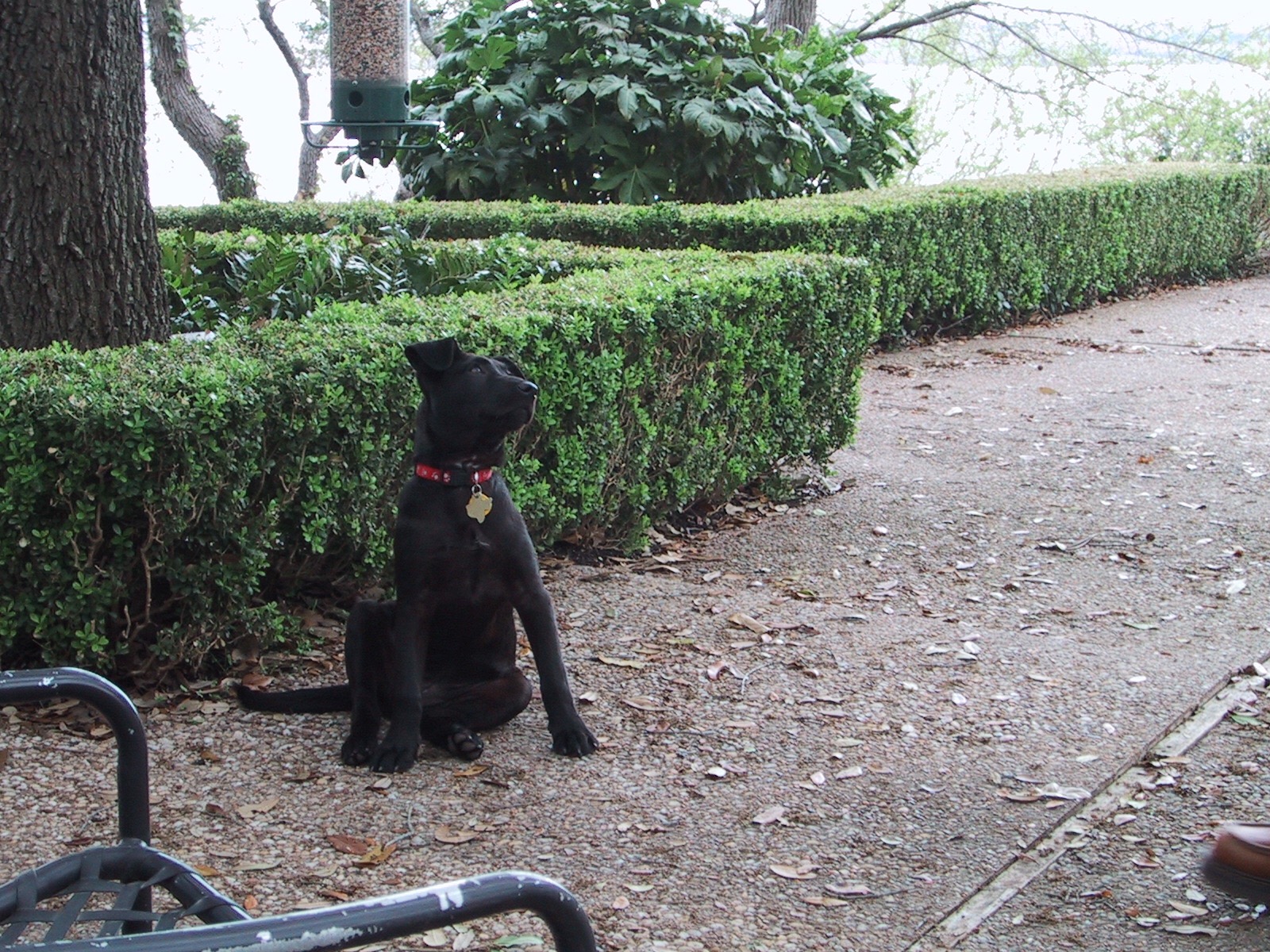
Starting a new painting based on one of the hour challenge sketches from last week. This is Crash looking at squirrels in the tree when she was a year old – long time ago.
Using a small wood panel and painting knife, maybe a little brushwork to finish. Not sure if I can get the right level of detail with the knife but I'll give it a go.
Pic below is first 30 minutes of block in using a burnt sienna wash, using both brush and paper towel. Wanted to make sure I got the values and proportions right. Having sketched this a few times in the past I know how easy it is to get the face dimensions out of whack.
Moving these updates to the blog to motivate myself to do them more frequently. The goal is to hone my drawing skills by doing sketches in 1 hour.
This session is from a reference photo taken by my brother. Very challenging given the need to incorporate movement of the bird and the advancing waves. Oh, and drawing ocean foam is hard as hell. I think the key is to not draw it.
This was supposed to be a quick study session, but it turned into a full fledged effort. I couldn’t help but get sucked into it. It was an exciting time to be in San Francisco, especially living in the Castro – summer of 2013 – if you don’t know what I’m talking about, look it up.
Strolling with Boom – 8×10 oil on canvas board
This is my wife walking Boom around the neighborhood. Walks with him were always so easy – he was the perfect companion. They’re both looking to the right, as something has caught their attention, but it hasn’t affected the casual, enjoyable mood of their walk. Everything else in the painting is directed to the right, with the notable exception of a single white car coming down the steep road from the right. I don’t want to actively direct viewers out of the painting, but I’m trying to generate interest and perhaps discussion about what could be just out of the frame. I’m probably violating a central design tenet with this approach, but rules schmoolz.
The painting is on a canvas board with very thick texture. Made some of the detail work difficult, but it forced me to use some larger brushes and paint with more authority, which is good for me.
Getting the hang of painting cars, but had never tried painting a person or dog walking. I had to do a few sketching sessions separately, which helped, but it’s going to take a lot of practice over the coming months to get a better feel for the technique.
Artistic license taken on a few items. Most notably removed the leash from the composition. Also added cars as it suited as opposed to exactly as they appeared in the photo.
Turning a causal photo of a unique scene in New Orleans on Tulane’s campus into an electric color show! “Painting” using Art Set on iPad Pro. Original purpose was to simply trace the photo as an overlay to get a feel for the details before really painting on a canvass. Turned into a fun experiment smashing photos and art.
URBAN LANDSCAPE LOOKING SOUTH UP GREENWICH FROM BAY STREET.
UPDATE Feb 20, 2017: Done! While it took a long time to finish, it was a very rewarding project. Tackled a number of new challenges, but took my time and exercised a wealth of patience to not rush to the finish line. The hardest part turned out to be the alignment of the near foreground building facades and their maddening rows of windows.
UPDATE Jan 21, 2017: Worked on practicing drawing cars before getting back to the canvas. Took a number of tries, but once my brain “saw” the fix, it got much easier with each subsequent sketch. Duh! Now I’ve returned to this urban landscape to add the cars in the foreground. So far so good.
UPDATE Dec 18, 2016: Been working on this off and on for the past couple months. It’s been very slow moving, but I’m learning a lot about breaking down complexity, pushing and pulling with values, and most recently, the challenge of painting vehicles. Added a few of the latest progressions to the photo collage; note the zoom-in view of the cars in the final picture. Fingers crossed that I can make the time to finish this piece before the end of 2016.
Reference Photo: San Francisco
Initial block-in
atmospheric cool distance
GREENWICH VIEW || 20″ x 16″ Oil on Canvass || $250
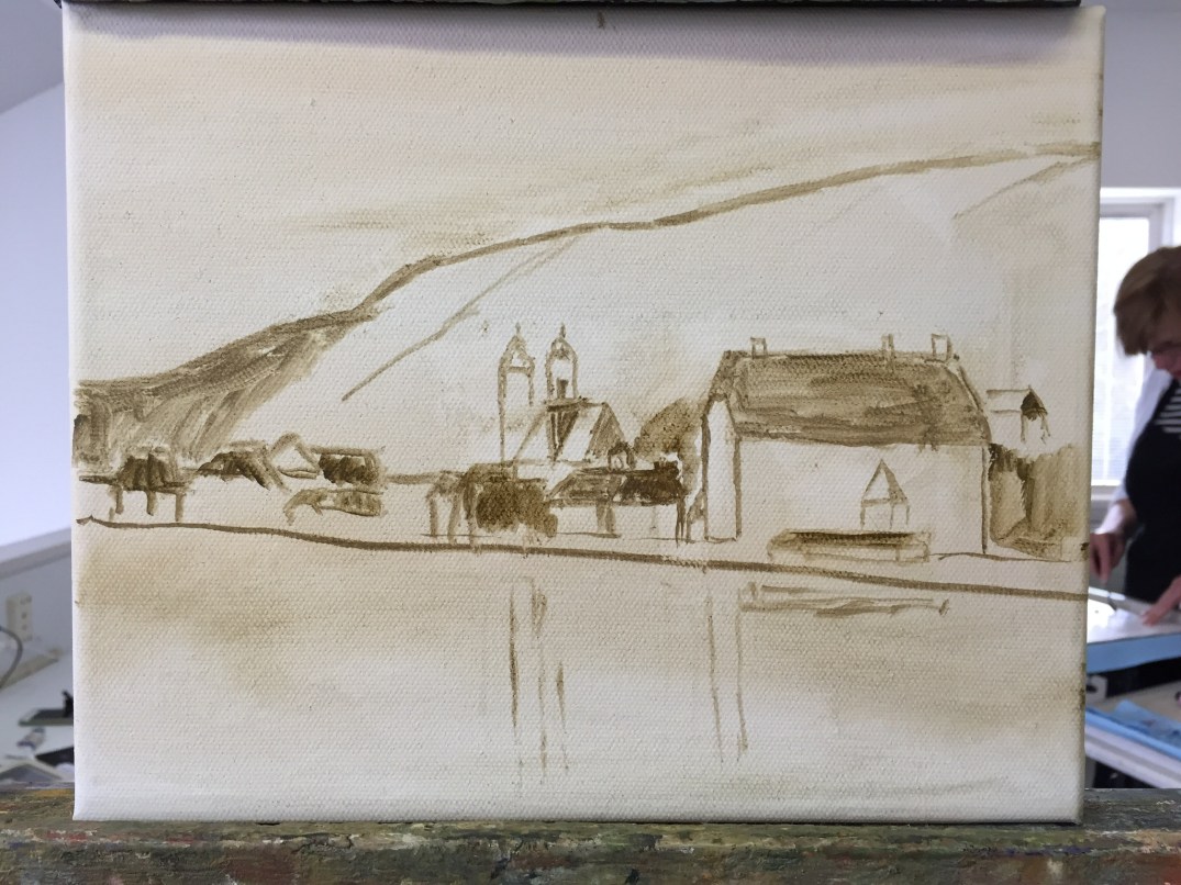
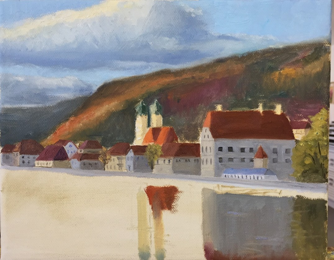
New project today from a photo along the Danube. My wife and I were visiting the Christmas Markets this past year, mostly in Austria and Germany. They were fantastic! Along the river these idyllic scenes were commonplace. We had ridden bikes along the river the day before and visited this church.
Smaller canvas this time around. Working on loose and colorful, with very strong contrast in values where the late day light is hitting the tops of the buildings. This post is about 3 hrs of work. Moved a little slow at the start to get the sketch right. Usually I draw the subject before trying to paint it, but opted to jump right in this time.
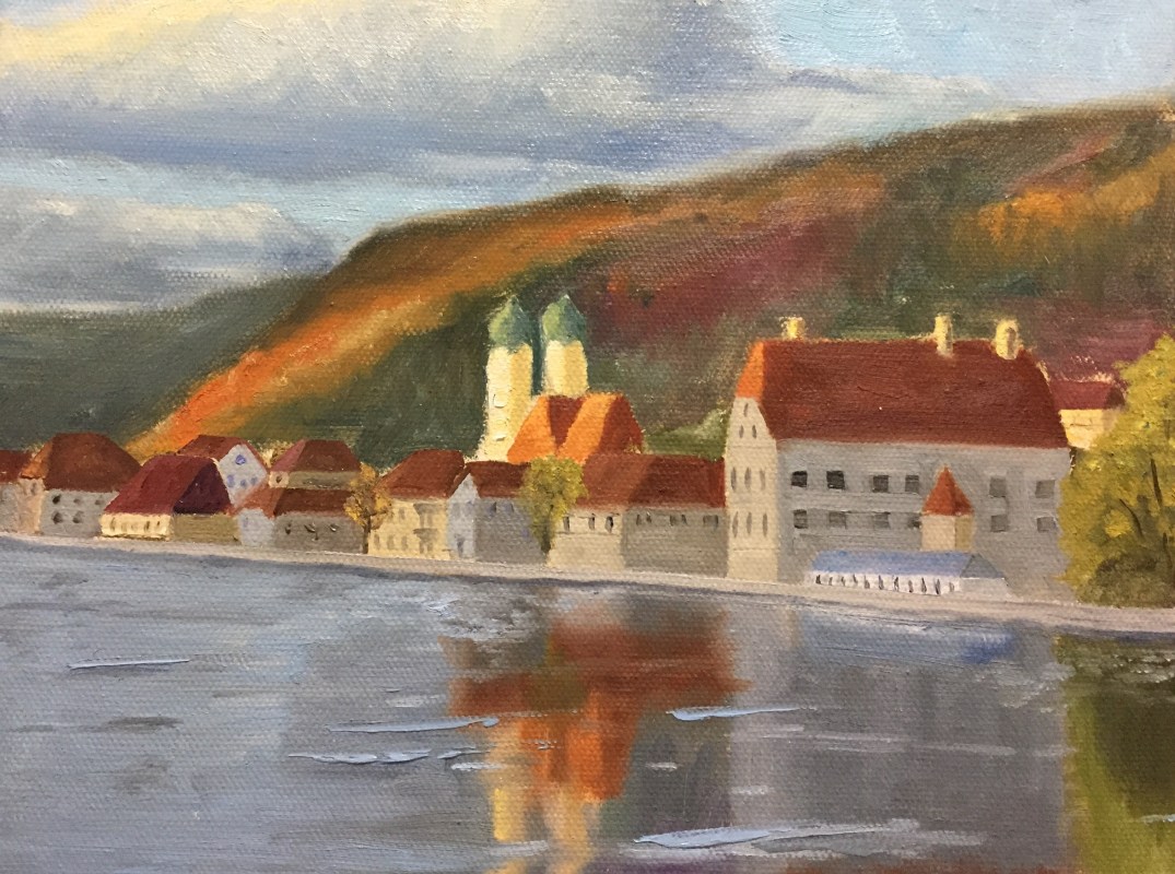
Updated progress: Couple of hours working on the detailed village. Getting the proportions and values in the shaded areas took patience, but very rewarding. One more session focused on the water reflections should get us most of the way there.
Forgot to add the finished painting from a few months ago. I like how this turned out but need to practice with more river landscapes.
Finished this piece a couple months ago, but forgot to post the last update. Originally this was going to be a practice piece to study the composition in preparation for doing a much lager painting. However, it was so interesting, I ended up with a more complete piece than planned. I’ll still do the larger piece, but I’m not going to jump right into it just yet.
In the end, I opted to stick with the knife only for the mountain itself, but the rest of the landscape was done with various brushes. This created a nice textural contrast, which may not be readily apparent in the picture below.
Started a new project this week, El Capitan in Yosemite National Park. This is a massive wall of rock that is a marvel to see in person. I haven’t been able to find them on the photo, but there are a number of climbers on the wall. If I hadn’t taken the picture myself I wouldn’t believe it either.
This composition is actually a study to get some key aspects of the hues and values figured out prior to doing a much larger piece. This particular effort is being done on a 12×18 canvass board, all oils, using palette knife only.
Figuring out the variations of grays, both sunlit and shaded, is proving to be an enjoyable challenge. This is a great way to really learn the subtleties of warm and cool grays.
Another session or two and this preliminary piece should be done. Still need to get the right half of the shadow area done, but it’s moving along at a faster clip now that the value scale has finally been figured out. There’s more paint on this piece than I’d like to admit.
This was a fun one! This is Heceta Head Lighthouse on the Oregon Coast. Breathtaking coastline and this area is particularly rugged and beautiful. One day I’ll replicate this painting en plein air, but for this iteration I had to use a reference photo. At least the photo was taken by myself, so I had a sense for the place; hoping some of that personal experience made it into the final work.
This piece is on 12″x18″ gesso panel and took about 8 hours to complete. While I still have a couple of minor highlights to add, this is close enough to the final product to call it done. I have never painted ocean, so the waves were a challenge, but I’ve started taking some lessons with a new instructor for a few hours every other week, and she was a tremendous guide when I ran into problems. If you like landscapes, check out her work at Mary Watkins Fine Art.
The palette is what I’m most excited about with this piece. While there’s a lot of (for me) technical skills that come into play with the water/waves/rocks, it’s the hues that I’m most excited about. Mary was very instrumental in teaching me about landscape warming and cooling using hues I hadn’t considered. Previously I had thought in terms of strict color wheel compliments to adjust saturation, but I learned how to think through the balance of what makes up colors that trend towards one end of the spectrum or another. For example, the use of Lemon Yellow, Cad Yellow Medium, or Yellow Ochre was actually a critical decision for this entire piece. Can you guess the winner and why?
Reference photo and progression timeline below. Enjoy!
Reference photo – Heceta Head Lighthouse – August – 8pm
Getting close to finishing this Austin urban landscape piece. The view is from the south across the river towards downtown. The city has grown a lot since this photo was taken, so those familiar with the area might wonder why I excluded some buildings; not the case, they just weren’t there a few years ago.
Oil on gesso board, mostly brush work, done in studio with photo reference (included below). The bridge was tricky, despite having done a couple of practice drawings. It’s been an exercise in patience, having to redo various parts, but it’s been a great “learner” piece, specifically with the sky and water. I’ve started taking some formal art lessons every other week, and my teacher gave some great guidance with the sky and the water reflections. Confidence with these elements is 10x what it was a month ago. Not sure if it comes through in the photos, but the colors are rich, probably a tad too saturated, but the values and reflections are solid enough to carry the composition.
The bridge needs some tweaks to the facade so it’s not so flat, the addition of cars on the road, and a few street lights. At that point I’ll call it done. One more short session should do the trick. I’ll post the final product this coming weekend.
AUSTIN LAMAR BRIDGE || 9″ x 12″ Oil on Board || $150