“Framecro” – Fast Framing on the Cheap!

Framing artwork used to be a dreaded task, but over the years I’ve come to really enjoy it. This is especially true as we start 2020 because I recently had 4 dog related pieces accepted to an Austin art show at Art for the People gallery called Celebrities – Pet & People Portraits. Future posts this week will provide more details about the show and the inspiration behind the pieces, but I wanted to share some creative custom framing ideas I used with 2 of the pieces in the show.
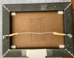
One of the troubling issues with framing is the commitment, secondarily the cost and complexity. The process of “properly” framing a painting often involves sealing it inside a frame in a way that makes getting it out an ordeal. When I hang finished art in my home, I can easily get bored of the frame after a year, or simply want to change the art that’s in the frame. To solve this problem, I came up with a Velcro based solution that works great with small pieces in floater frames, whereby you affix the piece with Velcro instead of glue or some other fixative, which allows you to swap out pieces in the same frame. This is handy for your personal art at home, gallery shows or events.
The steps to frame using Velcro, a process I’ve trademarked as “framecro“, are very simple, fast, and inexpensive. Let me know if you opt to framecro any of your paintings; improvements to the process are always welcome.
  1. Most Velcro types will work, but the Command line of snap-type from 3M is what I prefer. They market it as a picture hanging velcro because it snaps together very tightly, but you can still pull it apart easily.
  2. Cut 4 twin sets of velcro rectangles, which means you have 8 total rectangles of Velcro. These should be relatively small and easily fit into the 4 corners of the frame.
  3. Affix the velcro to the corners of the frame and the corners of the back of the artwork.
  4. Align the artwork and press it onto the frame.

You’re done! If you want to swap out a piece, just pop out the existing piece of art and press in a new one that has Velcro in it’s corners.

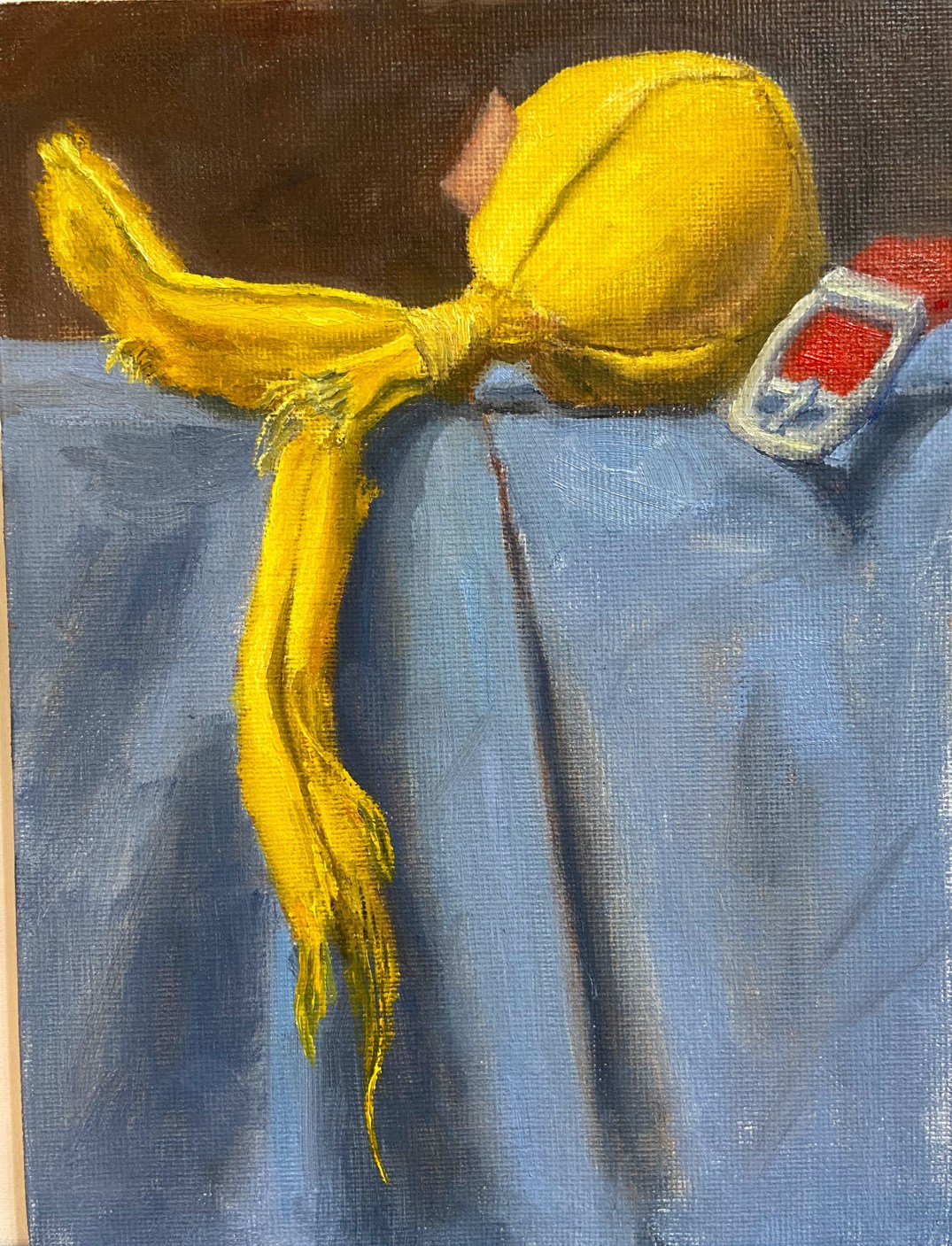
Yellow Ball with Tails

Yellow Ball with Tails
Oil on canvas board, 6″x8″
Sometimes you just know a composition is going to work, virtually able to paint itself. Yellow Ball with Tailswas exactly that kind of composition. Wolfgang and Zip loved this toy because the 2 tails made it tug-a-licious! As the designated thrower, I liked it because the ball made it easy to throw without getting dog slime all over my fingers.  Ultimately, this toy stayed inside and lasted about 20 play sessions before parts started to get ripped off and chewed up.
I’ve recently made some adjustments to my still life setup, changing the platform so it’s higher and is at sitting eye level. This gives a new angle that’s easier for me to translate to the canvas.
This piece moved quickly and was done in a couple of sessions this week. As I stated earlier, this composition looked great from the start and I knew it was going to be a fun project when I saw all that bright yellow shredding dangling against that blue background. Definitely going to spend more time on compositional arrangement with future dog toy paintings.
The canvas board was ideal for this type of toy because it has a lot of toothy texture, which easily lends itself to the toy’s material. The only thing I don’t like about a canvas board for this type of piece is the fine detail of the threads. The canvas texture makes it very hard to paint a thin line, so I often had to do some back and forth with the darker background color to get the thread lines just right, basically painting back into the yellow thread line to reduce the width.
There’s a lot of yellow in this piece, and I did some experimentation:
  • Deep Yellow + Titanium White as the base for the mid-range yellows. Added Ultramarine Blue and Cadmium Red Light in small doses for the shadows on the ball. 
  • Cadmium Lemon + Titanium White for the lighter areas. 
  • Indian Yellow, which I don’t typically use often, here and there to vary the lighting along some of the longer sections of the tails. 

The blue cloth was Ultramarine Blue and TW with variations of green made from Cad Yellow Deep and Cad Red Light. 

 
Originally, I had included the tag on the toy, but once the piece was 90% done the tag looked too distracting and didn’t add a lot of value, so I took it out. 
 
For those interested in the toy itself, it came from BarkBox, a monthly dog toy subscription service. Our dogs destroy toys, much to my artistic delight, so BarkBox has had to adjust what they send us to try and find toys that are good for tugging but also very durable.  Supervised play is the best solution for our fur balls because once they’re done tugging, it turns into keep away, which devolves into a game of “I’m going to eat this so you can’t have it”. Somewhere between keep away and vindictive chewing is when I like to step in and save the toy. If I was going to rate this toy, it would go something like this (1-10 scale):
  • Tugability 8 – withstood some strong tug sessions between my large dogs (Zip 50 lbs, Wolfy 85 lbs )
  • Durability 6 – hard for a canvas toy to rate higher than a 7, so this is pretty good
  • Versatility 8 – this could have easily been used inside or outside, both for fetch or tug. 
  • OVERALL 7
Yellow Ball with Tails - Dogs
Zip and Wolfgang – Dog Artists
Yellow Tail Ball - ref photo
Reference photo – Yellow Ball with Tails
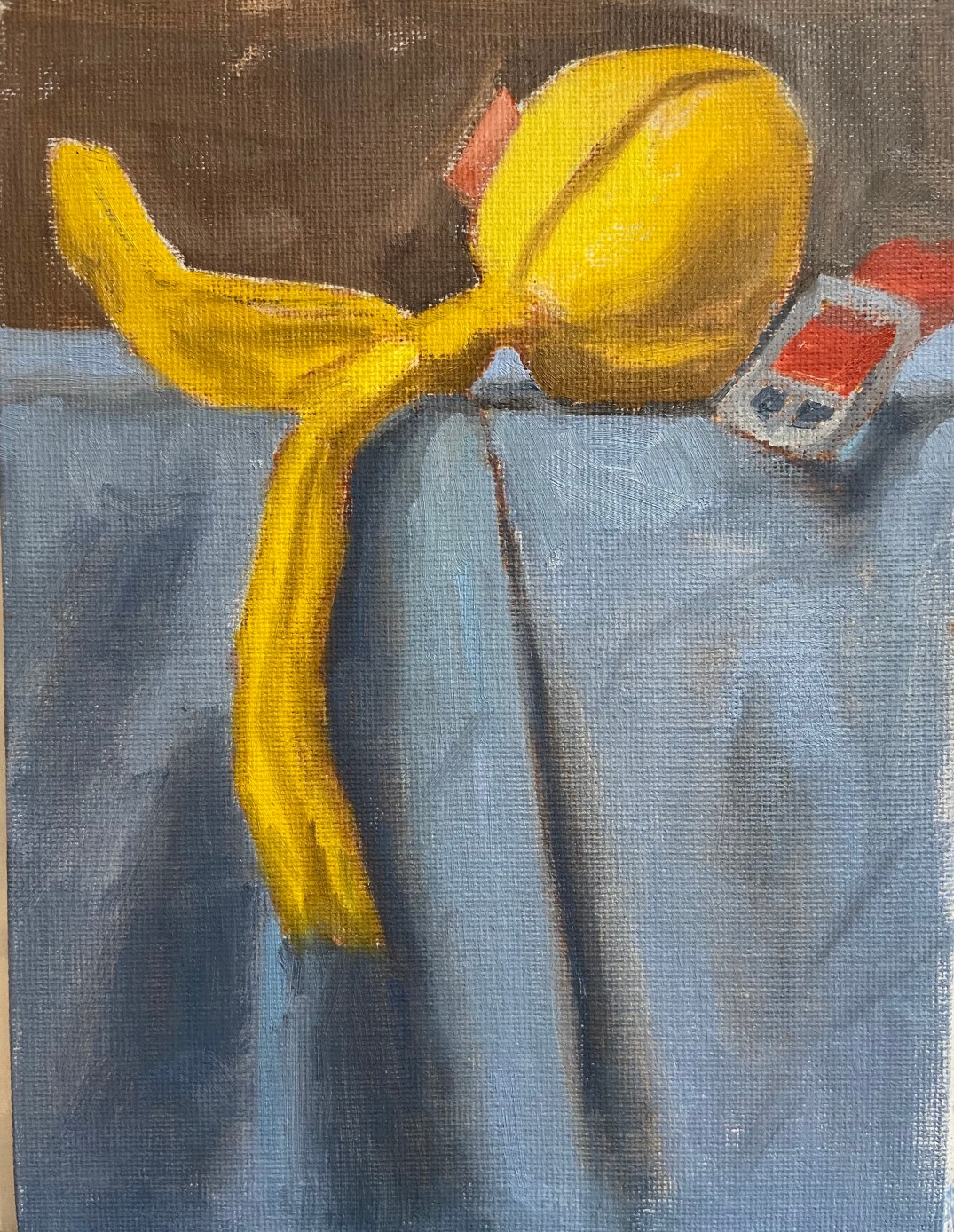
Yellow Tail Ball block in
Block in of dog toy
Yellow Tail Ball 1
Started with the yellows
Yellow Tail Ball 2
First paint draft done
Yellow Tail Ball 3
Working details
Yellow Tail Ball 4
Fine details of shredded threads
Yellow Tail Ball Final
Finished Yellow Ball with Tails dog toy

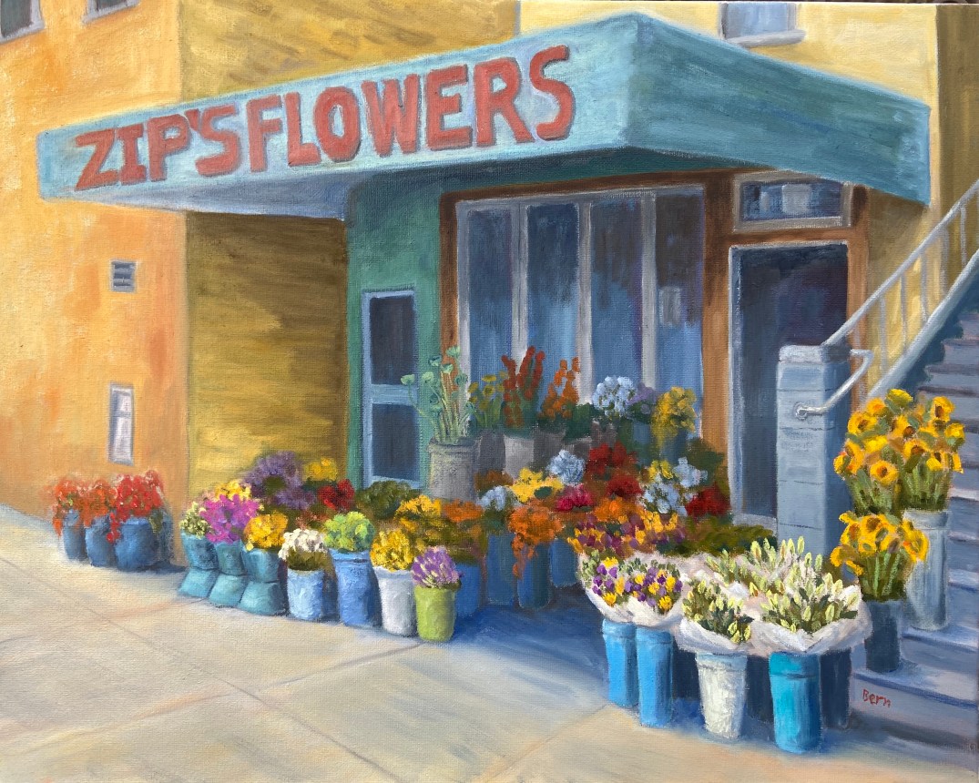
Zip’s Flowers

Zip’s Flowers: 20″x16″, oil on canvass

Sometimes art is very cathartic, but at times it can be maddening. However, I’ve learned over the years to rethink the frustration and consider those pull-my-hair-out-of-my-head moments as learning experiences, and more often than not it works. When I just can’t get a piece to work, either compositionally or from a technical skills perspective, if I focus on what I need to learn to fix it rather than become irritated at my shortcomings, I tend to get back that Zen painting zone.

Zip’s Flowers has been a long learning experience! Wars have taken less time to finish. That said, it’s chock full of newly acquired knowledge, of which I’m very excited about. There’s also some personal interest in terms of the background of this photo. This flower shop is a few blocks down the street from where I lived one summer in San Francisco. We lived in a great neighborhood along the border of the Mission and Castro districts, on 18th between Hartford and Noe. This flower shop, now called Urban Flowers, was along the way to the dog park. My wife would take the dogs at least once a day to the dog park. One day, the 1 year old puppy, Zip, decided smelling the flowers was no longer satisfying, so she opted to taste them. As the story goes, she reached out and grabbed a dangling flower from one of the pots and proceeded to knock the whole thing over! I wasn’t there, but my wife said the people at the shop were very friendly and weren’t concerned about Zip’s flower chomping. Of course I had to see this for myself, and a few days later I was walking Zip past this flower shop and sure enough, she tried to gobble down a basket of roses as we walked by.

The composition itself was probably the hardest hurdle to overcome, which I took license to adjust reality to make things work. The reference photo shows a wide variation of building colors and construction materials, so some adjustments had to be made on various fronts to make it look less contrived – ironically, the reality in the photo was too hard to believe in a painting. The values also had to be exaggerated to give depth and a sense of place, whereas the photo was very flat. Finally, the amount of tissue papered flowers was overwhelming and a bit distracting, so that was scaled back significantly.

My favorite part of this painting is the right foreground. First, the flowers in white paper came out much better than I had anticipated and they really frame that side of the painting. I also like the realism they add to the scene. Secondly, I’m very happy with the tall yellow sunflowers going up the stairs. These two elements combine to draw the viewer into the painting (hopefully) and consider wandering through the rest of the composition.

The sheer multitude of color is initially distracting for me, but once I stepped away from it for a day and returned to the completed piece, the colors were more welcoming and a source of excitement.

Do you like this piece? I’m guessing people either love it or hate it, given the colors and somewhat busy nature of the scene. Suggestions and observations are welcome.

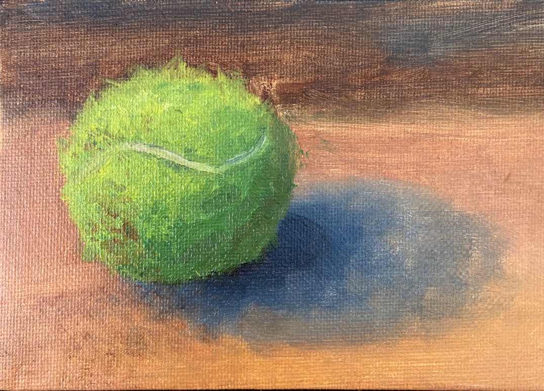
Ball! Ball! Ball!

Oil on canvass panel, 6″x4″
My dogs are a big part of my life, which means I live to serve their needs, in large part because I love them and, well, they don’t have thumbs. My oldest dog, Zip, is a 7 year old Aussie Catahoula rescue mutt from Austin Pets Alive!. Her world revolves around two things – food and “ball”. To that end, I serve as her chef and throwing machine.
The lifespan of a Zip tennis ball is a couple weeks. She chews on them while bringing the ball back for another throw, as if they’ve offended her and need to be destroyed. It’s the epitome of a love hate relationship.
This piece is a tennis ball after 1 throwing session. The fuzz and color have been adequately altered, making what had been a boring, new green smooth tennis ball into something with depth and intrigue. Thank you Zip!
I like to do these small dog toy pieces on a canvass board to help with texture. In this piece, it was very helpful with the need to pull out strands of tennis ball fuzz because the rough surface helped scatter the stringy look in a random pattern, thus making it look more natural. The hardest part was getting the dirt just right, which took some experimentation with Burnt Sienna, Raw Umber, and various puddles of orange.
Finally, I was pleasantly surprised how effective the white line of the tennis ball added realism. It was also important to put a small hint of shadow along the edge of the white line to give just enough depth on the surface of all that green fuzz.
Tennis Ball - Oil Panel 2

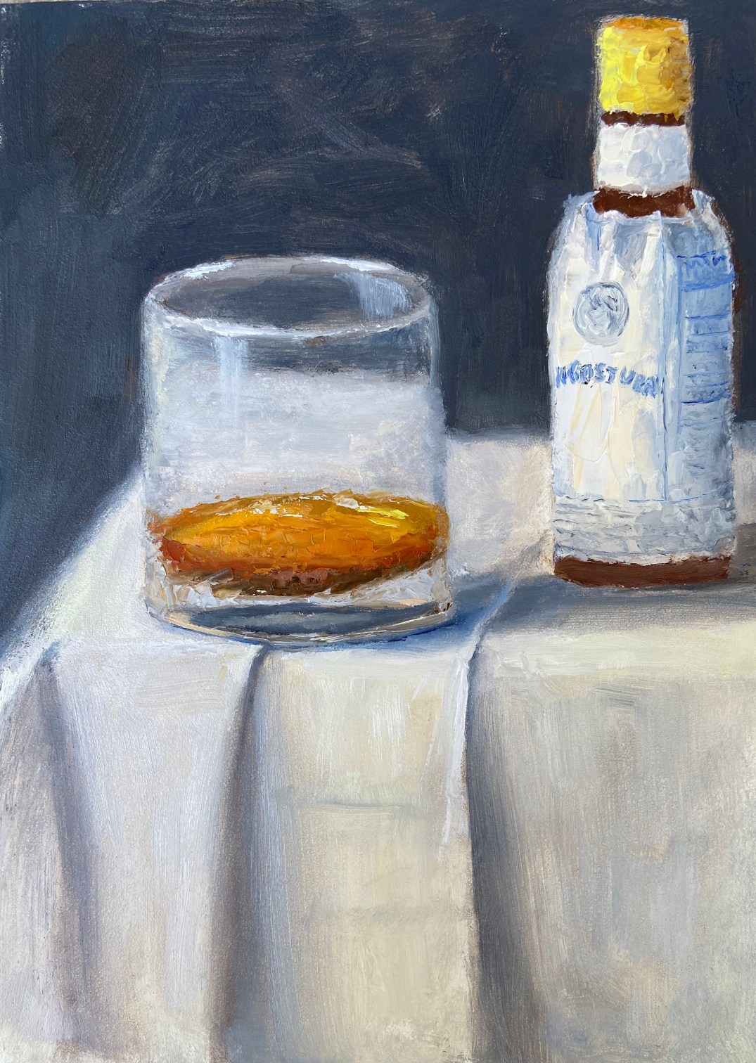
Happy Hour – Angostura

As the saying goes, “It’s happy hour somewhere in the world”, but seeing as it’s 10am here in Austin, a post about cocktails is about all I can muster.

HH Agostura 20200108
“Happy Hour – Angostura”

This is a small piece, oil on board, 5″x7″. This is the first in a series I’m going to do over the course of this year called “Happy Hour”. I’m always trying to think of ways to make art creative and engaging, which can be done in a number of ways. Instructors and workshops will often stress composition and technical prowess, which is very important, but I consider that table stakes. What’s often missing is intrigue, of which I’m plenty guilty of excluding in my works. To get the interest piqued with the Happy Hour series, I’m not going to reveal the specific cocktail in the name of the piece or initial blog post. The intrigue is for the viewer to figure it out based on bartender savvy hints.

Take this initial piece, “Angostura”, which is very simple in terms of composition. What do you consider valid and helpful hints in the painting? When putting this together, I wanted to provide 3 hints that a savvy bartender – professional or simply someone like me with a well stocked bar at home – would be able to use to identify the drink. In this case, those hints are some, but not all of the ingredients, color of the cocktail, and glassware. Can you figure it out?

If you want some help, PUNCH is a fantastic libation focused publication that is a notch above pretty much everything else out there, at least as far as I’ve been able to find. Once you crack the mystery of “Angostura” (hint: think simplicity… I’m not being clever with this one), dive into PUNCH and see what I mean about great cocktail insights.

Maybe 2020 should be the year of artistic intrigue?

The $250 Eraser

I wanted to share an expensive lesson I learned today in hopes that nobody reading this post will be doomed to repeat. For the artists out there, you’ll probably just laugh at this post, as you’ve surely experienced your own “eraser gate”, but if not, read on and take caution.

I’ll cut to the point and back into the details. If you leave a vinyl eraser sitting on a wooden table, it will MELT THE LACQUER FINISH!

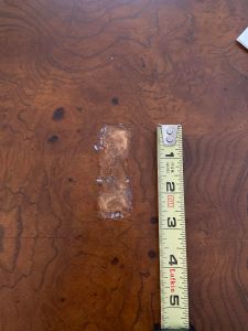
I had been drawing in my studio and left my eraser and pencils sitting on the table afterwards. I then got distracted, for many weeks, with other painting interests and didn’t return to the drawing for awhile. When I finally got around to finishing the drawing, I grabbed the eraser and it was stuck to the table! Upon closer inspection, it had actually melted / dissolved the lacquer finish into a gooey mess all the way down to the bare wood. See the picture below to appreciate the damage.

Eraser Burn Zoomed

I finally found a furniture repair company that does house calls and luckily they were able to do a suitable spot repair, which meant that vinyl eraser ultimately cost $250. Like I said, it was a very pricey lesson.

My understanding is that erasers (most but not all) will chemically react with their surroundings over time, so you have to be careful how they’re stored. The $250 eraser I used was vinyl, similar to this one at Jerry’s Artarama, but I believe this can happen with rubber and kneaded erasers, too. My erasers are now stored in their own canvass bag or wrapped in Saran Wrap. Hopefully I’ve seen the last of eraser meltdowns.


Dog Day Trifecta!

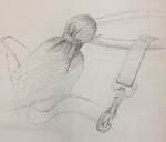
Starting some new pieces on used (loved) dog toys. This is the remains of a well used canvass purple octopus, called a Kong Wubba. The progression photos are over the course of a number of sessions, including a preliminary sketch done separately to get a better feel of the composition.

The trick with this piece was trying to get the right textural feel for the plush toy, which is the purple octopus. For reference, here is a link to a Kong Wubba so you can see what a pristine one is supposed to look like.

Ultimately this composition conveyed what I wanted, which are the essentials of a great day for one of my dogs, namely a walk (leash), play time (toy), and a fine gourmet meal (bowl).

“Dog Trifecta”

Oil on 5″ x 7″ wood panel


Danube – larger scale

Took another shot at the Danube river village. Originally did a small piece on canvass last year, which was challenging but fun. Took another go at it, but this time on a larger scale, going up to 24” x 12”, which for me is a considerable size leap. It worked out well, albeit slow going. The finished piece is ok, but I clearly leaned too heavily on the warm, red end of things, instead of capturing the fading cool light at the end of the day, which was the setting on this piece. That said, it came out pretty well and I learned a lot about details and the need to consider atmospheric perspective.


4652473C-68F2-460D-9FF0-A270A462CA6C

“Squirrel!” Finished

What I learned is painting a black dog, especially one near and dear, is very difficult. I never got Crash's face proportions just right in the preliminary sketches, of which there were many, and I couldn't get it figured out on the canvass. But it was better and a lot was learned about painting the black coat without using pure black. I'll tackle this again and get it right, but need to take a breather with a new project first.

Technical details:
Oil on panel, 6"x8"
Brush and knife
Ivory black, titanium white, ultramarine blue – most of her fur

1 Hour Challenge – Lough Corrib, Ireland

Another 1 hr sketch challenge. This is from a recent trip to Ireland on the grounds of Ashford Castle. John Wayne fans will remember The Quiet Man filmed here, in and around the village of Cork.

The boat on the right is the focal point. This is a good example of forcing yourself to sketch fast can hone the proportional calculation part of the brain – I made that up but it felt accurate when I did this sketch. If I had been drawing at a leisurely pace, I would have over thought the dimensions and shape of the boats.

This could be a good painting, especially with the red colors of the focal point boat.