“Framecro” – Fast Framing on the Cheap!

Framing artwork used to be a dreaded task, but over the years I’ve come to really enjoy it. This is especially true as we start 2020 because I recently had 4 dog related pieces accepted to an Austin art show at Art for the People gallery called Celebrities – Pet & People Portraits. Future posts this week will provide more details about the show and the inspiration behind the pieces, but I wanted to share some creative custom framing ideas I used with 2 of the pieces in the show.
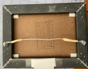
One of the troubling issues with framing is the commitment, secondarily the cost and complexity. The process of “properly” framing a painting often involves sealing it inside a frame in a way that makes getting it out an ordeal. When I hang finished art in my home, I can easily get bored of the frame after a year, or simply want to change the art that’s in the frame. To solve this problem, I came up with a Velcro based solution that works great with small pieces in floater frames, whereby you affix the piece with Velcro instead of glue or some other fixative, which allows you to swap out pieces in the same frame. This is handy for your personal art at home, gallery shows or events.
The steps to frame using Velcro, a process I’ve trademarked as “framecro“, are very simple, fast, and inexpensive. Let me know if you opt to framecro any of your paintings; improvements to the process are always welcome.
  1. Most Velcro types will work, but the Command line of snap-type from 3M is what I prefer. They market it as a picture hanging velcro because it snaps together very tightly, but you can still pull it apart easily.
  2. Cut 4 twin sets of velcro rectangles, which means you have 8 total rectangles of Velcro. These should be relatively small and easily fit into the 4 corners of the frame.
  3. Affix the velcro to the corners of the frame and the corners of the back of the artwork.
  4. Align the artwork and press it onto the frame.

You’re done! If you want to swap out a piece, just pop out the existing piece of art and press in a new one that has Velcro in it’s corners.

Zip’s Flowers

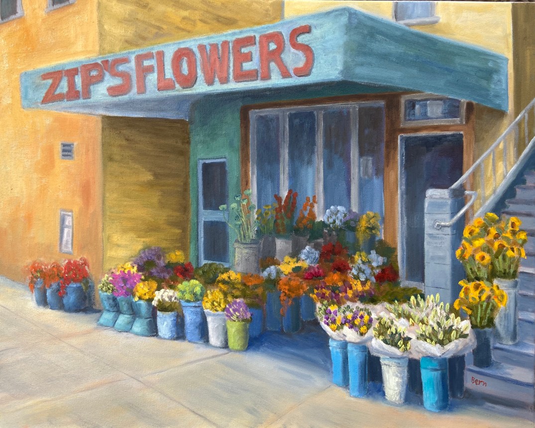
Zip’s Flowers: 20″x16″, oil on canvass

Sometimes art is very cathartic, but at times it can be maddening. However, I’ve learned over the years to rethink the frustration and consider those pull-my-hair-out-of-my-head moments as learning experiences, and more often than not it works. When I just can’t get a piece to work, either compositionally or from a technical skills perspective, if I focus on what I need to learn to fix it rather than become irritated at my shortcomings, I tend to get back that Zen painting zone.

Zip’s Flowers has been a long learning experience! Wars have taken less time to finish. That said, it’s chock full of newly acquired knowledge, of which I’m very excited about. There’s also some personal interest in terms of the background of this photo. This flower shop is a few blocks down the street from where I lived one summer in San Francisco. We lived in a great neighborhood along the border of the Mission and Castro districts, on 18th between Hartford and Noe. This flower shop, now called Urban Flowers, was along the way to the dog park. My wife would take the dogs at least once a day to the dog park. One day, the 1 year old puppy, Zip, decided smelling the flowers was no longer satisfying, so she opted to taste them. As the story goes, she reached out and grabbed a dangling flower from one of the pots and proceeded to knock the whole thing over! I wasn’t there, but my wife said the people at the shop were very friendly and weren’t concerned about Zip’s flower chomping. Of course I had to see this for myself, and a few days later I was walking Zip past this flower shop and sure enough, she tried to gobble down a basket of roses as we walked by.

The composition itself was probably the hardest hurdle to overcome, which I took license to adjust reality to make things work. The reference photo shows a wide variation of building colors and construction materials, so some adjustments had to be made on various fronts to make it look less contrived – ironically, the reality in the photo was too hard to believe in a painting. The values also had to be exaggerated to give depth and a sense of place, whereas the photo was very flat. Finally, the amount of tissue papered flowers was overwhelming and a bit distracting, so that was scaled back significantly.

My favorite part of this painting is the right foreground. First, the flowers in white paper came out much better than I had anticipated and they really frame that side of the painting. I also like the realism they add to the scene. Secondly, I’m very happy with the tall yellow sunflowers going up the stairs. These two elements combine to draw the viewer into the painting (hopefully) and consider wandering through the rest of the composition.

The sheer multitude of color is initially distracting for me, but once I stepped away from it for a day and returned to the completed piece, the colors were more welcoming and a source of excitement.

Do you like this piece? I’m guessing people either love it or hate it, given the colors and somewhat busy nature of the scene. Suggestions and observations are welcome.

Happy Hour – Angostura

As the saying goes, “It’s happy hour somewhere in the world”, but seeing as it’s 10am here in Austin, a post about cocktails is about all I can muster.

HH Agostura 20200108
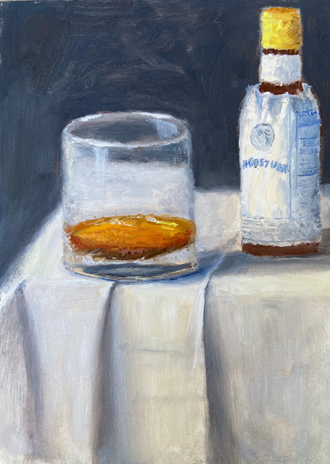
“Happy Hour – Angostura”

This is a small piece, oil on board, 5″x7″. This is the first in a series I’m going to do over the course of this year called “Happy Hour”. I’m always trying to think of ways to make art creative and engaging, which can be done in a number of ways. Instructors and workshops will often stress composition and technical prowess, which is very important, but I consider that table stakes. What’s often missing is intrigue, of which I’m plenty guilty of excluding in my works. To get the interest piqued with the Happy Hour series, I’m not going to reveal the specific cocktail in the name of the piece or initial blog post. The intrigue is for the viewer to figure it out based on bartender savvy hints.

Take this initial piece, “Angostura”, which is very simple in terms of composition. What do you consider valid and helpful hints in the painting? When putting this together, I wanted to provide 3 hints that a savvy bartender – professional or simply someone like me with a well stocked bar at home – would be able to use to identify the drink. In this case, those hints are some, but not all of the ingredients, color of the cocktail, and glassware. Can you figure it out?

If you want some help, PUNCH is a fantastic libation focused publication that is a notch above pretty much everything else out there, at least as far as I’ve been able to find. Once you crack the mystery of “Angostura” (hint: think simplicity… I’m not being clever with this one), dive into PUNCH and see what I mean about great cocktail insights.

Maybe 2020 should be the year of artistic intrigue?