Yellow Ball with Tails

Yellow Ball with Tails
Oil on canvas board, 6″x8″
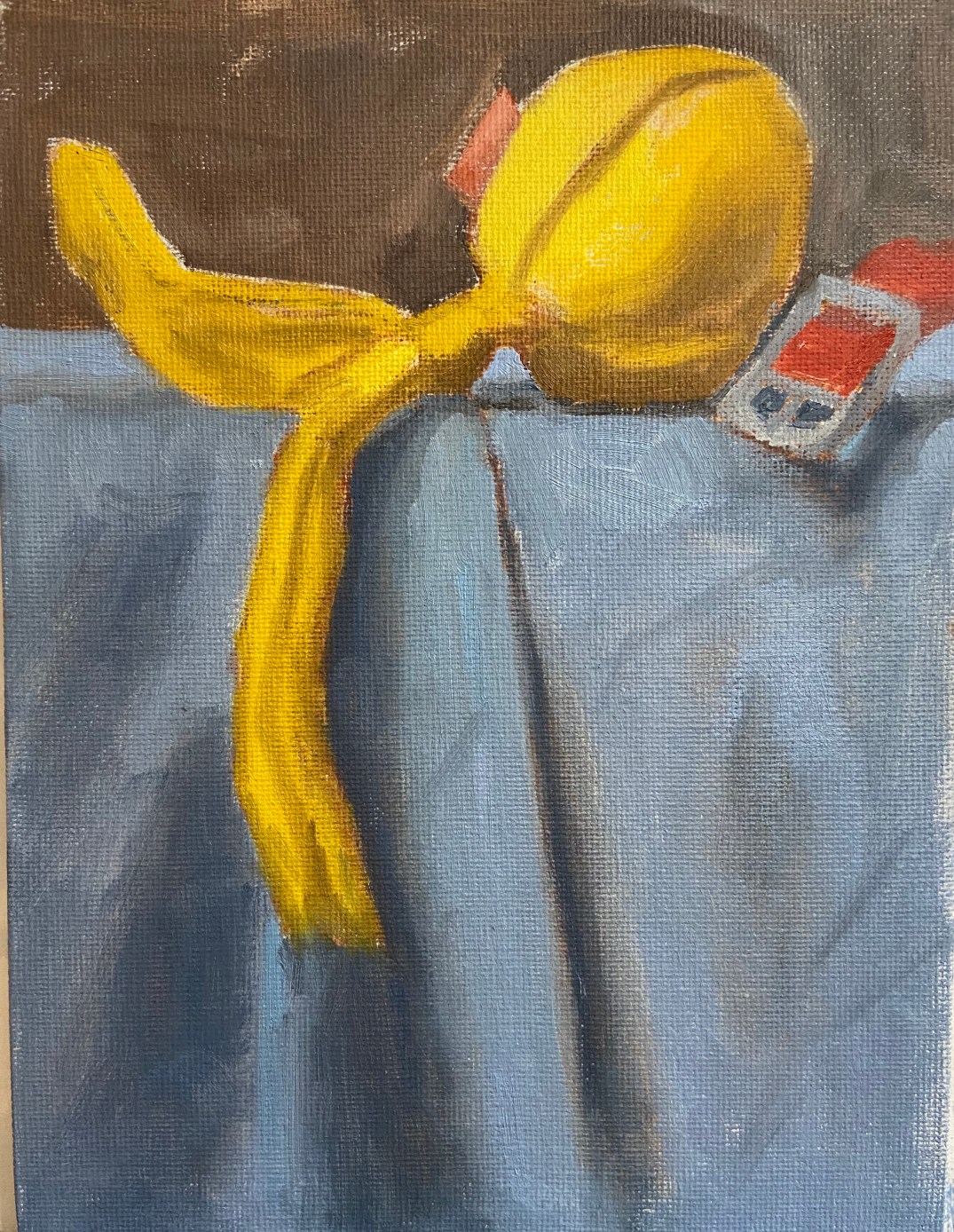
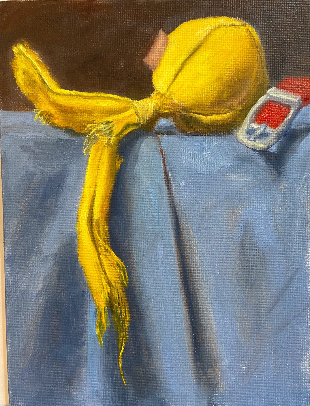
Sometimes you just know a composition is going to work, virtually able to paint itself. Yellow Ball with Tailswas exactly that kind of composition. Wolfgang and Zip loved this toy because the 2 tails made it tug-a-licious! As the designated thrower, I liked it because the ball made it easy to throw without getting dog slime all over my fingers.  Ultimately, this toy stayed inside and lasted about 20 play sessions before parts started to get ripped off and chewed up.
I’ve recently made some adjustments to my still life setup, changing the platform so it’s higher and is at sitting eye level. This gives a new angle that’s easier for me to translate to the canvas.
This piece moved quickly and was done in a couple of sessions this week. As I stated earlier, this composition looked great from the start and I knew it was going to be a fun project when I saw all that bright yellow shredding dangling against that blue background. Definitely going to spend more time on compositional arrangement with future dog toy paintings.
The canvas board was ideal for this type of toy because it has a lot of toothy texture, which easily lends itself to the toy’s material. The only thing I don’t like about a canvas board for this type of piece is the fine detail of the threads. The canvas texture makes it very hard to paint a thin line, so I often had to do some back and forth with the darker background color to get the thread lines just right, basically painting back into the yellow thread line to reduce the width.
There’s a lot of yellow in this piece, and I did some experimentation:
  • Deep Yellow + Titanium White as the base for the mid-range yellows. Added Ultramarine Blue and Cadmium Red Light in small doses for the shadows on the ball. 
  • Cadmium Lemon + Titanium White for the lighter areas. 
  • Indian Yellow, which I don’t typically use often, here and there to vary the lighting along some of the longer sections of the tails. 

The blue cloth was Ultramarine Blue and TW with variations of green made from Cad Yellow Deep and Cad Red Light. 

 
Originally, I had included the tag on the toy, but once the piece was 90% done the tag looked too distracting and didn’t add a lot of value, so I took it out. 
 
For those interested in the toy itself, it came from BarkBox, a monthly dog toy subscription service. Our dogs destroy toys, much to my artistic delight, so BarkBox has had to adjust what they send us to try and find toys that are good for tugging but also very durable.  Supervised play is the best solution for our fur balls because once they’re done tugging, it turns into keep away, which devolves into a game of “I’m going to eat this so you can’t have it”. Somewhere between keep away and vindictive chewing is when I like to step in and save the toy. If I was going to rate this toy, it would go something like this (1-10 scale):
  • Tugability 8 – withstood some strong tug sessions between my large dogs (Zip 50 lbs, Wolfy 85 lbs )
  • Durability 6 – hard for a canvas toy to rate higher than a 7, so this is pretty good
  • Versatility 8 – this could have easily been used inside or outside, both for fetch or tug. 
  • OVERALL 7
Yellow Ball with Tails - Dogs
Zip and Wolfgang – Dog Artists
Yellow Tail Ball - ref photo
Reference photo – Yellow Ball with Tails
Yellow Tail Ball block in
Block in of dog toy
Yellow Tail Ball 1
Started with the yellows
Yellow Tail Ball 2
First paint draft done
Yellow Tail Ball 3
Working details
Yellow Tail Ball 4
Fine details of shredded threads
Yellow Tail Ball Final
Finished Yellow Ball with Tails dog toy

Zip’s Flowers

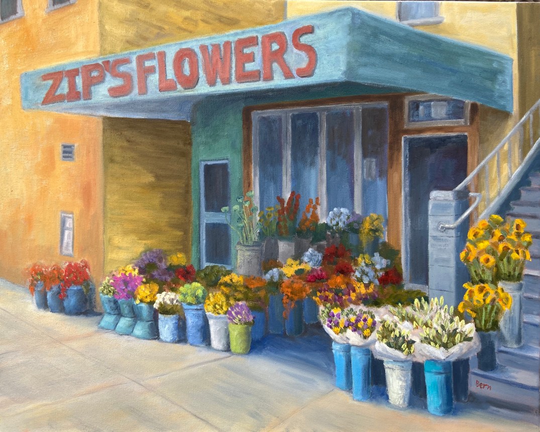
Zip’s Flowers: 20″x16″, oil on canvass

Sometimes art is very cathartic, but at times it can be maddening. However, I’ve learned over the years to rethink the frustration and consider those pull-my-hair-out-of-my-head moments as learning experiences, and more often than not it works. When I just can’t get a piece to work, either compositionally or from a technical skills perspective, if I focus on what I need to learn to fix it rather than become irritated at my shortcomings, I tend to get back that Zen painting zone.

Zip’s Flowers has been a long learning experience! Wars have taken less time to finish. That said, it’s chock full of newly acquired knowledge, of which I’m very excited about. There’s also some personal interest in terms of the background of this photo. This flower shop is a few blocks down the street from where I lived one summer in San Francisco. We lived in a great neighborhood along the border of the Mission and Castro districts, on 18th between Hartford and Noe. This flower shop, now called Urban Flowers, was along the way to the dog park. My wife would take the dogs at least once a day to the dog park. One day, the 1 year old puppy, Zip, decided smelling the flowers was no longer satisfying, so she opted to taste them. As the story goes, she reached out and grabbed a dangling flower from one of the pots and proceeded to knock the whole thing over! I wasn’t there, but my wife said the people at the shop were very friendly and weren’t concerned about Zip’s flower chomping. Of course I had to see this for myself, and a few days later I was walking Zip past this flower shop and sure enough, she tried to gobble down a basket of roses as we walked by.

The composition itself was probably the hardest hurdle to overcome, which I took license to adjust reality to make things work. The reference photo shows a wide variation of building colors and construction materials, so some adjustments had to be made on various fronts to make it look less contrived – ironically, the reality in the photo was too hard to believe in a painting. The values also had to be exaggerated to give depth and a sense of place, whereas the photo was very flat. Finally, the amount of tissue papered flowers was overwhelming and a bit distracting, so that was scaled back significantly.

My favorite part of this painting is the right foreground. First, the flowers in white paper came out much better than I had anticipated and they really frame that side of the painting. I also like the realism they add to the scene. Secondly, I’m very happy with the tall yellow sunflowers going up the stairs. These two elements combine to draw the viewer into the painting (hopefully) and consider wandering through the rest of the composition.

The sheer multitude of color is initially distracting for me, but once I stepped away from it for a day and returned to the completed piece, the colors were more welcoming and a source of excitement.

Do you like this piece? I’m guessing people either love it or hate it, given the colors and somewhat busy nature of the scene. Suggestions and observations are welcome.

Ball! Ball! Ball!

Oil on canvass panel, 6″x4″
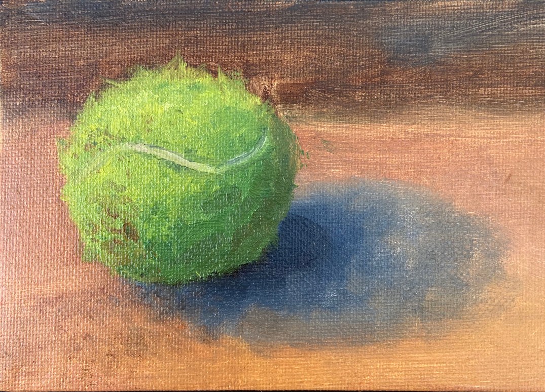
My dogs are a big part of my life, which means I live to serve their needs, in large part because I love them and, well, they don’t have thumbs. My oldest dog, Zip, is a 7 year old Aussie Catahoula rescue mutt from Austin Pets Alive!. Her world revolves around two things – food and “ball”. To that end, I serve as her chef and throwing machine.
The lifespan of a Zip tennis ball is a couple weeks. She chews on them while bringing the ball back for another throw, as if they’ve offended her and need to be destroyed. It’s the epitome of a love hate relationship.
This piece is a tennis ball after 1 throwing session. The fuzz and color have been adequately altered, making what had been a boring, new green smooth tennis ball into something with depth and intrigue. Thank you Zip!
I like to do these small dog toy pieces on a canvass board to help with texture. In this piece, it was very helpful with the need to pull out strands of tennis ball fuzz because the rough surface helped scatter the stringy look in a random pattern, thus making it look more natural. The hardest part was getting the dirt just right, which took some experimentation with Burnt Sienna, Raw Umber, and various puddles of orange.
Finally, I was pleasantly surprised how effective the white line of the tennis ball added realism. It was also important to put a small hint of shadow along the edge of the white line to give just enough depth on the surface of all that green fuzz.
Tennis Ball - Oil Panel 2

“Rescued” – molds and molds and molds

IMG_3641

As mentioned in the previous post, the process for creating the dog paw prints wasn’t straightforward. The challenge was finding a way to get the real prints of all 3 dogs on the canvass without having it look like a distorted mess. Sure, there are plenty of reasons to do a piece with the messy prints splayed across the canvass, and I’ll readily admit that is a good idea, too. However, that was not the direction for this project.

The other challenge was ensuring the actual prints of Crash, Boom, and Zip were used. I didn’t want to do a photo-based, realism approach, i.e. take a picture of the paws and free paint the shapes. I really wanted to have the touch and active presence of CBZ on the canvass. This became very important to me as the work progressed because it would be a forever connection to our beloved pups; a way to always reach out and touch their “real” paws.

So if you haven’t barfed from the sentimentality, you appreciate the concept… hopefully. The original thought was to slather some non-toxic kid paint on the dog’s paws and let them run on the canvass. That’s such a bad idea for so many reasons. Just think about it for a minute if you don’t know what I mean. The next idea was to paint the dog’s paws and then press their paws on the canvass myself, in a more or less controlled fashion. Aside from the obvious battle of wills that would ensue, of which I would surely be on the losing side, this doesn’t work well because the prints are muddled with hair marks, making the prints largely indiscernible. I know this because I did a trial with Boom, the mellow dog, by shaving his paws and following the technique noted above on a practice canvass. It looked like poo.

The final answer was molds in molds. The photo included has the molds I used plus one set I didn’t. The 3 molds on the top left and the set of 3 on the bottom left. Process went like this:

  • Pressed the dog’s paw into a round of molding clay.
  • Baked the molds for 30 minutes. These are the top 3 molds in the photo.
  • Using non-drying clay, pressed into the dried molds and pulled them out. These are the bottom 3 colored ones.
  • These non-drying clay molds held their shape, but could be manipulated, so I pressed each one gently down onto a flat surface to flatted out the paw prints so it would transfer the shape better.
  • Applied thin layer of paint to the clay molds and pressed carefully onto the canvass. This provided the general shape and worked surprisingly well.
  • Applied free-hand touch ups and additional layers of paint on paw prints on canvass.

The other 3 molds (on right side of photo) are a failed attempt to create oven dried impression molds as described with the non-drying clay above. They are great 3D molds of the dog’s prints, but turns out the paint doesn’t transfer well to the canvass because the paw pads are too well done, i.e. they are rounded and can’t be pressed flat to make a good stamp. One of those things you try and then feel like a moron for having overlooked such a simple mistake.

All the molds are reusable, so I can recreate this project again if I wanted to. The best part is that my wife gets the painting she asked for, plus a mold of each dog’s front left paw.