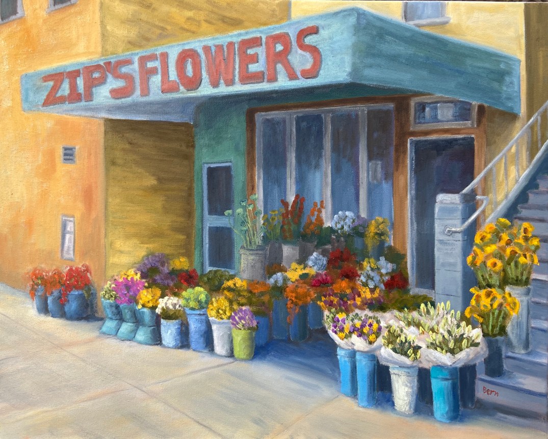
Zip’s Flowers: 20″x16″, oil on canvass
Sometimes art is very cathartic, but at times it can be maddening. However, I’ve learned over the years to rethink the frustration and consider those pull-my-hair-out-of-my-head moments as learning experiences, and more often than not it works. When I just can’t get a piece to work, either compositionally or from a technical skills perspective, if I focus on what I need to learn to fix it rather than become irritated at my shortcomings, I tend to get back that Zen painting zone.
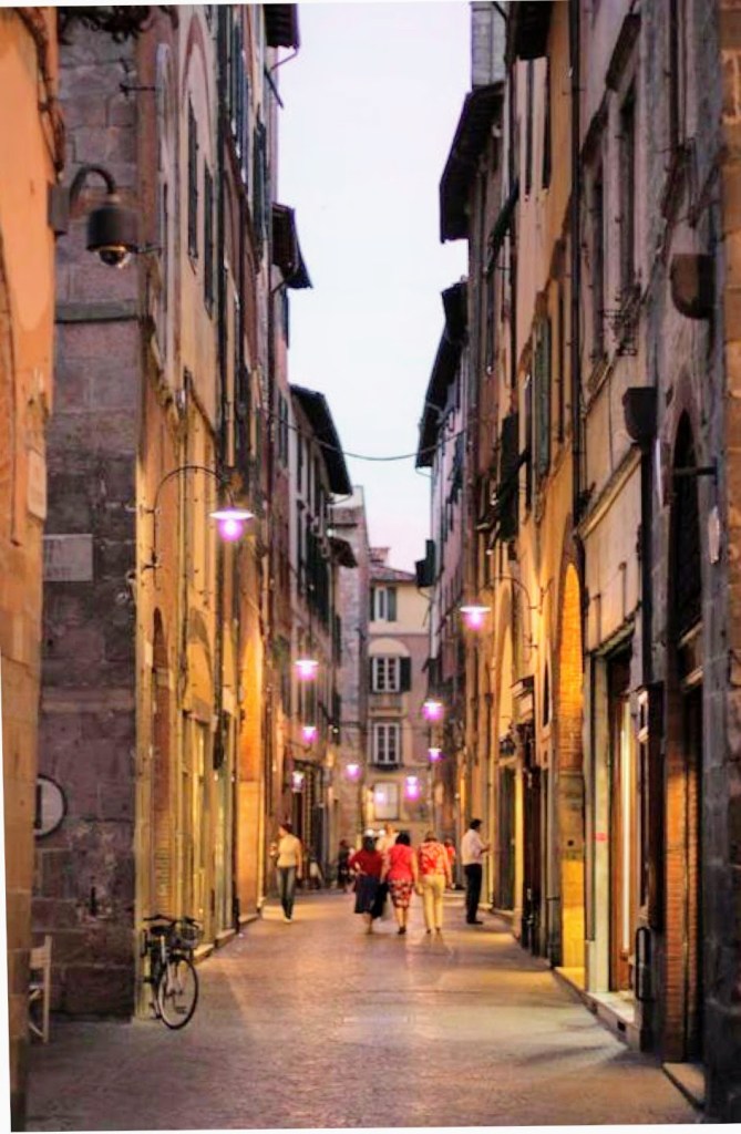
Zip’s Flowers has been a long learning experience! Wars have taken less time to finish. That said, it’s chock full of newly acquired knowledge, of which I’m very excited about. There’s also some personal interest in terms of the background of this photo. This flower shop is a few blocks down the street from where I lived one summer in San Francisco. We lived in a great neighborhood along the border of the Mission and Castro districts, on 18th between Hartford and Noe. This flower shop, now called Urban Flowers, was along the way to the dog park. My wife would take the dogs at least once a day to the dog park. One day, the 1 year old puppy, Zip, decided smelling the flowers was no longer satisfying, so she opted to taste them. As the story goes, she reached out and grabbed a dangling flower from one of the pots and proceeded to knock the whole thing over! I wasn’t there, but my wife said the people at the shop were very friendly and weren’t concerned about Zip’s flower chomping. Of course I had to see this for myself, and a few days later I was walking Zip past this flower shop and sure enough, she tried to gobble down a basket of roses as we walked by.
The composition itself was probably the hardest hurdle to overcome, which I took license to adjust reality to make things work. The reference photo shows a wide variation of building colors and construction materials, so some adjustments had to be made on various fronts to make it look less contrived – ironically, the reality in the photo was too hard to believe in a painting. The values also had to be exaggerated to give depth and a sense of place, whereas the photo was very flat. Finally, the amount of tissue papered flowers was overwhelming and a bit distracting, so that was scaled back significantly.
My favorite part of this painting is the right foreground. First, the flowers in white paper came out much better than I had anticipated and they really frame that side of the painting. I also like the realism they add to the scene. Secondly, I’m very happy with the tall yellow sunflowers going up the stairs. These two elements combine to draw the viewer into the painting (hopefully) and consider wandering through the rest of the composition.
The sheer multitude of color is initially distracting for me, but once I stepped away from it for a day and returned to the completed piece, the colors were more welcoming and a source of excitement.
Do you like this piece? I’m guessing people either love it or hate it, given the colors and somewhat busy nature of the scene. Suggestions and observations are welcome.

Reference photo – Urban Flowers

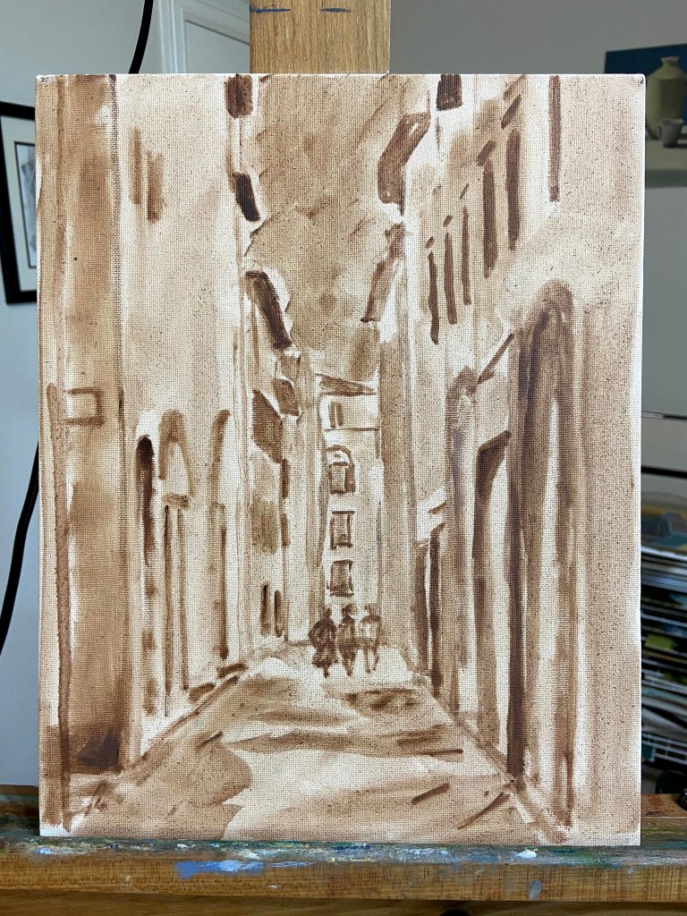
Flower shop sketch

So many flowers!

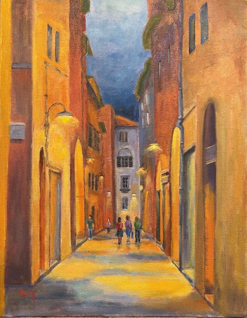
Getting close

ZIP’S FLOWERS || 20″ x 16″ Oil on Canvass || $100