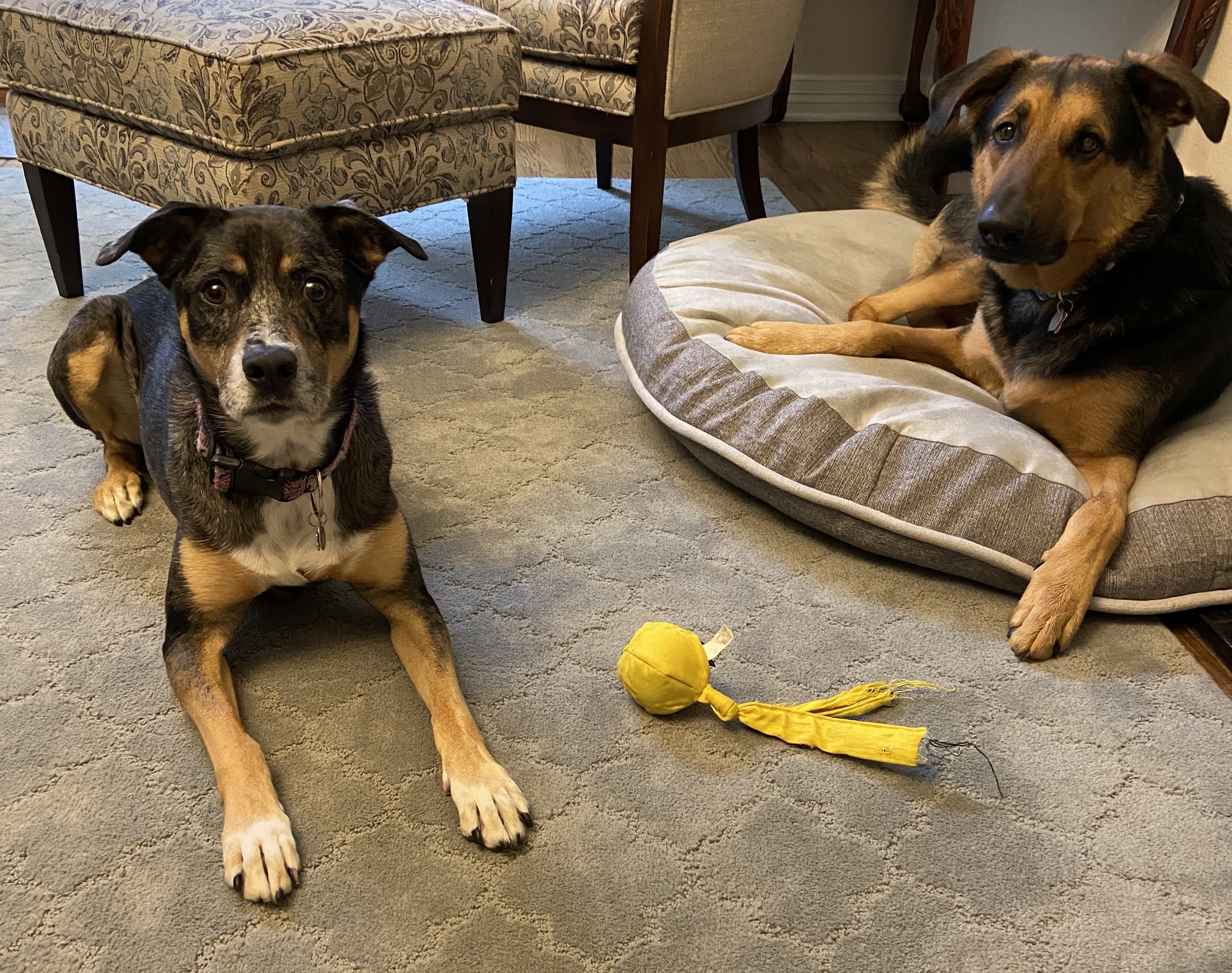
Pivoting from painting to drawing last week and finally made the time to finish this one. Squirrel Watch is pretty self explanatory – Wolfgang, my 3 year old rescue mutt, sitting in the yard watching the tree tops for the infiltrators!
One of my artistic goals this year is to improve my dog related art skills. I’m not a big fan of dog portraits, however, I thoroughly enjoy what I like to call “dogs doing stuff”, creating intrigue through motion and activity. Over the coming months I’ll work on various dog related pieces that capture the essence of dogs being dogs as they do their thing.

Squirrel Watch was done over the course of a few weeks – I have no idea how long it took, but I wouldn’t be surprised if I spent 6 hours on this relatively small piece. There were a lot of mistakes along the way, but nothing an eraser and some patience couldn’t remedy.
This isn’t a piece I would frame and hang, but I’m pleased with it from a progress perspective. It’s also riddled with lessons learned, so if you zoom in to see the details you can spot various styles and techniques.

Reference Photo 
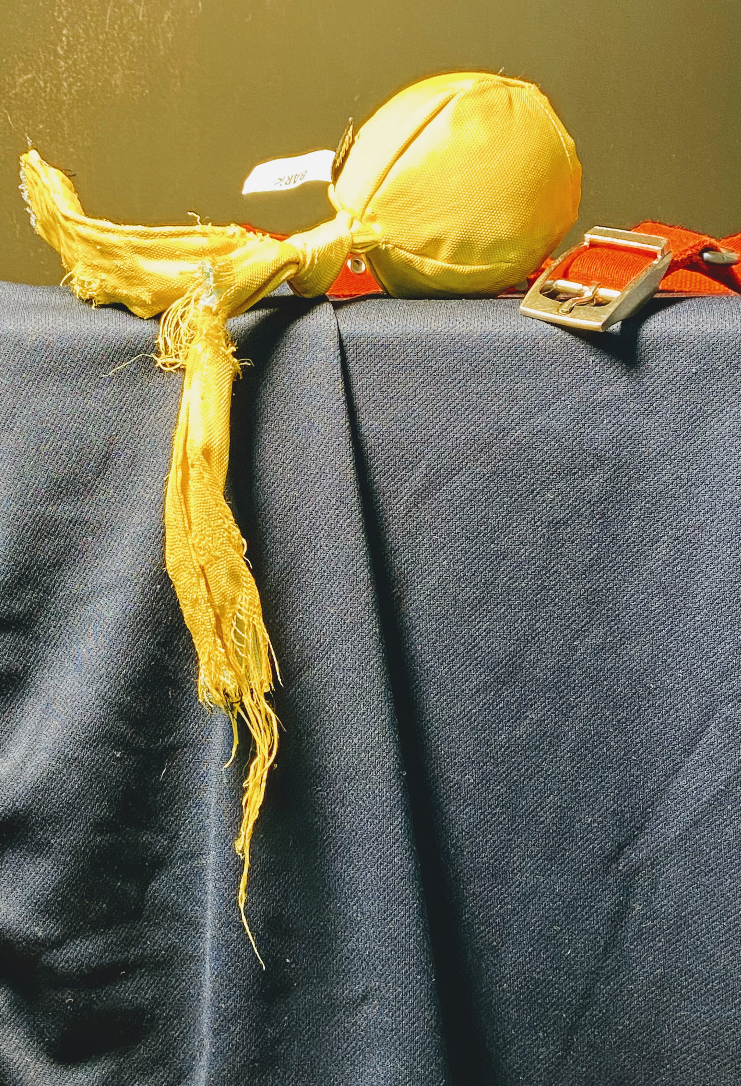
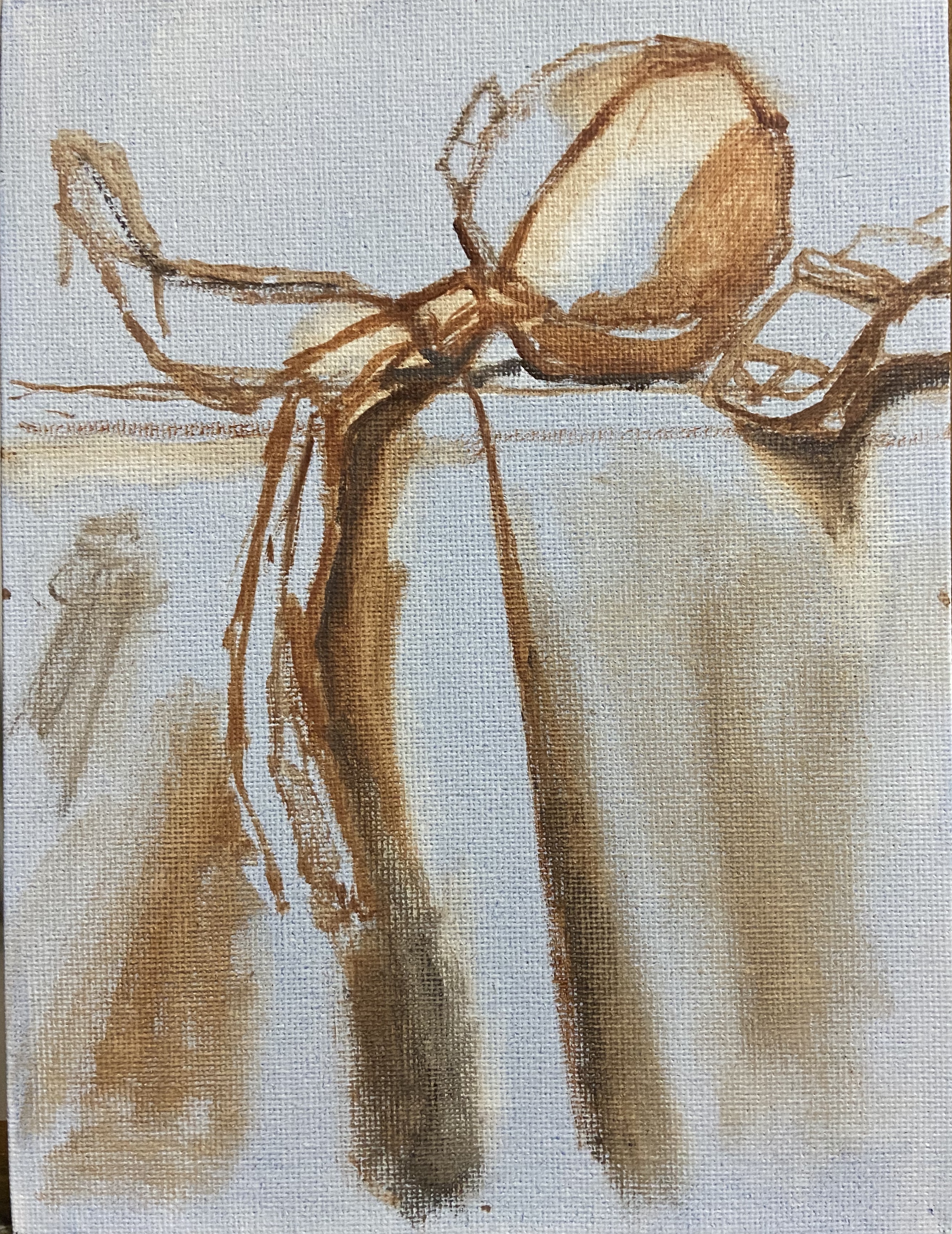
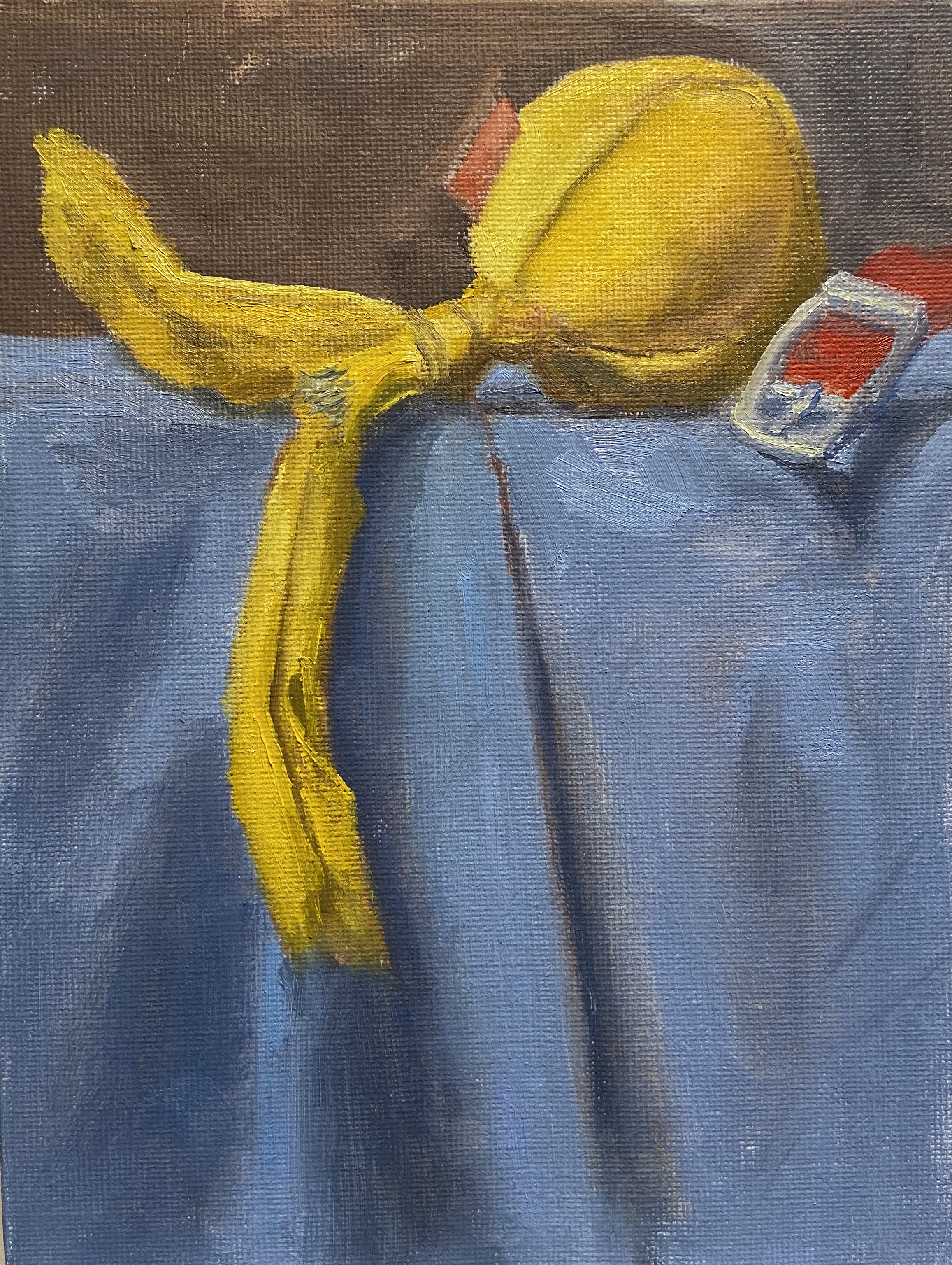
Squirrel Watch progress 
Squirrel Watch progress 
Squirrel Watch progress 
Squirrel Watch Final 
Squirrel Watch Final and Supplies
Here’s what I learned and need to remember for future drawings:
- It’s not necessary to draw hair detail throughout the subject. In this piece, the emphasis should have been on shading and shape foremost, whereas hair detail should be secondary.
- Draw hair details with a clear understanding of actual direction of the hair on the dog.
- Work hair dark to light.
- Most of the hair detail can be accomplished using 2B, HB, and H pencils.
- Show wrinkles in the coat by changing the density of hairs, i.e. closer together or further apart.
- Dog paws are hard to draw, dammit!
- Blades of grass can be done by either individual strokes or by lifting out shading with a thin eraser.