Tag: painting

Loire Valley Landscape
Started a new project today. I’ve sketched this one a few times already, but intend to use this as a reference point for the actual painting whereby I’m going to try to emphasize the storm clouds in the background, add some color to the foreground with flowers, and insert some actual people doing stuff in the village area to draw the viewer into the scene. This first effort will be a quick draft painting on paper to get the values and compositional elements figured out. If that goes well, I’ll parlay this into a larger piece.


Giverny update
Focused on the water again today. Also added some ripples to give the sense of movement. It’s not great, but good enough for now. Think it’s time to make some updates to the foliage and wrap this one up.


Giverny – There’s no panic in painting!
Took another stab at Giverny. Added the remaining foliage in the lower left bank, added the wooden posts, and took yet another whack at the water.
This water is looking much better than past efforts. Did some research and practice sessions to work on the technique. Pretty sure this will be easier the next time I take on moving water because it will be from a clean slate, but correcting/updating this piece is tricky. Regardless, I stuck with my “don’t panic, there’s no panic in painting” mantra and pressed forward. I’m happy with the progress, but the water will have a couple more sessions of work. However, for the first time, I feel like the basic structure and feel is in place. Yeah, some of the greens are too saturated, and the gray sky reflection (the white-ish part in the center) isn’t working yet, but it’s a huge stride past where I’d been stuck before. Feel like I’ve pushed past a plateau and can build from this. That said, anyone with helpful advice is more than welcome to offer; as you can tell from past posts on this project, I could use the help.


Going Big!
Started a new project this past week. I won’t reveal the final design details, but suffice to say its going to be very different from anything I’ve done so far in many ways:
- No reference photo: Instead it’s inspired by my wife, who is the source of this great idea, and it’s something very personal for both of us. While I don’t have the convenience of a picture to look at whenever I need guidance, I get to collaborate with her and evolve the idea together as it comes out of her imagination.
- This is BIG! At least for me. This is going to be twice the size of any work I’ve done in the past – 24″ x 36″.
- The technical challenges are very different, too. At first I thought it would be much easier because I’m using mostly just 2 colors, but neither are straight from the tube, which means the need to mix enough volume to cover the entire area is something of a challenge, which I didn’t realize until I was already running out of the first batch. You really have to mix a large volume up front so the area is covered in a contiguous hue, or else it will look uneven, i.e. the top half will look darker, lighter, duller, etc than the bottom half. In a landscape painting, even a large piece, you can get away without worrying about slight variations because you use it around the entire piece to create depth and texture to the objects, but this is a modern piece that needs continuity (at least for part of it.. hint hint of what’s to come) throughout.
- The other technical challenge is doing the large heart shape freehand. I didn’t use a stencil, and actually took some time to create a demo piece on a much smaller scale to get the proportions and shape aligned with what my wife wanted. Then it was a matter of dusting off some high school math on ratios to translate to the larger format, i.e. the 10″ x 11″ heart is what dimension on the 24″x36″ canvas? Patience on the drawing front paid off.
The photos below show the staging and completion of stage 1. I promise you, stage 2 and the challenges involved will be very exciting, so stay tuned for updates in the coming week.
 Reference drawing/painting. This was used to get the palette choices figured out and the proportions and shape of the heart established. The original idea was red on yellow, but all we could see was McDonalds, which led to a lot of laughter as we tested out new background options. The baby blue was final decision. The heart is cadmium red + a little white + a little permanent green light. The blue is Titanium White + a little Pthalo Blue. Looks greenish on this test piece b/c the yellow was bleeding through.

This is what 24×36 looks like on my easel. It dwarfs the pieces stacked up on the floor – still dealing with renovation messes, so all the art isn’t back up on our walls yet.

Transferred to the canvass, the red heart is looking great!
Finished with Phase 1 after getting the blue background slathered on. Getting the line crisp along such a large object made my shoulder ache, but it was great practice for painting adjacent wet paints. No easy feat, especially with the curvatures of the heart. I had to rotate it around the easel many times to get the right painting angle.
The color combination in real life is a little less saturated, but it works really well together. Hats off to my wife for making the palette call on this one. I wouldn’t have thought to go with such bright hues, but it works really well. Finally, the picture doesn’t show the texture contrasts – I used a palate knife for the blue area and brush for the heart. More on that later.

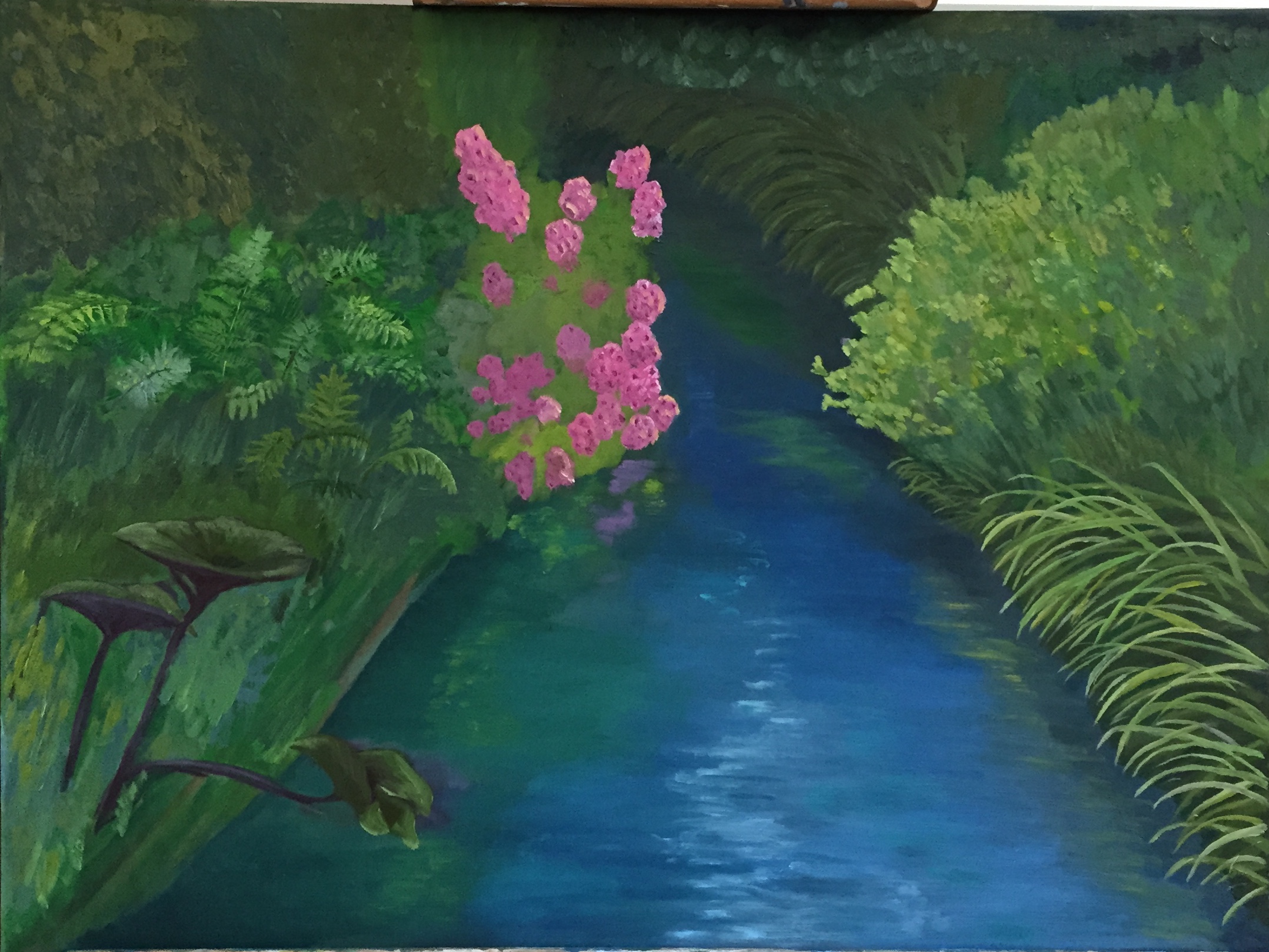
Back on the Canvass! Giverny Stream
Went on a short hiatus, but getting back in the swing of things. Getting ramped up on a few new projects, but knocking the rust off by revisiting an old foe – the love / hate relationship with Giverny. Original post is here.
There is a post of earlier progress on this green monster, but I’m finally starting to get my head around the challenge of reflections in moving water. See for yourself…
First, tried doing variations of blue water with white highlights, which didn’t look right. Roughed in the purple flowers in the lower left front corner.

Next idea was to do more greens with more aggressive use of whites/grays to give the sense of moving water. That didn’t work, but the additional work on the ferns on the right side was productive.

Third swing was building up much more gradual and interlaced mix of greens and grays. This photo is poor quality and doesn’t show the water very well, but it’s actually better in reality. Next session I’ll work in more of the greys to really give the sensation of moving water under a grayish sky. Also spent time reworking the reflections of the pink flowers and yellow flowers, both of which look really good in terms of glassy look on the water.
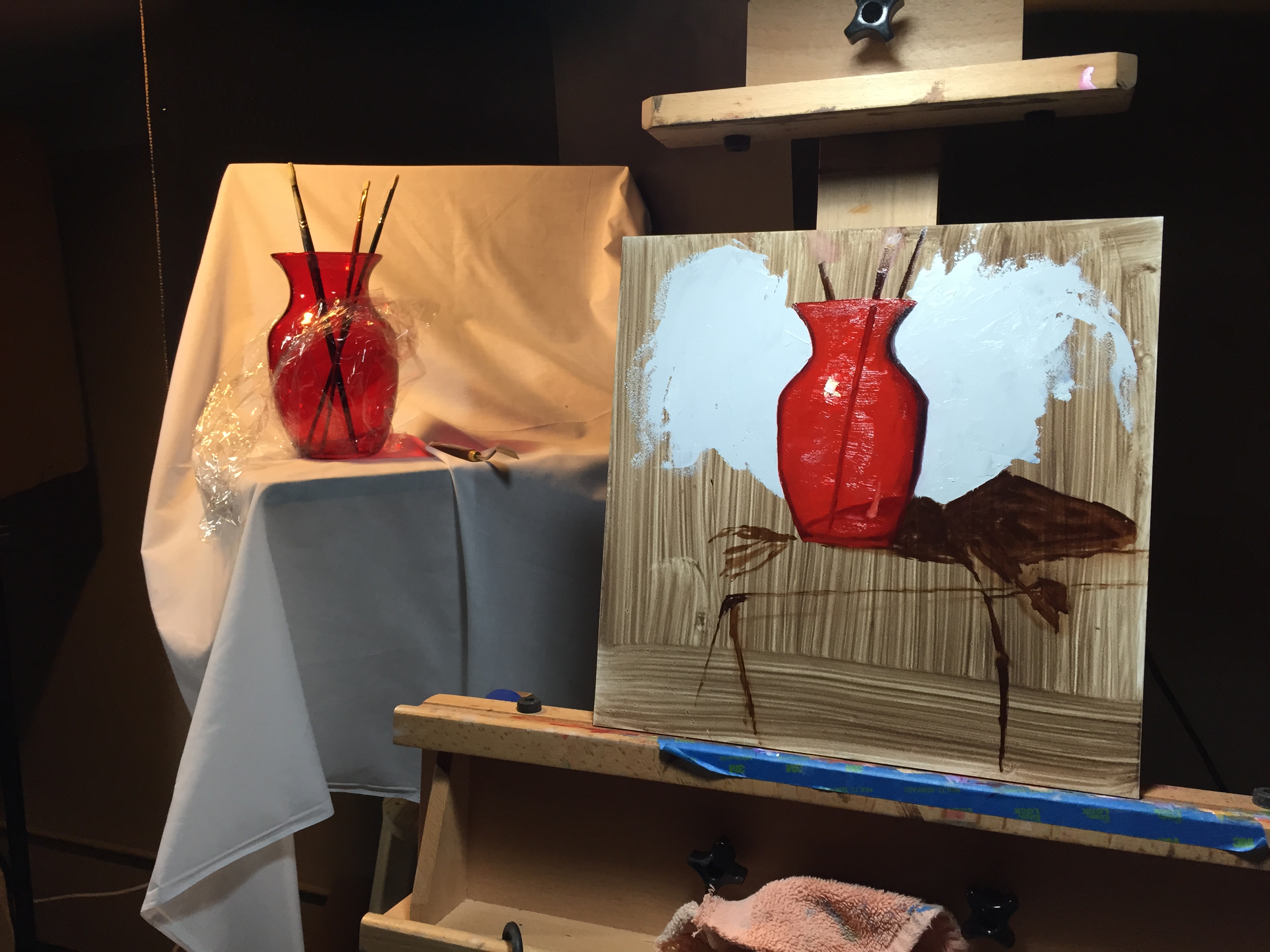
Red Vase in Cellophane: DONE

Did a pivot back to the “canvas” today, so Daily Sketch continues tomorrow.
I returned to the challenge of the cellophane wrapped vase, having run into numerous problems that I just couldn’t figure out. But after some time to think through why the cellophane just didn’t look right, I came up with 3 primary issues to fix:
- Too many highlights. The painting looked like it had run into a bird poop tornado! Luckily I had learned how to remove these with a painting knife from the Cheifetz workshop last month; added some pics of the removal of one of the offending highlights.
- The highlights were to rounded. The cellophane highlights should be at hard angles which helps give the sense of stiff shapes, as opposed to softer material like fabrics.
- The values were wrong. Needed warmer grays on the light source side (left) and a wider range of lights.
In the end, I’m pleased with the results given it was a first effort with this somewhat complicated medium. Next time I will make sure the wrapping of the still life object is done with more purpose and in tighter bunches. This composition was poorly designed on my part. The cellophane was a loose gathering on the left side and lacked enough tight fitting accents, which would have made it easier to interpret.


Progress Report – Red vase in cellophane
Not to the cellophane yet, but good progress overall. More meaty update later this week.

Workshop Day 4 – winter storm cuts things short
Day 4 turned into a hurried 1/2 day due to the winter storm that blew in during the morning. A couple of inches of sleet and icy roads forced me to head home around 12:30 before the roads south became impassable for the night. Good thing I did because the drive was very precarious for that first hour. But before I had to leave…
David spent another 90 minutes working on the cellophane objects, bringing the piece to its glorious completion. While it’s not as refined and polished as some of his other work of the same subject, it was still very impressive given the timeframe. It was very interesting to see the cellophane come to life, but he also spent a lot of time getting the drapes in the tablecloth just right, which was surprisingly fun to watch. Nothing in his composition is done half-ass; it’s all-in on every element.


I had a little time to work on my vase and cellophane composition before having to head out to avoid the worst of the winter storm. I was able to apply a lot of what I had learned, along with hands-on guidance from David during class, to get the painting in a good position for success. The vase is coming along nicely, and while I didn’t get to start on the cellophane elements, I’m excited to work on this project, very excited!
I’ll definitely take another Cheifetz workshop next year. He’s an excellent teacher and a true master of his craft. It was also nice to meet so many skilled artists and friendly people during the workshop. It was a great group and there wasn’t an annoying person amongst the lot, which is saying something given there were 10 students. I can’t wait to get the painting knife back in my hands this weekend!
Workshop Day 2 – knives aren’t just for cooking, slicing, and stabbing!
Another great day at the workshop. We did a lot more painting today, but things started off with an hour of David doing a demo. He picked up where he had left his painting off from yesterday. Very interesting as he demonstrated more technique and color strategies for the support cast of objects. I learned another volume of painting secrets, well secret to me at least, and was able to apply many things immediately to my painting later in the day. Watching David create one of his signature compositions before my very eyes was worth the price of the workshop alone.

We spent more time working on our paintings today than the first day. I spent a lot of time working slowly and carefully with the painting knife, never picked up a brush today. After 5 hours of painting I started to get much more comfortable with the painting knife, getting a feel for how to manipulate the paint on the surface of the board, as well as gaining more comfort in knowing where the paint was on the knife and where it needed to be on the knife for tricky angles.
David continued to work the room constantly during our workshop today. I spent numerous sessions of 1on1 time with him as we worked through some of the challenges in my painting, of which there are many. He told me that I was tackling a very difficult subject on many fronts – the water pitcher is hard to do b/c it’s reflective, has a wide range of values, the shape is tricky, and the coloring is far from straightforward. No better time to dance out of my comfort range and skill level. Needless to say, David was willing to demonstrate solutions to me directly on my painting.

The lighting in the studio is great for our painting work, but it’s awful for taking pictures of the work. I’ve posted my progress below, but will try to get a better shot tomorrow with some decent lighting. It has a long way to go, but I’ve already learned so much that it’s hard to believe it’s only been 2 days.


Day 3 we shift gears to a new composition, so I’ll have to finish my first knife painting back home later this month.
