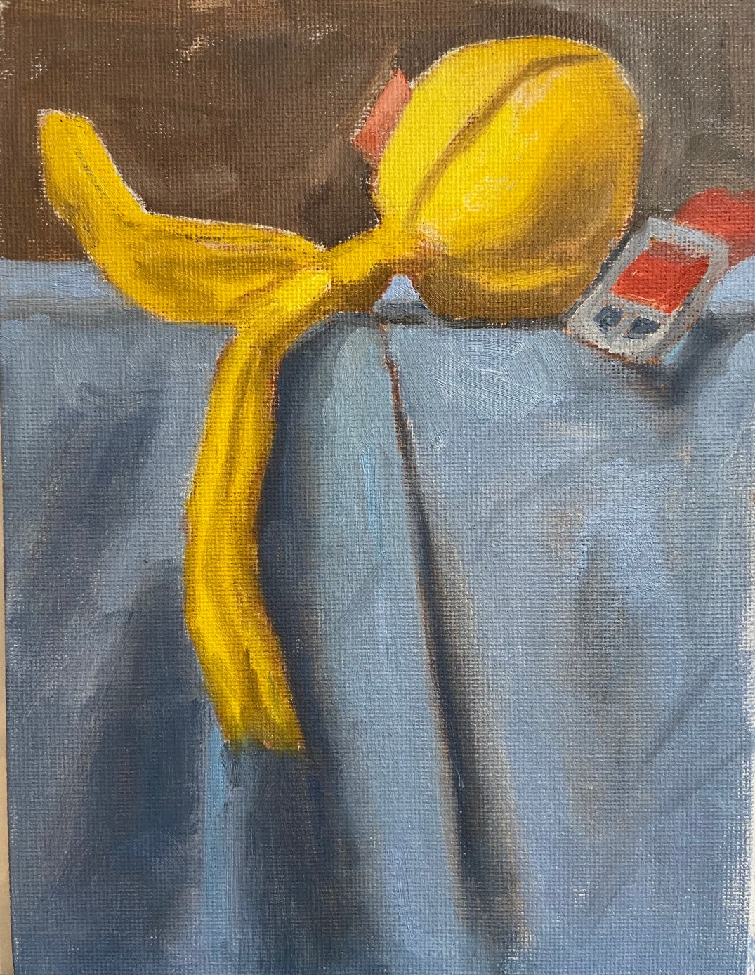
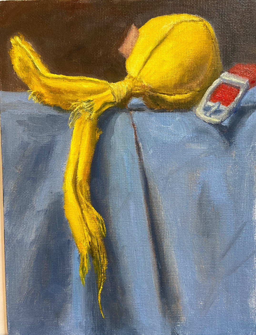
Yellow Ball with Tails
Oil on canvas board, 6″x8″
Sometimes you just know a composition is going to work, virtually able to paint itself. Yellow Ball with Tailswas exactly that kind of composition. Wolfgang and Zip loved this toy because the 2 tails made it tug-a-licious! As the designated thrower, I liked it because the ball made it easy to throw without getting dog slime all over my fingers. Ultimately, this toy stayed inside and lasted about 20 play sessions before parts started to get ripped off and chewed up.
I’ve recently made some adjustments to my still life setup, changing the platform so it’s higher and is at sitting eye level. This gives a new angle that’s easier for me to translate to the canvas.
This piece moved quickly and was done in a couple of sessions this week. As I stated earlier, this composition looked great from the start and I knew it was going to be a fun project when I saw all that bright yellow shredding dangling against that blue background. Definitely going to spend more time on compositional arrangement with future dog toy paintings.
The canvas board was ideal for this type of toy because it has a lot of toothy texture, which easily lends itself to the toy’s material. The only thing I don’t like about a canvas board for this type of piece is the fine detail of the threads. The canvas texture makes it very hard to paint a thin line, so I often had to do some back and forth with the darker background color to get the thread lines just right, basically painting back into the yellow thread line to reduce the width.
There’s a lot of yellow in this piece, and I did some experimentation:
- Deep Yellow + Titanium White as the base for the mid-range yellows. Added Ultramarine Blue and Cadmium Red Light in small doses for the shadows on the ball.
- Cadmium Lemon + Titanium White for the lighter areas.
- Indian Yellow, which I don’t typically use often, here and there to vary the lighting along some of the longer sections of the tails.
The blue cloth was Ultramarine Blue and TW with variations of green made from Cad Yellow Deep and Cad Red Light.
Originally, I had included the tag on the toy, but once the piece was 90% done the tag looked too distracting and didn’t add a lot of value, so I took it out.
For those interested in the toy itself, it came from BarkBox, a monthly dog toy subscription service. Our dogs destroy toys, much to my artistic delight, so BarkBox has had to adjust what they send us to try and find toys that are good for tugging but also very durable. Supervised play is the best solution for our fur balls because once they’re done tugging, it turns into keep away, which devolves into a game of “I’m going to eat this so you can’t have it”. Somewhere between keep away and vindictive chewing is when I like to step in and save the toy. If I was going to rate this toy, it would go something like this (1-10 scale):
- Tugability 8 – withstood some strong tug sessions between my large dogs (Zip 50 lbs, Wolfy 85 lbs )
- Durability 6 – hard for a canvas toy to rate higher than a 7, so this is pretty good
- Versatility 8 – this could have easily been used inside or outside, both for fetch or tug.
- OVERALL 7